Color is a design element that leaves an impression in an instant to your entire brand audience. Some brands are very colorful and expressive, while others are neutral and more serious. Color plays an important part in brand recognition and consumer behavior, guiding people to make decisions based largely on their own subliminal perceptions. There’s a reason you’ll never see a green “DANGER” sign, or an orange bag of salt and vinegar chips. Due to color systems that have been established over time, people develop learned behaviors relating to colors at a young age. Color perceptions depend upon a person’s cultural surroundings and ability to see colors, so it’s important to consider your audience demographics.
The basics of color
Navigating the landscape of color is essential for your brand’s success, but it can be tricky. We’ve created this guide to cover a few color basics so you can use color with intention.
Complimentary vs. Analogous
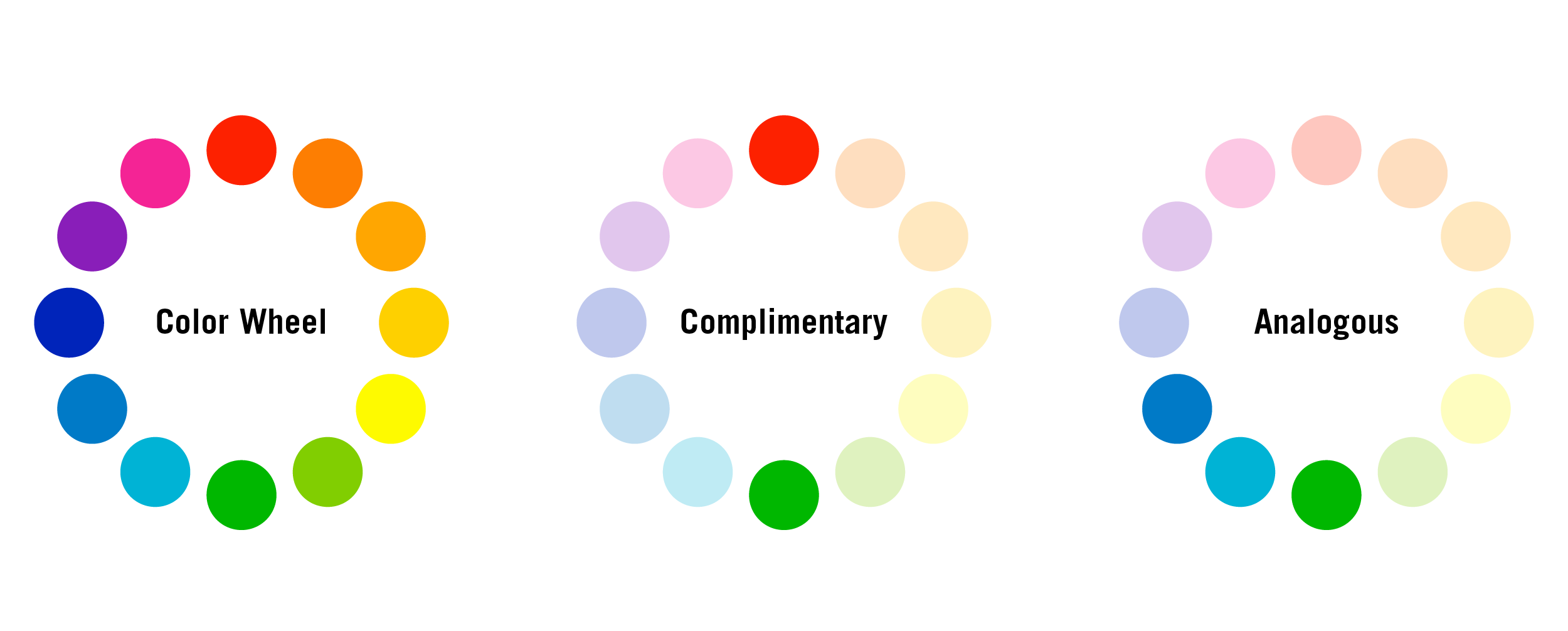
When choosing brand colors, it’s helpful to look at the color wheel. The color wheel is a helpful diagram that features a spectrum of colors. While there’s many types of color harmonies (types of color combinations), two of the most powerful and commonly used are Complimentary and Analogous. Complimentary colors contrast from each other and are often directly across from each other on the color wheel. Analogous colors are next to each other on the color wheel, offering a much more subtle or relaxing approach.

Neutral vs. Saturated
Neutral colors are colors like white or black that are often thought of as “color-less.” These colors offer less of a punch and can be more subtle. Saturated colors are visually vibrant and really pop. An example of a very saturated color would be hot pink.
Warm vs. Cool
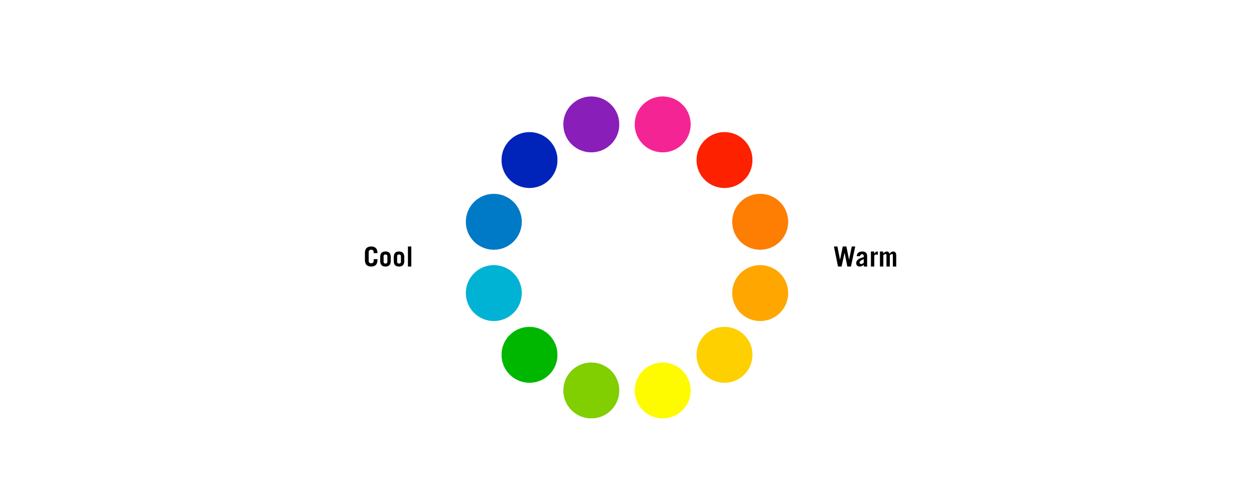
When thinking of warm colors, I often think of the sun. When thinking of cool colors, I think of the ocean. Warm colors, like red and yellow, are shown on the left. Cool colors, like blue and green, are shown on the right.
Print vs. Digital
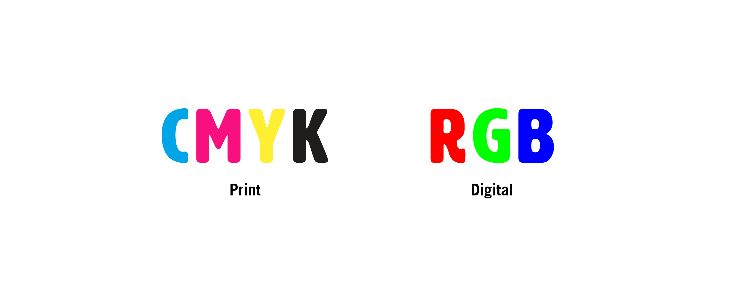
There are different color codes for the various applications of color. When using color on screens, use RGB color mixes or HEX codes. RGB, which stands for Red, Green, Blue, uses the mix of colors that are shown on your digital devices. On the other hand, when printing you should use CMYK or spot colors. CMYK, which stands for Cyan, Magenta, Yellow, Black, represents the 4 layers of ink that are combined to create graphics in most printing. Some specialty printing uses spot colors, such as Pantone colors. These colors are mixed to create ink with specific hues for the most accurate color matching possible.
Tint vs. Tone vs. Shade
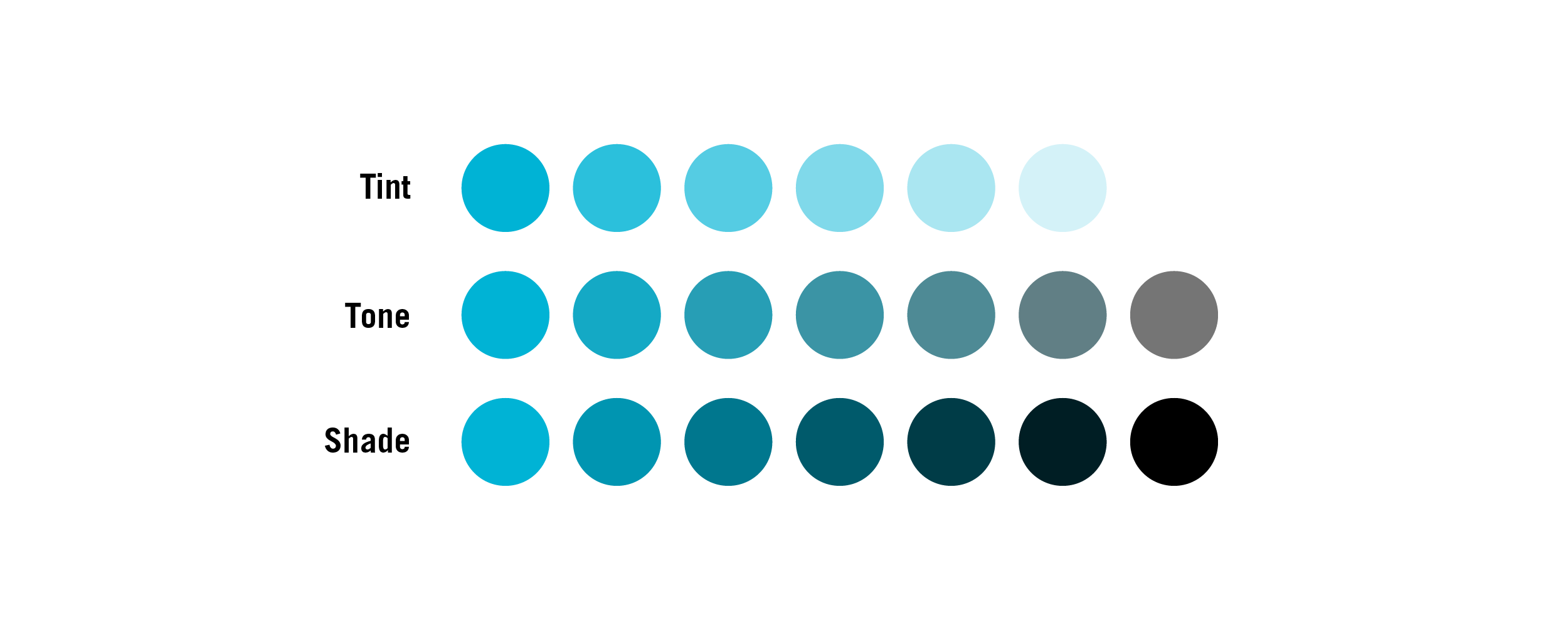
Colors aren’t usually as simple as “blue” or “green.” When describing colors, there are 3 terms that help describe how the color looks. “Tint” refers to white being added to a color, making it look more subtle. “Tone” refers to gray being added to a color, making it appear more dull. “Shade” refers to when black is added to a color, making it darker.

High Contrast vs. Low Contrast
Contrast refers to how noticeable a color difference is when placed together. For example, white and black have high contrast, while orange and pink have low contrast. Having good contrast is essential! Text and logos in particular need to have high contrast so they can be easily seen by a viewer, while decorative graphics like illustrations can have lower contrast.
Color will motivate your audience
At its core, color is very subjective. While it’s impossible to please everyone, it’s essential that brands use color in a strategic way to help reach their goals. Although the ways color can be used is truly limitless, here are three examples of how color can be used to reach your brand’s goals.
Consumer Decisions
 If a picture says 1000 words, then at least a few of those words are describing colors. Your product’s colors inform your audience’s perception of your brand. Bright and engaging colors are great when engaging children, while subtle and neutral colors will be more effective when establishing a luxury brand. It’s not uncommon for a market to be oversaturated (pun intended) with specific colors. For example, energy companies are often green and tech companies are often blue. While it’s important to stand out and be different, it’s also important for consumers to have an understood perception of your brand as soon as they see it or they may lose interest.
At ST8MNT we recently branded and designed packaging for Sweetens Cove, a Tennessee Whisky. The colors of this packaging are unique, but subtle. While it’s easy to recognize the packaging due to it’s unique color combination, the colors are used sparingly to elevate the brand and maintain a luxurious feel.
Hospitality Vibes
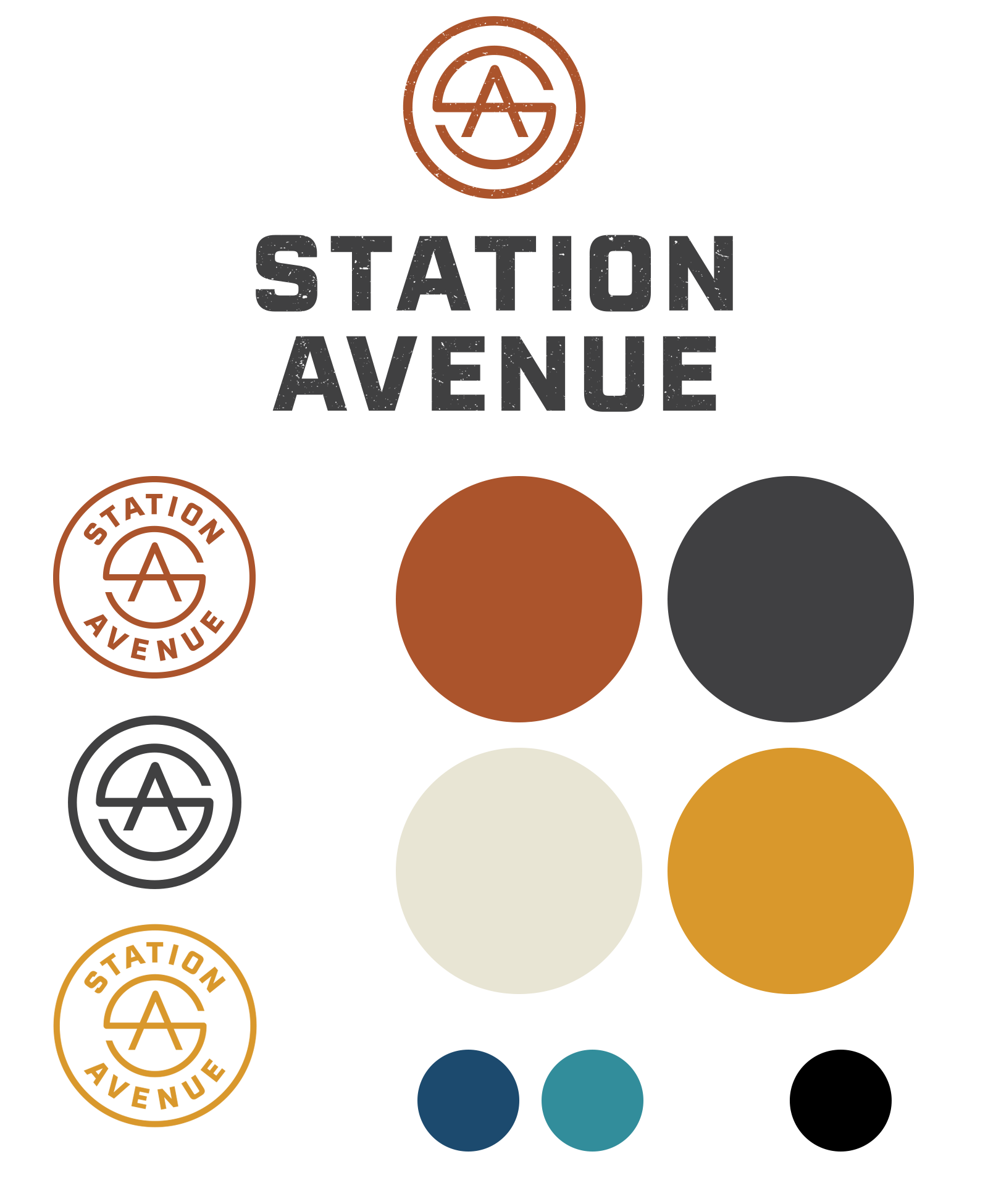 Hospitality brands often sell a feeling. This feeling needs to be representative of the brand’s experience, relating to the atmosphere and offerings that the brand provides. Hospitality brands often have a large color palette, giving the brand more color options for things like one-off campaigns or even sub-brands.
The color palette for Station Avenue, a development in California’s wine region, was inspired by the area’s modern architecture and native Californian landscaping. These colors create a laid-back, warm and inviting tone that accurately portrays the district. The warm, sunny colors are offset by cool colors to create a dynamic juxtaposition. The brand’s color system allows enough variety to be used for transportation wayfinding, area murals, signage and digital representation.
Intuitive UX
 Color gives users visual cues when using digital interfaces. Whether it’s on a website, an app on your phone or at the self checkout screen at your local grocery store, colors can be used intuitively to guide you through the process. Great user experience means users should be able to understand what to do without much explanation.
For example, this form on a Fleetcor fuel cards site uses color to guide you through the process. The blue-filled in fields allow the user to know what they’ve completed, while the light fields are obviously incomplete. The red button at the bottom offers high contrast and leads the user right to their end goal — submitting the form.
Picking colors with purpose
Colors aren’t arbitrary, they’re strategic brand assets. While color is only one way to connect with your audience, it’s something that’s instant and visceral. When used correctly, colors can give your audience context clues to better understand and reinforce your brand’s best qualities. Unless we’re talking periwinkle, color should never be taken lightly.

