Everyone loves pretty design. But who cares? We designers love nothing more than showcasing beautiful designs on our Instagram, Behance, Dribbble accounts or what-have-you. Beautiful work is essential for designers; it inspires us to come up with new ideas and push visuals and new ideas to the limit. However, if these visuals aren’t paired with a purpose — a solid strategy with clear rationale — then why bother? Good design solves problems.
Inspiration to the MAX
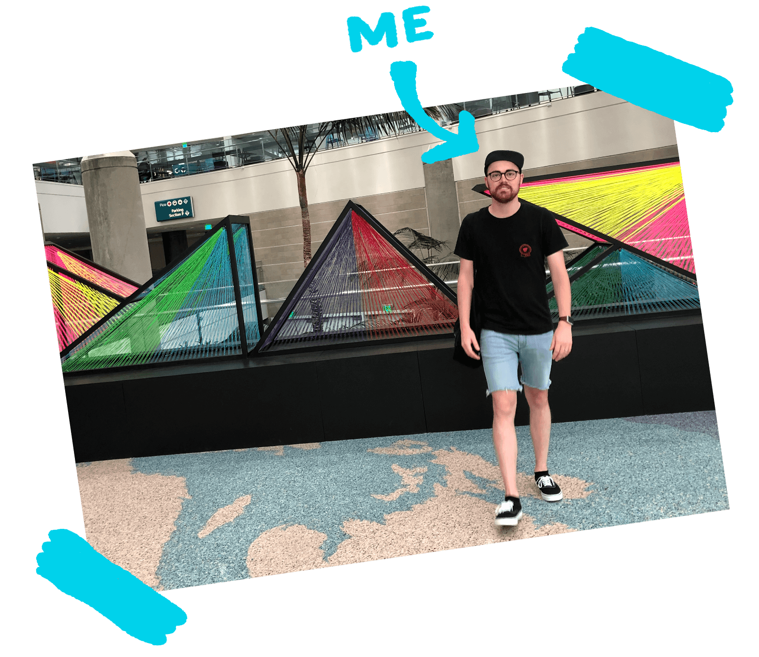
The idea that design solves problems has never been more apparent to me than when I was in attendance of this year’s Adobe MAX conference in Los Angeles. I was lucky enough to hear some really great designers speak about the projects that meant most to them. And guess what? The projects that conference speakers felt most proud of weren’t always the ones they found the most beautiful. These projects were always the most meaningful for the client and their audience.
Step Into The Audience’s Shoes
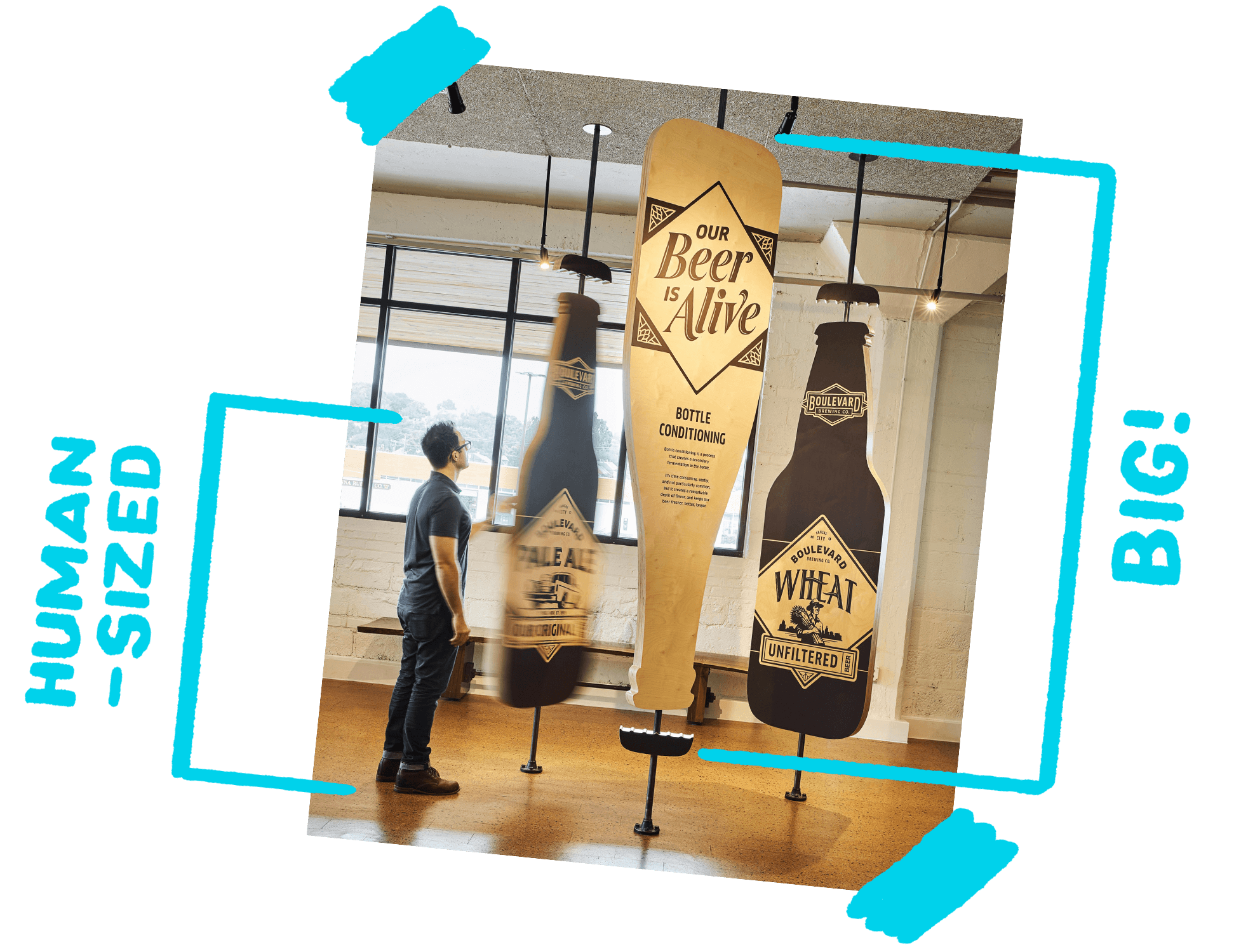
Tad Carpenter spoke at Adobe MAX 2018 about designing a museum experience all about beer for Boulevard Brewing Co. in Kansas City, Mo. The biggest successes in the project came as a result of “stepping into the shoes” of the museum’s future audience. Tad and his team did this by creating paper models with small figurines for a visual reference to scale and experience. Sometimes it takes more than a visual mockup to understand how graphics will be interacted with in a space. As designers, we need to do all we can to understand the atmosphere where our designs will live.
T is for TOYOTA
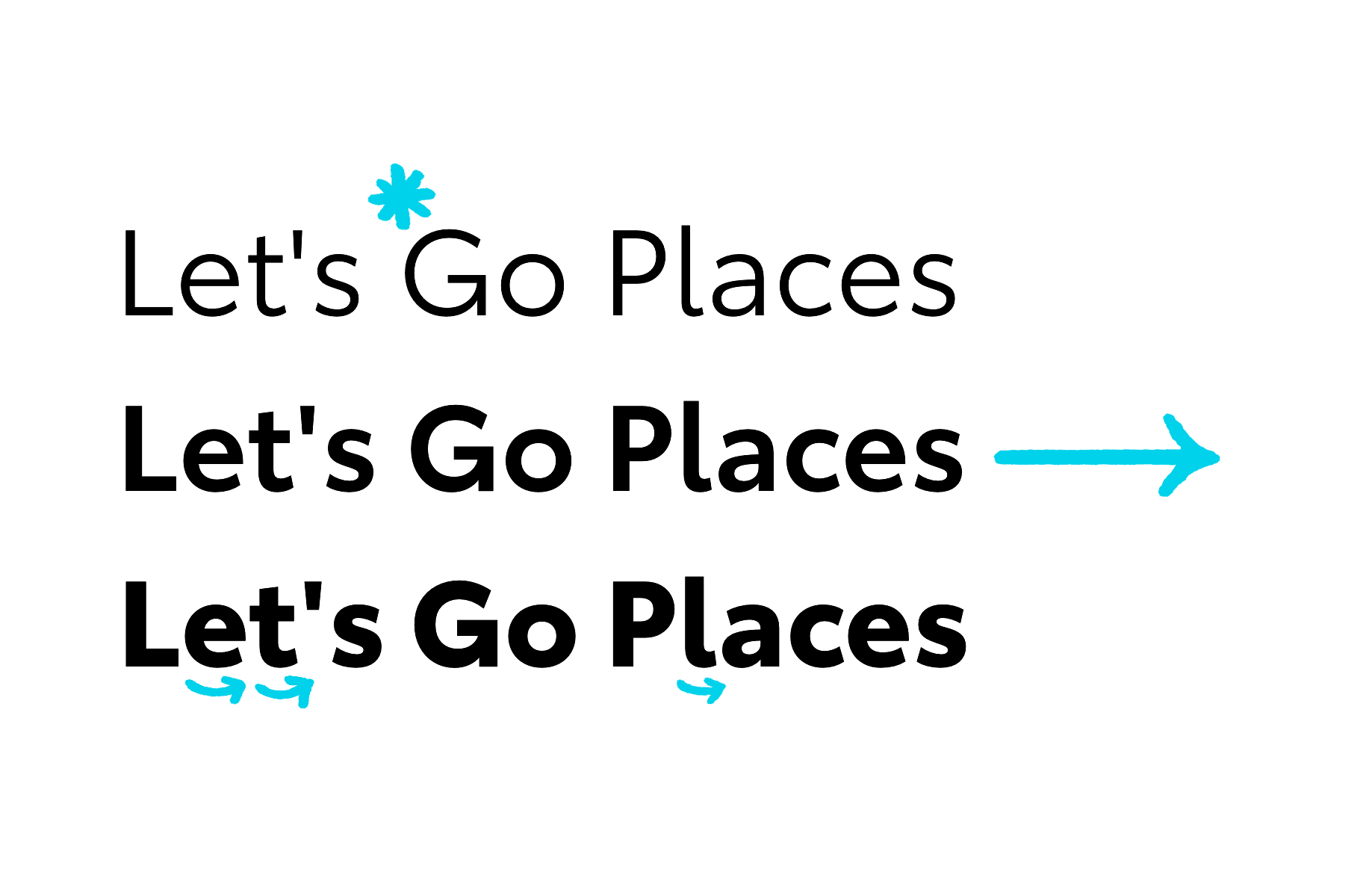
A great example of putting one’s ego aside and designing with the client in mind is the custom typeface designed for Toyota by Steve Matteson of Monotype. Matteson spoke on this project at Adobe MAX 2018, discussing how he had to put his personal distaste of geometric sans serif type aside to match the overall branding of Toyota. The typeface needed to have high legibility and illustrate a forward motion, to capture the brand’s main goal: moving people forward.
Work With What You Have
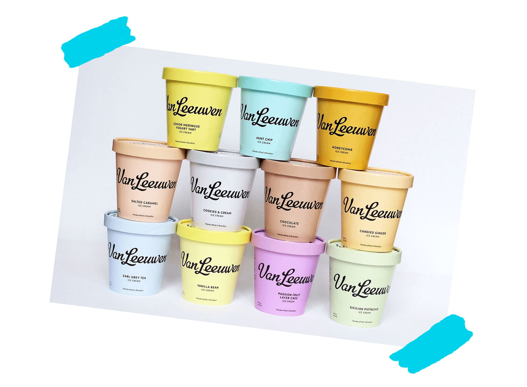
Not all projects are created equal. Natasha Jen from Pentagram spoke at Adobe MAX about her work for Van Leeuwen, an ice cream brand who’s popularity is growing fast. The company needed a brand refresh quickly to make sure their brand was represented consistently across packaging and storefronts. However, the client had limited resources. Because the brand already had some visual equity and a rather nice looking script logo, why reinvent the wheel? Jen and her team made the script logo the hero across all branding pieces and created a color system for packaging that pops off the shelf and is clear to distinguish.
Ditch the Ego
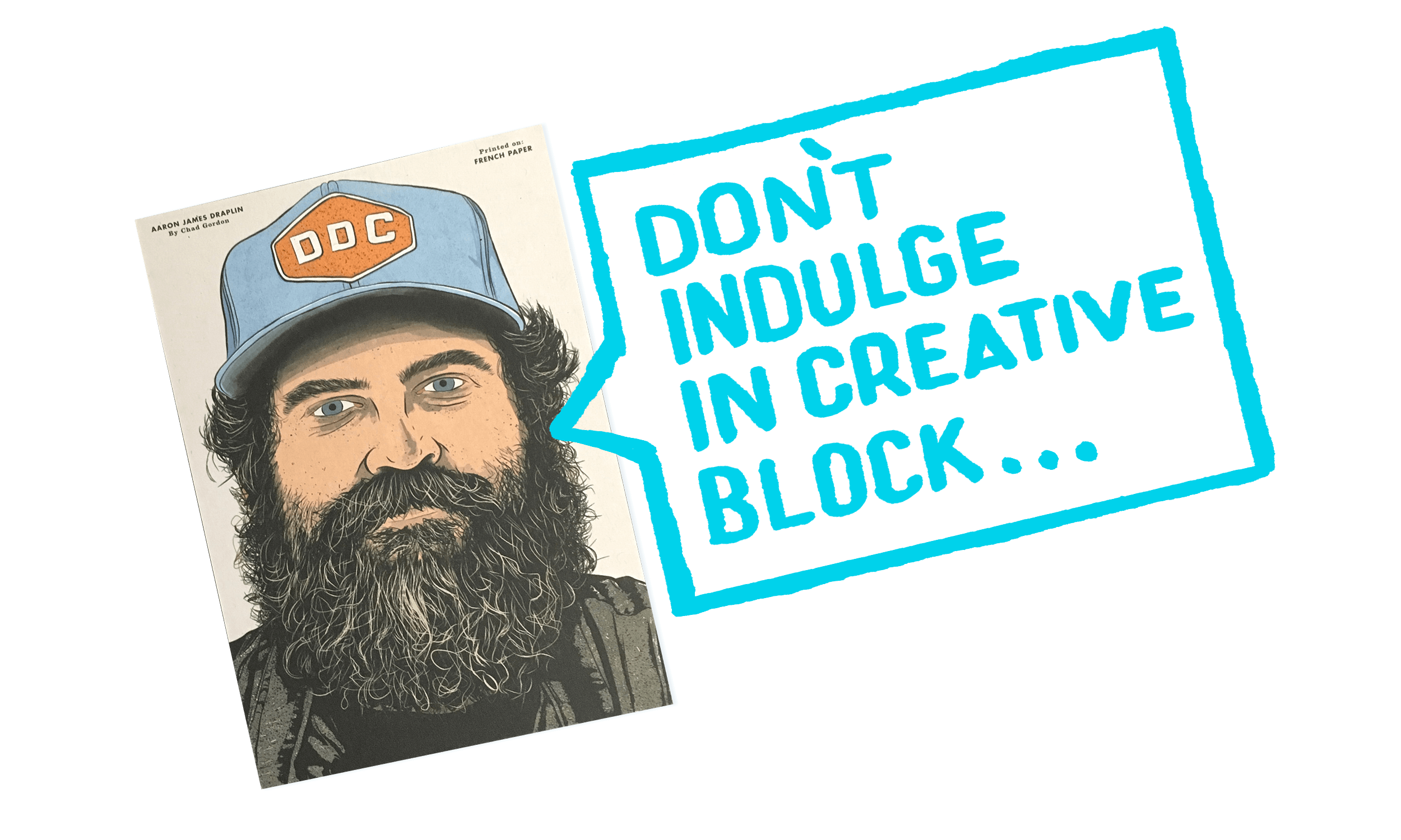
Throughout my time as a ST8MNT designer, I’ve discovered something really important that has changed the way I approach every single project. We have to design for the client, not for ourselves. My opinion isn’t going solve our client’s problems. What will is designing with a clear strategy and empathetic perspective. We have to put ourselves in the mindset of the audience.
At ST8MNT, we’re totally focused on the client and their needs. Every decision is made with strategy in mind. “How will this be received by the audience? How will this achieve the projects goal?”
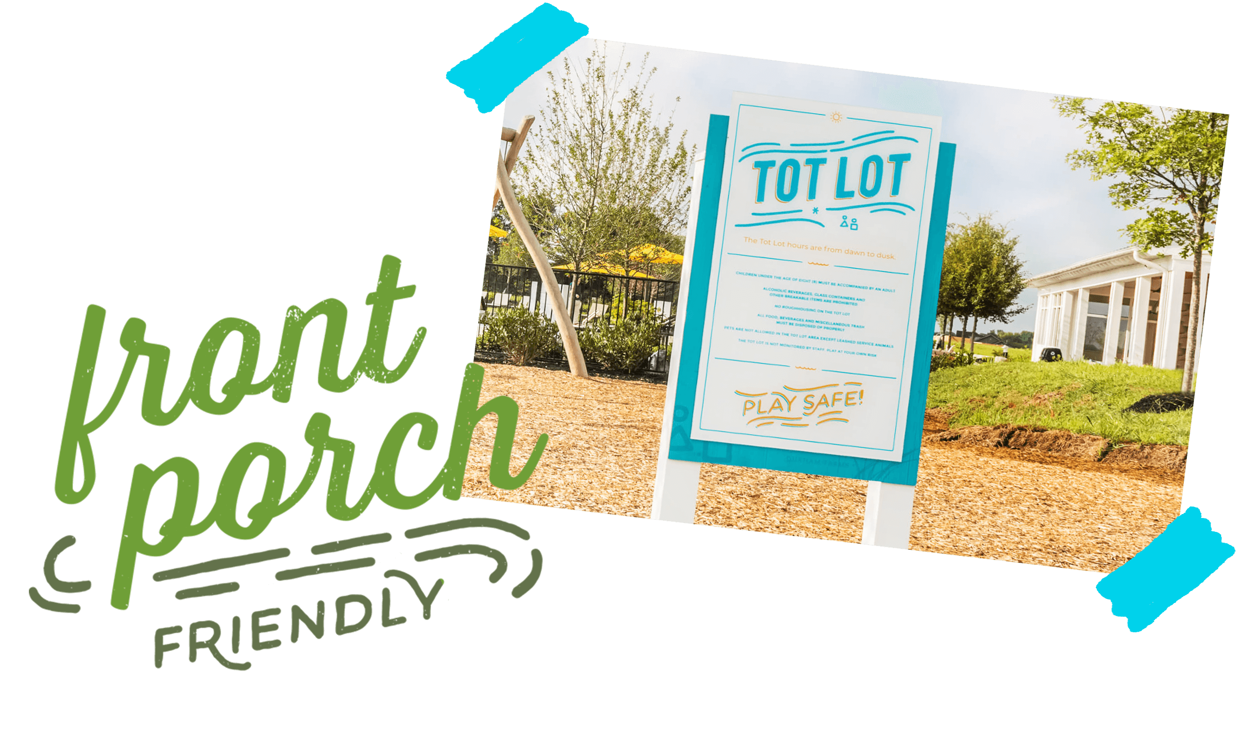
One example that demonstrates this mindset is the approach we took for the re-brand project for Durham Farms, a master planned community in the suburbs. When it came to visual directions, the one that was chosen was inspired by the DIY movement (think Etsy and Pinterest crafts) as this would relate to family decision makers (primarily Gen X women). Sometimes the best inspiration for a project is what inspires those of whom you’re communicating. The graphics are vibrant, and messaging aspirational. Countless scribbles later, this solution still stands as a strong representation of the Durham Farms community.
Nobody Cares!
At the start of this post, I posed a question: Everyone loves pretty design. But who cares? The answer: only your ego. Design is only as good as the message it communicates — the denotation and the connotation. That’s why graphic design is so powerful. If a picture tells a thousand words, a design tells a million. So, drop the fluff and create with meaning. Let’s make every design count.

