

As we look back on the past year, with one horrifying news story after another, it’s no surprise that the creative industry had a strong and drastic reaction to the events surrounding them. 2020 created a new world – a world dominated by Zoom, FaceTime, and other tech companies accelerating their presence in everyone’s lives. With the emphasis being drawn to tech and digital companies, many of the logo trends have shifted to serve that area. Design influenced by tech is known to be very stark, cold, and impersonal; however, given the emotional weight of last year, designers reacted by adding some human touches to make brands feel more personal.
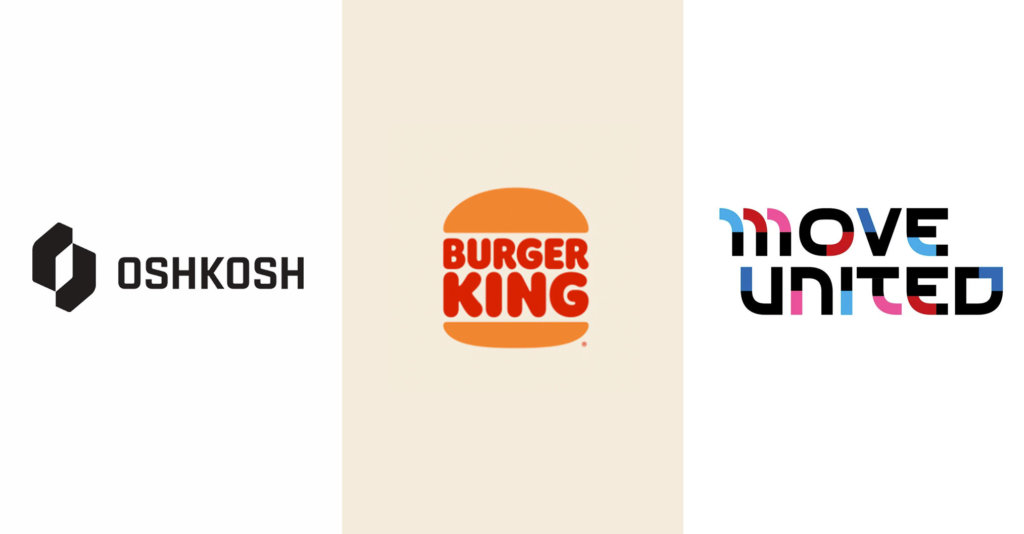
- Bold logomarks
- Bold logomarks has been on the rise since last year. This is attributed to the world being predominately in the digital space and simple, easily recognizable marks perform better on screen. These logomarks have thick lines and shapes and usually minimal in details and color to create high contrast and work really well as being ADA compliant.
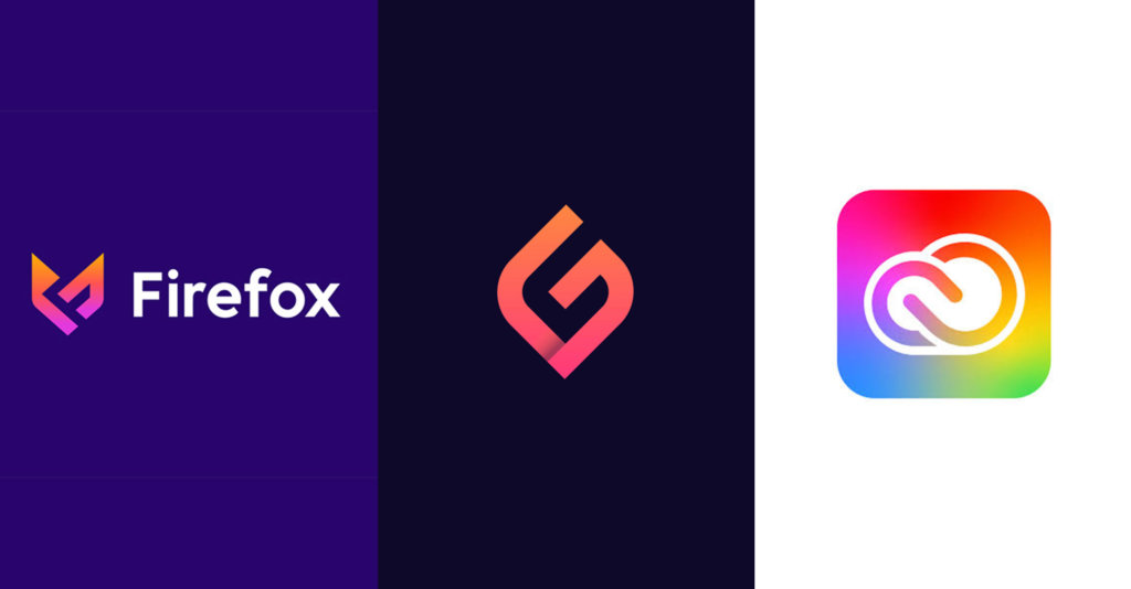
- Balanced marks
- Another logo trend of last year, and a classic, are marks that have symmetry and roundedness to them. Beveled edges give a softness to logos that contrasts with a hard straight edge. A mirror of a mark to create a symmetrical logo was also a trend last year. The balance of the final mark gives off a sense of assurance and peace. It also exhibits having a sort of partnership that is showing the two parts working together in harmony.
- Another logo trend of last year, and a classic, are marks that have symmetry and roundedness to them. Beveled edges give a softness to logos that contrasts with a hard straight edge. A mirror of a mark to create a symmetrical logo was also a trend last year. The balance of the final mark gives off a sense of assurance and peace. It also exhibits having a sort of partnership that is showing the two parts working together in harmony.
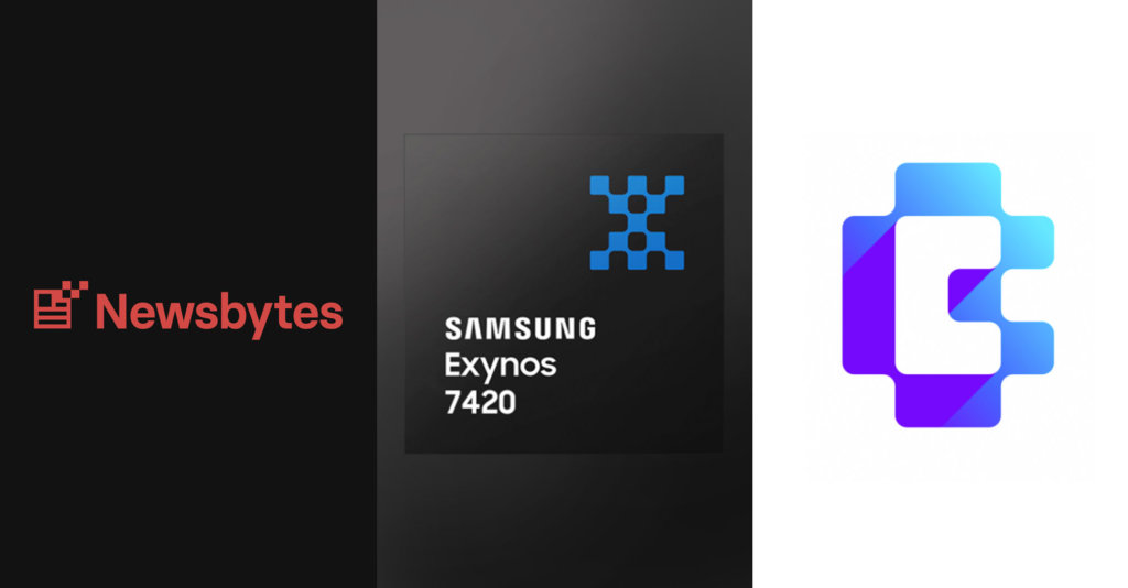
- Pixel/digital / Variable Type
- This trend is a direct reflection of the economy and how tech companies are domineering the markets. Pixel graphics and variable type are specific instances where the design world meets tech and the rise of these treatments were bound to happen.
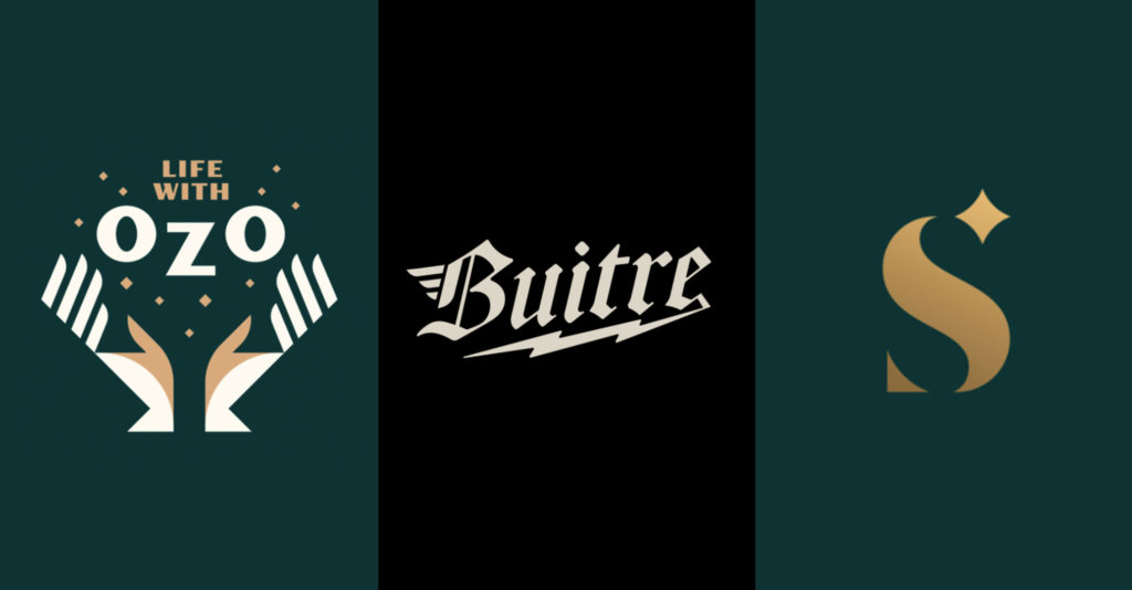
- Hands / Bolts / Twinkle – Human, techy/energy/”magic” or charm
- Some imagery that have been trending in logos are the inclusion of hands, bolts, and “twinkling” stars. The hands are a literal approach to add in a “human touch” to the designs to feel more sensitive to its audience. Thunder bolts or electric bolts bring a high energy feel that seems to be generated from the boom of the tech industry. The twinkle is a decorative element that gives a logo a bit of charm or magic to it. This creates a brand that feels romantic or fantastic, which is a nice escape from reality.
These trends are not to be used as a guidelines on how you should develop your brand, but merely as an examination of how the design industry reacted to one of the most significant year of the world’s history. All trends come and go, and it’s interesting and revealing to point out what they are and how they influence the world around them. Designers can’t help but create in reaction to the times and these are definitely trying times. However, as chaotic and literal these trends reveal, they show that the world will continue, and we will come out of this with a new resilience.