

After my initial 3 months at ST8MNT it is safe to say that I love my job…how often do you hear that?! I have wanted to work at ST8MNT for about 2 years now; my initial reason for wanting to work here was as a result of my love for their flawless creativity. Don’t get me wrong, there are a lot of places in Nashville and beyond that I would die to work for, but I’ve always felt a type of affinity for ST8MNT’S work…which really set a fire in me to get my foot in the door.
I was a bit nervous once I got hired…like a kid starting school after a summer hiatus. I knew I would learn a ton, and that design-wise this was where I needed to be. But, you know, the thoughts like, “I wonder if they will like me” drifted through my mind as I was counting sheep the night before my first day on the job. Little did I know, I got more than I ever bargained for on the coworker front! I shared the following enlightened thoughts with a close friend just a week after starting my job: “I never knew how weird I was until I realized how weird everyone at ST8MNT is, and that I fit right in. (see below)” Not only have my design skills grown exponentially in the last three months, but I’ve also been on this Oprah-Winfrey-ish path of self realization….Killer combo!
Anyways, back to the meat and potatoes. These are the top 8 pieces that made me fall head over heals for this place:
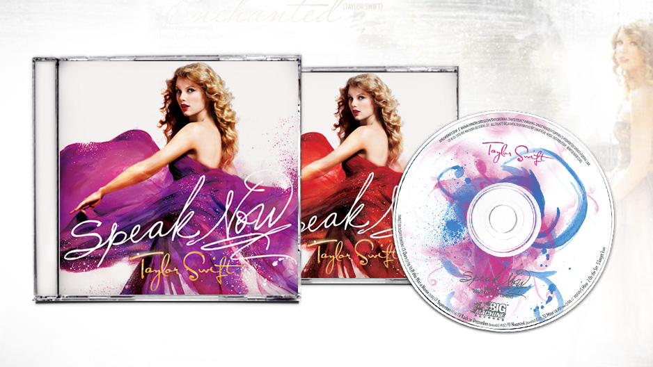
1 | Taylor Swift, Speak Now Album Design: This was the piece in which I first discovered ST8MNT. I loved this piece, because of how the graphics and text seamlessly flow together. I used to work for Taylor Swift’s record label (during her “Red” era) and after flipping through this piece, I walked straight into the creative director’s office to discover the creative genius behind it. That is when he told me about ST8MNT, and I immediately spent hours gawking at the website. I immediately felt enlightened, that this was the place I would work someday.
2 | ST8MNT, Demo Reel: There’s a warning sign on the website with this one. “may cause spontaneous dancing”. Affirmative. This piece makes your eyes pop out of your head like a good ole’ looney tunes cartoon character. A flawless highlight reel, that keeps your attention from the first second.
3 | Fellowship Bible Church, Imagine: I love everything about this piece. Subtle textures and strong geometrical shapes with a classic typeface. It is refined and eye catching. I just LOVE it!!
.
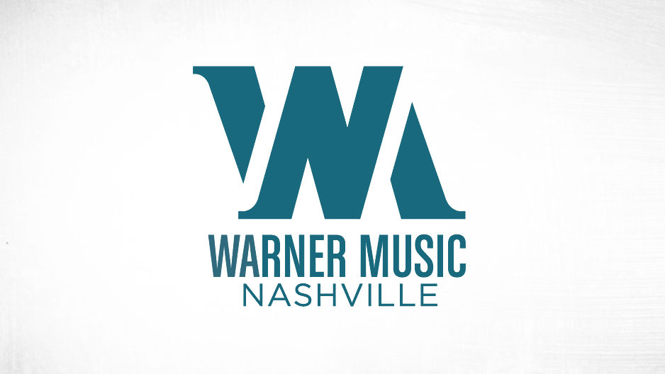
4 | Warner Music Nashville, Logo Design: I didn’t even realize that ST8MNT created one of my favorite logos until I saw it on their site. It is simple & clever. An ingenious way to use 3 letters that are similar in form, in a way where they are all still subtly visible on their own.
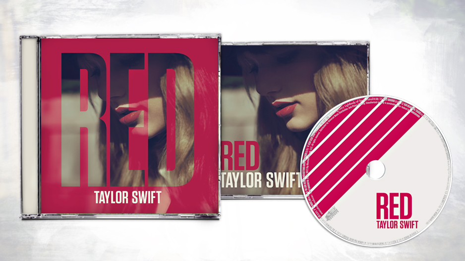
5 | Taylor Swift, Red Album Desgin: I’d say this was a HUGE success on making a color, an artist, and a three letter word incredibly iconic. Flawless branding carried throughout all of her collateral, without being redundant or boring.
6 | ST8MNT, Logo Design: My new badge of honor. 8 is an interesting shape compositionally speaking, and the use of negative space in this logo is kind of genius (don’t tell Josh I said so…we don’t need any big heads around here!).
![]()
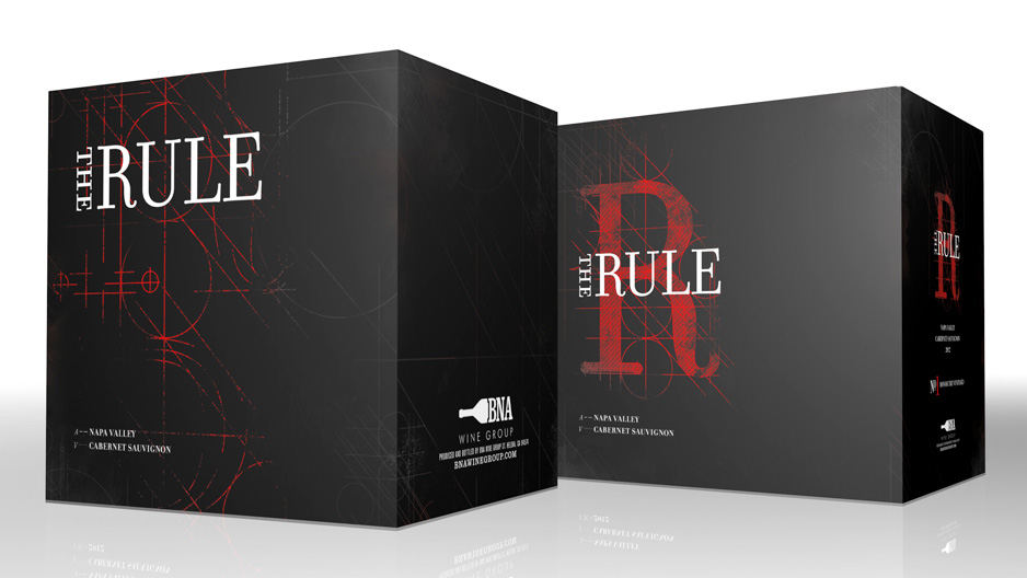
7 | BNA Wine Group, The Rule Cabernet Packaging: Who doesn’t love black white and red? I know I do! But I also love this piece because it is sexy. I’ve learned more about this wine since initially falling in love with the aesthetics, and learning about the communication factor behind the name really threw me over the edge. The price on this Cabernet breaks the traditional “rules” of wine making (ie. it follows the traditional methods of how Cabernets are made, but it is priced much lower.)…which is communicated visually throughout the wine’s packaging in that it breaks traditional design rules.
8 | PM, Branding & Menu Design: As a Belmont alum, I have long been a fan of the neighborhood sushi joint–PM– but again was unaware that ST8MNT was behind the delectable branding! When I go out to eat, I habitually critique menus before I can even think about what to order, and I was delighted to see such a well thought out design at PM…it really makes or breaks the whole dining experience for us designers!

So there you have it–A real-life love story! I think ST8MNT and I are a match made in creative heaven.