Anarchy right? The system is a construct. Why are there rules to begin with? Well if there weren’t, everyone would be a designer. A lot of time that’s already the case but that’s an entirely other blog post. Design has its rules and most if not all of them will help the design process and the end creation. I have no intention of bashing or saying that rules of design aren’t worth paying attention to; of course they are, but if you don’t know the rules how can you break them?
Communication
Ultimately communication is one rule that shouldn’t be broken. In a way, it’s a guideline of where the line is you should not cross. If your message gets lost in your design then it ceases to function. Whether the communication is verbal or visual there’s no need to experiment breaking communication. Starting off this blog about breaking the rules by explaining what rules shouldn’t be broken, which is pretty much breaking a rule. Still on track…
Form vs. Function
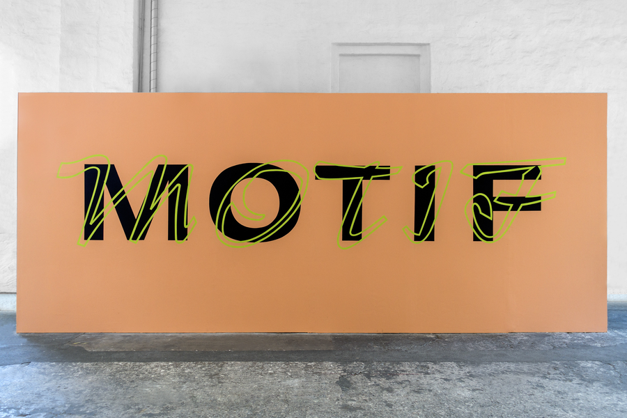
I’m a pretty big believer in “form follows function.” However, I think there is plenty of great design where form has given way to function. Such as MOTIF where the form has taken control over function. The layering of colors, form and type ultimately make this a tougher read initially but in doing so, creates a very functional piece. Breaking the rules for typography and color have given this a certain attitude and brought an exciting element to the design.
Like most things having a healthy balance is usually beneficial, but again, I think if you can keep the message it’s okay to get weird with the balance of form and function. Hort always does an amazing job at messing with this sort of thing. Their work with Nike and Kyrie Irving, in particular, expresses the beautiful way form can give way to function with the piece below. The word “CUT” is obstructed and slanted in a way that typically isn’t in the typography “rulebook”. They’ve allowed the form of Kyrie and the word to give way to the function and in doing so enhances the communication of their message.

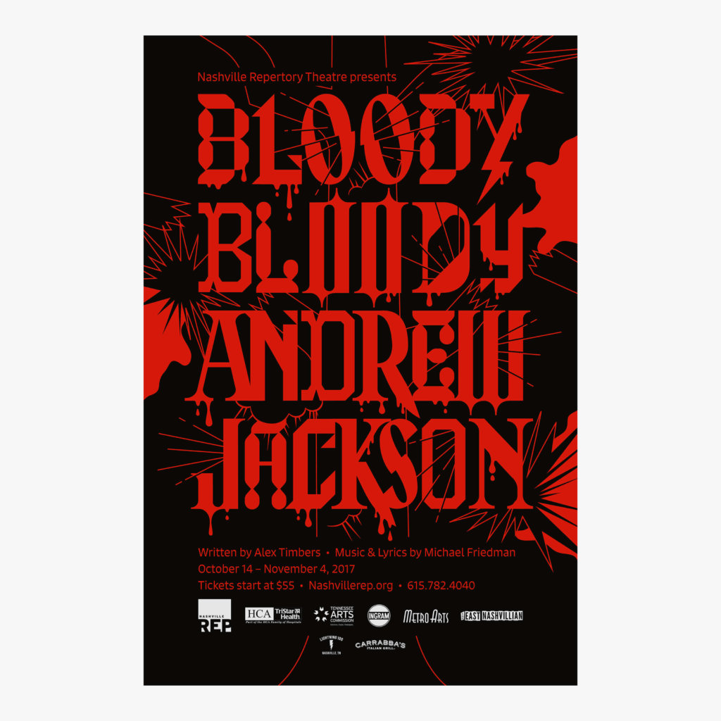
A healthy balance of form and function come together here to create a really striking poster for a play. Plenty of other rules get broken here but the form and function balance keep it together nicely. Most of the time you aren’t going to want to combine 10+ typefaces to get your message across. However, when you take into consideration the form and function of what the design needs to accomplish it allows you to break these rules. A complete lack of white space, letters ripped, torn, tree-ted to death combined with plenty of chaos create a very striking visual and somehow very direct and easily read message.
Hierarchy
Hierarchy is one of the most useful rules to help guide someone thru a design. You have control of how the viewer’s eyes move through your design. It’s honestly a pretty amazing concept. Sticking with the idea of breaking the rules, hierarchy lands in an interesting spot. You can break the rules of hierarchy to create interesting designs or use the rules of hierarchy to break other rules of design and still maintain good communication in your design.
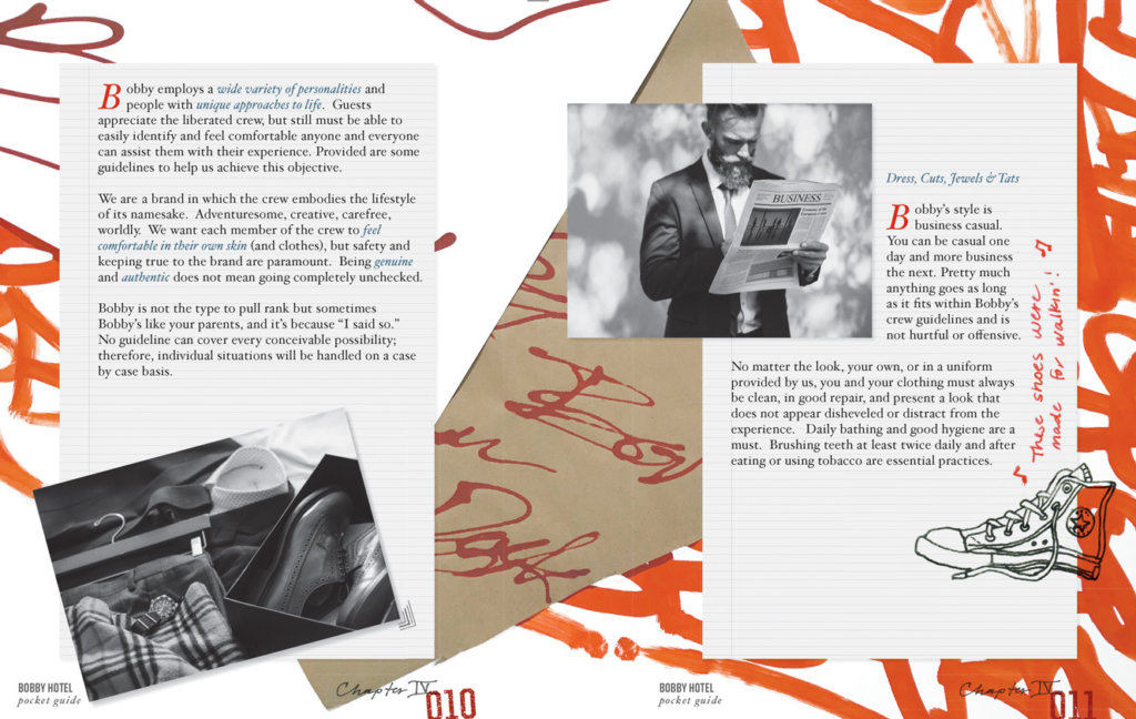
We’ve broken the rules of hierarchy here to create interesting visuals. It doesn’t have the typical flow of something following the rules of hierarchy and allows your eyes to bounce around to discover the little elements in the design that make it so fun. The communication is still intact and in a way, even though the basic rules of hierarchy have been broken, there is still enough of an element intact just to draw your eyes into the design.
This new Thelonious Monk live album cover is a simple example of using hierarchy to allow other rules to be broken. There aren’t a lot of times where it’s going to be a good idea to set type like this, but in this case they’ve broken the rules to create something that communicates so much more than if they hadn’t. They use the letters to guide your eyes through the image. You can still clearly read the word and it brings about the emotions, sound and general nature of Jazz music by breaking the rules of typography. Really great example of using a rule to break another rule to enhance the message of the subject matter. Have a listen and dive a little deeper.
Tip: Start this album then go back to the top of this blog and read thru it again while it plays.
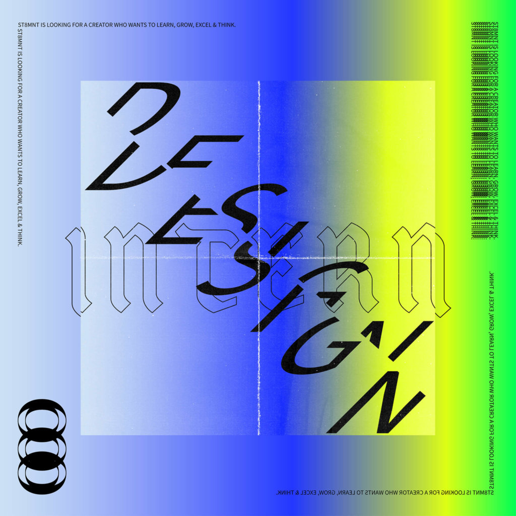
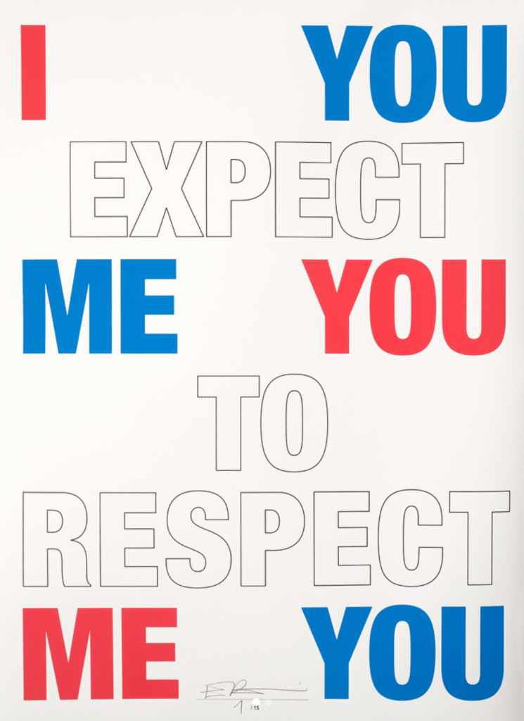
Just going to throw this Eike König example out as another way in which the rules of heiarchy are broke in half then put back together to create a message that requires effort from the view to understand. Using color, line-weight, white space, repetition and strong contrast it’s a killer example of creation from breaking rules.
Break the rules. Bend the rules. Stick to the rules. Whatever works for the design but always know the rules. It allows a designer to push boundaries, and create truly meaningful work that always gets the message across.

