

Branding is a practice that is never two-dimensional. It’s no secret that all brands go beyond visuals to take on the perceived meanings understood by those who interact with a brand. The retail company Target, for example, is much more than a red dot inside a larger red circle—it’s a place where customers walk through and search for products they want to buy (a sacred practice known by most Americans as ‘shopping’).
“Wayfinding refers to informational systems that guide people through a physical environment and enhance their understanding and experience of the space.”
—Society for Experiential Graphic Design
There are many types of branded physical environments. These include retail stores, entertainment venues, events, transportation hubs, restaurants and even workspaces, just to name a few. CMA Music Fest is an example of an event that takes place here in Nashville that utilizes environmental branding to create an impactful and practical environment for country music fans to enjoy. Some of the environment branding done for the festival includes the branding of stages, maps, music lineup times, signage and more. Not only do these branded pieces add to the overall environment, but they contribute to the festival’s wayfinding system, which gives fest-goers the information they need to navigate the venue.

“For CMA Fest we focused on branding different areas to be easily identifiable and somewhat unique to their own with specific colors and visual elements, but that also worked as part of a larger visual language for the overall Fest. These functioned to guide visitors around the Fest and on the map, and they were also crafted in a such a way to delight visitors and make them feel like they are a part of a collective experience.”
—Austin Hale, ST8MNT Art Director
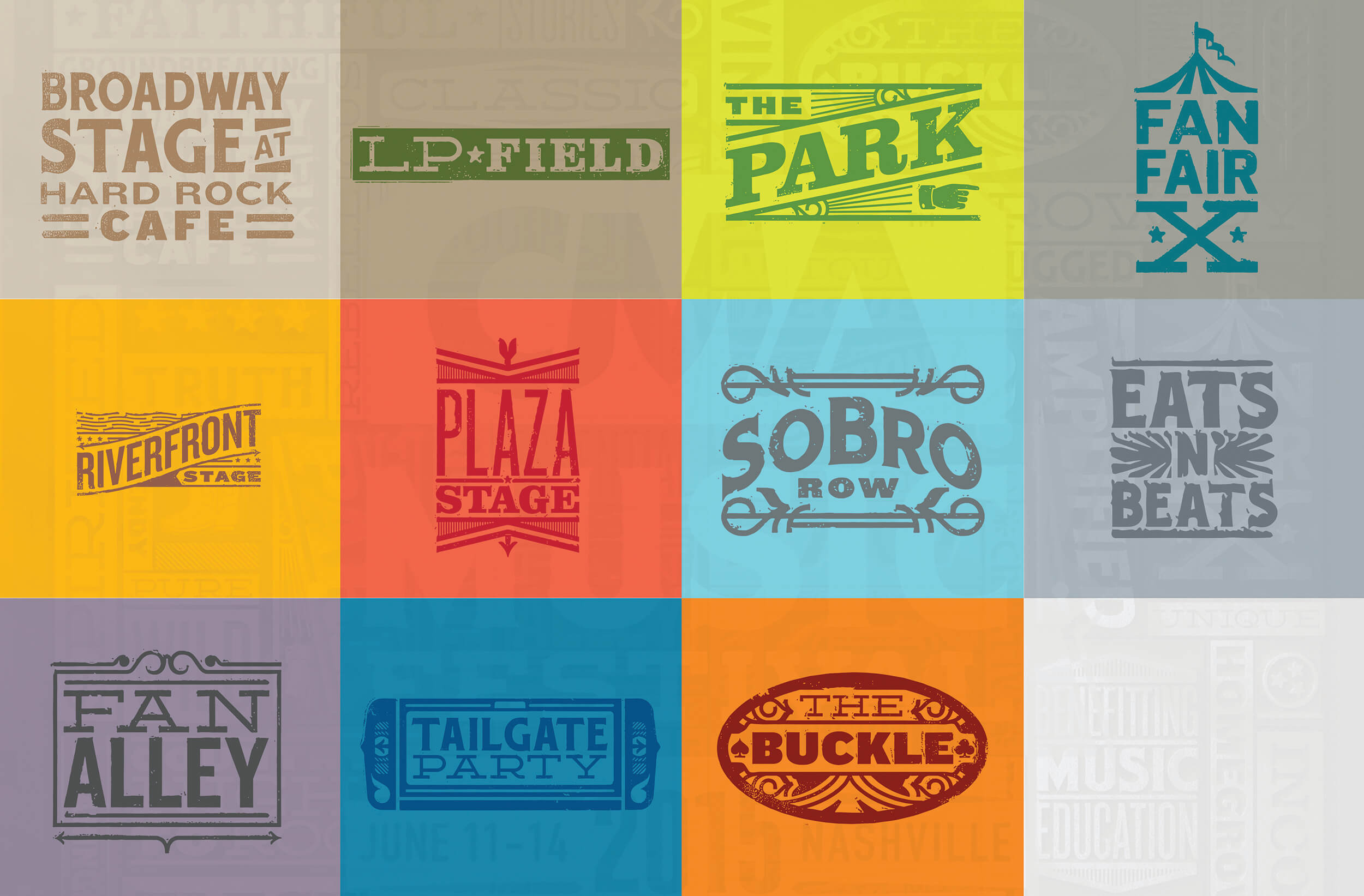
CMA Music Festival’s branding includes 11 stages/areas that are branded by logo and color which are unique to the area they represent. The logos are inspired by the letterpress type that was used on many country music gig posters (these posters are part of Nashville’s design history—check out Hatch Show Print if you haven’t!). These areas contribute to the overall visual language of the festival, but differentiate each area enough to allow Fest-goers to easily identify where they are, and which stage or area is the one they’re trying to find next. The brand assets for these environments are seen throughout the Festival on signage, stage graphics, banners and other printed materials.

A map is one of the most commonly used wayfinding tools. The Festival’s map was printed large scale and as a foldable pocket-sized map. The map features the logos of the various areas to identify where they are, as well as Nashville’s most notable landmarks such as The Ryman, the Cumberland River and the Country Music Hall of Fame. These visuals add context to the map, making it a practical tool for country music fans to use to get around the Festival, drink beer and see their favorite country acts—isn’t that what it’s all about?! Yee-haw (Too far? I couldn’t help myself…)!
Click here to see more of the branding work ST8MNT has done for CMA Music Fest, and don’t forget to check out the 2016 CMA Music Festival that starts June 9th!