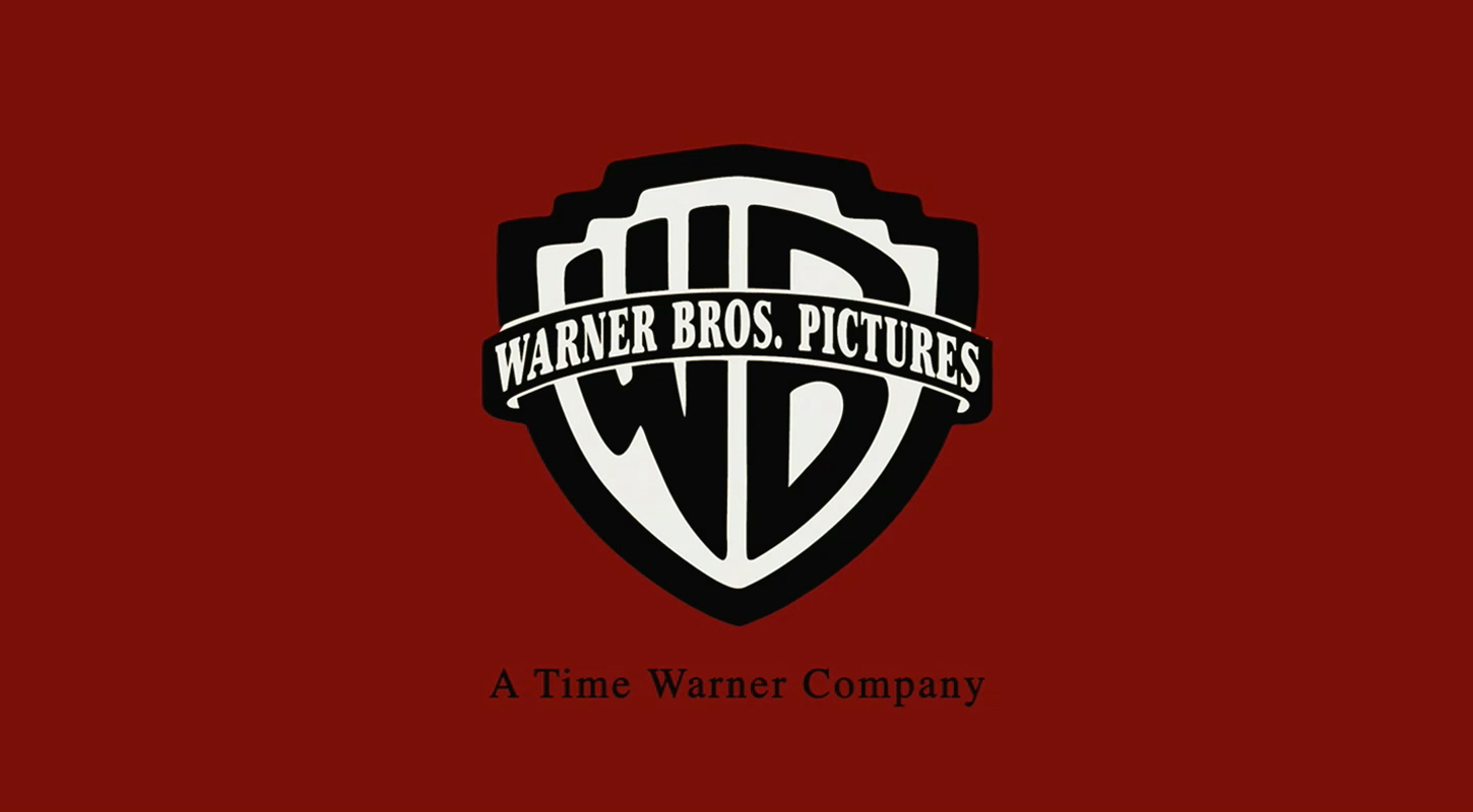
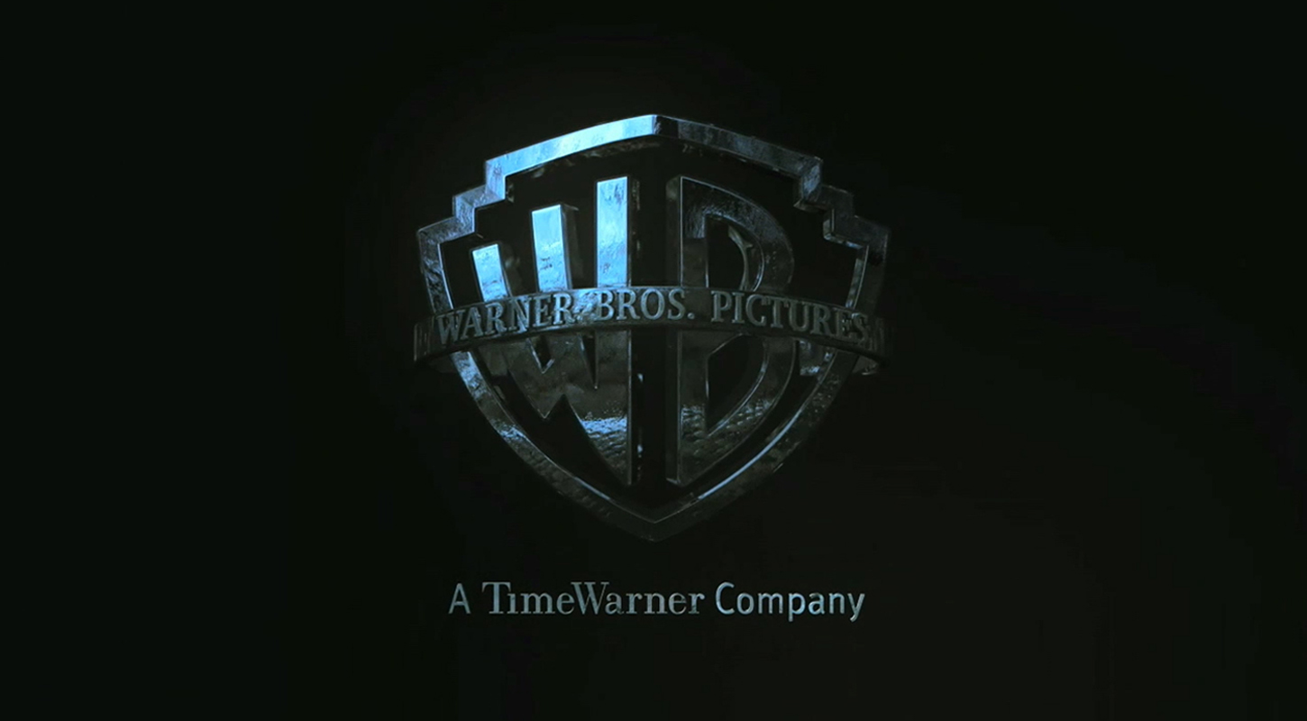
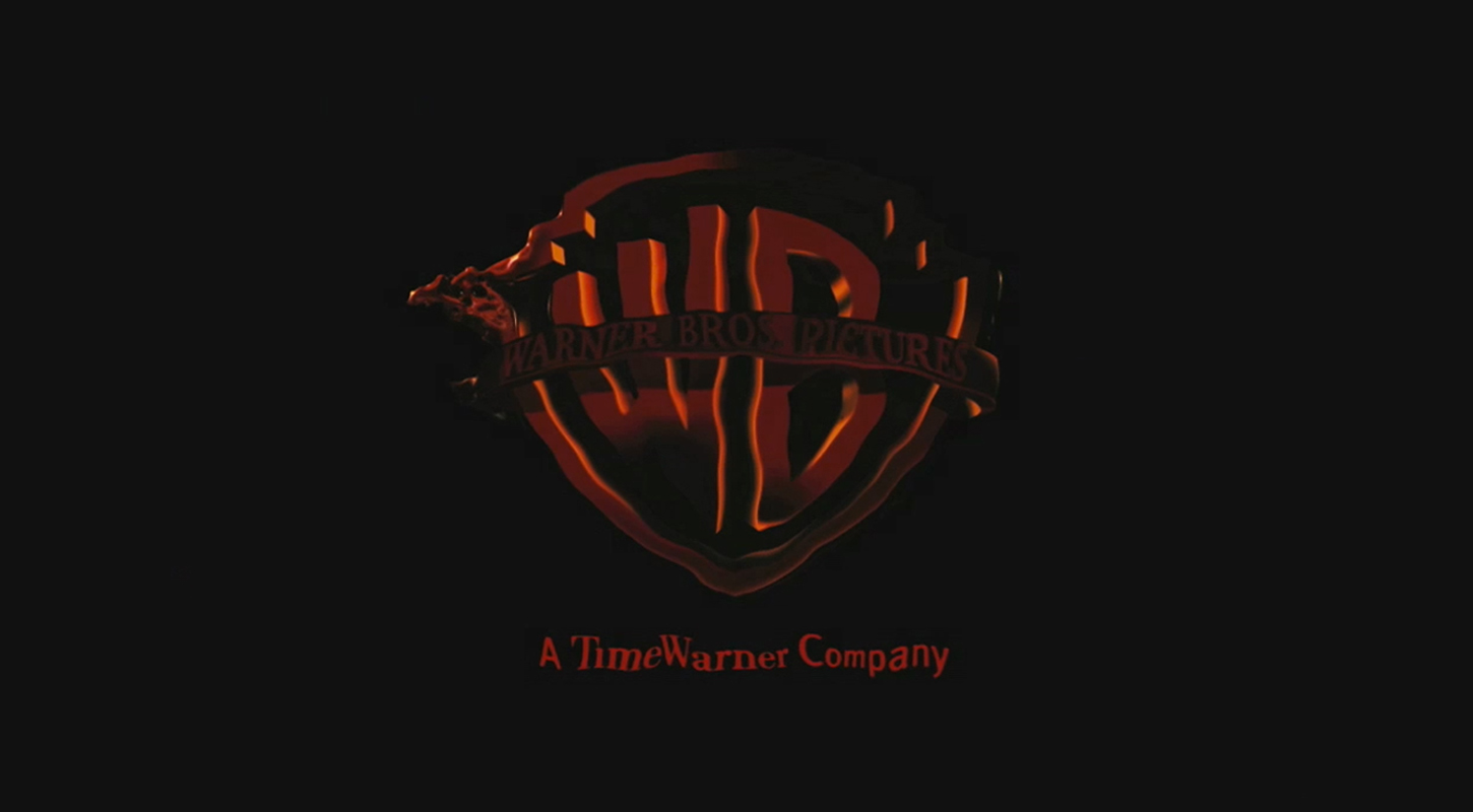
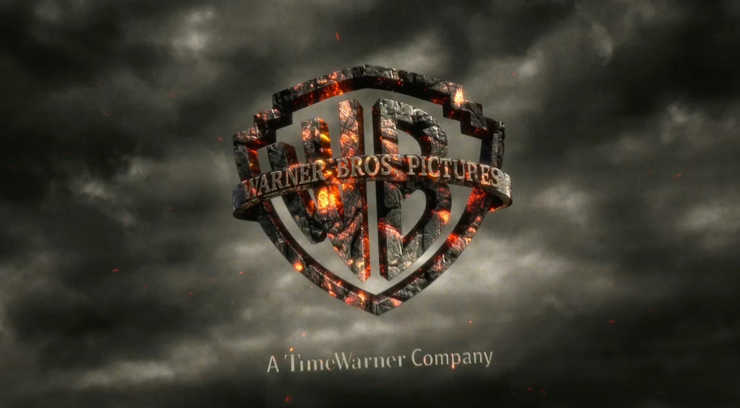
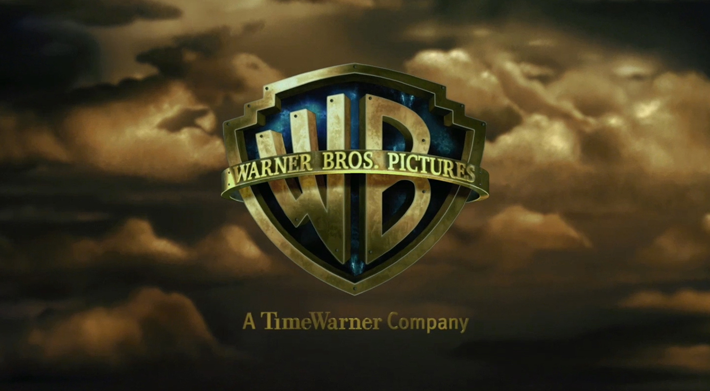
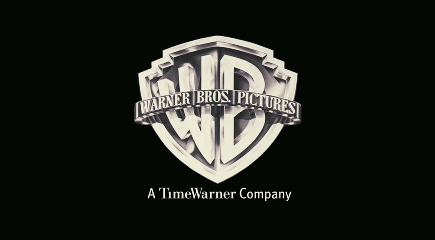
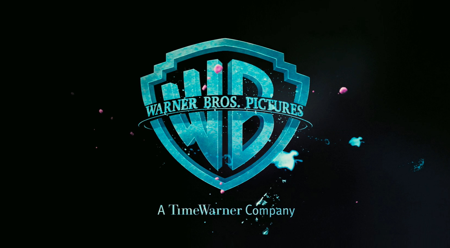
One of the best things about looking at movies and their trailers is how they stylize the studio logos. Whoever started the trend needs to speak up and take all of the credit. Of today’s twenty or so majors, Warner Brothers seems to be the most lenient in allowing motion designers to accentuate the WB mark according to the pace and style of the film.
We’ve been catching up on the latest trailers and thought you might benefit from our study. Here’s a 2 minute parade of some of WB’s best, chronologically:
Some other studios of note:
20th Century Fox doesn’t have near as much texturing, but the camera rotation and stop motion is uniquely varied.
Marvel‘s flipping comic book logo is flat-out tight and it was designed by the legendary Kyle Cooper.
Paramount is similar to 20th Century Fox, in that they generally keep the look rather consistent, but the camera rotation and swooping speed has liberty.
Pixar usually has awesome intros – always intertwining the famous 1986 lamp with the theme of the film.
Scott Free is simply a motion nerd favorite and was frame painted in 1996 by Gianluigi Toccafondo, who you also saw balling on this.
Check out a couple of our favs.
Harry Potter and the Goblet of Fire
The Reaping
Wrath of The Titans
Journey 2: The Mysterious Island
J. Edgar
Orphan
Ocean’s 13