

In the new year, it’s fitting for our team of brand-building experts to weigh in on their favorite rebrands of 2022.
Personally, my favorite rebrand of the year was that of DAVID agency, which was executed completely in-house.
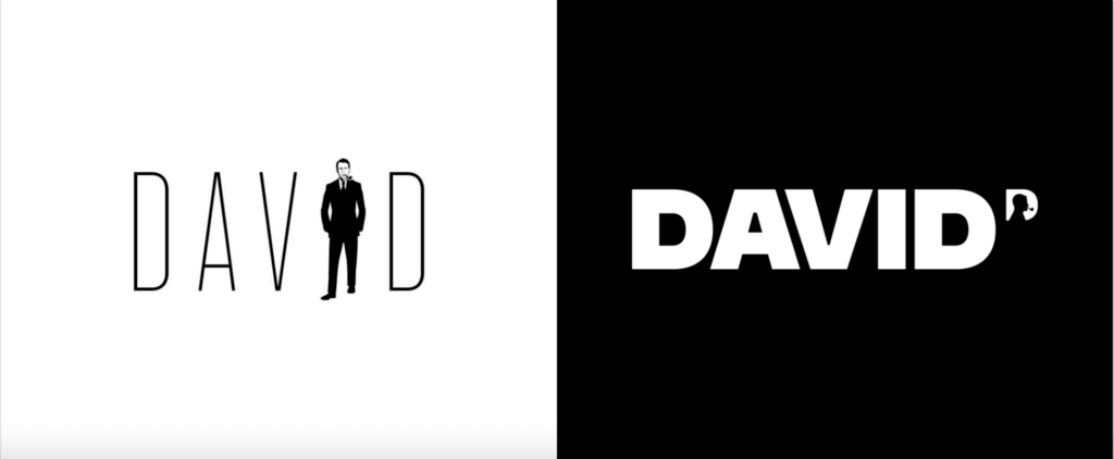
As an advertising nerd, I follow agencies closely and always find it interesting when they take the opportunity to rebrand themselves. I love how David Ogilvy is still the centerpiece of the new logo, but the mark includes the flexibility to be customized for each team member. This piece cultivates community, making every employee feel like an essential piece by living out David Ogilvy’s legacy in their everyday work.

Hermitage Hotel by Mucca
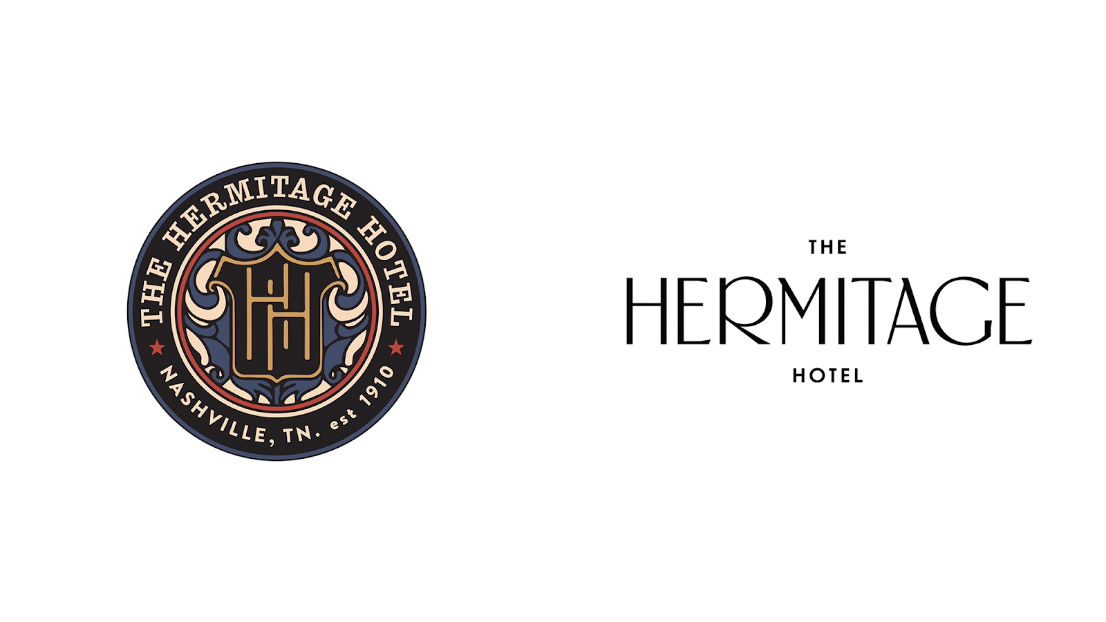
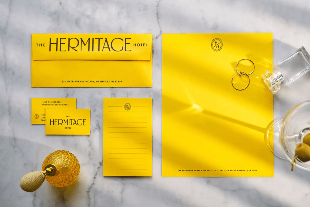
As Nashville’s original million-dollar hotel, The Hermitage Hotel is a timeless icon representative of Nashville’s evolution since its opening in 1910. In 1920, Tennessee was the last remaining state with the power to ratify, or nullify, the 19th Amendment, which would grant women the right to vote. The Hermitage subsequently became the headquarters for women’s Pro- and Anti-Suffrage groups. As a nod to The Hermitage’s integral role in the fight for women’s suffrage, a custom typeface named “Suffragette” became the foundation for this refresh. To match the yellow-rose-wearing Pro-Suffrage campaigners, yellow became the new cornerstone color.
Why we love it “My favorite thing about this rebrand is how every aspect is deeply connected to their history; they found a great way to honor, but still revitalize, their past.” – Elle, Designer
Instacart by Wolff Olins
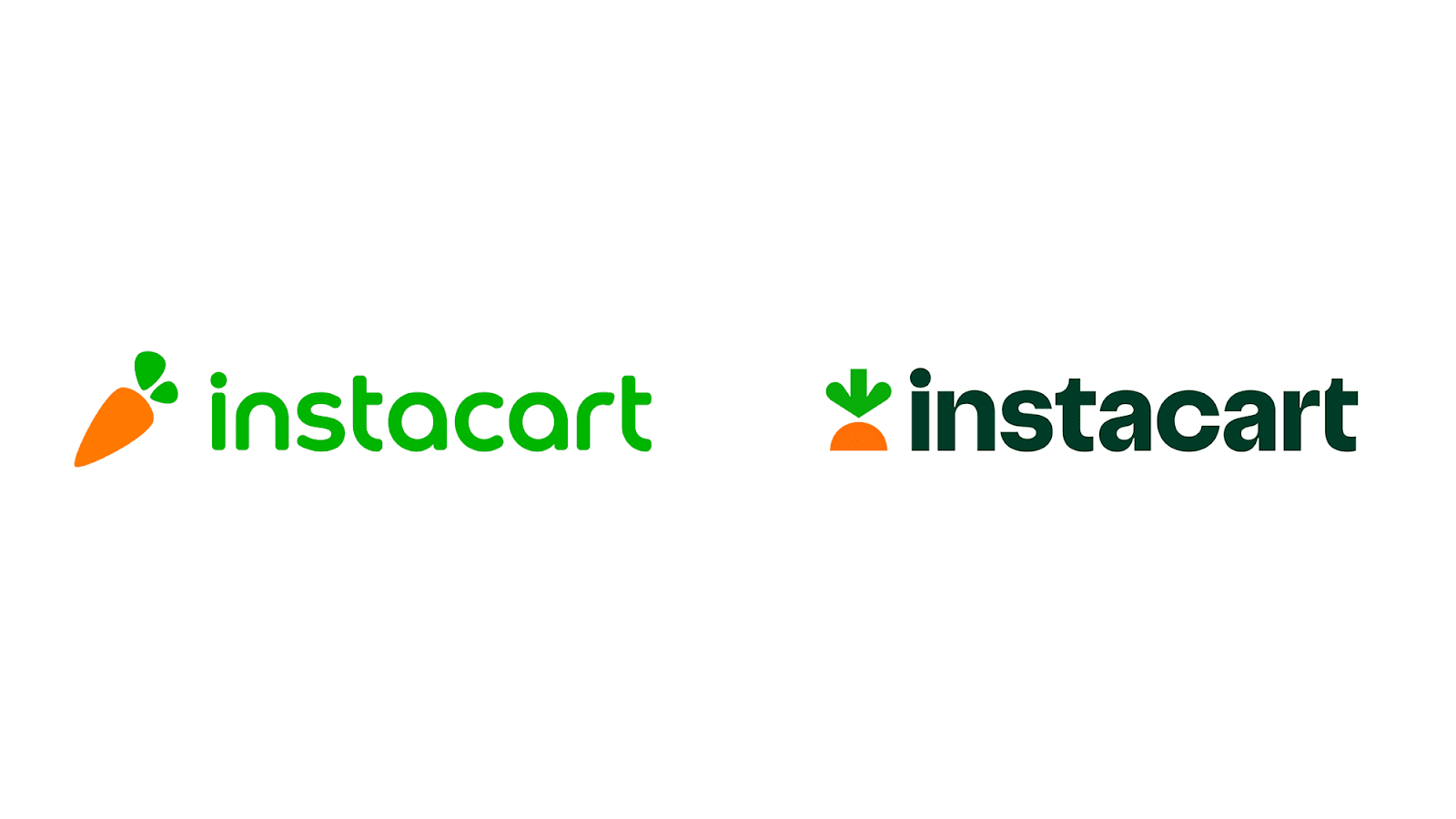
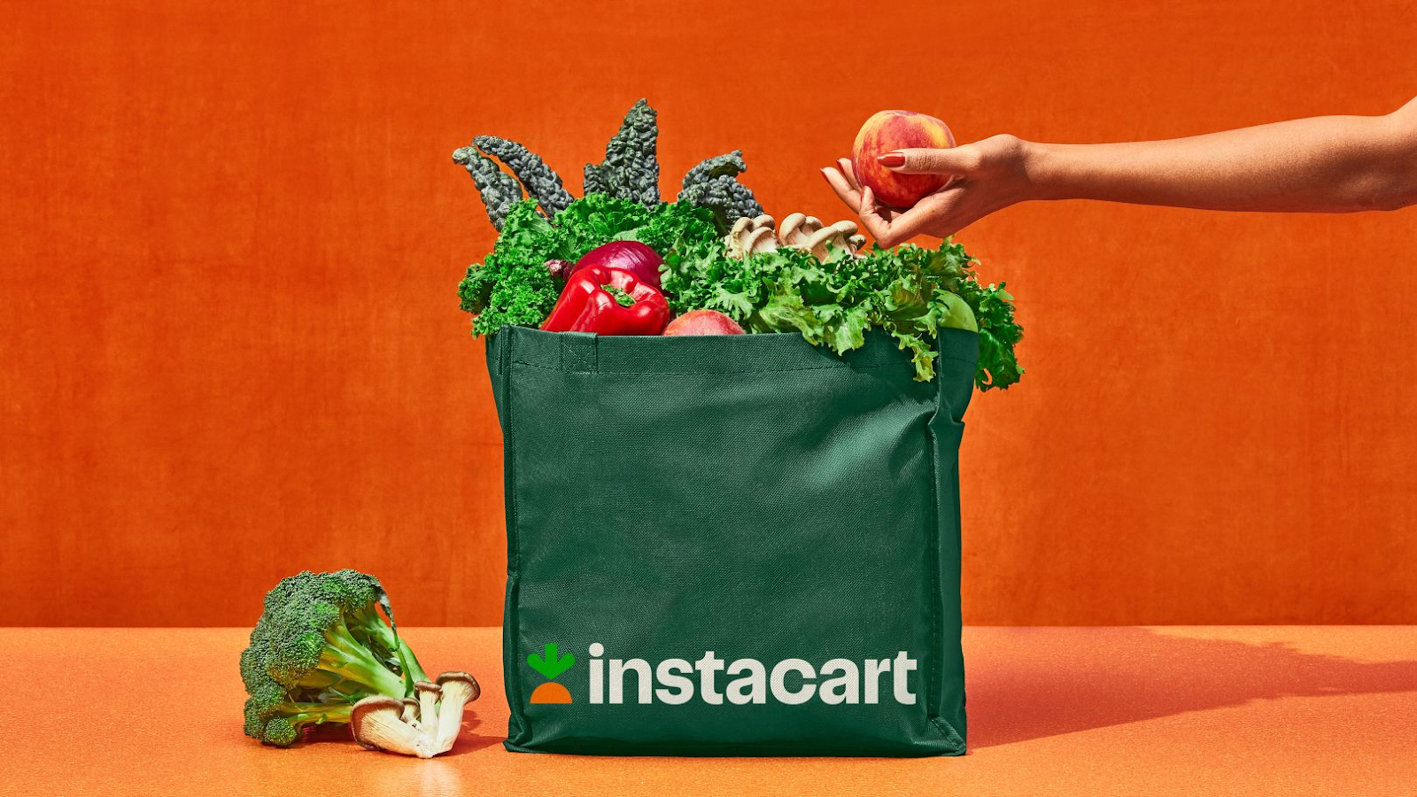
Instacart, the grocery delivery and pick-up giant in North America, worked with Wolff Olins on a new identity system for the brand. The rebrand was derived from Instacart broadening its strategy to become more than just groceries.
Why we love it “I love how the mark is easily recognizable and memorable. It can be used to play into a larger cohesive system. ” – Sean, Designer
Baskin Robbins by ChangeUp
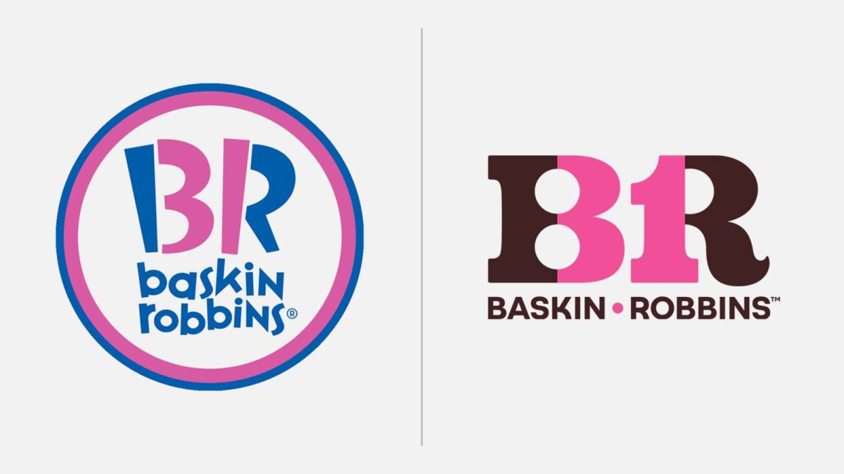
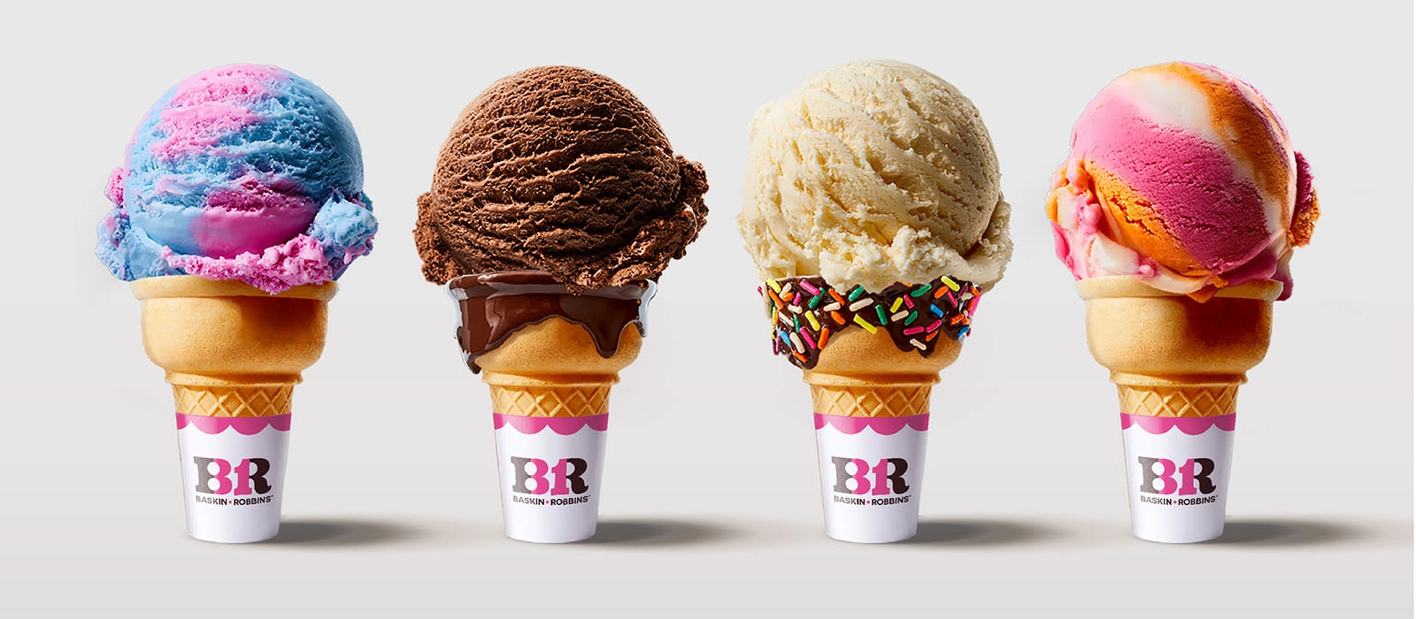
Baskin Robbins introduced their first complete refresh in decades. The new logo modernizes the brand through cleaner lines and a simpler typeface. While becoming more modern, the new Baskin-Robbins logo ties in inspiration from the brand’s early days with the original brown and pink color scheme.
Why we love it “The Baskin Robbins rebrand pulled visuals out of a childish past into a modern and sophisticated future. The logotype feels classic and timeless, and the focus on pink, brown and white colors feels pretty tasty, possibly referencing strawberry, chocolate and vanilla.”
– Abby, Art Director
KALW by Collins
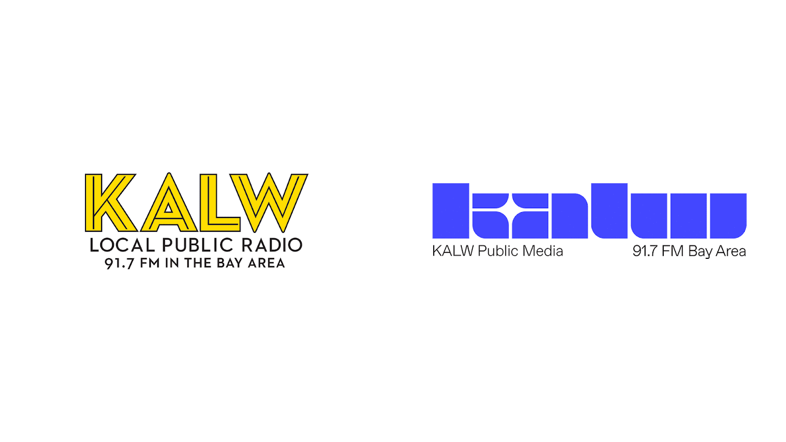
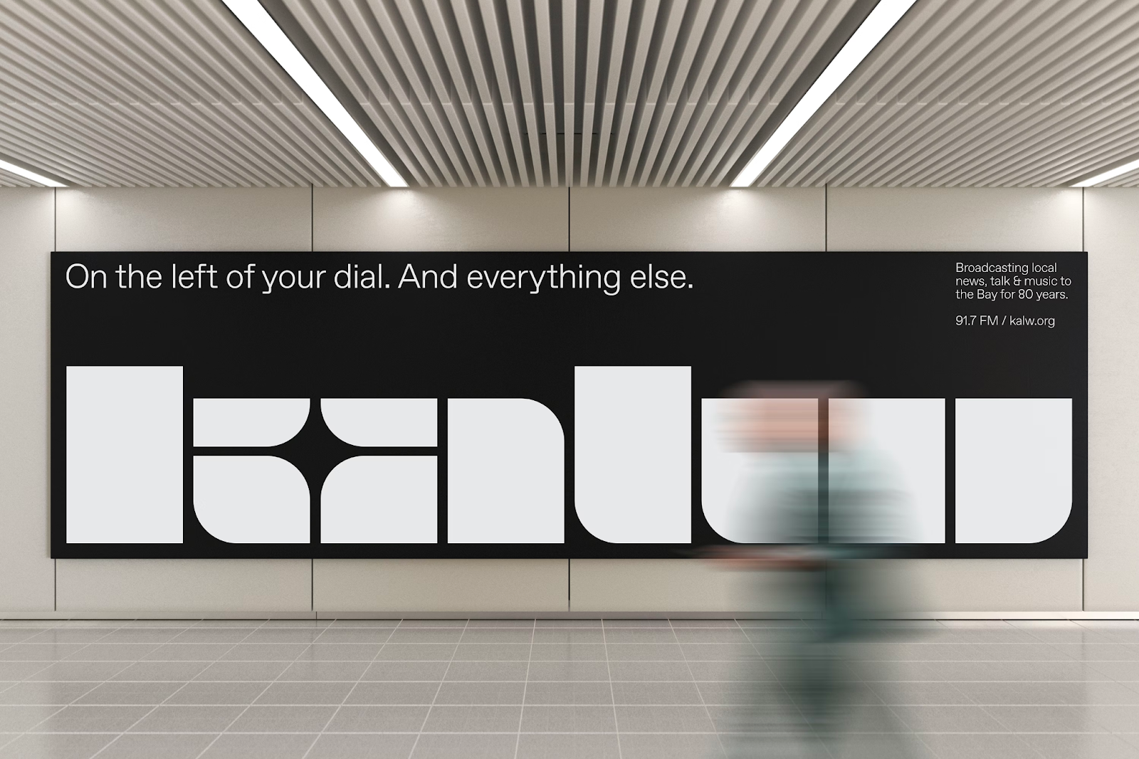
KALW is a San Francisco local public radio station that needed a rebrand to help them ring in their 80th anniversary. The station wanted a mark to celebrate their progressive ethos and rich past.
Why we love it “I love that the primary mark was allowed to be so expressive and the supporting text can be added for identification/legibility. The funky letterforms convey the retro, nostalgic feeling I get when listening to the radio but in a way that’s still fresh and modern.” – Sean, Designer
M&Ms by Jones Knowles Ritchie
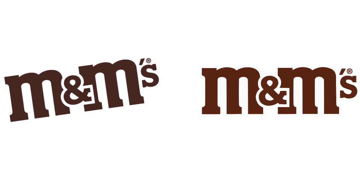
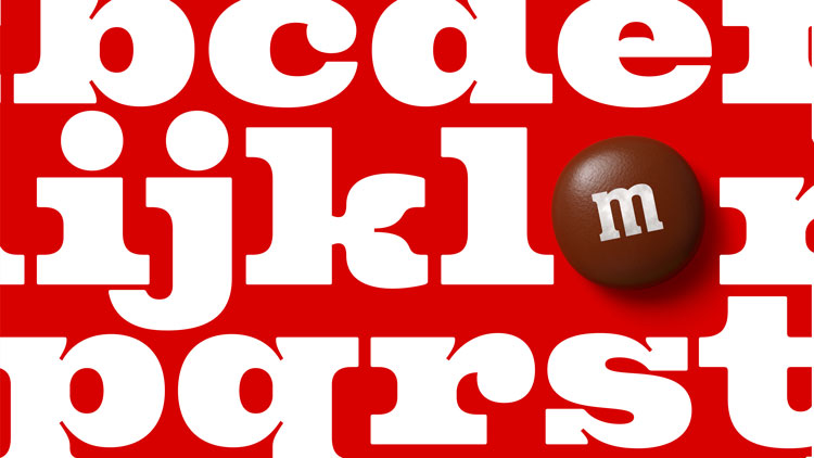
Iconic candy brand M&M’s updated their identity with a custom typeface and a new focus on the ampersand. The key behind their messaging was to symbolize belonging and togetherness.
Why we love it “I love a good ampersand, and this new typeface brings a playfulness that works well for a candy company!” – Grace, Designer
“Kind of a subtle one, but I loved the new typeface and messaging for the updated M&M brand.” – Anthony, Sr. Designer
Sprite by Turner Duckworth and In-house
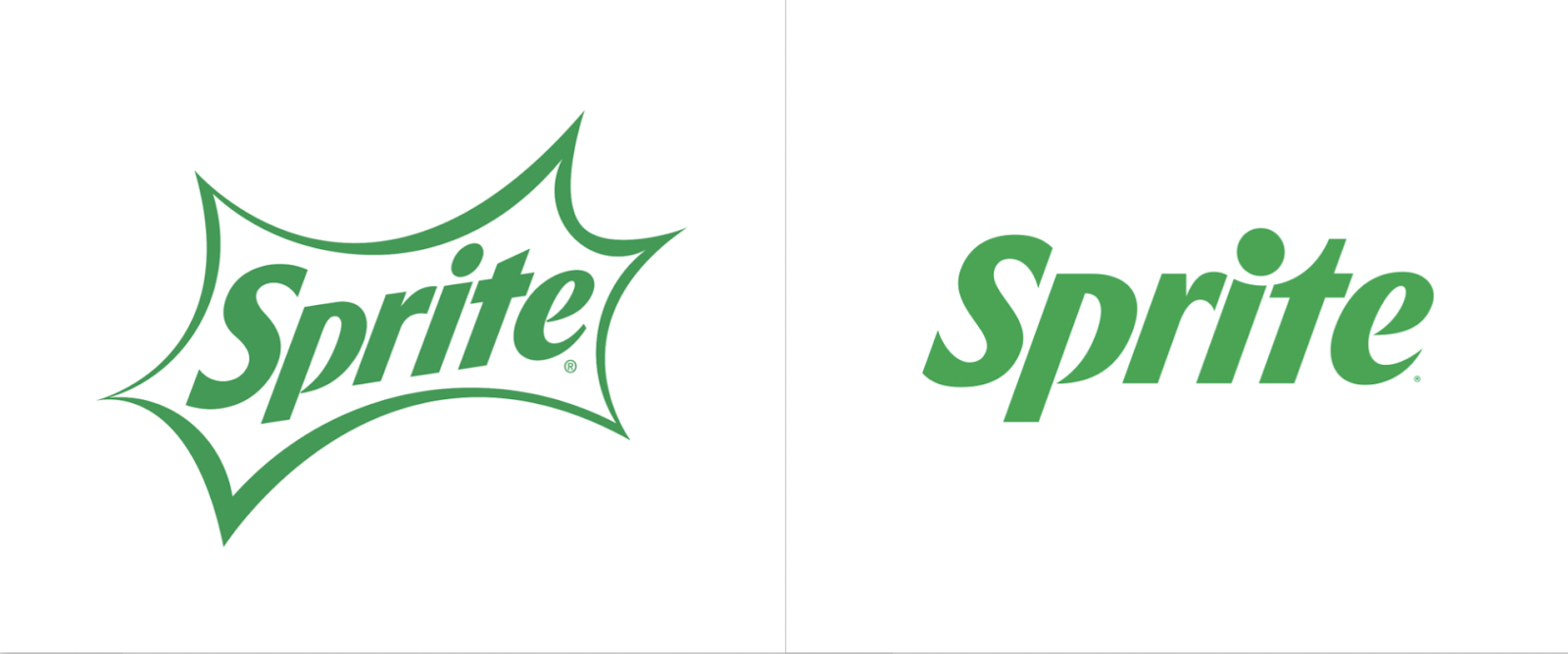
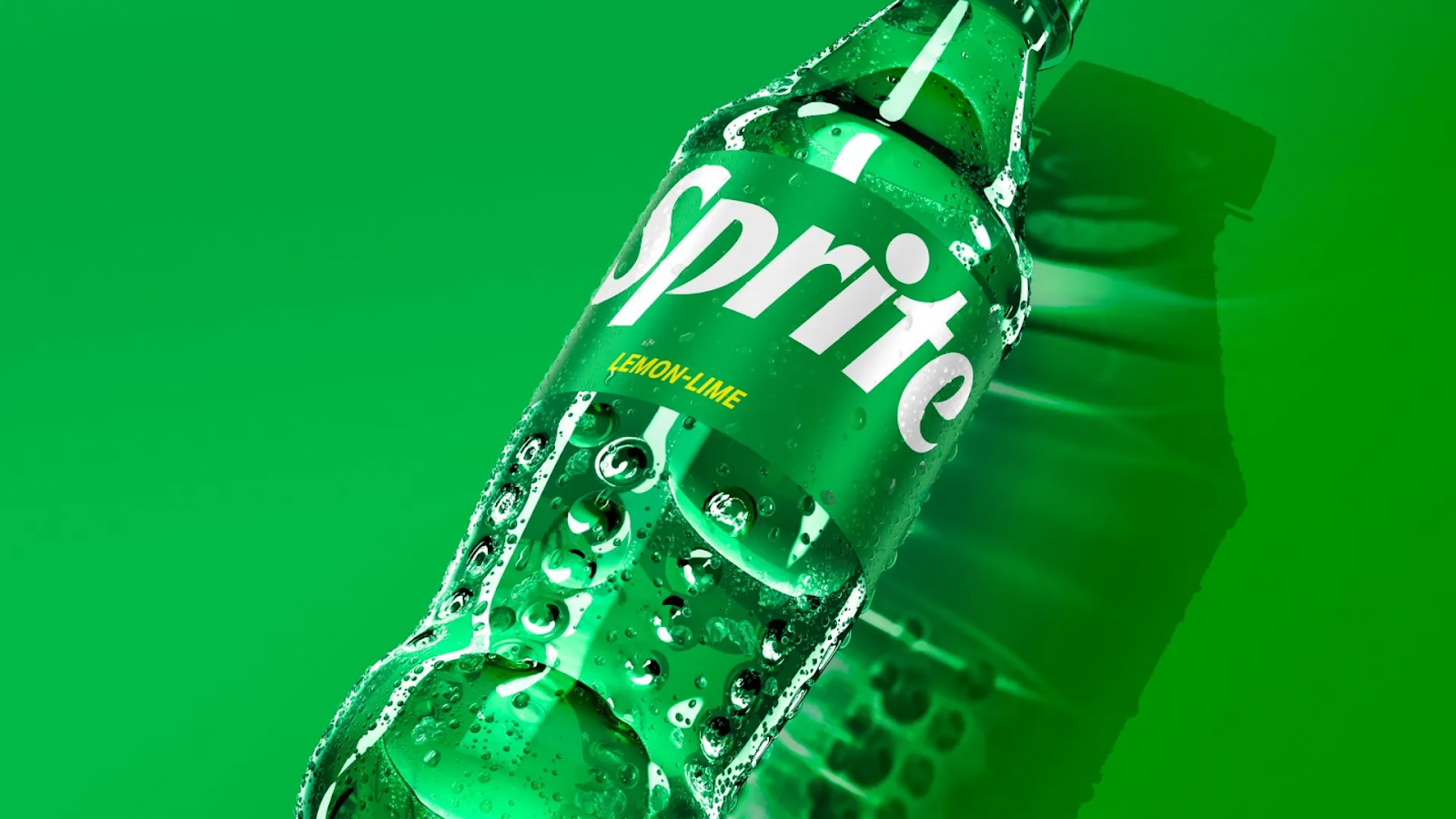
This year, Sprite underwent its first-ever global brand refresh. The brand system was reintroduced to appeal to a younger, Gen Z audience. At the same time, Sprite traded their classic green bottles for clear ones to make their packaging more sustainable.
Why we love it “Sprite had a really nice redesign this year! They added a lot of movement to the text in their wordmark.” – Emilie, Designer
Toblerone by Bulletproof
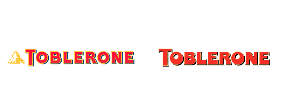
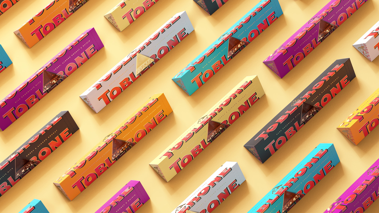
Toblerone, a Swiss chocolate brand known for its distinctive triangular shape, rebranded with a bright new color palette, typeface and brand purpose that capitalizes on Toblerone being “a triangle in a square world.” The brand’s new purpose features a unique call to action, ‘Be More Triangle,’ to champion those who choose to be different.
Why we love it “The packaging is infinitely attractive, and the weighty logotype makes you hungry enough to indulge.” – Parker, Creative Director
The NHL’s Stanley Cup Playoffs by Fanbrandz
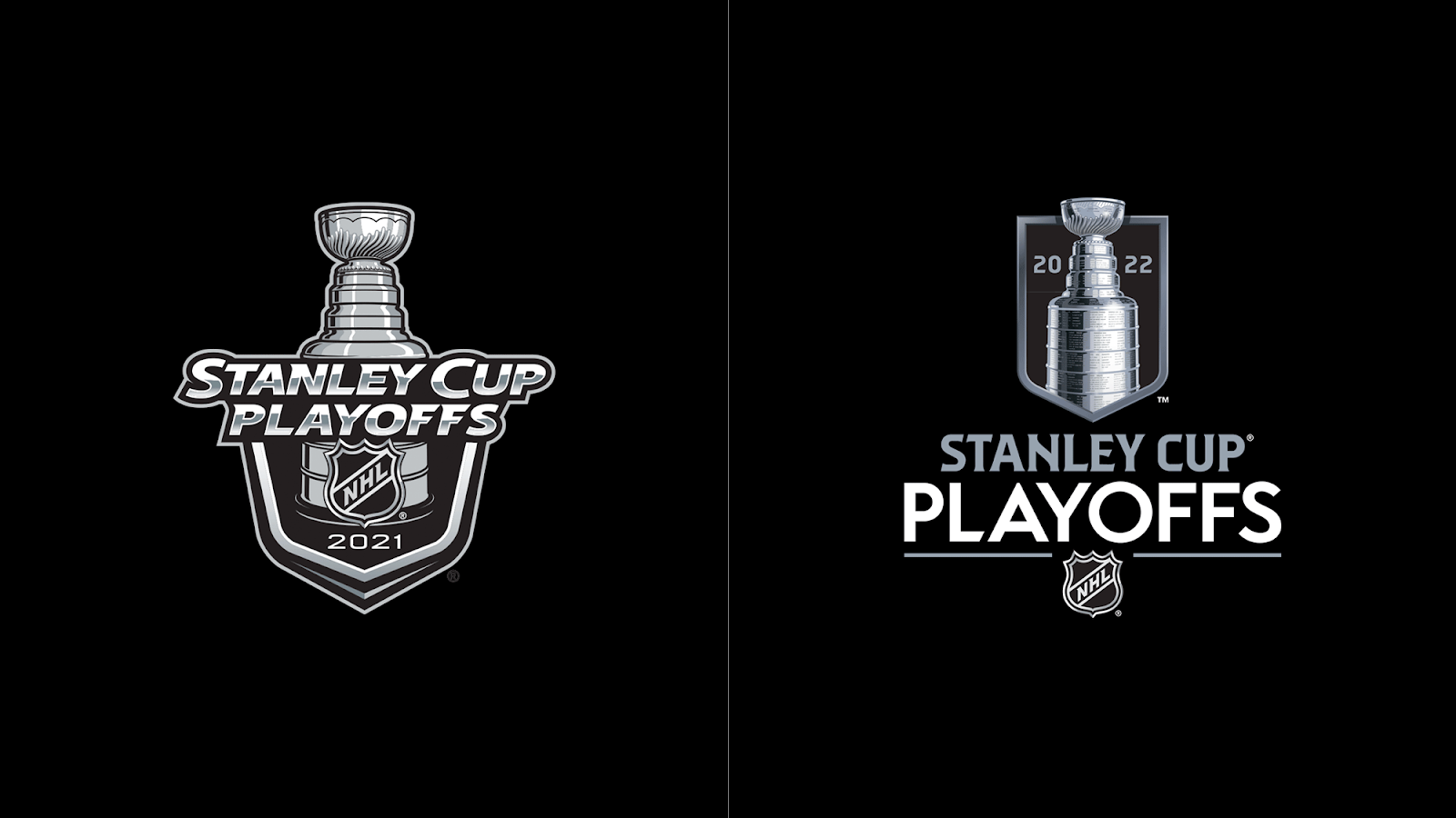
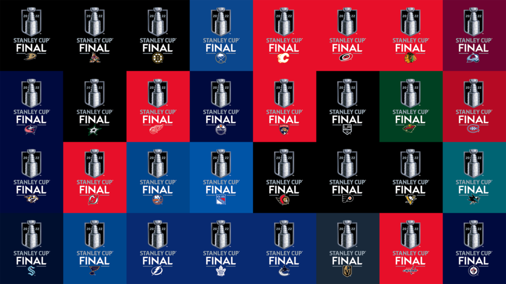
For the first change in 13 years, the National Hockey League unveiled a new logo for their highlight event, The Stanley Cup. The logo is said to reinterpret “what’s rooted in tradition with a fresh perspective.”
Why we love it “I think the new logo looks much more clean and modern.” – Megan, Production Manager
CNET by Collins

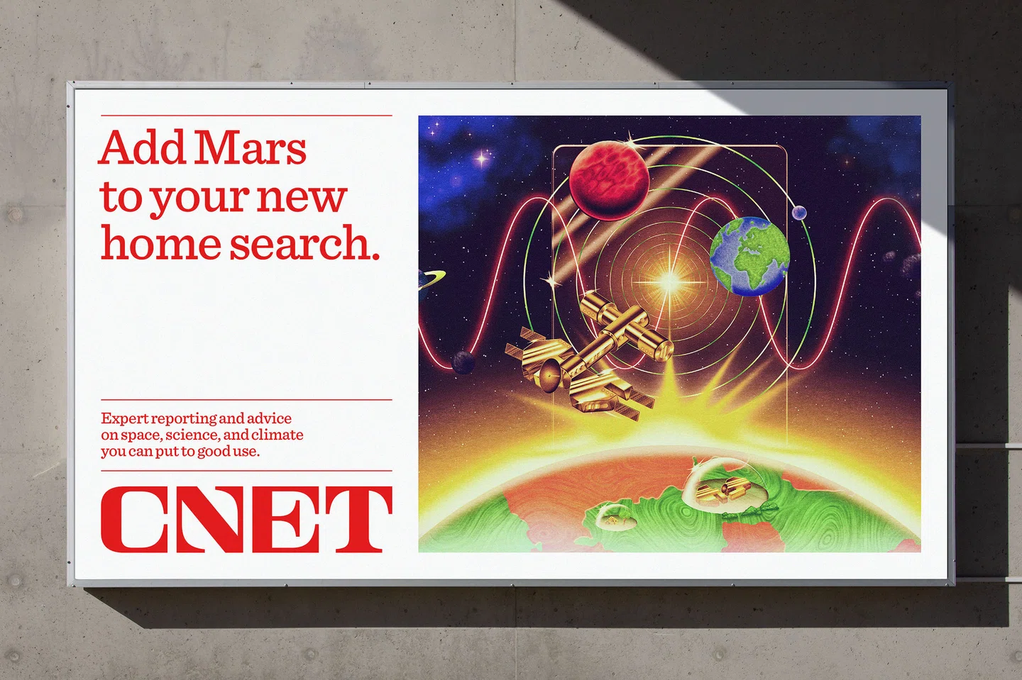
CNET launched its first rebrand in 25 years, working with Collins agency to bring a unique form of storytelling to the forefront. This new branding looks to link the past and future, with a nod to the mid-20th century and sci-fi illustrations.
Why we love it “Tech doesn’t have to mean clean and boring. Serifs don’t always have to be nostalgic! The modular CNET logotype is distinctive yet practical.” – Parker, Creative Director