

No one likes reading long paragraphs. When information becomes indigestible, it often becomes overwhelming to understand, analyze, and compare vast amounts of statistics and figures. Data visualization provides an excellent way to present information. Using good design, brands can create engaging graphics that tell the story in a way that captures the attention of the audience.
For example, let’s chat about the largest sports franchises.
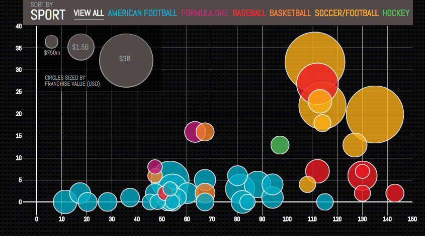
At first glance, this chart shows the huge value of soccer clubs amongst other sports franchises. While Forbes could have shown us each specific amount in a chart, the two axes show the number of years the franchise has spent in competition and the number of championships won. The chart isn’t labeled clearly, so there are fallbacks here. But one could quickly infer the long history of soccer teams and the great value that has resulted from their successes.
The design here isn’t striking or anything special, but goes to show how data is functional. When brands invest in gathering data, making decisions is an informed process that results in success.
Layers of Data
Diving deep into numbers can be fun for more right-sided brains. Insights provide value for business and allow users and viewers to locate patterns and come to some conclusions. Information can often get cluttered and messy while finding those relationships. Laying out information without context can lead to an endless pool of data, resulting in analysis paralysis. Eventually, the user gets tired of sifting through the nitty gritty, and gives up on understanding it.
Oftentimes, charts have attached points that pull out key information that state the relevant value or information. Users can use these charts as a supplement and visual aid to support any conclusion, and also keeps information interesting.
ST8MNT x RCS
Retail Cash Solutions provides cash management solutions to retailers across the country, and we often depict complex systems, data for presentations and key statistics. When we first began on simplifying their cash ecosystem graphic, the chart lacked context, and related groups were unclear.
Our team provided context through a series of isometric illustrations, using arrows, color and simulated spaces to show A. what areas in the ecosystem are affected by their solution and B. How their solution enhances each within the cash management process.

Providing clear information is critical in helping audiences understand information better, and improving visual data comprehension. Brands that prevent confusion will often find it easier to sell their ideas, services and products to potential customers. Using visual branding elements is one way that companies can use to communicate a consistent message and stray away from basic charts and cluttered data.
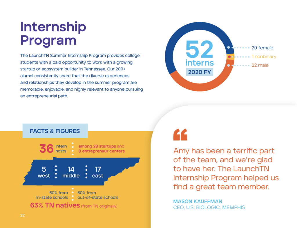
ST8MNT x LaunchTN
We also had the privilege to collaborate with an organization serving entrepreneurs across the state of Tennessee. Their annual report shows the year’s successes and highlights some of the key moments from past conferences and initiatives. While the information was written out, we wanted to ensure the data was eye-catching and key points were emphasized. Using the brand stylings we created during the brand refresh process, our team was able to create more engaging pages rather than simple paragraphs to dissect.
Data often has a way of getting confusing, but charts allow that information to live with less chaos and more clarity. As a visual society, it’s not an accident that we have maps for weather and line graphs for stocks. Pies and bars are loved by many, but simply are just the foundation of the many ways to visualize data and information.