

Summer in one snapshot is cookouts, swimming pools, beach trips, stargazing, fireworks, horseshoes, and other occasions that compliment hot temperatures. And all of us pursue a drink of choice to accompany our summer affairs.
Through 2012-2013’s short, cold-ass winter days, ST8MNT was hard at work crafting your favorite poison’s summer attire. Meaning: we have a handful of new tight branding projects that we’re excited share with you, the rebrand of The Rule for BNA Wine Group, BNA’s Short Cake, and a moonshine called All Purpose Shine from Tenn South.
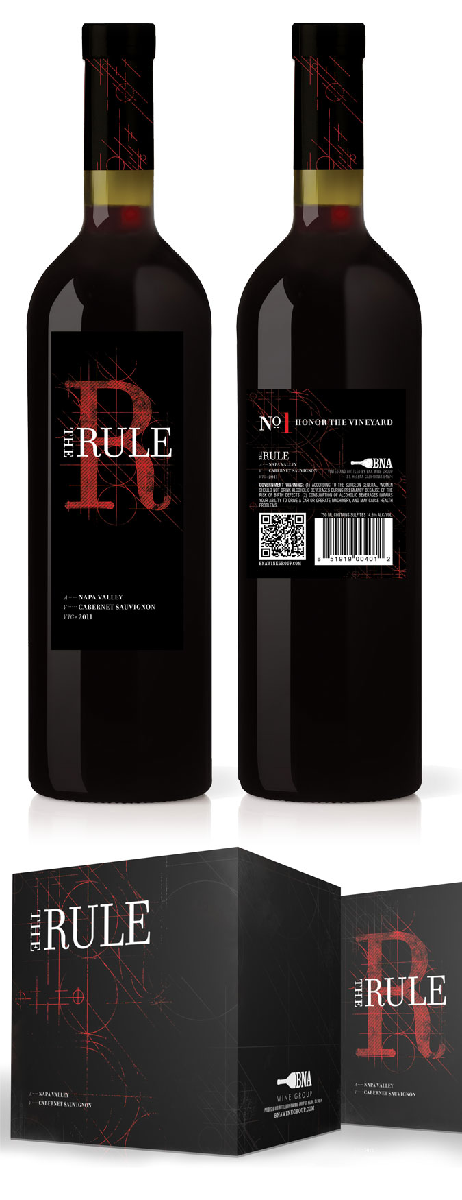
The Rule
BNA approached us at towards the end of last year about doing a rebrand of their Cabernet Sauvignon.
#WineGeek
The Rule contains aromas of red raspberries, black cherries, vanilla, and toasty oak. Its meant to be enjoyed immediately with a silk round feel on the palette followed by a long finish with mild tannins. This cab pairs great with duck, beef, and unique cheeses (i.e. Camembert, Danish Blue, and Grafton village cheddar). BNA sticks to many rigorous principles to create a Napa Valley Cabarnet, the one they break is the price.
#DesignGeek
With these ideas in mind, we chose a direction that would compliment the existing brand but freshen it up some. Architectural lines and shapes show the rigorous process BNA undertakes to make The Rule. We didn’t want to do much to the pre-existing logo, so we moved “The” to the side of “Rule” so the lockup would be friendlier for future usage.
Below you will see the new The Rule label (left) next to the old The Rule bottle (right), as well as the new box below.
Nanna’s Short Cake
This year BNA is rolling out a new Zinfandel called Short Cake. The flavor has remnants strawberries, currants, and other berries. With this in mind, we came up with a variety of approaches to the label.
The hand-crafted look resonated with our client. Our inspiration for it was country strawberry-patch road-side signage. The label imitates a tattered hand-painted sign with stains and wear with crude/quick lettering and illustration to give it a lo-fi effect.
We drew a shit ton of strawberries for the box.
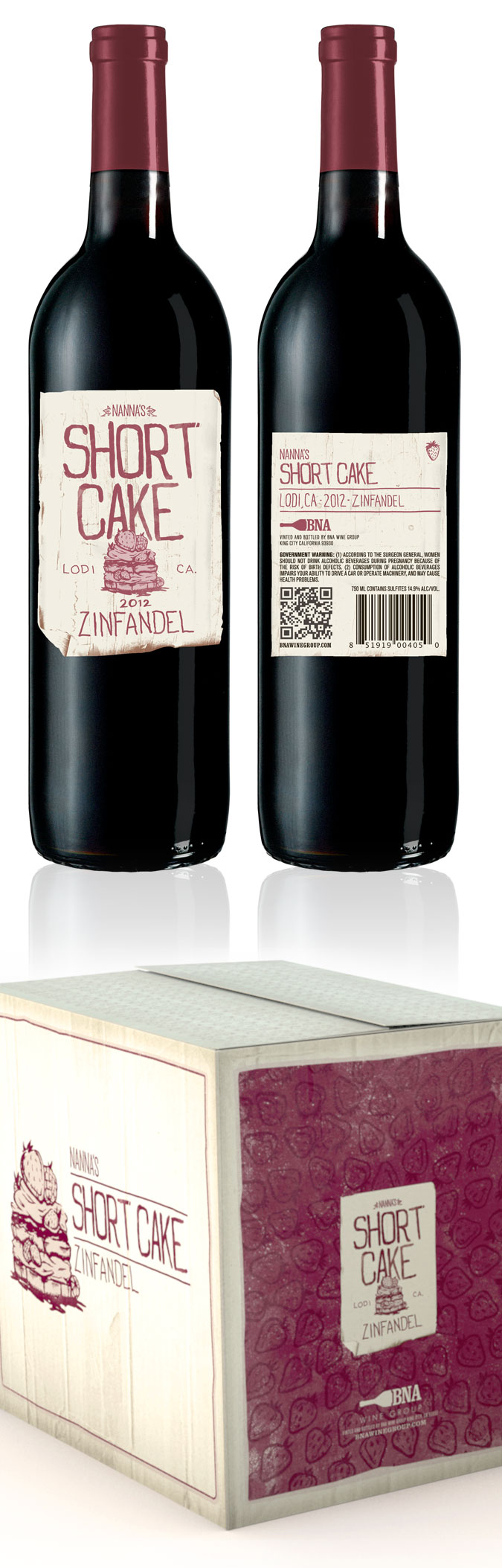
End result is a label and box that if wine splashes on either it only compliments it.
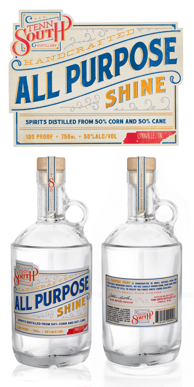
All Purpose Shine
All Purpose Shine is the moonshine lovechild of Blair Butler in Lynnville, Tennessee. It’s a 100-proof moonshine that’s launching this year just outside of Nashville, Tennesse, where people really love their authentic moonshine. We’ve done wine packaging/label design before, but this is our first shine moonshine and was an exciting toe dip into the world of southern liquors.
Each of these endeavors were great experiences that challenged us to try new directions resulting in a great finished piece. Thanks for watching!