If humans (or cyborgs… it’s 2019, y’all) interact with your design, they shouldn’t need step by step instructions. It’s important to understand immediately how to use a website, navigate a festival app or how to pick out a veggie burger among the menu items at a restaurant. This post sets out to explain why all interactive design, whether online or IRL (or in the interdimensional hyperspace… it’s 2019, y’all), should do the following 3 things:
- Be obvious.
- Lead people to meet their goals.
- Be memorable.
Be Obvious.
Listen, we get it. Design is about pushing boundaries and doing things differently. We love being different! It’s one of our ST8MNT brand pillars #RebelsForLife. However, when doing something unexpected interferes with a person’s ability to use a website or a mall kiosk, the “super cool design” is pointless. Crafting experiences that use expected conventions is often the best way to approach an experiential design project. And being obvious doesn’t mean you can’t create an experience that exceeds expectations.
The hamburger button, for example, is a convention that’s used all over the internet — and for good reason. The hamburger button, or menu icon, can be found in the top left or right corner of many websites and mobile apps. It doesn’t take up much space, and usually is a persistent button that’s fixed on the top of your screen. It’s become the universal symbol for ‘navigation menu.’
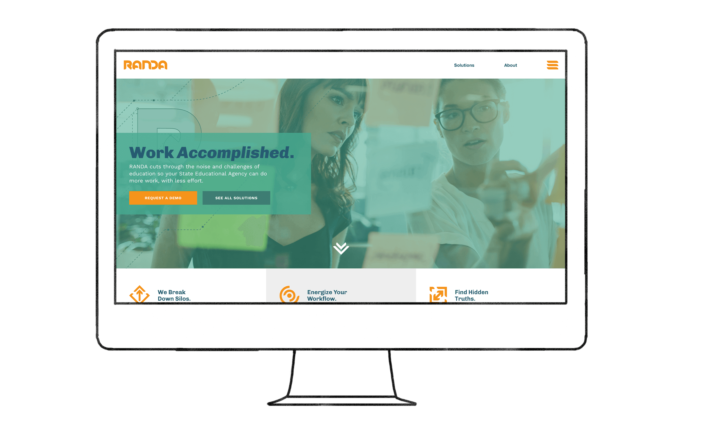
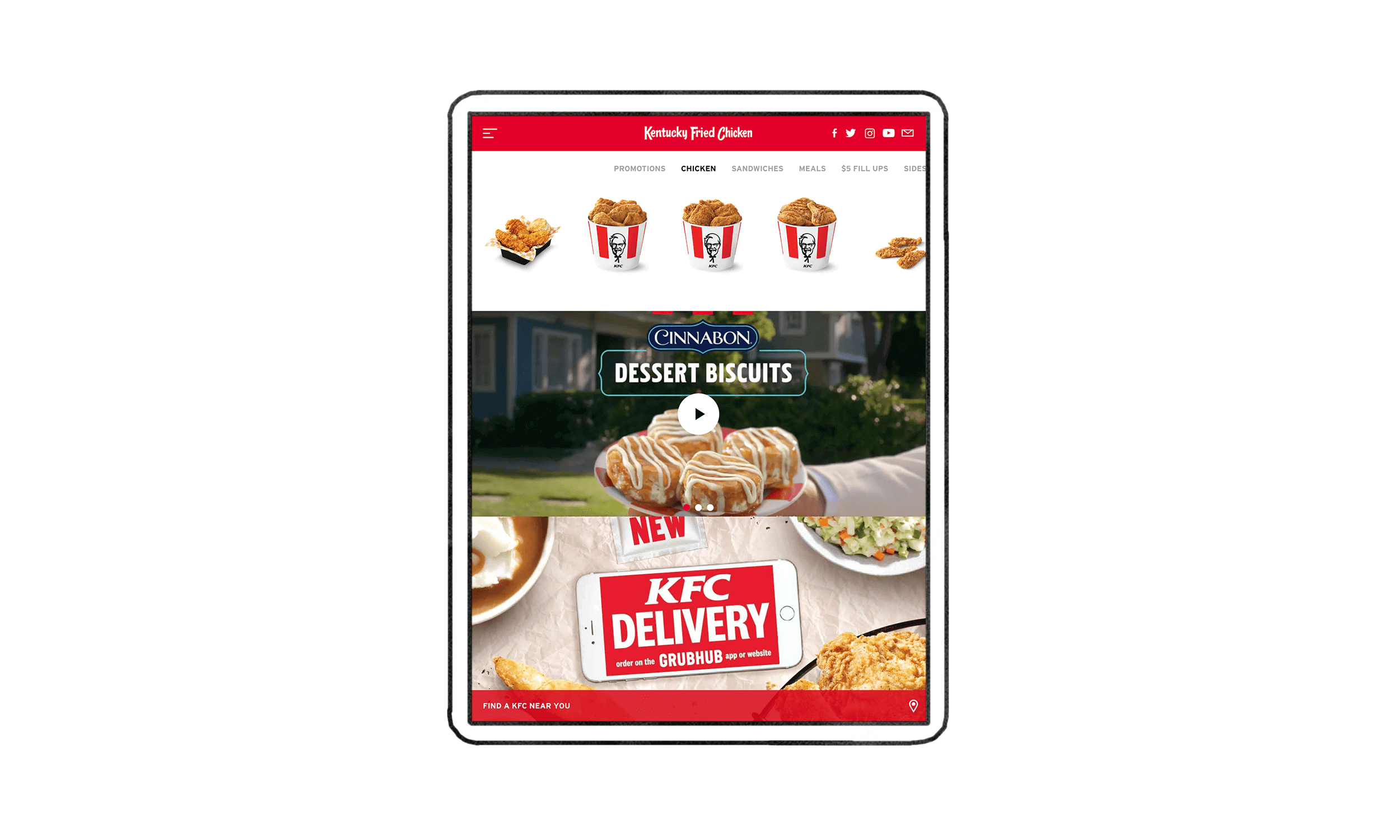
The hamburger button was originally introduced as part of the user interface for the Xerox Star in 1981. The intention Norm Cox’s transcendent design was that the lines would represent a “list.” The icon is so simple due to the restrictions of pixel space in the interface, but has help up incredibly well throughout the years. It works particularly well on mobile devices where space is limited.
Lead People to Meet Their Goals.
Leonardo da Vinci once said, “Every action needs to be prompted by a motive.” Trust me… I looked it up! People are goal-oriented by nature. If you’re going to the grocery store, you probably need to get some food. If you’re on Netflix, you probably want to kick back and watch a movie. When designing, we should always create with the human in mind. Designers should always ask themselves this question: ‘What purpose is my design to the people who will interact with it?’ Then, base your decisions on that answer!
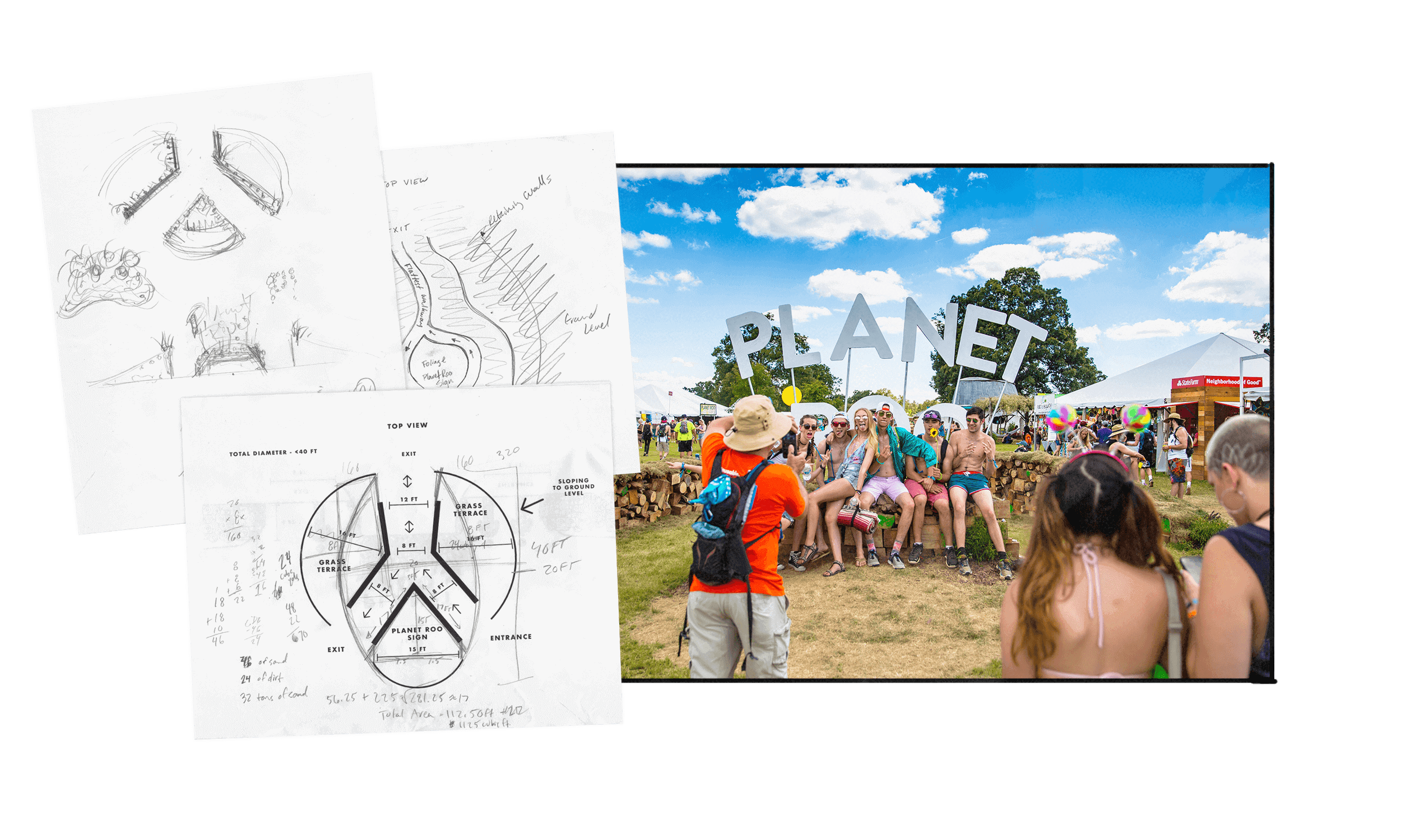
A while back, ST8MNT got the opportunity to create a few installations for Bonnaroo Music & Arts Festival. One of these installations was for the entrance of “Planet Roo,” an area of the festival where festival goers can shop, partake in activities & give high-fives (it’s a Bonnaroo thing). The installation needed to provide a walk-through entrance for fest-goers, be a visual landmark to be used as a meeting point and provide a great photo opp. By using big, floating letters and offering a designated place for people to sit and pose, we created a scene that lead people to meet their goals of taking an epic pic at Bonnaroo and effectively spreading FOMO to all of their Instagram followers. Mission accomplished.
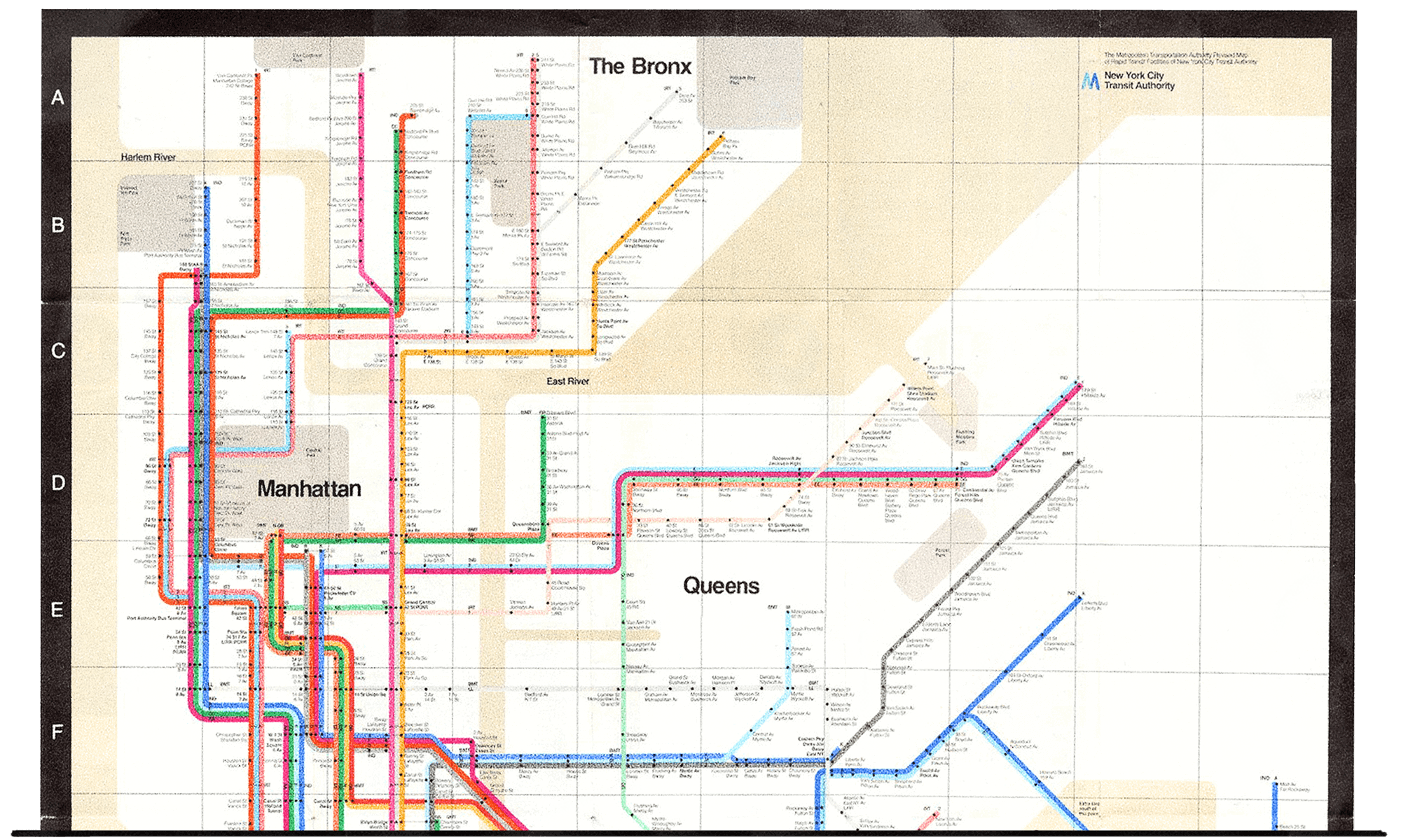
A classic example of goal-driven experiential design is Massimo Vignelli’s New York subway system map. What’s interesting about this map is that it’s not an accurate representation of the train track’s angles — the map only uses right & 45 degree angles as a tactic to help people visualize the train lines in relation to New York. This map simplifies a complex web of tracks so that users can figure out how to get from point A to point B. Sure, this thing is a work of art and has been replicated in transportation systems across the globe, but Vignelli used simple visual elements to lead people in the right direction (how’s that for a metaphor?).
Be Memorable.
What I’m about to say next is somewhat controversial … so hear me out! Creating a memorable experience is just as important to experiential design as a clear user experience. Of course it’s important to create an experience that’s easy to use and understand — but what’s the point if the experience wasn’t memorable?
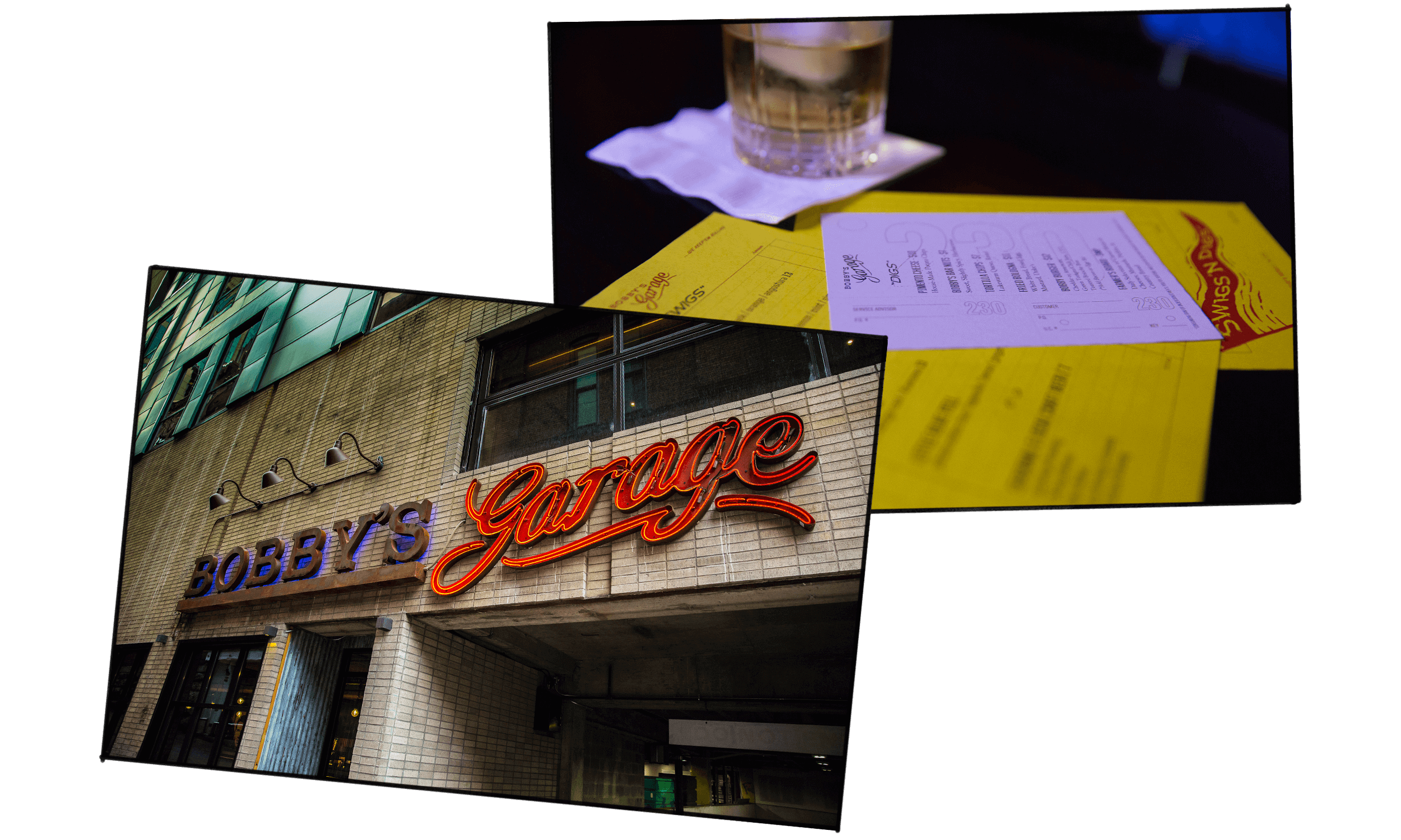
Bobby’s Garage isn’t just a hotel bar in downtown Nashville — it’s a dive bar. If you’re walking by, you’re going to see a large sign. But it’s not any large sign — it’s a rusty metal and neon sign. When you go in, you can get a menu, but it’s not a regular menu — it’s a menu printed on an auto shop ticket that offers tasty delights like “lukewarm queso.”
Do you see what I’m getting at here? An experience needs to be memorable and distinctive. Otherwise, your audience is just going to forget it! You need a reason for people to come back. The signage, menus, interior and the service work together to create the overall experience of the bar. Intuitive, goal-oriented design is the backbone of why the experience works, but that’s not what people are going to remember. People don’t go to Bobby’s Garage to go to a bar. They go because Bobby’s Garage is the coolest dive bar in town.
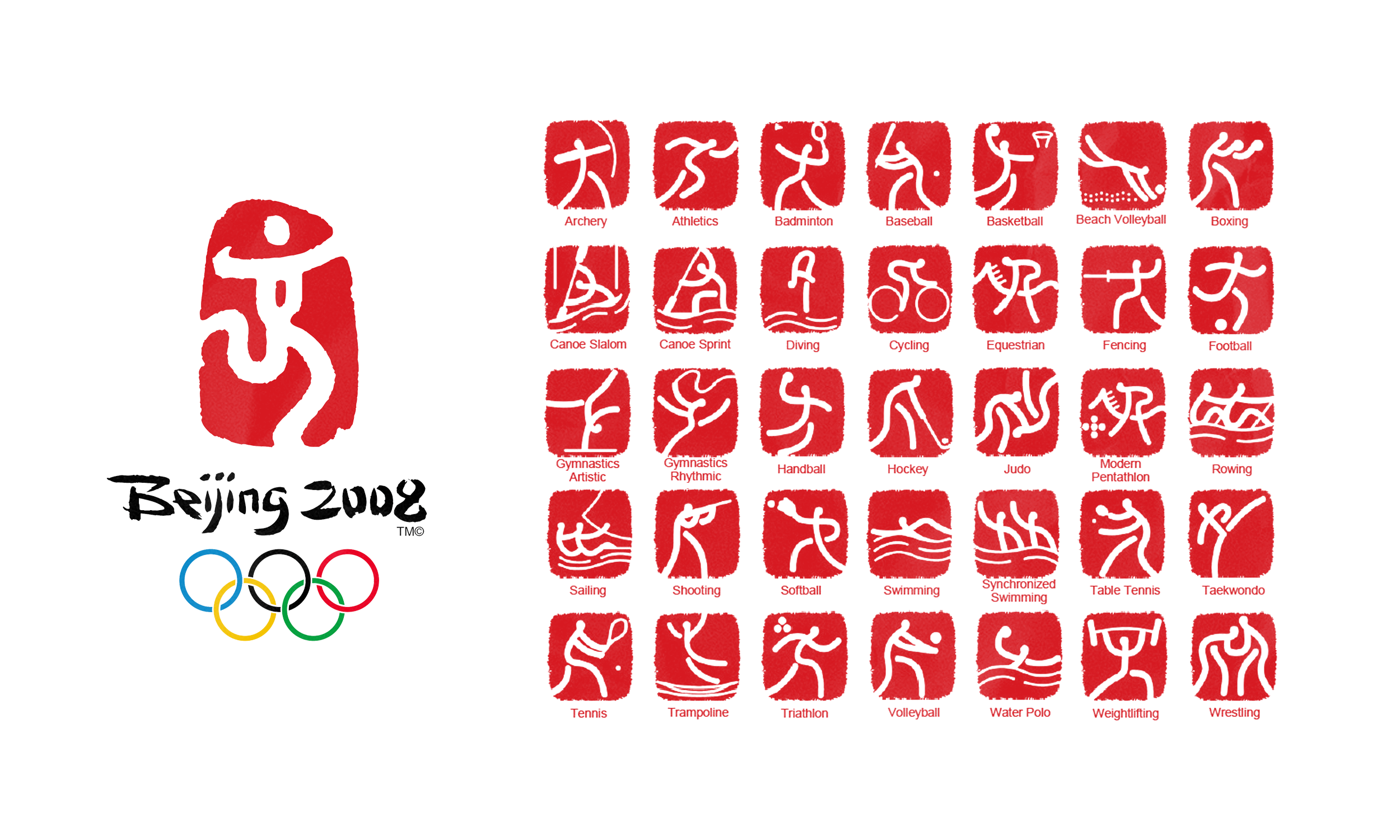
The Olympics are a monumental experience. Not only is the event massive, but its audience is incredibly diverse in culture and language. Because of this, pictograms are used to represent the different categories. The 2008 Beijing Summer Olympics offer a great example of how experiential design can be distinctive, but incredibly practical.
Experiential design is most successful when it is intuitive, goal-oriented and memorable. If you really think about it, all design contributes to some form of an “experience” for its audience. It doesn’t matter if your design is in the physical, digital or interdimensional world (it’s 2019, y’all). It’s up to us to make sure that we elevate the brand behind the experience.

