We encounter them every day, whether we are conscious of it or not. Grids. In the supermarket when browsing the packaged coffee, when scrolling through Twitter, when placing that Amazon order, or with the countless amounts of signage, grids are everywhere. Designer or non-designer, grids provide a structure to consume and create information. Some may view the grid as mechanical and cold, but utilizing a grid at this point in time is innate. It’s the way we have historically organized information, consciously or not, to make sense of things. Since becoming conscious of it, we have evolved the grid through art and design, now utilizing it every day to structure information in a delightful and informative way for better human engagement.
HISTORY OF THE GRID
Grid precursors can be found in the ordering of pictographs in Sumerian tablets, in Mesopotamian steles and inscriptions, and in the structuring of hieroglyphics. But our familiar concept of the grid really took to life in the manuscripts of monks and in the paintings of the Renaissance. With all of these developments, humanity discovered this is a very useful way of deconstructing our world to communicate information in a sensible and attractive way.
It’s building on a structure in an attention-grabbing, but elegant, manner.

The development of the Western grid (how we read and write, right to left top to bottom) has held strong bearing on how we layout information. There’s early evidence found in monk manuscripts and in the early Renaissance paintings. These grids soon gave way to our modern layout, whether that layout was guiding the reader through a biblical passage, or through a painting.
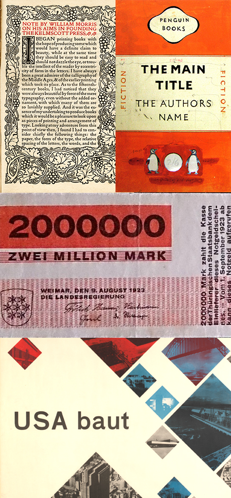
Our modern grid expanded into the typographical layouts of movable type and onward into the arts and crafts movement, where William Morris and others began to develop theories on the grid. This was further built on by the executions of Jan Tschichold, then the Bauhaus, furthered by International Style and on to today.
THE GRID AND ITS AUDIENCE
The grid has a very rich history, but how does that work with us? If you structure a website, social media campaign, or label in unintentional fashion, you get confused consumer engagement. Wondering how to achieve better engagement? Here are a few good examples that do so in a naturally digestible way.
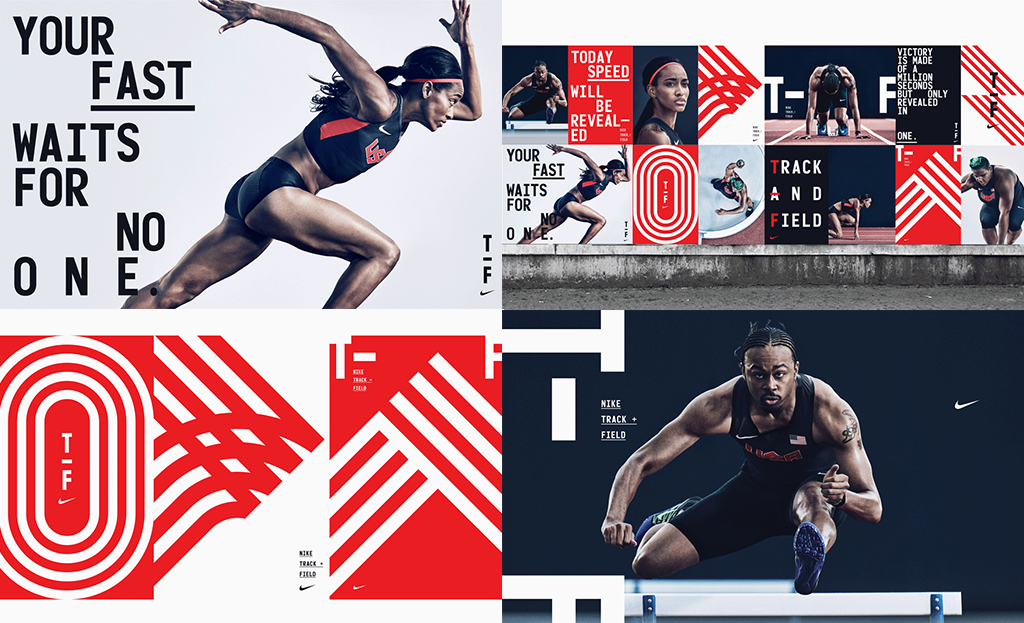
Nike Track & Field by Build
Build is using a minimalistic approach to visualize Nike’s track and field brand. Instantly you will recognize there is a grid utilizing monospaced type, with charged and fresh photography on simple color fields. This gives the brand an airy but bold rhythm representing the athlete’s rhythmic exorcise and breathing.

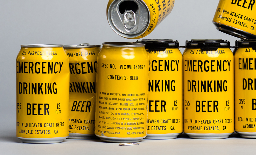
Emergency Beer Brand by Brothers and Alvin Diec
Emergency Beer by Brothers and Alvin Diec is a great example of information hierarchy on a grid. “What do you need…Beer?” “Yes.” “Okay, and when do you need it?” “Like now.” The way the packaging’s information is structured in a way against competitors in yellow with black type, having the name front and center, then additional information in an organized fashion makes a bold but subtle comical statement to consumers. It’s building on a structure in an attention-grabbing but elegant manner.


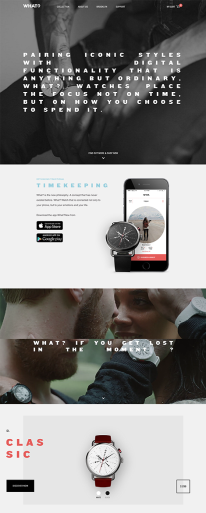
What?Watch
Here in this system the grid and structure on the What?Watch site is present, but not overstated. Typography builds in an orderly, but timely manner (wink wink …please, hold the applause on that amazing joke). This type is set over beautiful lifestyle photography that focuses on important moments, a clean color palette of elements and buttons, and understatedly lovely interaction design. The main page is structured to capture your attention, connecting with special moments, showcasing the product in a personable way and invites you to discover their inventory. All of this is designed to work on a range of devices to preserve the experience.
…We utilize it every day as an invisible platform for structuring information, and to delight and inform our audience for better human engagement.
SO WHAT ABOUT IT?
As branders, we develop a grid to create structure and hierarchy. We have this power of knowing how to scale and sort information, and we should use it a good way to dictate what the audience sees and thinks about first. This means the tone of how we want to brand things is heavily up to us, the designer. The grid gives brands the power and the constraints to structure elements and information to challenge and inspire the conception and fruition of a project. It also improves the experience, better connecting with its audience, by organizing these components in a harmonious and attractive way. As we administer different brand experiences from websites to social platforms to packaging, let’s be conscious of how we use the grid with its range of visual elements, to communicate and captivate the receiver in a positive and beautiful manner.

