We recently worked with Fusion Management on a Lady Antebellum show poster that was part of the VIP ticket package. The band was performing a charity event benefitting the Ronald McDonald House in Augusta, GA at the Lady Antebellum Pavilion.
The kind folks at Fusion wanted something illustrative — and something that could match the quality of their music. Initial thoughts were fireworks and all-American picnics, references to muscle car motors and old road maps, roadside fruit and boiled peanut stands, old phonographs, and Georgia’s state fruit: peaches.
We first explored these ideas in some initial roughs, jotting, and thumbnails. After reviewing these thoughts we came up with 4 different directions and began sketching out the winning ideas.
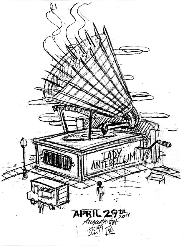
The first idea was a giant phonograph/structure that incorporated the new Lady Antebellum Pavilion.
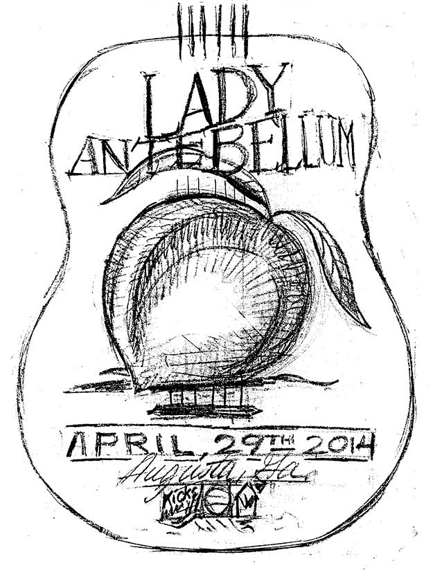
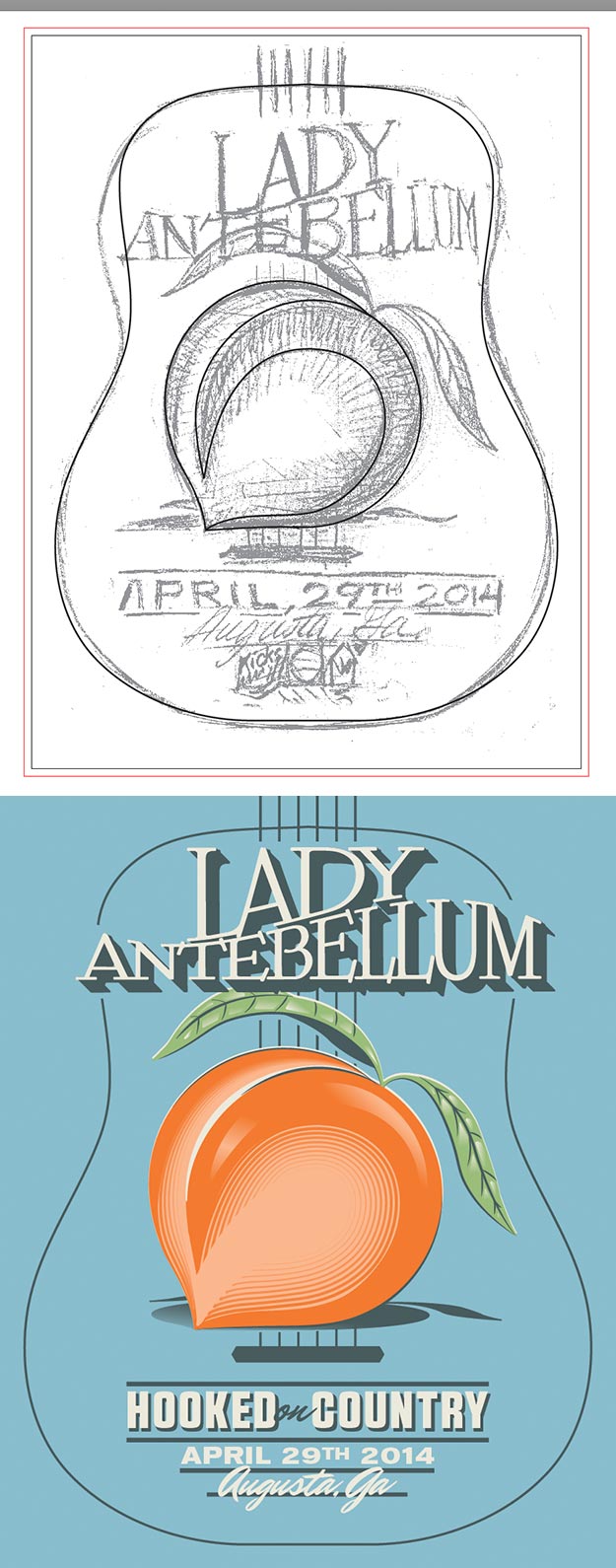
Second, was a giant peach in the silhouette of a guitar with the Augusta skyline behind it.
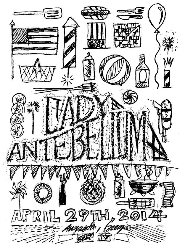
Our third idea was a wooden fireworks sign with pinwheels, American flags, bottle rockets, beach balls, Uncle Sam hats, balloons, hot dogs, hamburgers, sparklers, apple pies, and other fourth of July and picnic essentials surrounding the typography.
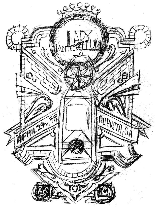
Finally, the fourth idea was a large composition made up of elements you might find on an old mobil gas station road map, like a compass, wings, map key, border lines, and such.
Fusion was keen on doing a giant peach that landed on the city of Augusta.
So, like any good designer, I scanned my sketch and made it a template and began tracing.
Here are a few screenshots showing the building of the vector bones for the peach and poster.
To get that real-fruit-crate-label-feel we incorporated some stippling and painted in a little dimension on the type and on the peach itself, while keeping the skyline flat in the background.
Even with all that, the poster still felt like it was missing one small detail. FIREWORKS!!!! Who can possibly roll through Georgia without wanting to stop and get a paper sack full of roman candles and black cat?!
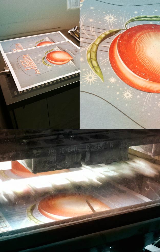
After deciding to take the stylization of the poster in this direction we decided on good ole 4 color offset.
Here’s a few shots of the printing process.
There you have it folks! End result was a nice 18×24 to embody a worthy cause.


