“To design is to communicate clearly by whatever means you can control or master.”
~ Milton Glaser
It’s easy to become so enveloped in your work culture to the point of forgetting not everyone shares the same lingo. 5 years ago I gave my first bit of professional client feedback in what I have affectionately dubbed ‘Designese’. Needless to say this was met with a bit less understanding and a lot more, “Wait… What?” The primary function of design is to better communicate and yet we ironically have an entire catalog of niche language that can end up sounding more obscuring than descriptive. So in the spirit of always sending a clearer message to our clients and our audience in general, here’s a St8mnt guide to speaking Designese:
Typography
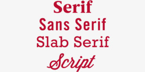
Serif
A curved, decorative line added to a type character. These can make a typeface look subtly classy.
Sans Serif
A typeface or character without serifs or any embellishment.
Slab Serif
A typeface with mechanistic serifs represented by blocky shapes.
Script
A typeface characterized by flourishes and all organic flowing linework.
Kerning
The process of increasing or decreasing spacing between letterforms to get a pleasing distribution of visual weight.
Tracking
The space between lines of text. This can make or break the readability of large text areas.
Display Copy
The initial eye-grabbing large type at the beginning of articles.
Body Copy
The meat of an article. All these little words you’re reading.
Orphans & Widows
A Widow is a very short line or part of a hyphenated word residing on it’s own line in a text column. An Orphan is a single word appearing all alone in an open line. Be kind to these lonely words and always reunite them with their fam.
Color
CMYK
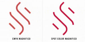
Cyan, Magenta, Yellow & Black: The four magic colors that produce almost all the print media seen today. Any color you can imagine (almost) can be generated by various combinations of these four colors.
RGB
Red, Green, and Blue: Believe it or not, every color on a computer/TV/mobile screen is generated by these three colors. There are 256 intensity levels of each color resulting in 16,777,216 (256x256x256) different possible color combinations. These colors are shown in software as a six-digit ‘Hex Number’. If you want to preview hex numbers this is a fun way to do it.
Pantone (Spot Color)
Custom colors for printing specified by a single number. This is the way to 100% guarantee your color will appear the same across all print media Instead of the halftone print pattern of CMYK, a Pantone Spot Color will be a solid coat.
Image
Resolution
The level of overall image clarity and amount of details in an image.

Opacity
Another term for the level visual transparency. An image with high opacity is basically
opaque and low opacity is transparent.
Saturation
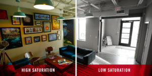
The intensity of color in an image. An image with high saturation will consist of intense and exaggerated colors whereas a desaturated image would be closer to black & white
Curves
Tool for remapping of an image’s tone used as a way to emphasize colors or other elements.
Levels
Refers to the overall brightness and darkness of an image.
Layout
Hierarchy
Visual ranking of importance. The biggest element of a layout will have the highest hierarchy.
Grid
A two dimensional, intersecting line guide to help guide and align content in a layout.
Scale
A Designer’s fancy way of referring to literal size of an item on a page.
White Space
Sometimes also referred to as “negative space”. White space refers to the portion of a page left unmarked or completely blank. This space adds a natural level of visual asymmetry that allows the content to breathe be more noticeable in the layout.
Digital
Wireframe
An essential step to our digital process. This is strictly layout and functionality without the design bells or whistles.
CSS
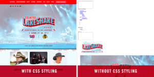
Shorthand for ‘Cascading Style Sheet’. This is a coding text document that gives a website all the style and aesthetic charm you could want.
CMS
A Content Management System. An example would be a system like WordPress that packages all the complex info of your site into a simple, navigable interface.
UX
Short for ‘User Experience’. Refers to the holistic experience, usability, and satisfaction of a user’s interaction with a product.
UI
Shorthand term for ‘User Interface’. This refers to the relationship between the user and the tools on the computer. UI Design is involved in every step of forming a Website or web app to ensure functions such as searches and navigation not only work but are optimized and intuitive. The ultimate goal of UI Design is to get out of your user’s way.
IA
A way of not having to say ‘Information Architecture’ every time. This refers to the process of organizing and labeling websites and online communities. You can’t have a large search engine like Google or a large online community like Facebook without advanced IA Design behind it.
There are countless facets to every one of these elements and you’ll no doubt hear us mention many if not all of these in the future. Although this blog is no Rosetta Stone, hopefully this helps shed a little light on how we creatives get our points across and get us that much closer to really speaking your language as well.

