During my yearly review in February of 2014, Bethany asked me where I’d like to go for my 5-year sabbatical. I asked her what does this trip entail? She responded with – and I am exaggerating – you can go sit on your ass for two weeks on some remote island and stare at the ocean and sip on beer if that gives you inspiration. Really anything.
One of the many perks of working at ST8MNT is, after 5 years each designer is eligible for an out of the country sabbatical trip from ST8MNT. I haven’t really heard of other companies or organizations doing this. I’m aware of self-intiated sabbaticals but not company ones, so it comes as really great opportunity to expose yourself to new perspectives and experiences.
So, Holy Moses, where do you go?
Do you venture to somewhere otherworldly from your day to day norm, i.e. Thailand, Iceland, Patagonia? Do you go to witness up-and-coming design in Argentina, Brazil, Chile, or Mexico? Do you venture to Machu Picchu to meditate on low oxygen levels? I passed this one up in July – and yes some survival enthusiast is griping right now. It’ll be a future trip.
So where? I don’t know. The question is a very baffling one, so you need to make it count.
This question perplexed me over the past year. It took me 9 months to decide.
I wanted to make sure the trip would be very informative and inspirational to what I’m deeply interested in, good type and lettering. Well-crafted typography is occurring every where. But over the past 6 months I’ve become very intrigued in what is currently happening and what has happened in London, Amsterdam, and Berlin among other places, places like A2, Radim Pesko, Colophon, and Shick-Toikka to name a few.
Type – as described by my former instructor Seth Johnson at MTSU – is the designer’s paintbrush, to me its the primordial soup for design. Its usually the most integral and important element to good graphic design. Its the first thing that breathes life into your designs.
As I started to plan my trip across Northern Europe, I soon found we couldn’t hit every spot on the map. We’ll have to save those for future trips. I narrowed it down to London, Amsterdam, and Frankfurt. Thats hard to narrow down though because there is so much current and historical stuff to dig through in other little and big spots around Europe.
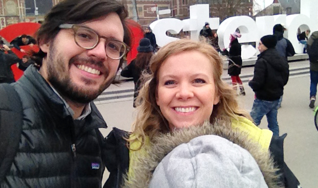
After a month of planning and a rushed toddler passport we purchased our United tickets and finally lined up our accommodations. So, with my wife at my side and my 1 year-old daughter strapped to my chest we ventured across the pond on Thanksgiving day – a most splendid day for travel!
Day 1
We landed at Heathrow airport in London, took a train to Paddington station and then a taxi to our apartment in Pimlico. And then slept like crazy after having a red-eyed meltdown about losing an iPhone during our overnight flight to London (due to lack of sleep and traveling with a child). We never recovered it. London is very bitchin’ by way!
Day 2
We slept some more and took some time to get acquainted with London’s Tube and the city itself – which kind of reminds me of a blend D.C and New York. Then we had a dinner at the Marquis of Westminster, the food was pretty great.
Day 3
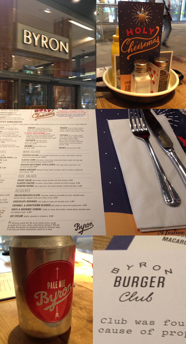
I was bent on having lunch at Byron. In 2013 I sat in on a talk from Douglas Riccardi of Memo, who had an informative talk entitled “When is a Burger more than a Burger” at the AIGA “Head, Heart, Hand” conference in Minneapolis. Douglas highlighted a few past projects of Memo’s and their approach to branding a restaurant from menus to the atmosphere. He emphasized the need to have every touchpoint, visual, and space to convey the restaurant’s essence; an interesting approach to this was Bryon, the burger-chain in London that doesn’t feel like a chain.
Memo’s approach to Byron is to have different signage, ephemera, and interior and exterior designs for each location with very little consistency. This sounds a bit like a designer’s nightmare. But they do this with consistency, having each restaurant tailored to reflect the neighborhood’s identity that it inhabits. It sounds weird but it works, so without uniformity we have authenticity.
Here are a few photos. We visited the Cheapside location.
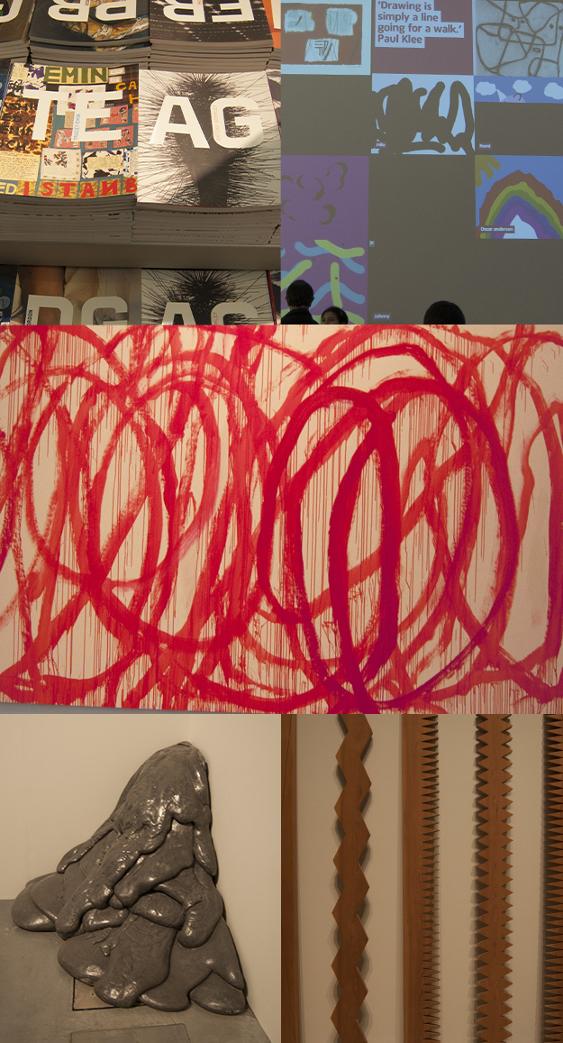
After Byron we took a stroll down to the Millennium bridge and took in some of the art at the Tate Modern, like this giant Cy Twombly.
Day 4
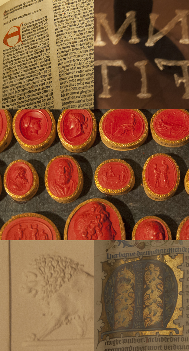
We made a trip to the British Library to view some very old manuscripts in their Treasures collection from Gutenburg’s Bible of 1455 to Shakespeare’s First Folio. There were a lot of beautiful illuminated manuscripts, maps, and old printed books in their collection. No photos were allowed though because of the delicate condition of the documents.
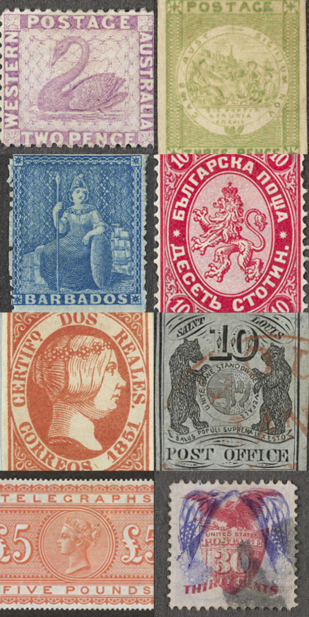
The British Library did have a wonderful collection of printed stamps in their Philatelic collection, which are stored in these sliding metal glass frames, their collection covers just about every country, Bolivia, Russia, Barbados, the United States, and more. No photos were allowed of these either but here’s a little taste from their online collection. There was slide frame after slide frame full of these stamps.
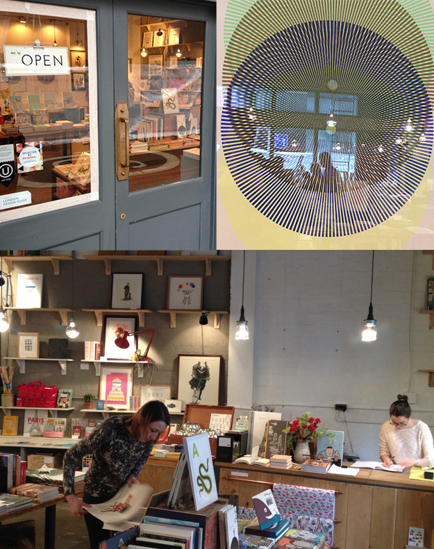
After spending sometime at the British Library we made a trip to the rare and specialist bookstore Collinge & Clark, where they have books covering typography, graphic design, illustration, lettering, printing history and a variety of other subjects. I really had no idea of the treasure trove I was about to stumble upon when I walked in this bookstore, and I could have easily gone broke very fast without any self-control. This place is has books for sale ranging from thousands of pounds to 60 pence. When I first walked in I could already see from the large specimen books sitting on the tops of the shelves, that Collinge & Clark had a lot of great items. After spending some time talking to Oliver Clark, who was very accommodating to me visiting with a 1 year-old, I made my way to their basement which was down a very steep ladder from main floor.
The basement has boxes on top of boxes full of old specimen books, pamphlets, flyers, and other books piled on top of shelves. WTF? I was losing it just drooling over one thing and then the next. I walked out spending $90 but good grief I could’ve spent more. If you ever happen to be in London pay this guy and place a visit and buy something!
Day 5
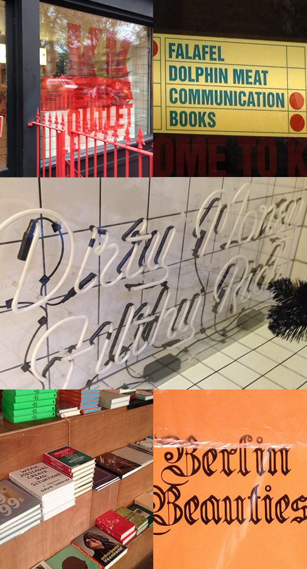
The next day we made a trip to Shoreditch. Shoreditch is an active creative corner of London, full of galleries, bookstores, designers, and agencies, with a lot going on. That day we took a train to the Old Street Station in London to visit a few galleries and bookstores. Kessels Kramer has an office there which functions as a working office, gallery and bookstore – KK Outlet. This and other galleries don’t just showcase art during show openings, they’re showcasing work from designers, type designers, and other works.
After KK Outlet we paid a visit to Material an art and design bookstore.
Day 6
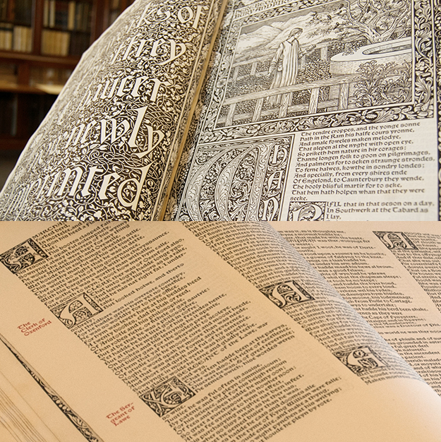
On our last day in London, I visited the St. Bride Foundation Library, where I was welcomed on a tour of the library that a school group was taking that day. We were first shown a Kelmscott Chaucer that was highly elaborate. On one page we were told that William Morris went to the length of creating like 9 or 10 different capitals of the letter A to reduce repetition, versus only doing 3 or 4 which would have sufficed.
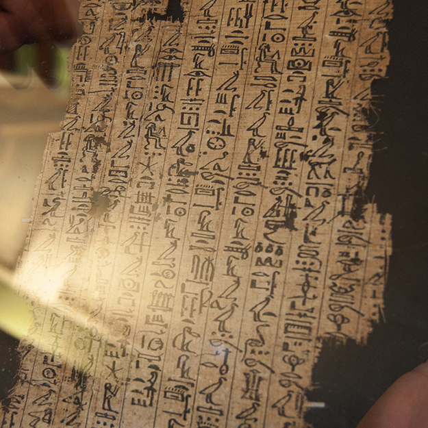
This was a Book of the Dead, a funerary text meant to help one’s journey through the underworld.
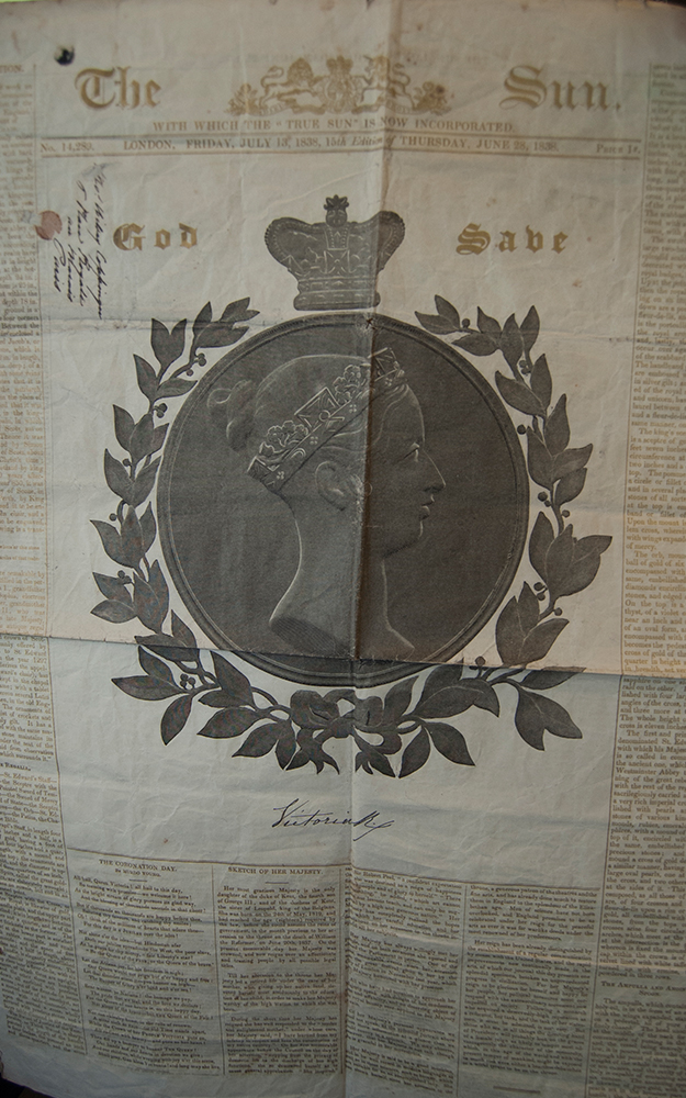
This cover page from the The Sun is a portrait of Queen Victoria was printed in gold and black. The first color black was put down, then the second ink with a slow drying time was applied to give the printers time to carry the prints down the street on a horse cart to a temporary tent on the street where applied gold dust to the wet ink. Apparently this process made the workers very ill turning their hair green because of poor ventilation and chemicals getting into their system.
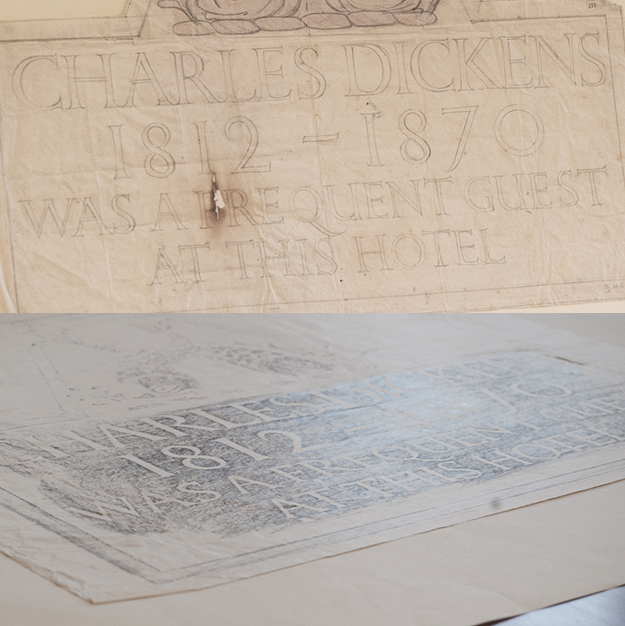
Here is an Eric Gill stone engraving sketch and rubbing for a hotel concerning Charles Dickens.
An original drawing of Gill Sans.
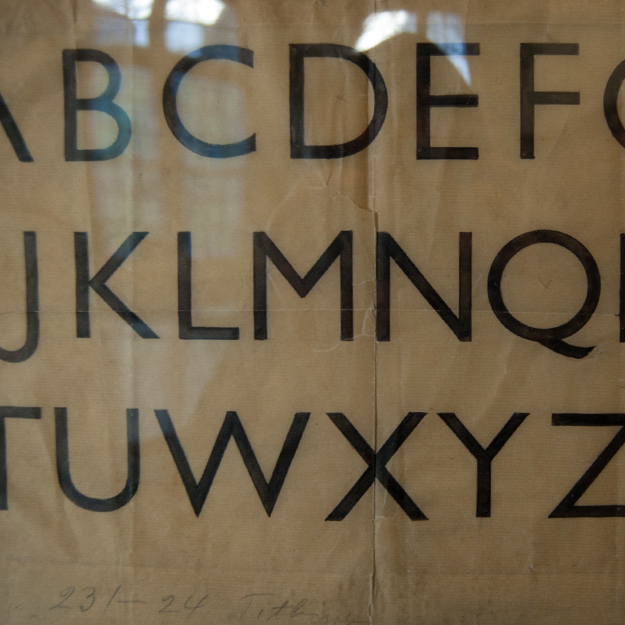
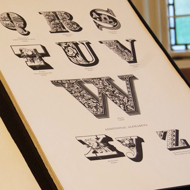
And the highly detailed alphabets of Louis John Pouchée.
After Saint Bride I made another trip to Collinge & Clark. 🙂
Day 7
We traveled to Amsterdam and rested.
Day 8
With a new day and a new city, Amsterdam was pretty fresh to us so we strolled around Amsterdam trying to get lost in The Joordan and in the canals – Amsterdam is good place for that – I and took a bunch of shots of street signage.
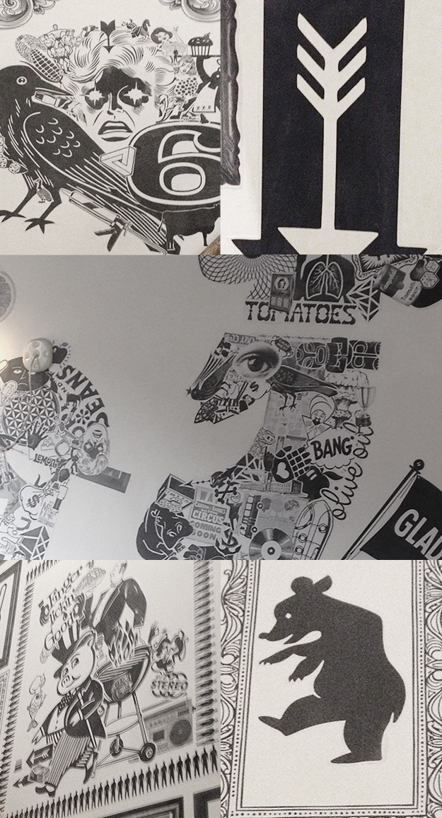
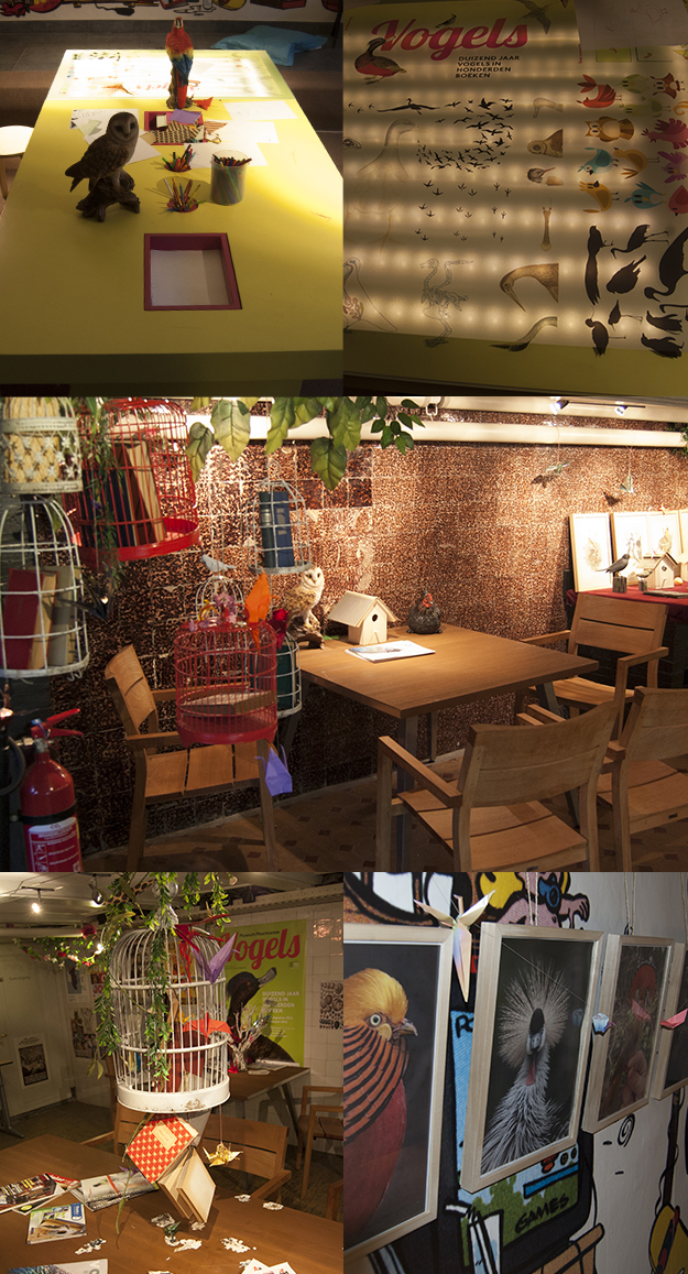
We had breakfast here at Cafe Bosco, where we later returned for dinner. The wall installations are really fun.
Day 9
For our second day in Amsterdam we visited the Stedelijk Museum. It had several great exhibits. One show called How Far How Near showcasing the work of Dorothy Amenuke, Meschac Gaba, Abdoulaye Konaté, and Billie Zangewa; another was The Best Designed Books of 2013; Marlene Dumas: The Image As Burden; and a large design collection.
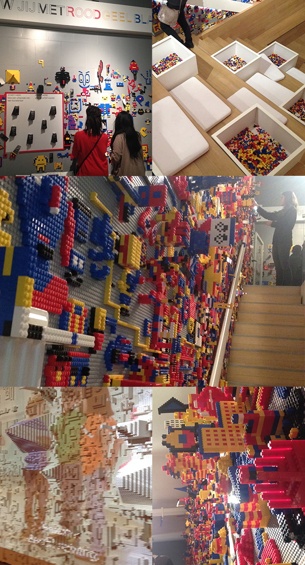
There was also this large room with lego boards on all of the walls, where visitors had built up images, words, and shapes. The room tiered down to a lower floor with a projection wall built out of white legos distorting the video that was projected upon it.
Day 10
On Sunday we took a 45 minute train ride to The Hague for a brief visit that afternoon. We went to the Museum Meermano just down the street from the Royal Academy of Art in The Hague. The museum had a small exhibit called “From lead to LEDs” documenting the change from printing with lead type to digital.
And it also houses a large collection of early printed books and illuminated manuscripts.
Here is the children’s learning area and the break room downstairs, the interiors are pretty fun.
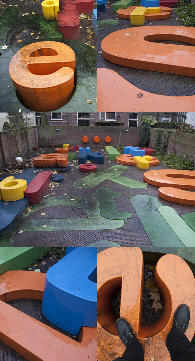
There was also this giant playground made up of large refrigerator magnet shaped letters. Most of the museums that had childrens’ areas, always tended to have a really cool one – good thing when you’re traveling with a one-year old.
Day 11
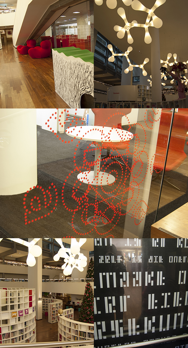
That morning we set out for a breakfast place we had read about the night the before only to find out is was closed when we arrived. Luckily a few doors down we found this place De Laatste Kruimel, which had really great quiches and coffee. After breakfast we walked to the Open Bare Bibliotheek Amsterdam.
The Open Bare Bibliotheek Amsterdam is Amsterdam’s newly built public library overlooking the Oosterdock just down from Amsterdam Centraal. The library is a wonderful piece of architecture, it resembles a hotel from the outside. Its six to seven stories tall which each level housing a different type of media, like children’s books, film, music, video games, books and periodicals. The top level is a theatre with a cafeteria, that has a great selection of dishes and beers. Yep a library with beer. You can’t go wrong with that.
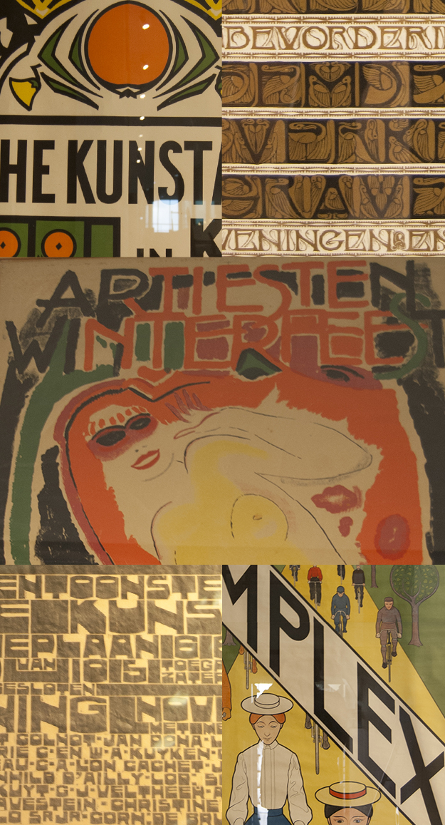
The library also houses a small gallery where they had a small Art Nouveau and Art Deco exhibition called “Beauty as life necessary” featuring the work of Chris Lebeau, Johan Thorn Prikker, Jan Toorop, and others consisting of glassware, metalwork, book cover design, and poster design.
Day 12
We woke up at the butt-crack of dawn and hustled down to the train station, making it just in time for our train to Frankfurt, which was kind of nice and easy ride to sit back and relax.
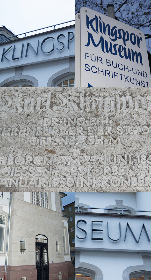
Once we arrived in Frankfurt we checked into our hotel and grabbed a bite to eat. Later that afternoon I took the S-Bahn to Offenbach located on the River Main just across from Frankfurt. There a few blocks from the Subway station was the wonderful Klingspor Museum for book art, typography, and Calligraphy.
Klingspor began as the Rudhard’sche Gießeri foundry in Offenbach in 1842. It was then taken over by Karl Klingspor in 1892 and was established as a museum in 1953, The foundry was taken over by D. Stempel AG in 1956 and continued working in the Graphic Arts until its bankruptcy in 1984. Over the years it worked with many designers such as Otto Eckmann, Peter Behrens, Heinrich Vogeler, Otto Hupp, Walter Tiemann, and Rudolph Koch.
It was later in the afternoon when I arrived at the Museum. I explained to the woman at the front desk that I was a graphic designer visiting from the U.S. and have a keen interest in type history and design. She kindly contacted their library to see if someone could show me around. I was then taken down to their bottom floor where I was welcomed by Helga, who was very accommodating. She walked me through some of the gorgeously attentive works of Walter Tiemann, Peter Behrens, and Rudolph Koch and some of their old type specimens. Good grief, I could have poured over these page by page for days on end. Unfortunately I cannot showcase the photographs I took because of rights issues with the Museum. But trust me they were gorgeous.
Helga and the rest of the crew at Klingspor sadly informed me they had to close for the afternoon. If you ever find yourself in the Hesse region of Germany for some reason, please go and visit the Klingspor Museum.
As I left that evening to head back to the train station and catch the next S-Bahn back to the hotel I was in a bit of an euphoria just thinking of all the wonderful things gracing the shelves of the Klingspor library. And the next morning we flew away back to homey Nashville.
Does it end now?
So what have I taken back from this venture? There is so much rich design and type history not just in London, Amsterdam, and Frankfurt but all across Europe, other places and even back here in the U.S.
These libraries, museums, and institutions often have a good amount of resources not only sitting on their shelves or in their archives, but a lot of these places have wonderful online resources.
In the U.S. we have the Herb Lubalin Study Centery of Design and Typography, the Hamilton Wood Type Museum, and other numerous institutions. Your own local cities and towns are filled with signage, stone carvings, and flea markets full of undiscovered finds.
Honestly, I really didn’t know that much about type history and I still don’t, but I want to. Discovering this little tip of the type iceberg only leads me to hunger for more and to continue searching and dig further into who did what and learned from whom.
I think designers should find what deep at heart that interests them and dig for more. Type is only one of many for me. We all live in the digital age with wonderful specimens and resources only a few clicks away. Go outside your norm and look for current and historical finds other than what fills Behance, Dribbble, and other social creative platforms. Let those things inform and push your work into the new and undiscovered.


