Whether you like it or not, Neumorphism is here to stay. Neumorphism, a dimensional user interface design style, is soon to be on your phone, your web browser and in your favorite apps. Apple is embracing the trend full force for its release of iOS 14 and macOS Big Sur, adding just a touch more shadows and rounded corners into our daily lives. “Flat design” isn’t going away entirely any time soon, but how will the added dimensionality change the landscape of interfaces in the future? More importantly, how can we capitalize on this trend without sacrificing user experience or blending into the background?

You’re So 2000 and Late
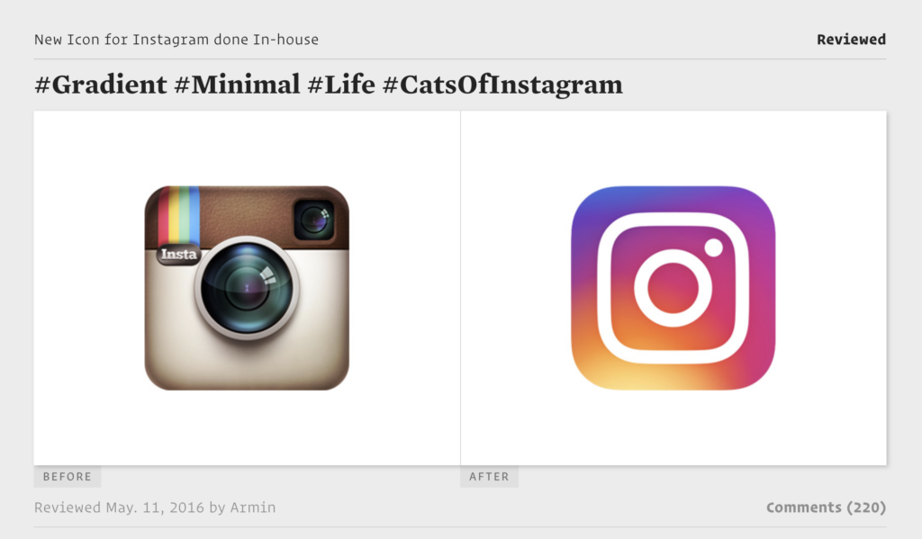
Neumorphism is considered the second wave of Skuomorphism, a design trend that was largely made popular by Apple’s original release of the iPhone in the late 2000s (sound familiar?). Skuomorphism took advantage of better screen resolutions on phones and other devices by using texture, colors and shadows to make UI elements like buttons and app icons seem “real.” After a few years of secret agent buttons with perfectly rendered bevels there was a major shift toward “flat design,” the rejection of photo-real graphics and embrace of clean colors and simple shapes. A great example of this is the evolution of the Instagram logo. The once realistic-looking square camera, complete with retro camera texture and a glossy glass lens, was evolved into a minimal, flat icon that captured the essence of the camera with none of the detail.

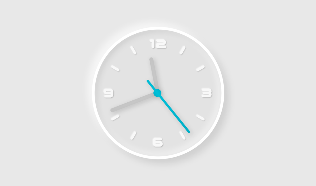
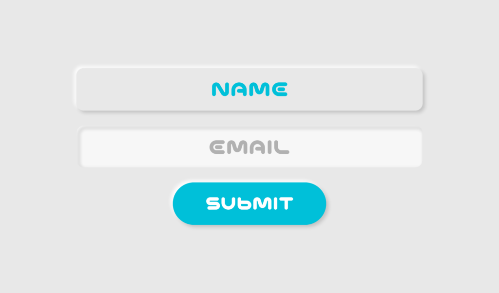
Neumorphism can simply translate to “new Skuomorphism.” The trend pairs the depth of Skuomorphism with the clean colors and shapes of flat design. In some ways it’s a resurgence of the past, but some people may see it more as a natural progression of flat design. It’s no secret that design trends cycle in and out of style. Designers and other cultural influencers will always continue to wrestle with form and function, trapped in the continuous cycle of abstraction and realism.
Riding the Neumorphism Wave
There’s good reason for some brands to embrace Neumorphism, but it’s not for everyone. Some brands will benefit greatly from this trend, while others will reject the norm and stand out because they’re different. It’s important to remember that while this style seems fresh and contemporary, it’s not new. If we look to history’s most recent example of hyper-realistic graphics, Skuomorphism, we see that while it became incredibly popular, it wasn’t long before it became even more unpopular. It’s inevitable that the wave of Neumorphism will reach its apex soon enough and come crashing down. So why should anyone catch the wave? Here are a couple things to consider before jumping on the futuristic bandwagon.

Should your brand be timeless, or adapt through time?
All decisions are brand decisions. Before embracing any trend, always consider whether the trend would compliment or clash with your brand’s overall vibe. At ST8MNT we often think of brand systems as a “visual language.” The question is, should Neumorphism become a part of your brand?
People often think that design should always be timeless, but this just isn’t the case! If your brand is trying to convey “cutting-edge tech” for example, you don’t need to have a “timeless” design aesthetic like a high-end luxury brand. If you want to convey fresh ideas and have the means to refresh your website every few years, Neumorphism might be for you.

Will Neumporphism enhance your website or app’s UX?
The biggest difference between flat design and Neumorphsim is dimensionality. Could it help your users to know where to click quicker if the buttons look like they are popping off the page? Could dimensional buttons give context within a navigation system’s hierarchy that wasn’t there before?
Surf’s up?
So, should you embrace Neumorphism and use this style for your brand? One criticism of Neumorphism is that the subtle colors can be difficult for vision impaired people to see. It’s imperative to put the user experience first, always. Always use appropriate visual contrast, and if that’s not possible with Neumorphism, then head back to shore. If Neumorphsim gives your UI the extra pop you need, catch the wave.

