In the midst of a public health crisis, communication is crucial to informing the general population about ongoing risks and prevention. During the COVID-19 pandemic, organizations like the CDC and health departments have the responsibility to provide information in order to save lives and reduce the spread of illness. Visual messaging on these crises has evolved with changing times, including diseases dating back to the Spanish Flu epidemic of 1918. Let’s take a stroll down memory lane to look at the design styles of the past century.
SPL/AGE FOTOSTOCK
Spanish Flu
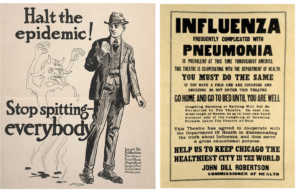
The Spanish flu infected a third of the world’s population and killed as many as 50 million during the last years of World War I. These two posters show the typographic expressions of the early 1900s. The letterpress poster shows the importance of text hierarchy, with headlines “influenza” and “pneumonia” bringing a stark warning about the conditions. The illustration issued by the US shipping board shows a demon-like figure representing the idea that spitting would aid in spreading the droplet and airborne disease (most of us now know that viruses aren’t demons, what a concept!). Using such fearful depictions displayed the gravity of the infection rate, and the deadliness of the respiratory disease. Designing epidemic illustrations and typographic posters helped to convey a message of importance to save lives.
Polio Epidemic
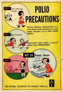
Polio is a virus that hit at least one part of the United States every summer beginning in the early 1900s, with terminal consequences, resulting in paralysis or death of children. One localized cluster occurred in New York City, resulting in whole families being quarantined. Residents were cautioned to avoid drinking from public water fountains, swimming in public pools and otherwise gathering in public. This poster design from 1953 is an evolution of communication that used more imagery, color, and a more dynamic design. The design choice here strikes less fearful, although the targeted audience would be adults, who influence the actions of the child. Again, illustrations help clarify the do’s and don’ts and help with action visualization. The design strategy helps amplify the public health guidance to prevent disease, focused on clear communication to the audience. Kids can now go back to play time, until their next timeout.
HIV/AIDS Epidemic
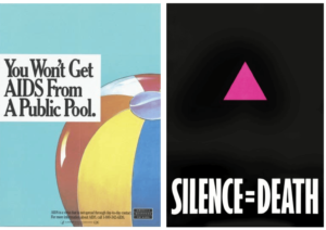
The 1980s brought on a surging death sentence for many LGBTQ+ individuals, with the HIV / AIDS epidemic bringing on panic and uncertainty about its origin, spread, and prevention. Common misconceptions were addressed as researchers gathered data, and organizations like America Responds to AIDS used conclusions on data to share that information through public announcements, bulletins, and banner design. Clear messaging like ‘You Won’t Get Aids from a Public Pool’ directly addressed the misinformation, and additional information was published at the bottom (sigh, beach balls make me miss the pool. RIP 2020). The CDC sponsored a public information campaign that resulted in shifting the narrative and stigma around AIDS. The striking purple triangle with a simple message “Silence=Death” is much more minimal, but its warning resonates. Activist campaigns were successful in persuading people to speak up about their actions to minimize harm for their friends and family.
Swine Flu and Ebola Epidemic
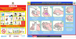
This century has brought on two newsworthy infectious diseases, the H1N1 pandemic and the Ebola epidemic. The visuals surrounding these tend to lean more into step-by-step visualizations and focus on an infographic design style. These two epidemics weren’t focused on awareness as much as showcasing visual cues about preventable steps. The red and yellow colors of the Ebola poster are flashy, playing a role in the danger and deadliness of the virus. The designs here are busier and not as beautifully designed than previous epidemics, with more focus on detailed information. The information is useful, but also results in less captivating and less memorable messaging.
COVID-19 Epidemic
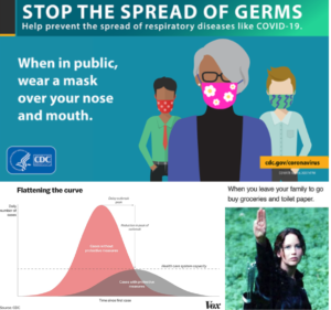
As COVID-19 has taken a toll on the global community, design continues to play a role in how we share information and spread awareness. Simple charts and data can be quickly shared on social media, and digital advertising has a more direct impact as less people travel and people consume more information from phones and devices. In the digital age, data visualization is crucial in tracking and forecasting patterns. Messaging like ‘flatten the curve’ dictates a constant reliance on data and charts that show that curve. As future health crisis come, we will be less reliant on demon scare tactics of the 1920’s (eek!, don’t let the tarot card readers know) and more focused on capturing data that helps people make informed decisions about their health.

