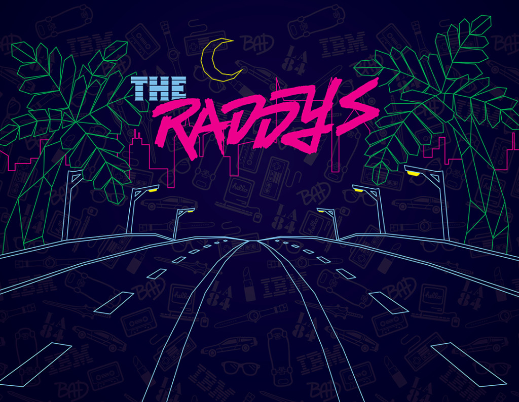
On Saturday, February 27th, over 400 people in the Nashville advertising community gathered to award the best work of the past year at the 51st Annual Nashville American Advertising Awards. This year, ST8MNT won one Gold and five Silver 2016 AAF Addys. Even more exciting than that, though, ST8MNT was honored to brand Nashville’s 2016 American Advertising Awards as The Raddys, a transformative night of nostalgia bringing to life the obscure and iconic moments of the 1980s.
THEME CONCEPT
Looking to spice things up with a theme that would ooze fun and excite the creatives working on it – we hijacked “The Addys” and turned it into the “The Raddys.” Our only rule was to execute in an unexplored manner, picking out untapped moments and icons of the 80s that others had not ventured. And for the advertising audience – utilizing quirks of 80s technologies and processes, as well as moments that would have affected the course of advertising during the 1980s.
For copywriting, we were totally choice, using non-sensical, mix-and-match slogans and quotes of eighties pop culture. Keepin’ it bitchin’!
BRANDING IS WEIRD SCIENCE
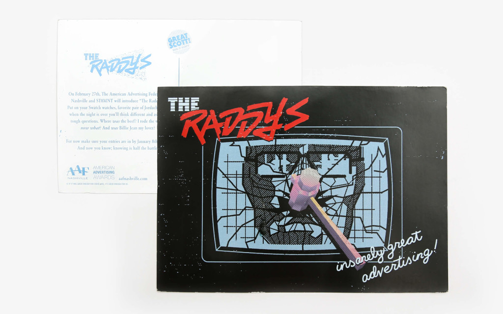
A RAD film influenced punk brush letter logo, that your homefry would’ve plastered on his skateboard or Huffy, was crafted as the logotype. The theme announcement was a play off the iconic 1984 Apple commercial with the athlete’s hammer smashing through the buzzing screen of tyranny. So clutch.
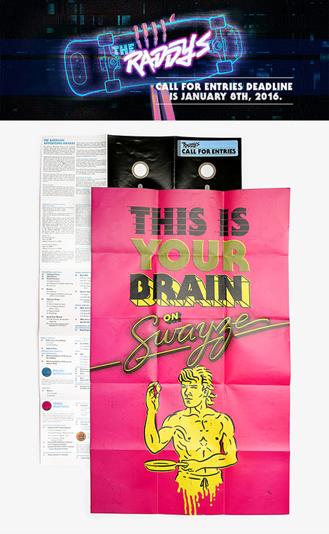
The call for entries was a mix and match of Powell Peralta, analog glitch, and early computer generated art for the digital campaign. We followed up the radical digital campaign with mailers for invitees. The call for entries was a wicked floppy disk poster that unfolded to reveal Patrick Swayze frying an egg, referencing the infamous PSA “This is your brain on Drugs.” The other side of the poster featured an array of buttons, which served as a way-finding system for award categories.
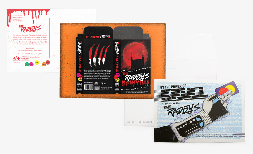
Inspired by B-movie slashers, our save-the-date postcard displayed a sick VHS cover of our own. The front carried out American Werewolf in London vibes and the back was a simple lo-fi Peralta inspired ripper hand. The official invites were sent out using the power of Krull.
A PARTY FIT FOR FERRIS
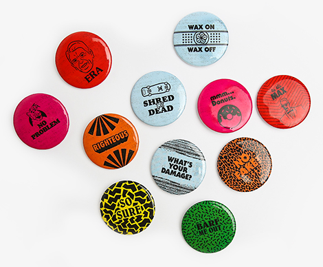
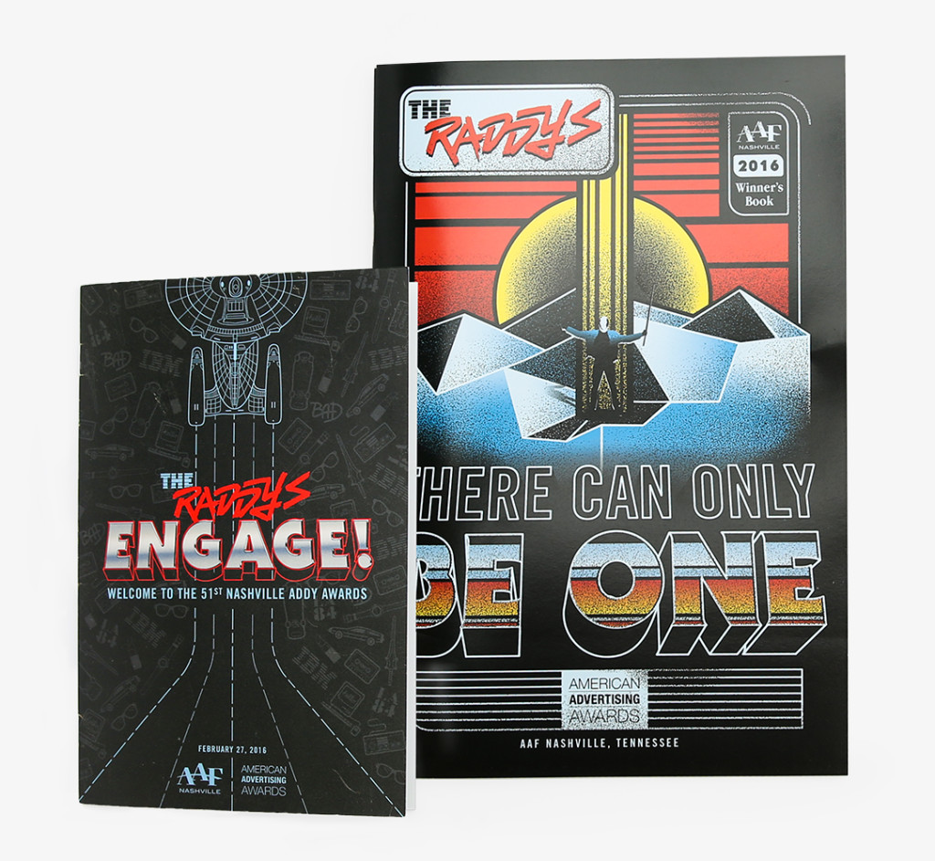
Upon arriving at the Raddys, all guests received a winner’s book, one of 42 pin-back buttons, which had corresponding table markers, and a drink ticket. We designed 42 pin-back-buttons that utilized different 80s mash-ups, moments, gnarly patterns, and different era-centric typefaces like Belwe, Goudy Heavyface, and Serif Gothic.
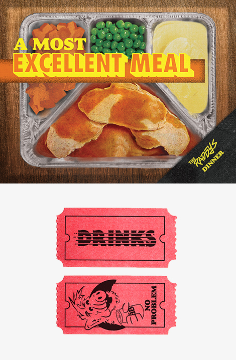
A favorite detail of the event was the drink ticket image of Alf holding a can of Tab.
The 80s TV dinners and their faux realistic imagery and bold design inspired us. We applied that unmistakable aesthetic to our own mock TV dinner tray. It was a fun way to show how commercial marketing has evolved since the 80s.
Being a group of designers, we have always enjoyed the look of the early arcade vector games. Galliga and Tempest, to name a couple, were the graphic inspiration for the photo booth backdrop. As for the environment, we wanted a minimal Miami Vice setting since nothing evokes the party spirit of the 80s like palm trees and city lights.
We kept the visual language loose, nostalgic and totally awesome. From the copywriting to the color palates, we enjoyed every bit of this campaign. Fingers crossed it wins an Addy in 2017!
