Let’s just go ahead and say it… Moodboarding is (among other important things) one of the MOST IMPORTANT steps in the brand building process. Your moodboard not only serves as a guiding north star for your brand, it can also be considered the foundation as to which your brand will grow and expand on. It’s your compass and your building blocks, establishing the visual and abstract goals for the future of your brand.
Moodboards also serve as an important bridge between you/your brand and the designer or agency that is creating the board. When it comes to our process, we (the agency) begin by building out multiple moodboards based on the discovery phase where we research, discuss, and collaborate with the client on the brand foundation. During this process almost all of our designers are heavily involved, so that we can achieve the broadest range of imagery and ideas to start out with. Moodboards are very useful during the beginning phases of a brand because 1) they are fairly easy to create and 2) they spark conversation between the client and designers and help to establish the brand aesthetic efficiently and visualize vocabulary for alignment (i.e. this saves money and time AND helps the design work start off on the right foot – for example, be on the same page of what a person’s idea of “fresh” is). Moodboards can also be very helpful to the process when clients create an initial inspiration moodboard to communicate their vision. The more visual information that a designer has to go off of, the more streamline the process will be.
The purpose of this guide is serve as a tool for anyone who is interested in creating moodboards, whether you are a designer wanting to knock the socks off your client or you’re the client looking to build a strong and successful brand.
1. Where do I create my moodboard?
There are tons of resources online that can aid you in creating your very own moodboard. Here are a few of our favorites:
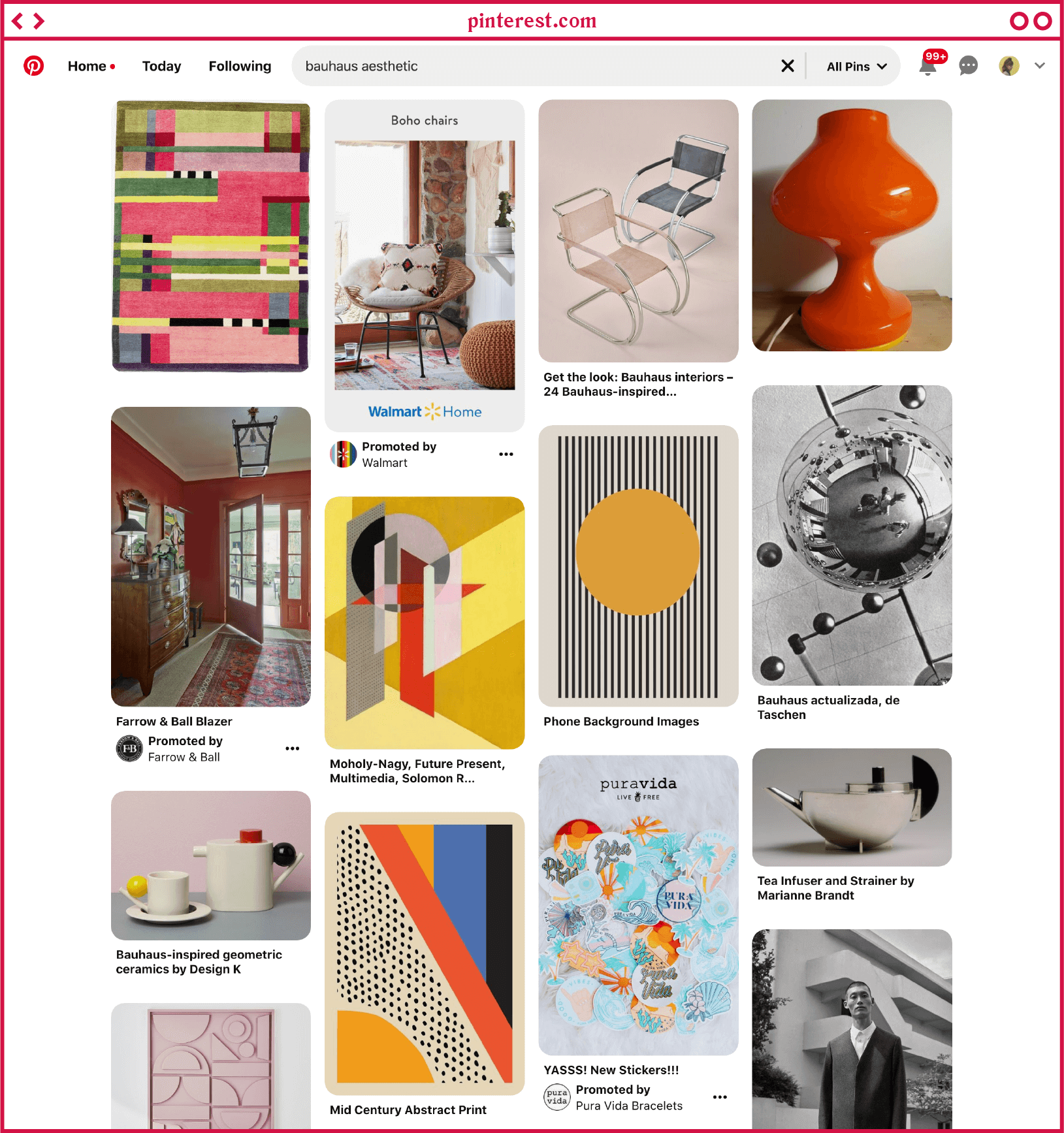
Pinterest is a great tool, not only for gathering images, but it also provides an easy place to create “boards” where you can organize and build your own moodboards. Here are a few tips for finding great images on Pinterest:
1. As cringey as it may sound, adding the word “aesthetic” to the end of whatever you are searching for will pull up some great visual resources specifically for moodboards. For example, if you were creating a brand for a tiki bar try searching terms like “tropical aesthetic” or “orange aesthetic”.
2. Make use of the “More like this” feature. When you find a specific image that you like, make sure to click on that image. After you’ve saved the image, scroll down to the “More like this” section. Pinterest will filter and select other images that are similar to the one you’ve just clicked on. This is actually one case of a productive rabbit hole.
It’s important to note that while you may be tempted to use these images for design work, the images you pull from Pinterest should serve only as inspiration. Most of the images are not free to use and are the work of other artists and photographers. It’s important to give credit where credit is due.
As far as the actual building out of your moodboard, Pinterest is a great starting point, but it doesn’t offer the customization found with some of our other favorite design programs/websites.
Invision
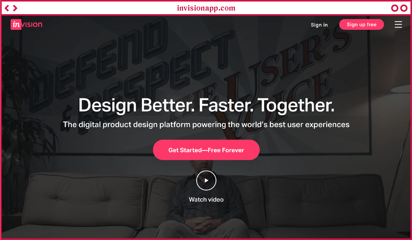
Invision is an online resource for easily building boards, as well as prototyping digital designs such as websites and mobile apps. The free version of Invision allows you to create up to three boards or prototypes, this is a great way to go if you’re just creating a few moodboards here and there. Go ahead and test the site out and see if it is something you’d like to invest in before you take the plunge for the paid version.
Creating your moodboard with Invision allows for a lot more customization than sites such as Pinterest. Simply drop in your images and arrange them however you’d like. You can organize the images into different sections, each with the option of having a section header. You can also add color swatches and notes to your board. One example of how we take advantage of these features is by creating multiple color palettes using the swatch tool and then organizing them into their own their respective sections. The “notes” tool can be handy if you want to include any URLs that serve as website inspiration or if you want to include brand messaging examples.
Using an Adobe Program
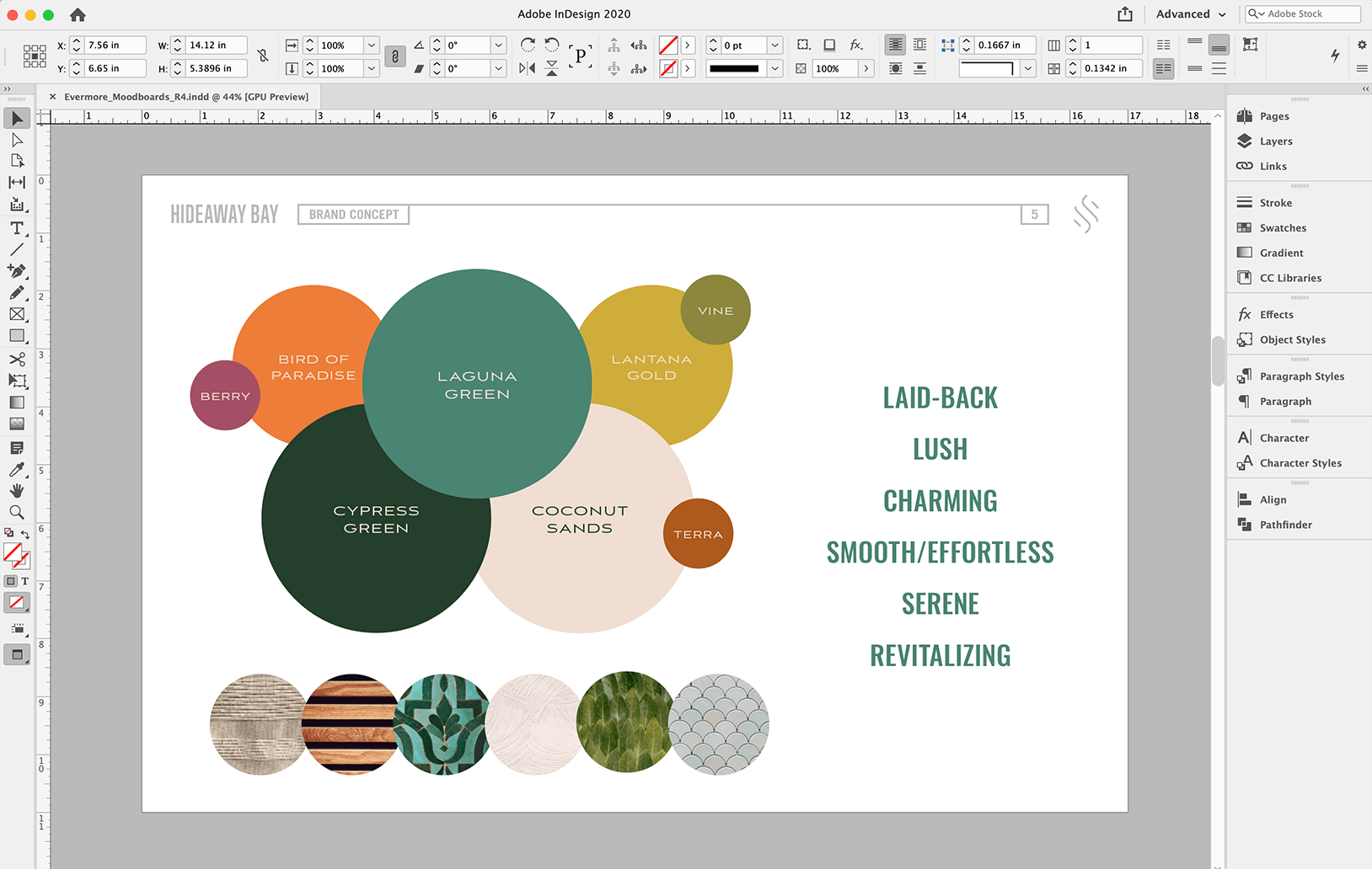
The best way to create a custom moodboard, organized and displayed exactly how you want, is through an Adobe program such as Photoshop or InDesign.
If the look you’re going for is more organic and heavily based on blending imagery, Photoshop is the way to go. With photoshop you can easily drop in photographs, textures, patterns, typography and more. You can easily move and arrange each element on the page. You can even overlap elements and try different blending styles to create a unique look.
If you are wanting to achieve a more organized and grid-like moodboard, InDesign is your best bet. Use guidelines to create a grid on the page, then drop your images in and size accordingly to the grid.
Use the shape tools on either app to create color palettes or textile/pattern palettes. Don’t be afraid to get creative with your moodboards, adding in paper textures, polaroids and other digitally-tactile elements (is that a thing? ¯\_(ツ)_/¯)
2. Gathering Materials
As mentioned before, Pinterest is a great resource for finding an array of elements for your moodboard. Similar to Pinterest is Designspiration. Designspiration is a little more curated with an eye for design. Both provide a great source for photography, patterns, illustration, branding, etc.
Two great places to grab free-to-use photography are Unsplash and Pexels. Grabbing photos from these sites are a great idea if you want to showcase photography that can potentially be used for your design and marketing projects.
At ST8MNT we are constantly creating moodboards that are meant to inspire logo design, brand identity, digital design or marketing materials. A few of our favorite places to grab inspiration for boards are Dribbble, behance and awwwards.
3. Get Inspired
At ST8MNT, we create moodboards for just about every client we have. Here are a few examples of moodboards we’ve created in the past:
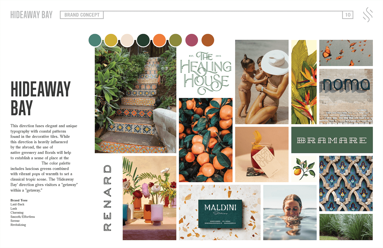
Since we wanted to create a gridded design for the board featured above, we created the moodboard in Adobe’s Indesign. This is just one page from the entire moodboard presentation, which was created in order to present 3 overall brand directions for a resort.
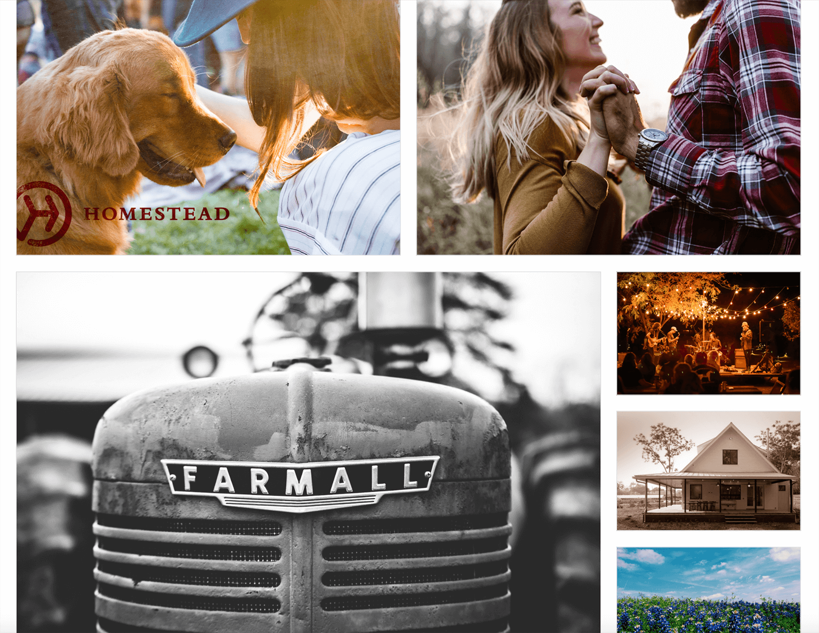
The board above was created in Invision for a development in Texas. This section of the moodboard showcases possible imagery that could be used to steer the direction of the marketing campaigns.

The collection of images above was also created and presented in Invision, and was created to inspire brand and bottle design for a whiskey made in Tennessee.
We hope that this served as inspiration and was helpful to your process. Now, go forth and moodboard!


