Prologue — The Universe 宇宙
The universe didn’t want me to go to Japan. At ST8MNT, employees take a sabbatical after five years of work. The idea is to travel outside of the country to experience a culture and atmosphere other than our own. Gain some world experience. Get inspired to approach creative challenges from a new perspective. When I started at ST8MNT, a couple of my colleagues had just taken their sabbaticals and shared all about the new experiences and great design they’d seen along the way. I couldn’t wait until a few years later when I could go on mine!
Well, wait I did. Five years into my ST8MNT design career the world entered a global pandemic. I decided I wanted to visit Japan for my sabbatical and I was willing to wait until they opened their borders. Three years later I found myself booking a trip for Jade (my wife) and me to visit Japan in the summer of 2023.
After countless hours of planning and eight years of anticipation, we boarded our flight to Tokyo only to be immediately greeted by a message from our pilot that the flight was canceled due to technical difficulties. The universe didn’t want me to go to Japan.
1 — Endless Inspiration インスピレーション
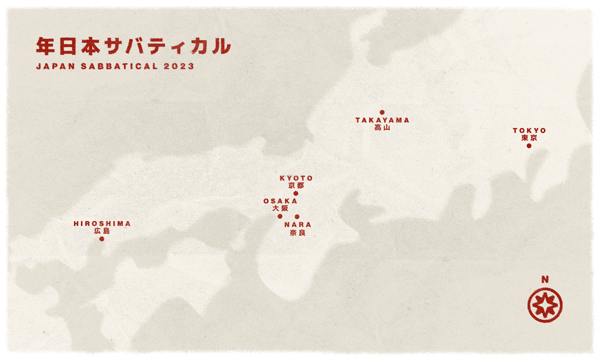
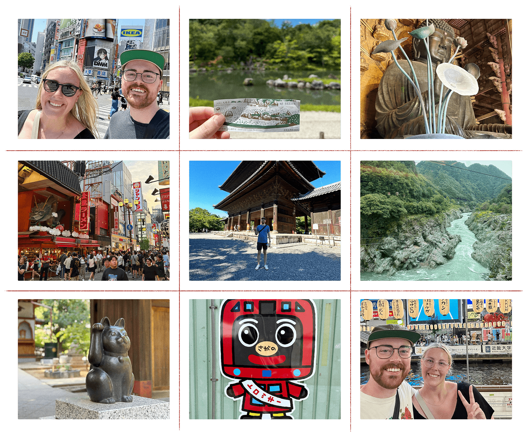
Well … the universe got over it! We called the airline, booked a new flight and 36 hours later we touched down in Tokyo. The first few days we spent exploring a few of the big sights of the biggest city on earth, and it quickly became clear we could spend the rest of our lives here and never see it all. We were immersed in a sea of neutral clothing and vibrant signage in this incredibly well-designed city.
Whether we were in the clean-cut wards of Tokyo, the mountainous countryside near Takayama, the traditional and beautiful Kyoto or the gritty streets of Osaka, I found myself constantly taking photos. While I was inspired by so many things I saw, I was particularly drawn to the diverse styles of typography I was seeing everywhere I went. From expressive letterforms in advertising to clear wayfinding systems in train stations, visual design is clearly a crucial part of Japanese society.
Traveling around Japan is incredibly easy thanks to high-speed trains called Shinkansen and robust public transportation systems in each city (we will get to those later).
2 — Form (Expressive Type) タイポグラフィ
For context, dear reader, I am writing this post from a western perspective. I don’t claim to be an expert on Japanese typography. However, I am an expert in visual communication and setting type. In some ways, I didn’t understand any written Japanese I saw. In other ways, I understood exactly what was being said, which is a testament to the great visual communication I experienced through design.
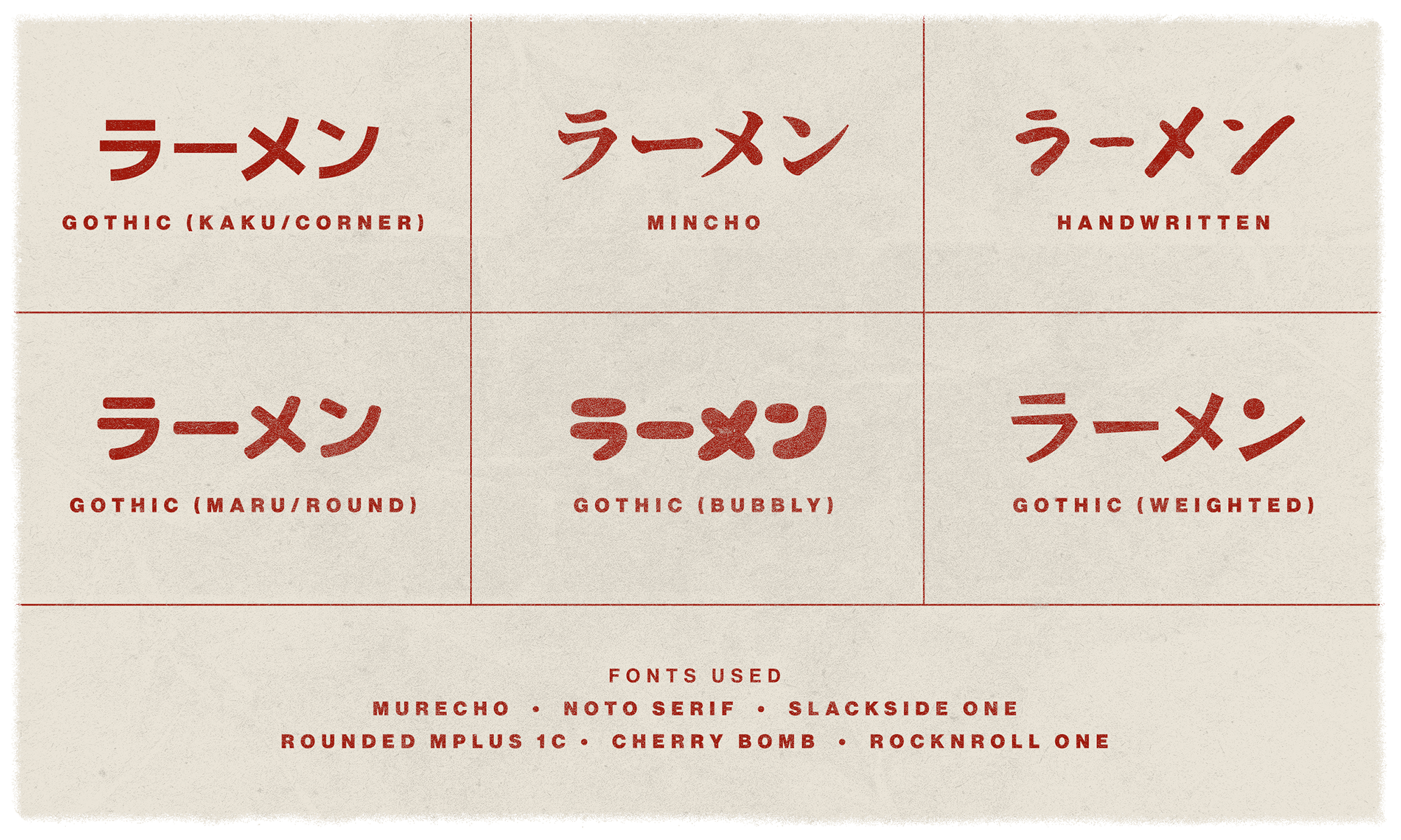
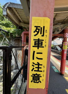 While there’s no shortage of differences between latin script (the Alphabet) and the three Japanese scripts (Kanji, Katakana, Hiragana), there are many similarities in type styling. Let’s take typography through advertising as an example. Much like in western design, bold type can communicate something strong or powerful, handwritten type can make products feel artisan, gothic (similar to sans-serif) gives a modern vibe and mincho (similar to serif) feels refined and classic. My time in Japan solidified what I’ve learned over the years — perception is a massive part of communication. Without being able to read what I was seeing, I understood the attitude of each brand, which — along with imagery and ample kawaii (cute) brand mascots — helped me understand what was being advertised. The same goes for type outside of marketing. For example, large black text on a yellow background is still the universal symbol for “watch out!” Type styling and the use of design conventions transcend a word’s definition and contribute to a universal language.
Did you know that Japanese scripts are designed to be read horizontally and vertically (from top to bottom)? This allows for greater flexibility in layouts.
3 — Function (Successful Systems) システム
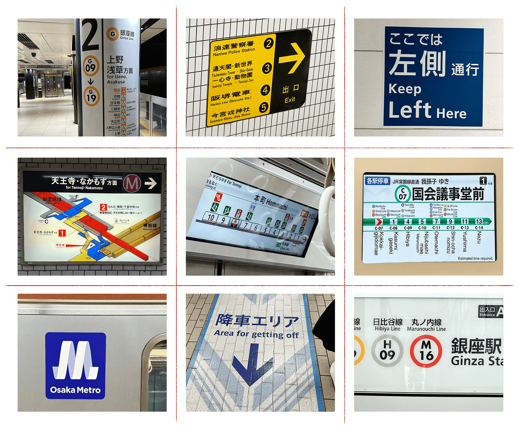
As someone who can’t read Japanese, I was a bit nervous about navigating around the country. I downloaded several navigation apps and planned out as much as I could before heading overseas. Turns out — I had nothing to worry about! I experienced many wayfinding systems while in Japan and each was very easy to navigate. This was inspiring to me, as wayfinding design is a passion of mine. I’m fascinated with the concept of a “global language” and the idea of communicating information to a broad audience with different perspectives. Through the use of clear iconography, multiple written languages, color coding systems and arrows, the wayfinding systems of Japan were incredibly effective in guiding people to where they want to go. Here are a few examples of the excellent wayfinding design I saw in Japan.
Logos for public transportation organizations in Japan are awesome. However, Osaka Metro takes the cake as it is cleverly an M and an O at the same time.
4 — Something to Noodle On 麺類
In Japan, there’s greater emphasis put on the collective rather than the individual. This perspective is felt throughout the visual language of the country. Design in Japan is accessible and intuitive, which leads to the success of design systems and everyone who interacts with them. I’ve been gr8ly inspired by this perspective, and I know this experience will influence my design decisions moving forward. Dōmo arigatō gozaimasu ST8MNT for the opportunity to go on this unforgettable trip!
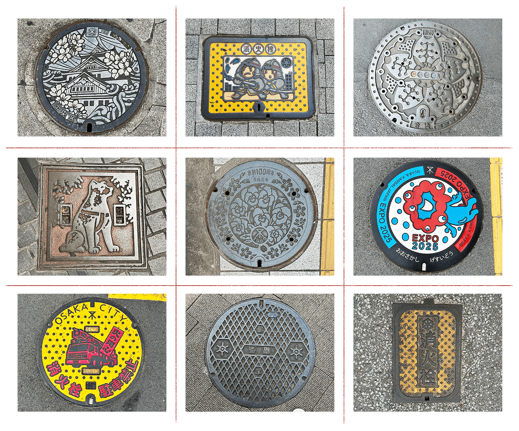
The maintenance hole covers in Japan are all beautifully designed! Check out some of my favorites below.
