It’s always disappointing when you’re planning your next getaway, and you come across a find with branding that spot on, but the architecture, rooms, and interior execution is not. And disappointing if its the reverse – an exceptional hotel deserving of exceptional design. Basically, gold shouldn’t be rolled in shit.
So…We’ve made a list of first-rate getaways that having both the suit and suitor going for them.
1. Wanderlust Hotel – Signapore
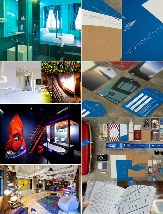
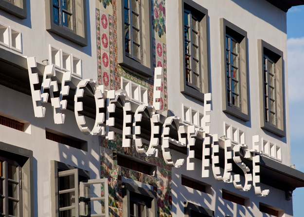
To start, there is Wanderlust in Singapore; a whimsically eclectic destination that features tastefully themed rooms. Sorry, no heart shaped jacuzzi’s. You can stay in one of their several monotone suites referred to as the “Pantones”; a linear illustrated room that feels like a paint-by-numbers. Then, the rooms get a little more adventurous. What do I mean? Well you could stay in a spaceship retreat, a tree/house, I mean treehouse, and yes, a giant type-writer. The four floors even feature different concepts: Lobby – industrial glam, Level 2 – color mother fucker!, Level 3 – no grays, Level 4 is where your imagination can run wild with monsters and fantasy destinations galore.
The hotel interior and exterior is a great mix of pattern meets contemporary design.
Branding was done by Foreign Policy Design Group. It makes you want hop aboard Pan-Am with a one-way ticket to a vacation worthy of Frank Abagnale.
2. Ace Hotel – New York, Los Angeles, Seattle, Palm Springs, and Portland
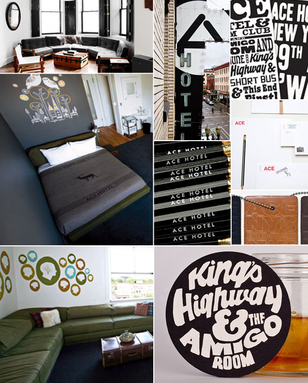
Next we have the Ace Hotel, a kitschy find with locations in New York, Los Angeles, Seattle, Palm Springs, and Portland. The locations each have a good mix of modern, americana, repurposed furniture, and campy decoration. If you’re a designer you will want to chill here.
Branded by Official Mfg. Co, it goes hand-in-hand with the hotel experience (block-type, retro signage, lo-fi typography, a mix of vintage design, and an earthy color palette). This hotel is bound to attract its counter cultural audience. Yes, it definitely speaks to a certain crowd like any boutique hotel, though it does so in a way that doesn’t feel “alienated”.
3. Hotel Wiesler – Graz, Austria
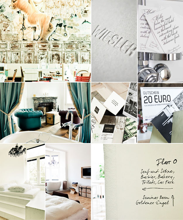
Not sure when your going to find yourself in Austria next, but when you do (and you have the company Visa) stay here. The Wiesler is a fresh concept that feels like a collage of marbled paper, water color, and gatsy-grandiose. Founded in 1870, Carl Wiesler took a collection of guesthouses and began a luxury hotel. It took a fall in post-war Europe until being revitalized in 1986. This place is the definition of modern luxury.
Designed by Moodley, the hotel’s branding allows the location and hotel to speak for themselves. White space and playfully simple typography seem to portal 1909 to 2013. The website not too shabby either.
4. Hotel Lone – Croatia
Lone looks like a contemporary resort from the mind of Walt Disney’s on the outside. I mean that in a good way, just hear me out. It is bright white in a minimal-esque shape with floor breaks that give glimpses into the euro-modern hotel interiors. It feels like a confluence of work and play.
The graphical representation does just that! Designed by Bruteka-Zinic, the visual language of this hotel utilizes flowing lines, a nice serif, playful imagery, and a limited color palette of red and white. An hip invitation for this locale.
5. Iori Hotel
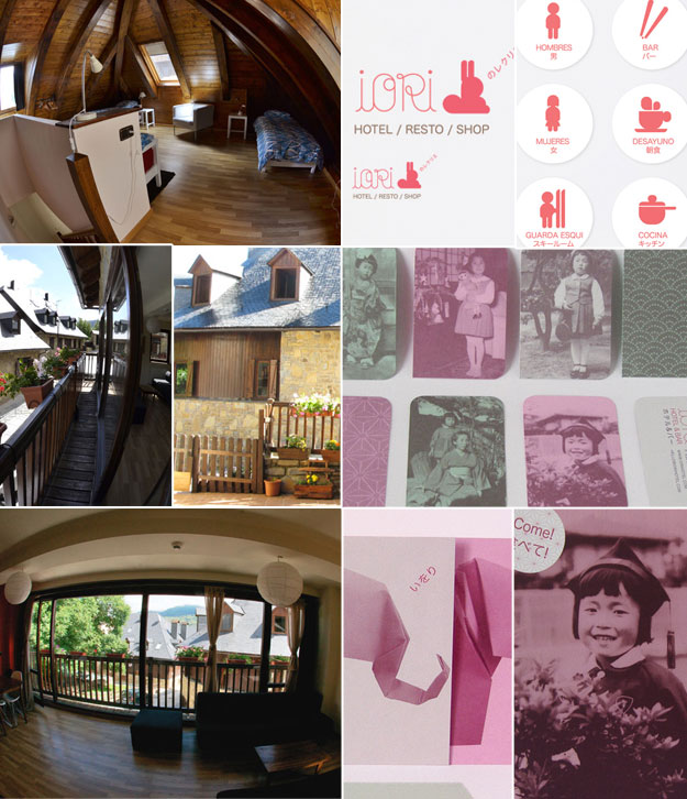
For those of you with a Japanese-Pop itch, I give you Iori. This quaint getaway features a mountain-cottage exterior with a modern Japanese style interior. Functioning as a hotel and restaurant, it is surprisingly located in Vielha, Spain in the Val d’Aran of the Pyrenees.
These hotel greeting cards are a both a sophisticated and lighthearted way for travelers to write friends and family.
The branding was done by Tea Time Studio who have a playful approach in the representation of Iori. There is a combination of traditional Japanese imagery, old family photos, and fun iconography that gives Iori a welcoming and familiar feeling in its Spanish mountain design.
Send us your favorite stays and finds!


