Have you ever heard the phrase ‘accessible design’ and wondered what it meant? Maybe you’ve been asked to create a product that meets the Web Content Accessibility Guidelines 2.0 standards, and thought what the heck does that mean? Maybe you’re like me and you opened the link only to find an HTML file poorly laid out with a lot of content and not a lot context, closed the link and thought ‘I do NOT have time to comb through this.”
While it’s easy to push accessibility standards to the back burner on a project… kind of like that list of weekend chores or that New Years Eve Resolution(s)… the reality is that we as designers have to start making a conscious effort to create designs that can be used by every user.
So what do I mean when I say every user? I’m referring to everyone with access to the internet. Users who are blind, color blind, deaf, hearing impaired, users with mobility issues… the list goes on but you get the idea. We have an obligation as designers to ensure that each product we create is not only beautifully designed but inclusively designed.
An article by Wired puts this issue into even more perspective:
“A FEW WEEKS ago, Lucy Greco heard a story on NPR about more clothing retailers shuttering their stores and moving online. Oh, great, she thought, recalling some of her past experiences with online shopping: “You’re clicking on something that says, ‘graphic graphic graphic,’ or some numbered file name, or some gibberish like that.”
The internet can be like this for Greco, who is blind and uses a screen reader to way-find online. Screen readers convert display text into synthesized speech or refreshable Braille, giving visual displays an audio equivalent. But many websites have features that make them impossible for her to use—unlabeled graphics, forms with missing field labels, links mysteriously named “link.” Greco says she runs into issues like this “90 percent of the time” that she spends online. When she does, entire chunks of the internet disappear.”
The Internet Is for Everyone, Right? Not With a Screen Reader
Arielle Pardes
Did you read that snippet and immediately think of all of the unlabeled graphics and empty alt tag fields you have added to a site? Not to make you feel even worse, but let’s add a few statistics in just so we can fully understand the gravity of the situation.
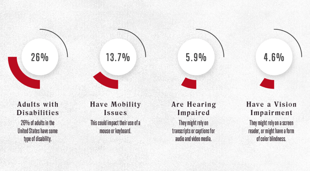
It’s estimated that 20% of the United States population has a disability:

Credit: www.interactiveaccessibility.com
19.9 million (8.2%) have difficulty lifting or grasping. This could, for example, impact their use of a mouse or keyboard.
8.1 million (3.3%) have a vision impairment. These people might rely on a screen magnifier or a screen reader, or might have a form of color blindness.
7.6 million (3.1%) have a hearing impairment. They might rely on transcripts and/or captions for audio and video media.
Of that 20%, 54% are estimated to regularly access the internet. And when, as Lucy said, 90% of the internet fails to use ADA compliant regulation, you start to see the big picture: we’re creating products that are inaccessible to a large portion of users.
So how do we fix it?
I’m glad you asked! Below I have compiled a simple checklist of ways you can improve your website’s accessibility.
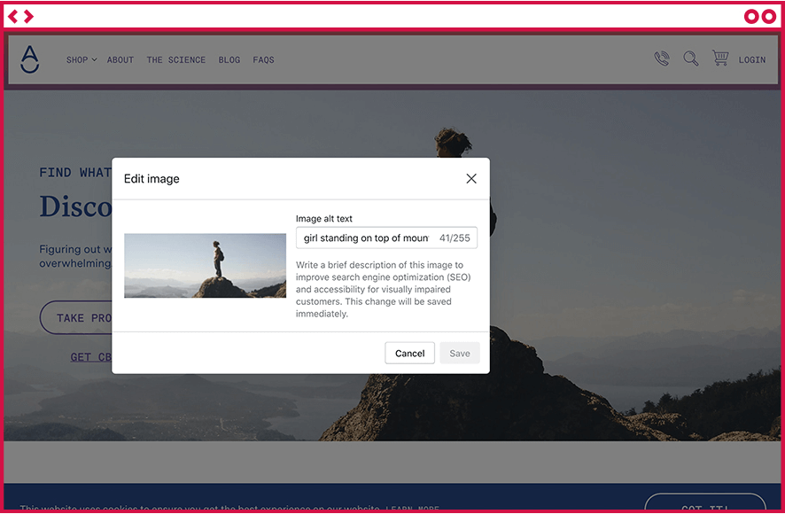
Don’t Skip Adding Alt Text to Site Images
Considered the cornerstone of accessible web design, alt text helps describe images to users who cannot see them. This is why it’s important to use descriptive language when describing the images on your site, as opposed to image1.png.

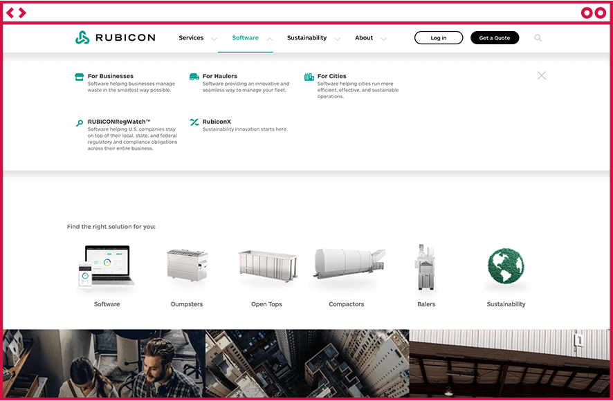
Don’t Rely Solely on Color to Get Across Important Messages
It almost feels like a default reaction to add color to a CTA to make it stand out. But what about users who can’t differentiate that bright red text from the black body copy underneath it? Try adding a box to the CTA, an underline, or graphic treatment to make it stand out.

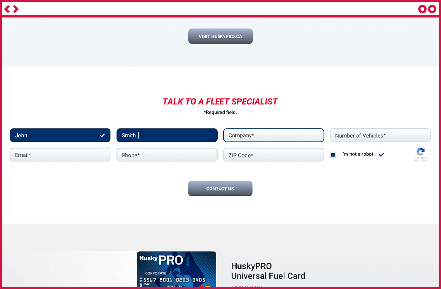
While we’re on the Topic – Stop Using Color as an Indicator on Forms (and don’t forget to fill out the form field text!)
We LOVE to use color to get across active/inactive states on forms. But what happens when there is an error? We can’t just outline the form field in red to show an error state. Instead try adding a background to the form field, a symbol, or an error message.

Notice that the checkmark icon appears next to the “I’m not a robot” field. Another great way to indicate a success message.
That’s it! Well, not really, but it’s a great stepping stone to help user’s more easily navigate your site. So the next time you sit down to create a new design, implement new content or perform routine site maintenance, take a moment to check your site’s accessibility and make sure that it’s designed with everyone in mind.
Helpful resources to check your site’s current accessibility:

