Flirting with trying something new this year? February’s the month to fall in love with some of these of-the-moment design trends (or to take their curators out to a nice steak dinner):
Ambigrams
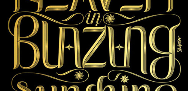
Tops our list because they are smart (both mentally and aesthetically). We’ve seen resources for type nerds flourish over the past few years, and the internet can now satiate a designer’s every typographical appetite. Most recently, we see the emergence of type that can be read from any orientation or position, or backward and forward.
Parallax Scrolling
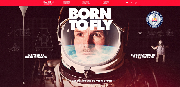
In an age where all the information that we could ever need exists in a 6″ x 2″ device in our pocket, designers and developers are creating new and interesting ways to interact with that content. Enter parallax scrolling, a new way to engage with a web presence. Think traditional animation mixed with optical illusions.
The Stamp
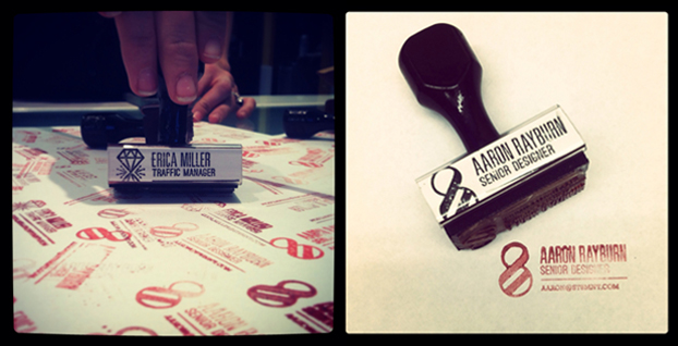
Visible imperfections remind us of the craftsmanship behind design. The revitalization of the stamp has become the easiest way to fulfill this desire, allowing designers to prepare a space for imperfection and the means to execute it.
Glitchy-Digi-Retro-Tech
Representing old technology with new is a thing of beauty, and we’re seeing a surge in this technique, even on the big screen. The twitching, glitching and ghosting of images across a screen is mesmerizing… dare you to end this clip early:
The Minimal
A return to minimalism has been trending in the design world for the last half decade, and even though we see it everywhere doesn’t mean that that we’re sick of it. If anything, the mass quantity of crappy execution makes the successful minimalism really shine.
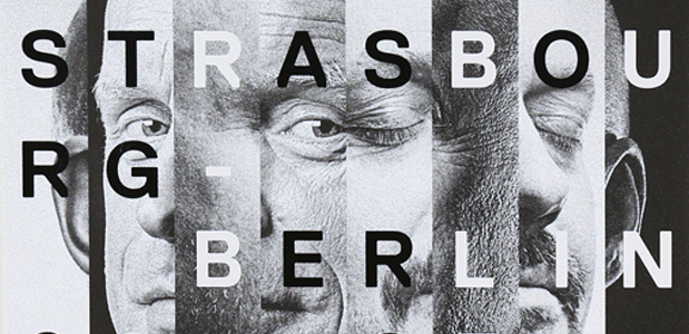
Stripes
Whether it be latitudinal, longitudinal, or diagonal, lines are a long-time friend. They seem to be one of the most simplistic uses of pattern, elegantly using repetition and a constant rhythm to add a sleek and humanistic quality to design. They may not be as young as they used to be, but with age comes experience.
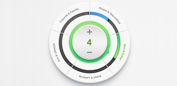
Large Buttons
This interface element started to pop up a few years ago as mobile users began to shift web usage from desktop to mobile. With responsiveness now standard, our fat fingers need more wiggle room for a more fluid experience. Aside from being functional, bigger buttons give type a larger runway for strutting its stuff.
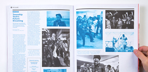
Luxury Printing
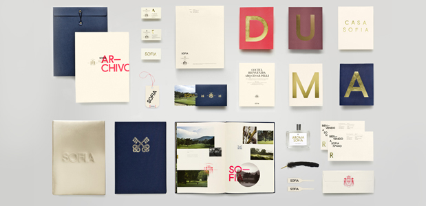
As the presentation and exchange of information moves toward digital, designers are rethinking their approach to printing. We all love the experience of holding and interacting with a physical artifact which is why we’ve seen a transition to printing budgets that focus on quality ingredients. There are some things that a glass screen, mouse click, or gesture will never be able to recreate…at least not yet.
