Hello.
I’m Zach, and I’m pretty new at St8mnt.
I’ve been here for about a month doing design and web development. It’s been fantastic so far! I’m very grateful for the people I get to spend my days with. We work really hard here, but try to have a lot of fun. I’ve been here long enough that I was asked to write a blog post about something in design that inspires me. Here goes…
I love cars. Ever since I was a kid, I’ve always loved cars. I appreciate everything from big mud trucks to fast Japanese cars. I can’t get enough. Every car I own I modify. This might be as simple as a new set of wheels, or it might be as complicated as a full engine/exhaust and transmission swap.
These days though, I’m addicted to Volkswagens. They are quite possibly the coolest brand on the planet. I love the old ones, the new ones… you name it, I love it.
I’m the guy who would be honored to be seen in a lime green VW hippie bus with a big huge Grateful Dead sticker on the back. No shame in this game. VW’s are my thing. (pun intended)
I also love typography. Letterforms truly inspire me. I dissect restaurant menus when I go out to eat, much to my wife’s shagrin.
Last weekend I travelled down to Chattanooga for a Volkswagen event called Bug-a-Paluza. It’s a 2 day gathering of VW fans and their cars. There are early air-cooled VW’s, all the way to modern water-cooled, upgraded turbo, lowered on race wheels type VW’s. It’s amazing!
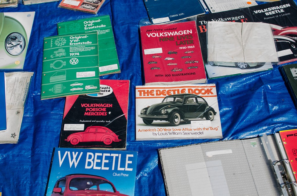
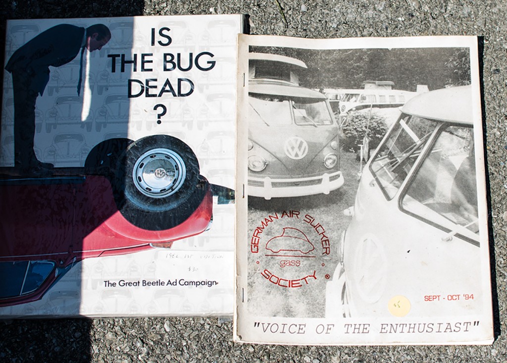
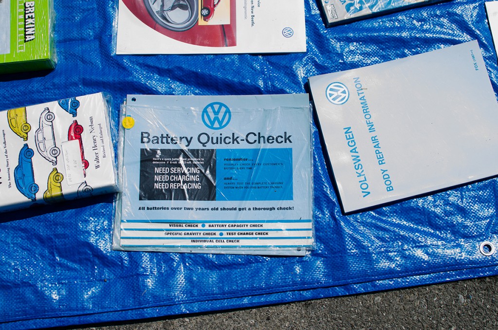
Bug-a-Paluza also has a pretty extensive swap meet. I knew it would be a great opportunity to break out my camera and take some photos of old advertising/packaging/dealer collateral material.
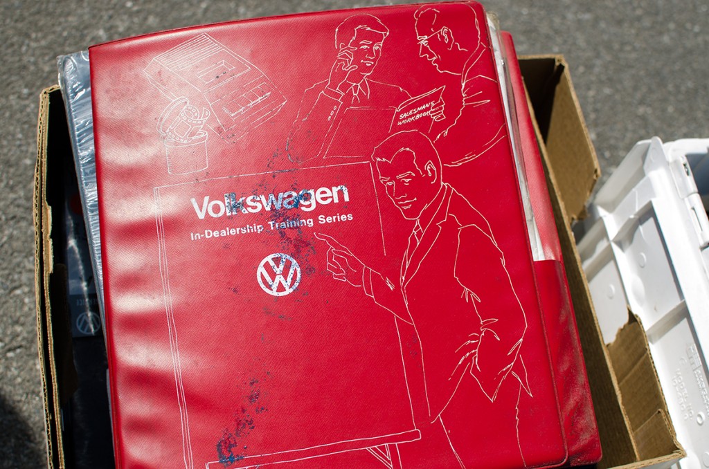
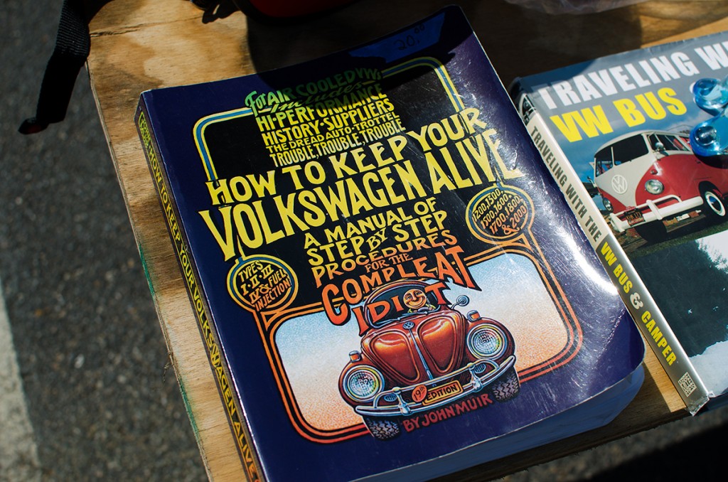 I love the hand-drawn, hippie style of this cover. This is basically the Bible for early VW owners, It’s getting harder and harder to find vintage copies, so this one was a real gem!
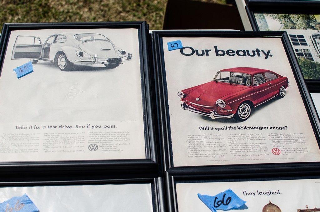 Ahh…. futura. It’s beautiful when people aren’t mis-using it for Children’s books and pacifier packages, don’t you think? Full disclosure: I took the one home that says “Our Beauty”. Wish me luck convincing my lovely wife to let me hang it in the bathroom.
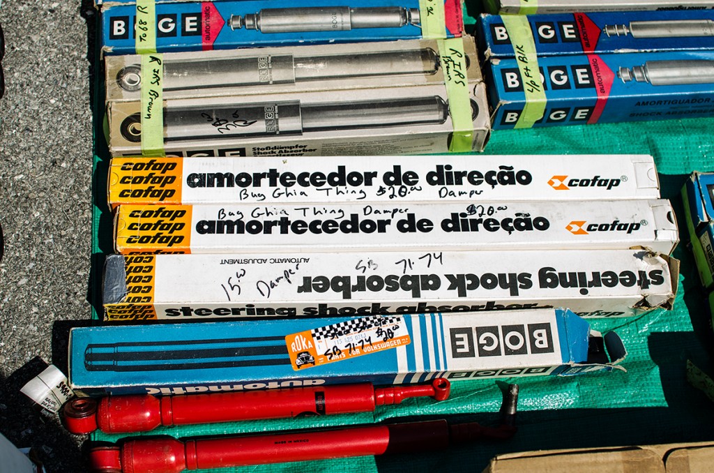 More futura goodness here. I love the tight kerning, black on white, with just a touch of color in the logo/brand mark areas. Gorgeous!
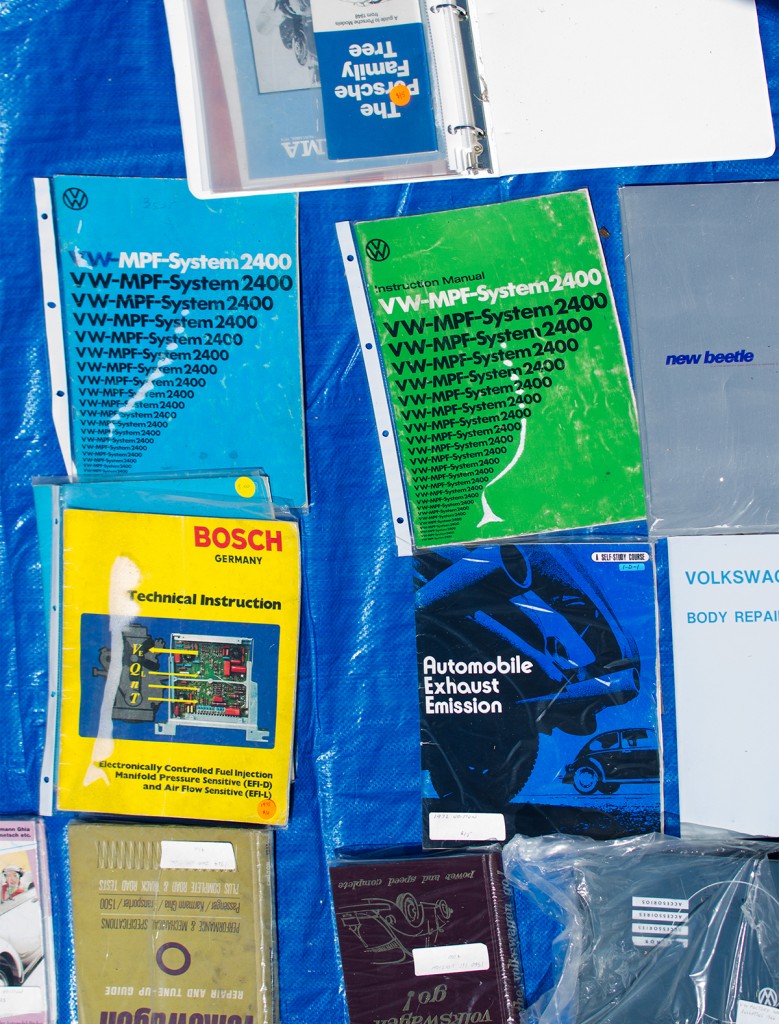 The green and blue “MPF-System” books here immediately caught my eye. They reminded me of Josef Muller-Brockmann, one of graphic design history’s prolific talents. If you don’t know his work, go here.
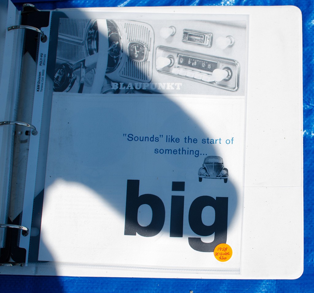 This blaupunkt VW ad caught my attention because they are breaking away from the standard futura headline and using Berthold Akzidenz Grotesque instead. For those who don’t know, Helvetica was suppsoed to be an updated version of Akzidenz. That really dates this ad! 1958!
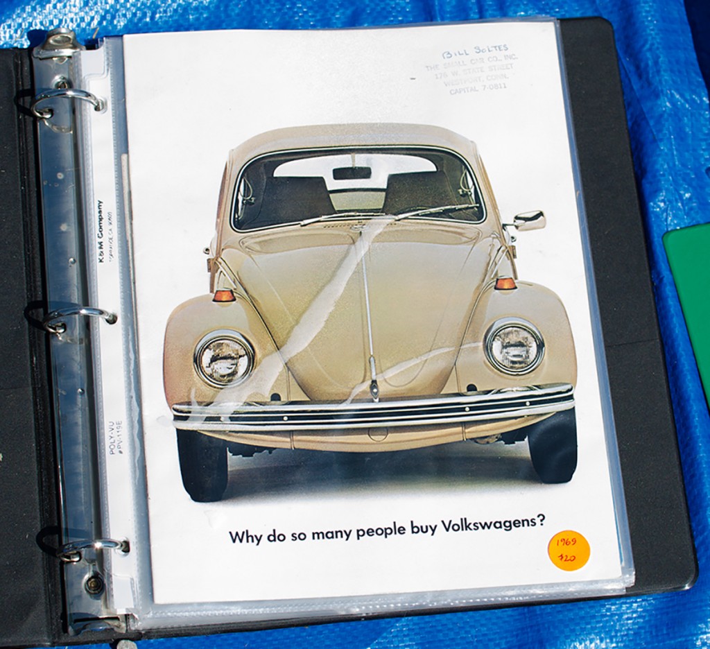
As you can see…. Back to the futura by 1969. I don’t think this beetle would hit 88mph however… Sorry Marty.
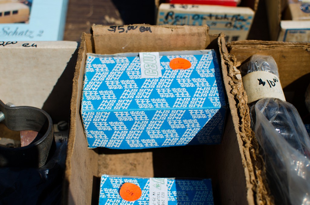
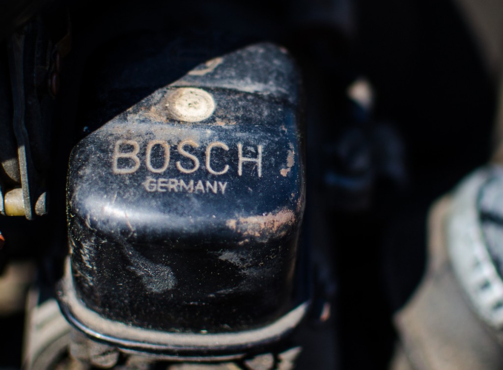
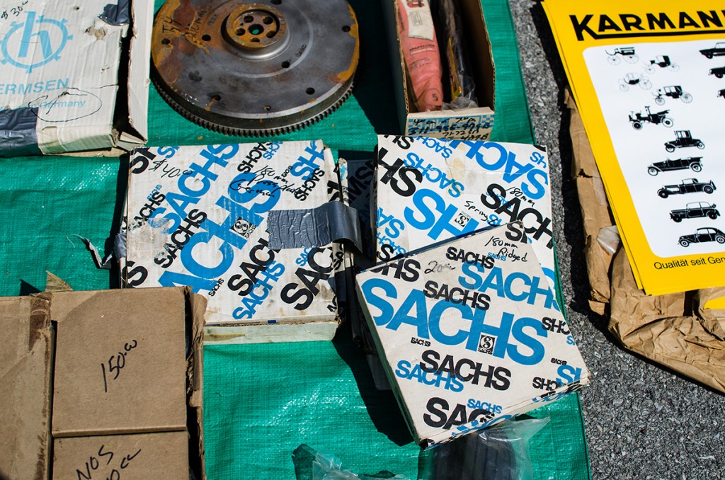 So there you have it! Mixing two passions. Volkswagens and typography. There’s some pretty amazing stuff out there still surviving. That’s a good thing for car guys and designers alike.


