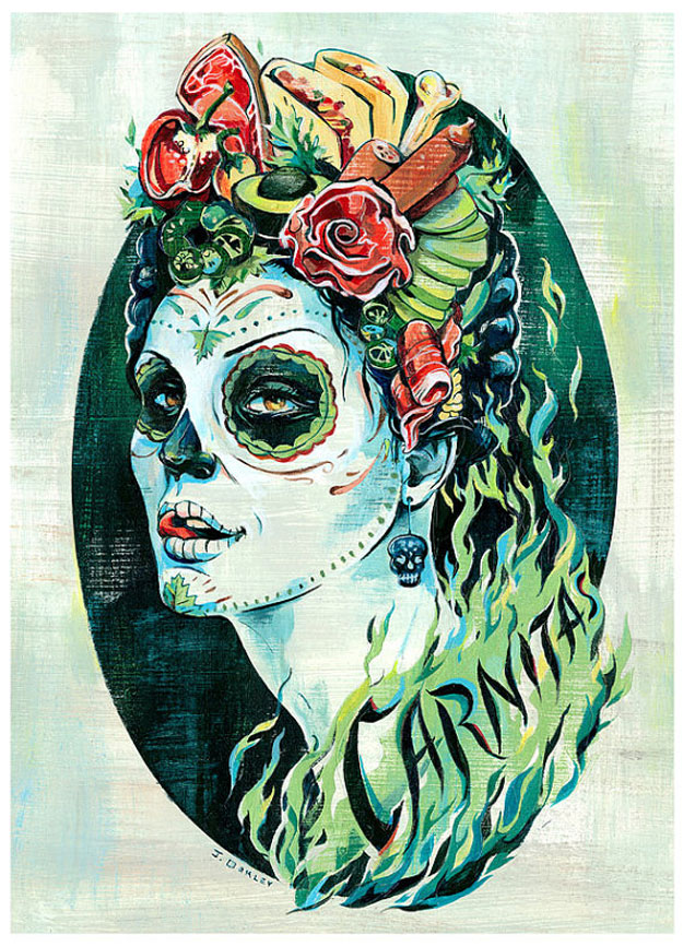
For a quick spotlight, I’d like to introduce you to the illustration and lettering work of Jacqui Oakley. She lives in Hamilton, Ontario and teaches illustration at Ontario College of Art and Design in Toronto. I first stumbled across Oakley‘s work a few years back on Designers MX (RIP), when she created a cover for her halloween playlist.

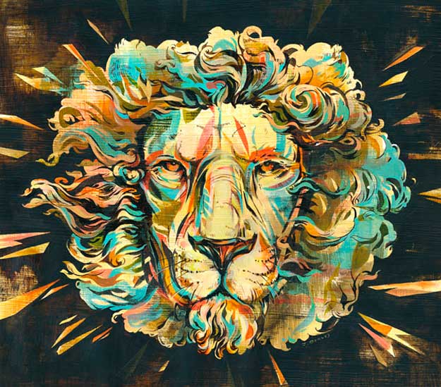
I would liken her work something similar to work of Jeffrey Smith, but with a more vibrant palette. Her color choices sometimes are really charged and adding an attractive energy to her work. It works well against the retro-comic inked linear rendering and the lightly painted gessoed texture.
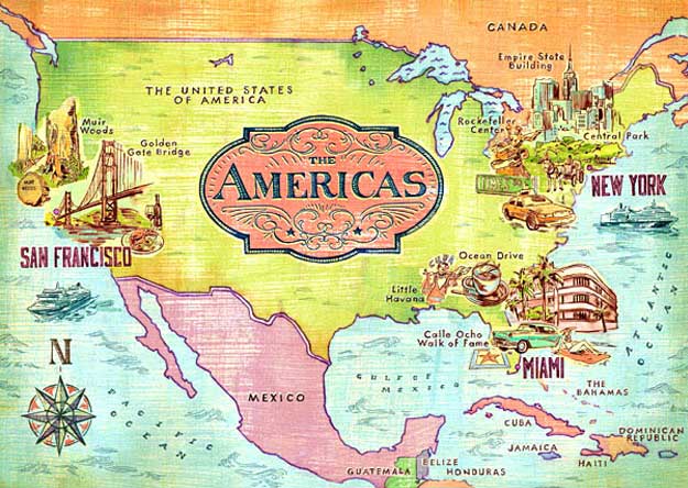
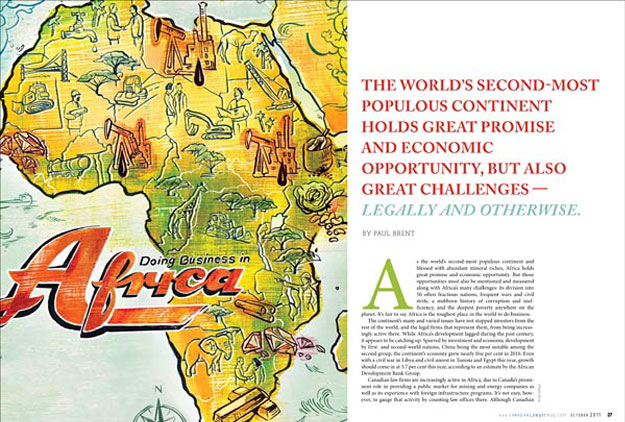
Here are a few samples of her work:


The map illustrations are fun to study.
What’s great about Oakley’s work is her wonderful incorporation lettering and her thoughtful understanding of typography with her illustration. I really respect that. Plus she’s pretty amazing at it.
If you’re into progress and prosperity and want to venture North, she’ll be speaking at Weapons Of Mass Creation Fest August 16-18 in Cleveland.
Weirdly, just staring at her work makes me crave avocados, cilantro or something super citrusy. Is anyone else feeling that? I think its her color palette, which is a valuable resource if your looking for color inspiration to for your next food packaging project.
Love your work Jacqui!
Geez, I need an avocado. Later!

