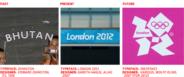
Beijing 2.0 is below the fold and the London 2012 “Touh-na-mint” is well underway. Hidden in plain sight is an ascerbic graphic aesthetic, constructed by various design thinkers and, strangely enough, conceived with different time periods in mind.
The time-and-place design curveball gets thrown every now and then, and we constantly adjust our philosophical swing. Sometimes we trace the methodologies, theories and rudiments of our assigned era; other times we simply attempt to reintrepret history via our contemporary zeitgeist. What makes these 2012 games especially pleasant for typophiles is their interesting spectrum of design interpretations, namely, how to use type from the past, from the present, and a future that doesn’t exist.


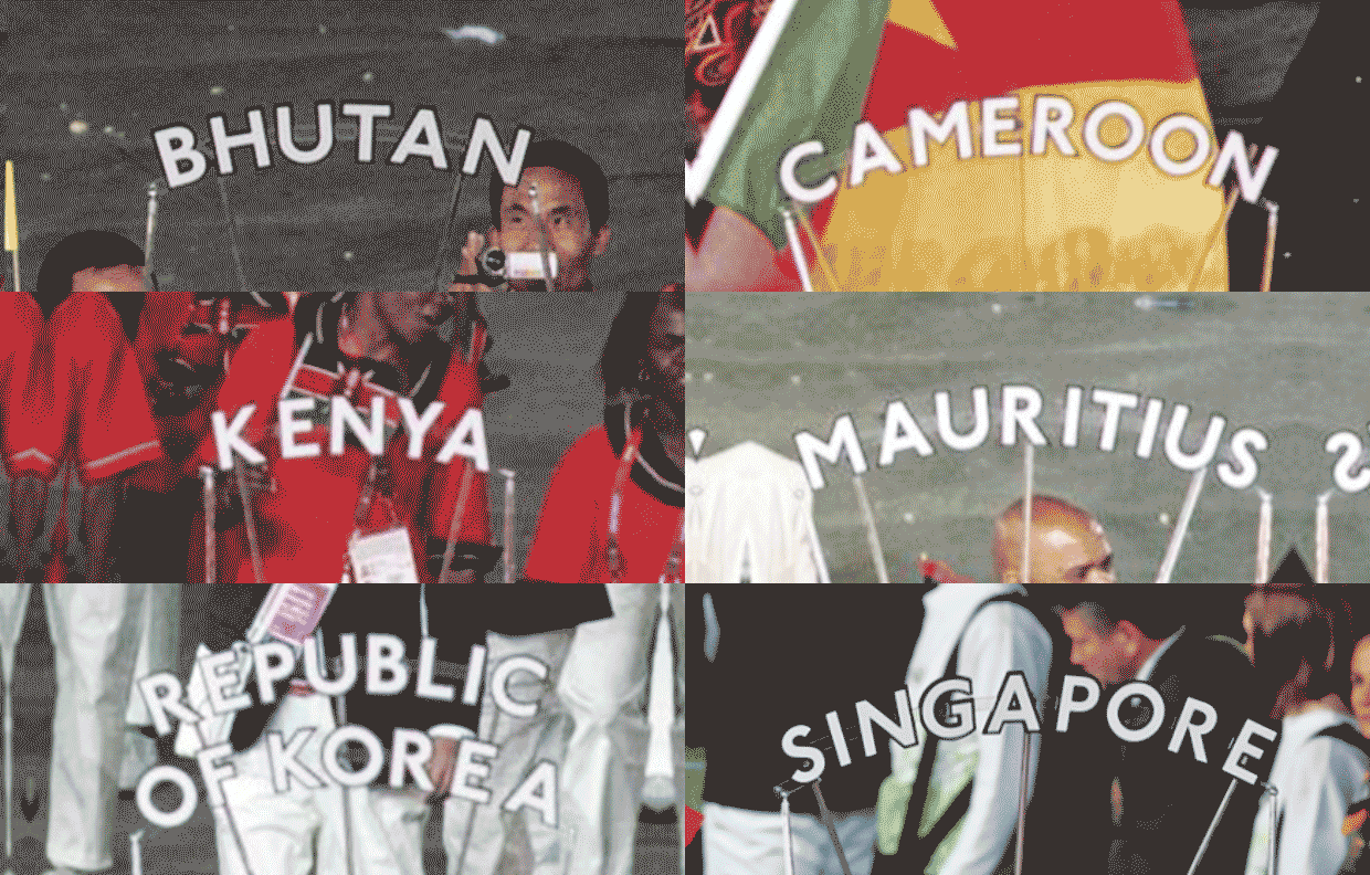
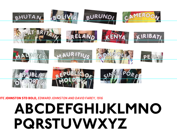
Friday night’s opening ceremony viewers may likely recall a repeating, simple, arced sign trotting ahead of each country. Set in Edward Johnston’s eponymous classic, the face is an example of a traditional method of designing from history, and is the perfect choice, in terms of the most monumental and essential British lettering (It’s London’s transport system font).
While design’s 1% might cringe at such a sophomoric methodology, most of us would do well to properly research the first use of our subject. Such insight can immediately command the essence of the design, even if it arrives invisible to the public, or at best, bland.
Similar to Johnston: Granby, Gill Sans, Corinthian, Bliss, English Grotesque, Agenda, Nexus Pro, Ministry, Yoga Sans, London

The lettering less heralded before the games because of the outright vituperative whining of the invisible Internet is Gareth Hague’s face, predictably titled London 2012. Peppered throughout each competitive facility lives a quirky, angular, almost blackletter display face that looks almost as if Thomas Hirschorn commissioned a neighborhood child to tape him a lowercase italic.
Nevertheless, it’s not a bad font. In fact, it may be just what the games needed. A typeface for the present, it was formulated in a round-about-way: as early as 2006 British design firm Wolff Olins built their hated sex pistol-ish 2012 lettering from Gareth Hague’s 1997 Klute, a diagonal blackletter apparently smuggling don’t-use-this-or-the-Internet-will-hate-you DNA. Entrenched in the massive international project, WO delegated the flagship type responsibilities back to the man behind the initial inspiration.
Thus London 2012 is a typeface that is very 90s, but, due to its attachment with aspirations of a 5-years-ahead-of-its-time logo, it becomes something that (though delivered in the present) may still be quite future in nature.
Though hated and misrepresented by the opprobius masses, the face was well received by the true believers in the type community but hasn’t reached a consensus by the less ambitious Jessica Hischites and Frank Chimeras.
Just because Simon Garfield hates it doesn’t mean you have to. Besides, he let Chip Kidd write his forward, and nobody is more 90s than Chip Kidd.

Consider the logo, Wolff Olins and their apostate child. An attempt, in what was the then present, to formulate a look that captured history, tradition, sport, and a maelstrom of other demands and somehow find acceptance in a post-Zuckerberg world. A prudent bellweather for any designer attempting to cast his creation in an epoch other than a bi-weekly vernacular. Whereas recent works have scaled down the flying cars and robot butlers of the future, (ala Prometheus) designing beyond one’s chronos is a particularly steep tax.
We easily forget that the various stages of introduction (2007 = design community, 2010 = Internet, 2012 = our mums) had different circumstantial presuppositions, evolving until and beyond this writing. How much of a fork or a bump in the design road WO’s ubiquitous graphic will become is anybody’s guess.
What we must take away from these consterning crucifixion sessions is the personal integrity and fortitude one must possess to create design that is timely, whether it is timeless or not.
References:
http://designmuseum.org/design/london-transport
http://en.wikipedia.org/wiki/Edward_Johnston
http://www.designboom.com/weblog/cat/8/view/22593/london-olympics-2012-the-look-of-the-games.html
http://www.creativereview.co.uk/cr-blog/2012/july/london-2012-the-look-of-the-games
http://alias.dj/blog/spoof-or-sinister

