With what looks like an economic renaissance in Nashville, the city is unapologetically growing into its own. The addition of the Music City Convention Center and Gaylord Opryland/Dolly Parton’s $50 million theme park investment are two of the biggest recent announcements with the ability to influence the economic climate of our steadily growing southern city. Much to the chagrin of many long-time Nashville residents, this will not be Opryland part II, but it does give us here at ST8MNT a reason to relish in the beauty and utterly horrid visual identities and materials of theme parks past. (Don’t get us started on Holiday World)
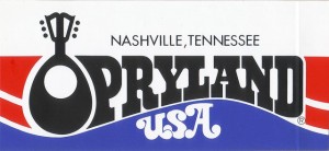
 Opryland USA’s mark was developed in the mid 70’s, a time in which computer-aided design had not infused the tacky, chunky, and gradient filled type of recent years. Logos with seamlessly integrated type always have a better chance of holding up overtime, but even Opryland evolved with the times dropping the mark but still integrating the mandolin as not to alienate the whole feel of the initial branding process.
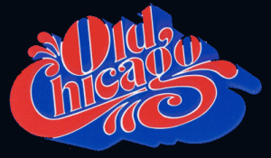
 These hand drawn marks have a nostalgic attention to detail focusing on manually rendered type that seems to be lost in today’s approach to theme park design. This mark for “Old Chicago” is a wonderful example of craft and vintage motifs used in in the 70’s. This suburban shopping mall in the small city of Bowling Brook, Illinois was labeled as the first indoor amusement park of our generation. Unfortunately good typography doesn’t always equal commercial success. It met its maker after only 5 years of business in 1980. (but that 3D treatment is beautiful!)
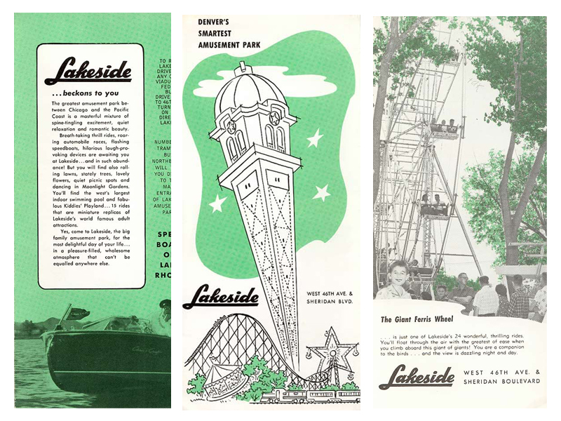
This brochure for Lakeside in Denver Colorado is from the 1950’s and is a great example of a process you will see less and less of as 2 color spot succumbs to digital 4 color process printing. This two-color print with mid-century modern illustrations, a tasty use of Futura, and a hand rendered logotype get our mojo working here at ST8MNT. Numerous logos for modern-day parks seem to think more is better and the overall tone and feel of this genre seems to be rapidly merging into one lack luster explosion of ribbons and primary colors.

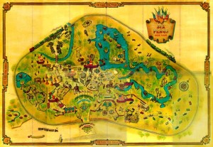
What is a theme park without a ridiculous map!? Map illustrators may be one of the few original craftsmen left that seem to be a relevant modern requirement when developing amusement park collateral. You will rarely go to an amusement park, museum, or zoo that does not have a wayfinding system for its patrons. All of these elements are important in making the navigation experience as simple and directional as possible. Here is a stellar example of a fun map illustration. It has such a great aesthetic and character due to all the Tex-Mex drawn border and type elements. For something as playful as an amusement park, it seems the emphasis on hand drawn elements help bring some amusement park visuals to life.
We are curious and excited to see how one of our new Nashville attractions establishes itself in a city that has fond memories of Wabash Cannonball and Grizzly River Rampage. Dolly be sure and give us a shout, we’d love to make a formal bid on all of your amusement park awesomeness.


