

College football in the South.
Life and death for some, and the epitome of annoying for others.
Most of us here at ST8MNT love SEC football.
We have three University of Tennessee grads here.
In all of our “what happened over the weekend” talk on Monday mornings, besides groaning about the Vols’ lack of offense, and cursing Alabama, we often discuss the good and bad of SEC team branding. There is some killer branding in this conference. There’s also some questionable branding. There’s a fine line in the SEC between history and tradition, and the mega millions of modern apparel and gear sales.
I thought I’d take some time to grade the branding of all 14 teams in the Southeastern Conference.
I’ll start with Tennessee, because, Go Vols!
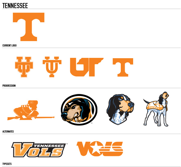
The Volunteers have one of the simplest logos in the conference, and this has been true for most of their history. Typically, some sort of Orange “T” on a field of white.
This team tends to let it’s colors do the talking. I do really love the alternate logos, especially the recent Smokey/Blue Tick Hound revamps. I’m still looking for a nice baseball cap with the smokey howling alternate mark. If you guys see one, holler at me. I am a total and complete Tennessee homer. No shame here. Because of this, the Vols get an A+.
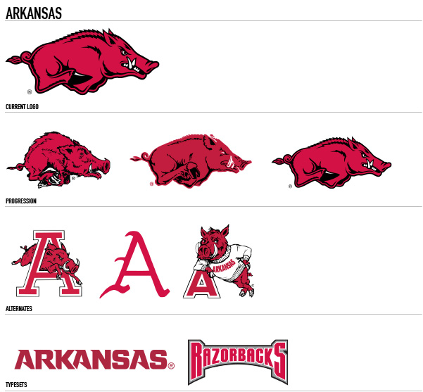
Arkansas has also stayed pretty true to their roots since the early days. 3 main revisions on their razorback/hog logo with just a few alternate marks.
Not my favorite brand in the conference, but certainly not one of my least favorites. Very recognizable, that’s for sure.
I give Arkansas a solid B+.
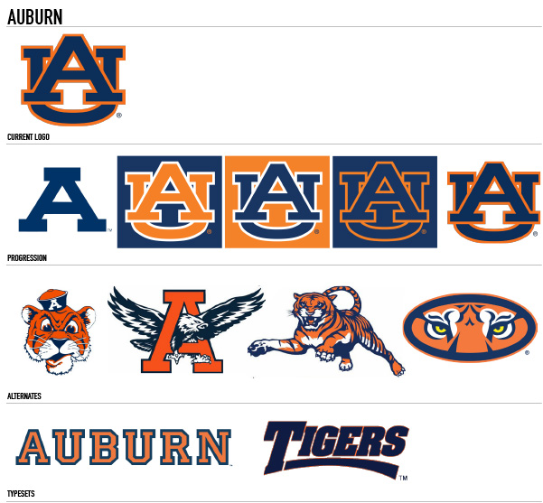
Oh Auburn…. Because of my lovely wife, who graduated from here, half of the cups in my cupboard have your logo on them. In fact, I can pretty much spot an Auburn logo from any vantage point within my house. War Eagle? Sure honey… why not? I must say I love the consistency Auburn has shown over the years. Despite being called “The Tigers”, yet yelling “War Eagle” everywhere they go, they have managed to be very consistent in their brand marks. I do love the old school alternate with the Eagle inside the A. This mark is incredibly bad ass to me. Auburn gets an A-.
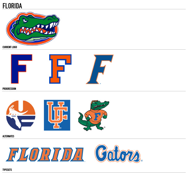
Not a fan of Florida as a team, school, or fan base. My Vols are apparently unable to beat Florida in pretty much anything these days. Very frustrating. I also hate their branding. A cartoon gator head is neither scary, nor cool to me. I also find their alternate “F” logo hysterical when we consider this is for an institute of higher learning where typically the letter F does not stand for success. You stink Florida.
I give you a D.
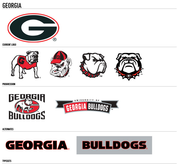
Funny story here. Georgia did not design their logo. They “borrowed” it from the Green bay Packers in 1964. That’s right… it’s not even their own logo. They just repurposed a good logo for their own needs, kinda like that high school down the street from you who uses the Kansas State logo, or the one across town who uses the UCLA Bruins logo. Way to go Georgia. Try a little harder maybe? That said, their bulldog alternates are amazing. I love these. It’s too bad their main mark isn’t as original. Georgia gets a C-.
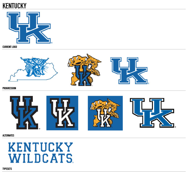
Kentucky…. The basketball school. While they are under a bit of a football resurgence with new coach Mark Stoops, they’ve never exactly been a football powerhouse. The UK logos have also remained largely unchanged since the early days, much like Auburn and Arkansas. For this reason, I give Kentucky an A-.
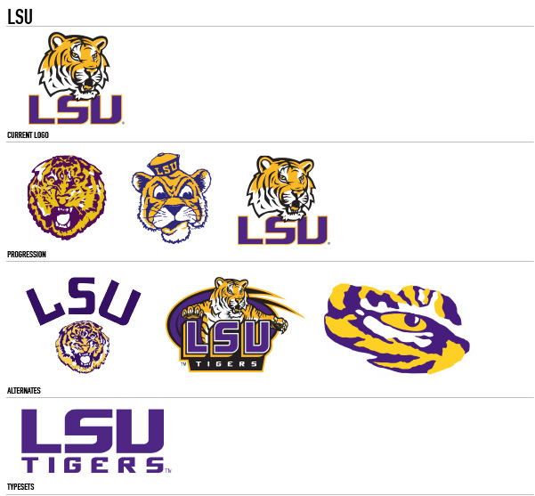
LSU. The drinkers. LSU fans rule, and their logos are pretty sweet too. This brand, like Tennessee, is all about the colors. There’s no mistaking the yellow and purple. It’s gone though some changes in regards to the tiger head mark, but they all work, and are instantly recognizable. LSU gets a solid B+.
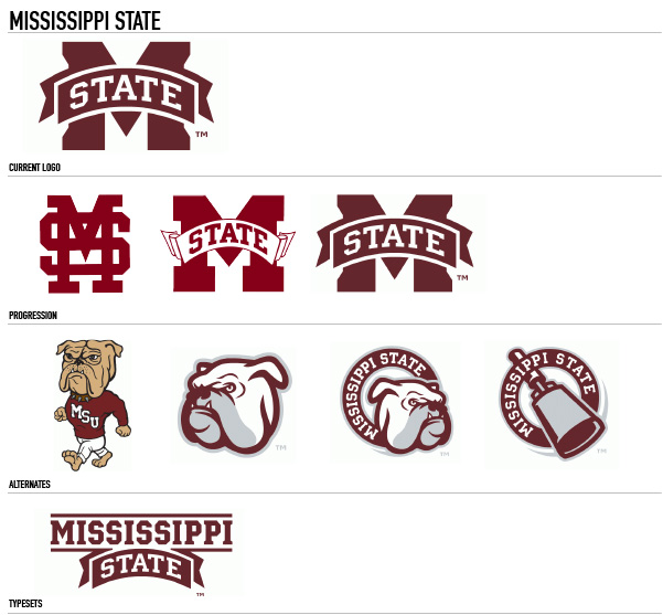
Mississippi State is another team that has stayed pretty true to it’s brand from the beginning. Simple mark, nice colors, very collegiate typeface. Not bad. I still think the cowbells are silly though. Mississippi State gets a strong B.
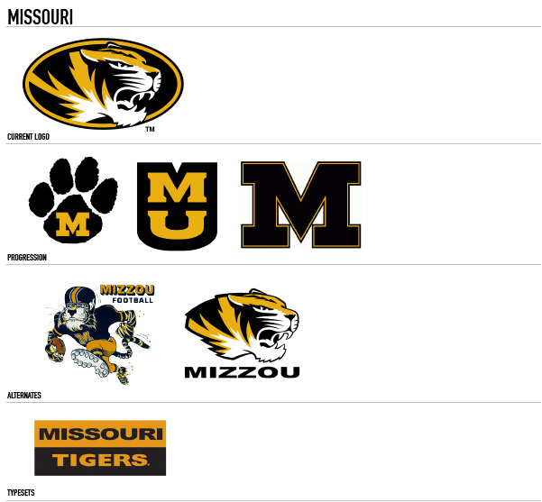
Missouri’s brand is all over the place. Tiger paws, tiger heads, MU lockups, and just a plain old M. What is going on over there? None of these marks are bad, per se, but they just aren’t very consistent. Mizzou gets a C-.
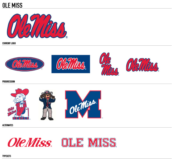
Ole Miss has a classic script type mark that is instantly recognizable. They’ve kept pretty true to it over the years, unlike their Colonel Reb mascot which has now been replaced by….. a bear? Yeah, it doesn’t make sense to me either. Ole Miss gets a C+.
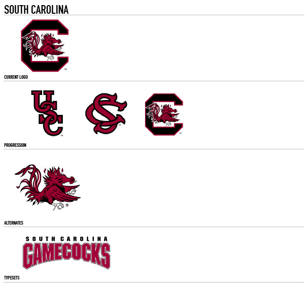
Any team that uses a chicken as it’s mascot is questionable to me. I wish South Carolina would use their alternates instead of the C with the chicken inside of it. The alternates are much cleaner in my opinion. Because of this, South Carolina gets a C.
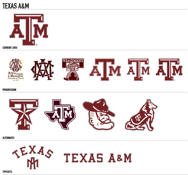
Tradition and history runs deep at Texas A&M. Their main branding shows this. I like the classic feel of this logo. It matches the university’s military history very well. The alternates are also pretty dang good, even if their mascot is a collie.
Texas A&M is an easy A.
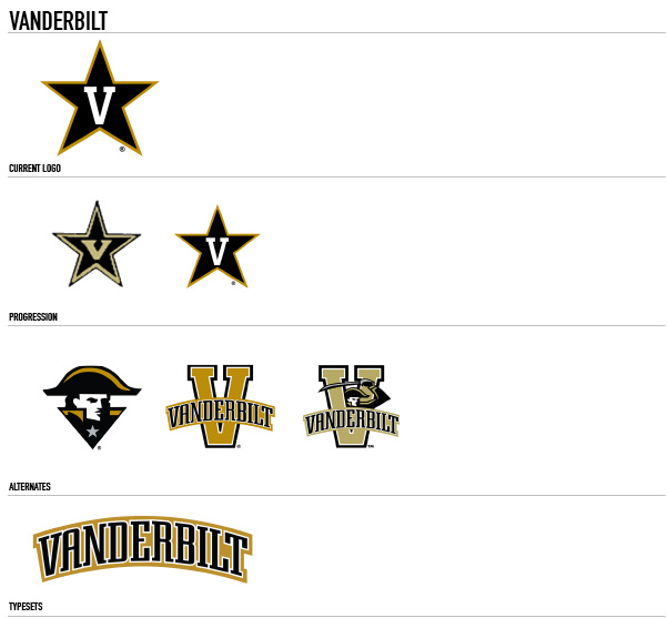
A star with a V in it. A naval reference in a landlocked state. I don’t get it either.
How confusing can you be Vandy?
Maybe it’s the Tennessee fan in me again, but Vandy gets a D.
Rounding out the bottom of the list is the reviled and hated Alabama Crimson Tide. My mother told me if you don’t have anything nice to say, don’t say anything at all, so I’ll just leave this one alone… Go Vols.
And there you have it folks. One opinionated, die hard SEC fan’s take on the logos of the Southeastern Conference.
These 14 teams are some of the most recognized and sold brands in all of American sports. The amount of dollars flowing into these universities by way of ticket sales and merchandise sales is truly staggering. The design of these might be an after thought to the casual fan, but with a few exceptions, these brands are well thought out, and very purposeful. Just another reason why the SEC is the strongest conference in college football.
Just remember everyone, 2015 will be the year the Vols return to dominance.
Mark your calendars. It’s coming.