Icons are everywhere on the Internet, and in many cases, their conventional usage as interactive buttons and links has become second nature to audiences worldwide. Most of the icons and symbols we interact with on the Internet every day (on websites and in our browser interfaces) have been around since before the web was widely accessible to the masses. Humans have been communicating through similar semiotic methods since hieroglyphics, maybe even before. (Check out the hieroglyph for ‘Waters.’ Hamburger/menu icon, anyone?!) Some internet symbols have even made it into our every day speech. Hashtag meta.
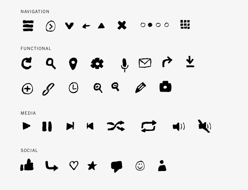
Most of us are familiar with the basics — ‘X’ means close, sideways triangle means play, magnifying glass means search. However, over the past few years there have been more and more icons that have become universally understood to Internet surfers. Here are some of the icons that have made the Internet more accessible and functional. (I started sketching the more well-known icons, and it became hard to stop!)

So, where did these icons come from, and why are they taking over the digital world? Icons that are used on the Internet today have been primarily influenced by wayfinding systems, buttons on electronic devices and interface design. For example, the hamburger/menu icon that we all know and love (those handy 3 lines in the top corner of websites that are clicked in order to expand a navigation menu) is believed to be first used as part of a computer program’s interface. The icon is heavily inspired by part of an interface design that was designed by a guy named Norm Cox who worked for Xerox in 1981. The device it was designed for—Xerox’s “Star” personal workstation.
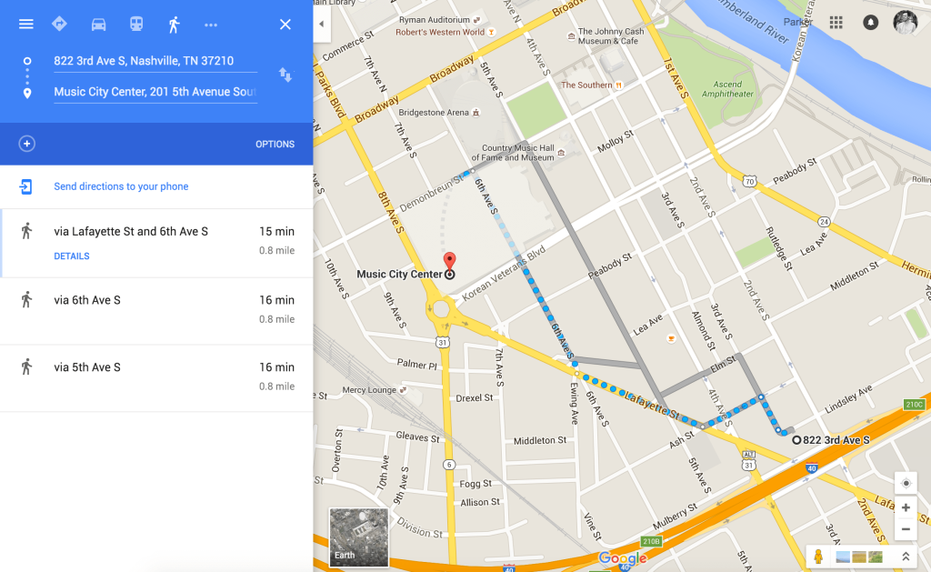
Navigation icons have been around since the start of the Internet, and have created a much more usable environment, as their purpose is to prompt user interaction. This is true for the use of browser interfaces, menu navigation systems, playable media like videos and music, content organization and management, maps and more. All symbols are learned, but great symbols are intuitive. For example, when crossing a road in a city, crosswalk signs prompt pedestrians to cross the road with a walking person, and to stop with an orange hand. These symbols are intuitive, because they visually explain what they are prompting. Symbols like this are seen all over the internet, and can be used for intuitive instruction for users. An example of an intuitive symbol on the internet would be the map marker symbol — it’s purpose is to plot a location on a map. It’s hard to imagine Google Maps’ usability without iconography. You probably didn’t realize it, but when you look up directions, you’re often interacting with upwards of 20 icons all at one time, fluently!

User experience is essential for a site’s success. Icons can allow for a cleaner, easier to use website, and allow the design to focus on a brand’s goals. A busy website can distract users from its content and dilute the impact of their site’s content consumption.
One strategy in building an effective website is to have a clean and usable navigation bar with functionality that is easy to understand. Icons aren’t essential in all situations, but they can make for an intuitive experience by cleaning up complex navigation menus to allow users to focus on the site’s content. Another reason to use effective icons—they quickly communicate an idea as they play on the conventions of iconography seen throughout the world (physical and virtual) in which we live.
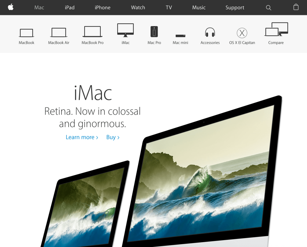
Apple is an example of a brand that has understood the effectiveness of a concise visual for years. For example, they use icons to represent various categories of products on their eCommerce pages of their website. This allows users to navigate to the product they’re looking for or toggle between several to compare.

So, what’s to come of symbols on the Internet? Here are my predictions… and they’re not as wild as they may seem!
1. The Internet will become even more visual.
Internet users will become as fluent with iconography as written words. Why? Because it cleans up interfaces, and it doesn’t matter what language you speak— the Internet’s visual language is universal.
2. The form of symbols will become more and more dynamic.
Check out the menu icon as used for KFC. On click, it transforms into an X for close and is quite fun to watch.
We will also see more and more brand-specific iconography. Take Pitchfork’s navigation icons, for example. The monolinear icons pair nicely in contrast with their new logotype (rebrand by GrilliType).
3. Web fonts will come with icons built into the font.
There are icon fonts currently (here’s an example), but how great would it be for web design if icons were built in as glyphs?
A great icon is clear, concise and leads users to meet their goals. When using an icon on a website, or interface of any sort, make sure to have a clear objective you’re trying to meet. A menu icon is often used to open a navigation menu. A magnifying glass icon implies the availability of a search function. Use icons with a strong semiotic meaning that your audience will understand. Inventing new icons to meet a specific need can be tricky, but often well worth it. Who knows, just like Cox’s three-line menu icon, it might just become part of the greater visual language we use on the Internet.

