

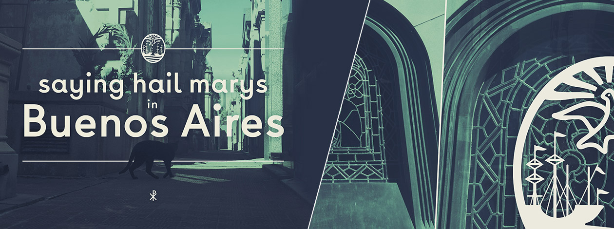
Yup, I’m definitely not Catholic… so I didn’t really say any Hail Marys… sorry… but hey, it rhymes. There’s also some Pope stuff in the mix, so it’s relevant.
Dude, I’ve been working for eight years. Five of them at the good ole ST8MNT BRAND AGENCY. AKA the best place in Nashville to work. Forget that dumb reader’s poll in that magazine. As a reward and to recharge my batteries, I got a trip anywhere in the world. Where to go… hmmmmmm. I’ve been to a few countries in Europe, around the continental US, the Caribbean, and Tijuana. So that leaves me with the Middle East, Africa, Asia/Indonesia and Australia. Pretty much the whole world was still on the table.
So I narrowed it down to places that are rich in culture, international, full of passion, with emerging economies and very artistic histories. Places that we kicked around were Cape Town, Dubai, Lima, Montevideo, and Rio de Janeiro.
But I really wanted to traverse the equator and head into the southern hemisphere. I hate winter, so escaping the worst season for the end of summer for a couple of weeks sounded like a major coup. Not to mention there’s an episode of The Simpsons titled “Bart vs. Australia” where the water rotates backwards, and that’s always stuck with me… Lame, I know, but it’s my trip and I can be inspired by whatever I want.
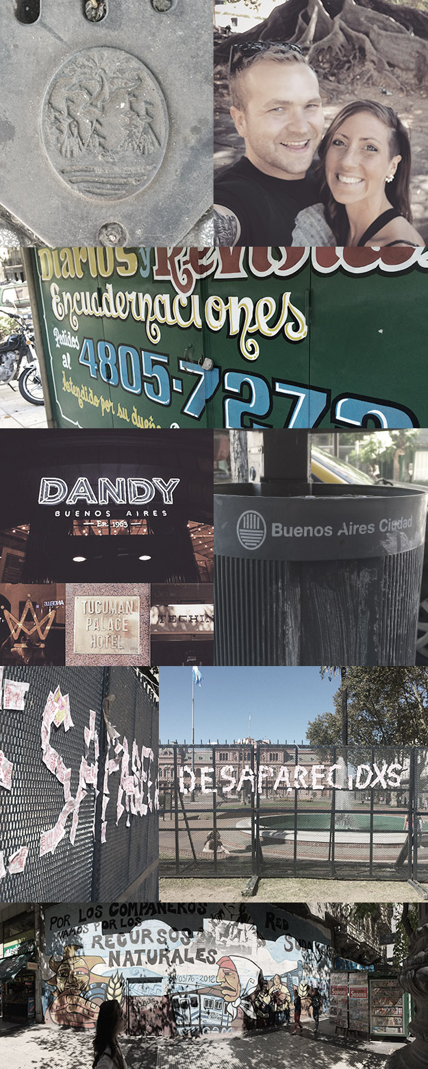
We landed on Buenos Aires, the capitol of Argentina, for multiple reasons. The biggest reason, though, was that South America has been killing it lately in the branding and design world. I feel like every other thing I see is from Central or South America.
Here are a few other reasons we decided to go:
- It felt safe even though the city was going through a protest period.
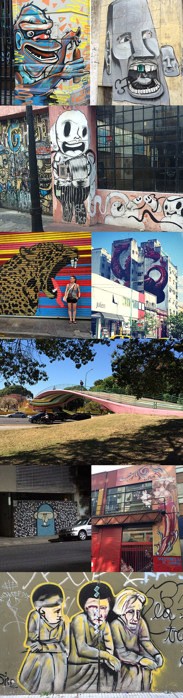
- It has a huge street art culture.
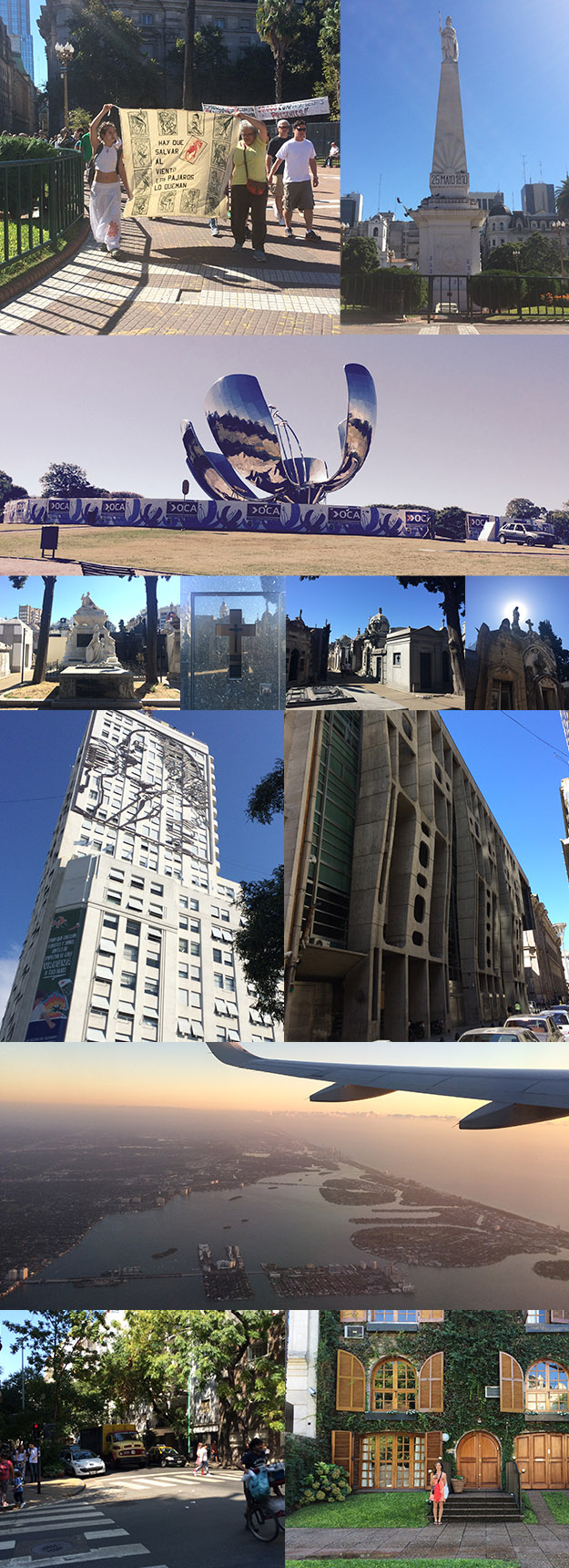
- It has loads of museums.
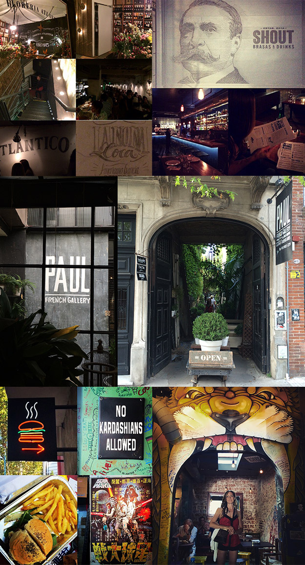
- It has tons of hip bars and restaurants.
- It combines southern American culture with Parisian and Mediterranean vibes.
- It houses a huge design community with loads of studios, agencies and creatives (personal favorites being Estudio Calendar, Alejandro Paul, and Ailoviu).
A huge takeaway was that the people felt American in not just the continental name, but as a melting pot of culture and inspiration. The only exception would be that the country still maintained more of a connection with the indigenous people and history than North America does. The city felt very European, eclectic and even had that same feeling of “E Pluribus Unum.”
I strongly recommend Buenos Aires as a travel location for anyone and I would totally go back. Heck I might even become a Protano myself one day.
Thanks to ST8MNT (Josh & Bethany) for giving me such a great life experience and adventure!
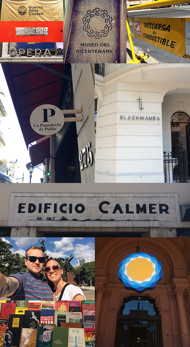
I apologize for my ramblings. Below are a bunch of pictures that sort of depict my radical sabbatical in photo essay form.
*notes
The “Featured Image’ type was designed by Luzi Type – A type foundry ran by Luzi Gantenbein, Swiss Born and Educated with experience working in Chile.
The city of Buenos Aires also is branded quite nicely. The city has a great sense of self and branding. See for yourself by visiting the links below.
Buenos Aires Ciudad Branding Google Search
Individual barrios branding for Buenos Aires
Graffiti is cool but this video that shows the restoration of a subway train displays the city’s branding nicely.
Estudio Calendar is also one of my favs from BsAs. They kind of remind me of Anagrama from Mexico City.
And while you’re at it check out Alejandro Paul and his type studio, Sudtipos. He’s Bad A script and font designer.