Signage always says more than a company’s brand name. The materials used, the form and shape, the placement and the size all contribute to an instant judgement that passerby make about your brand. Every physical sign is an opportunity to create something unique that leaves a lasting impression on your audience in the physical world. “What about boring signage,” you ask? Well … that says something too, but I can’t remember what.
In this post I’ll dive into a few of the different elements of impactful signage to consider, along with examples designed here at ST8MNT.
MATERIALS How are materials interpreted?
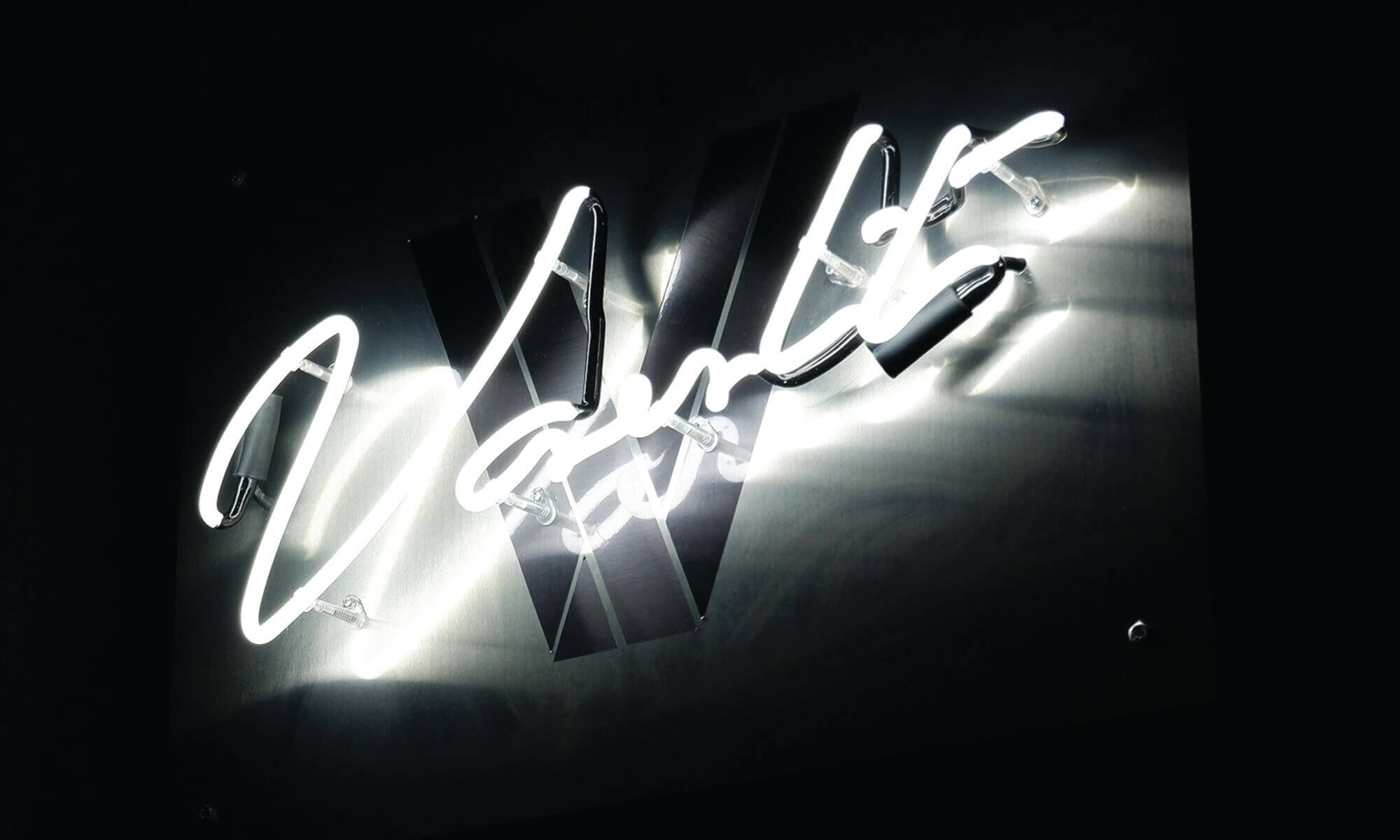
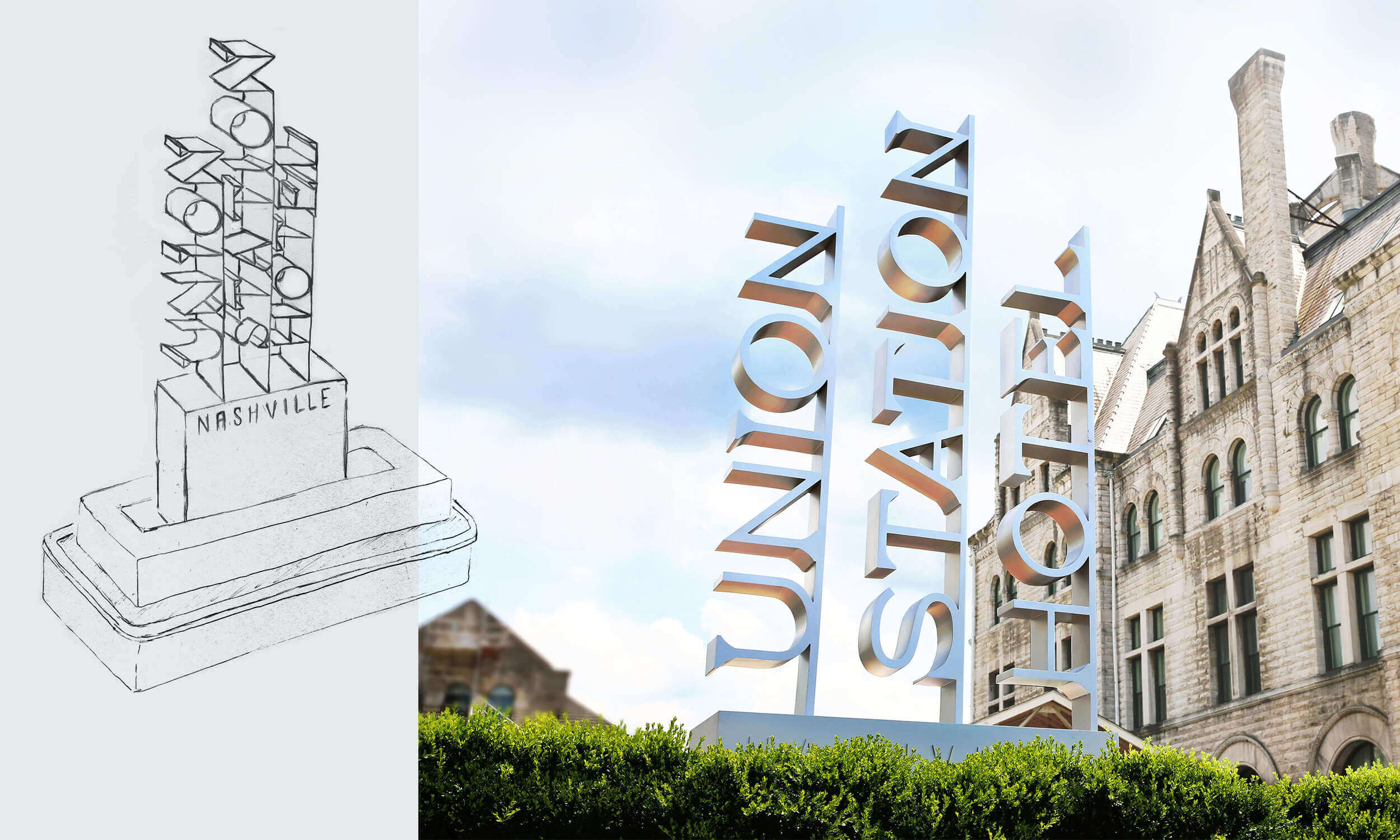
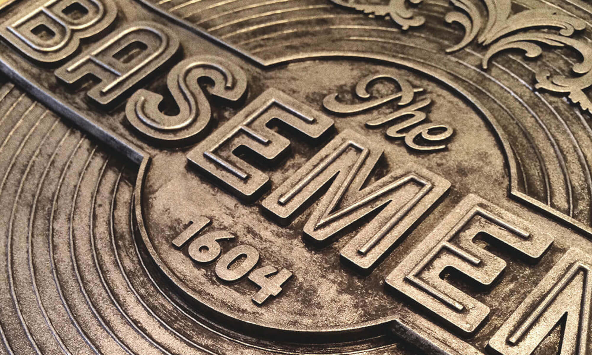
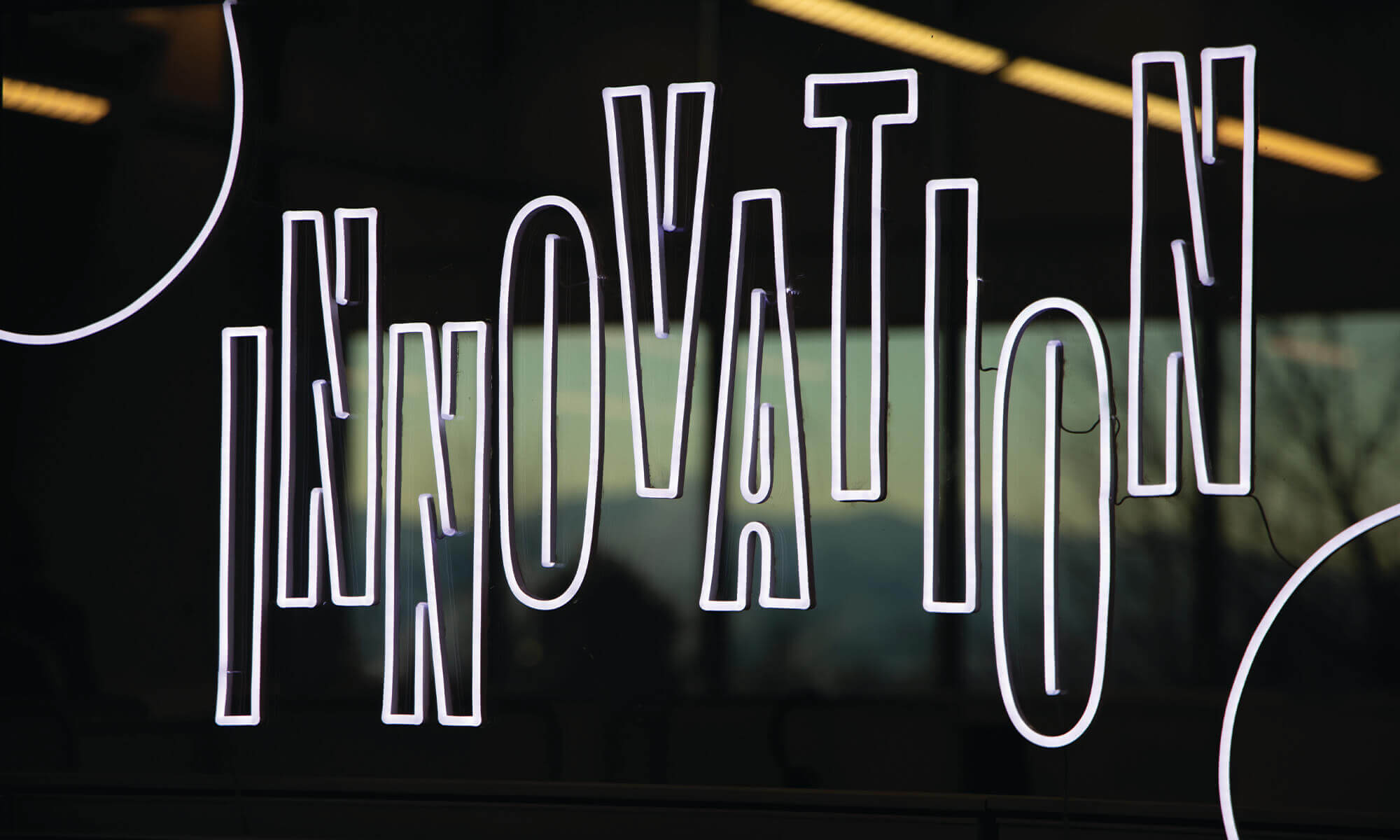
Signage materials add to the overall aesthetic and feel of your brand. Acrylic letters have a completely different vibe than a shiny metal. Choosing the right materials can elevate your brand’s physical presence and further your brand’s story.
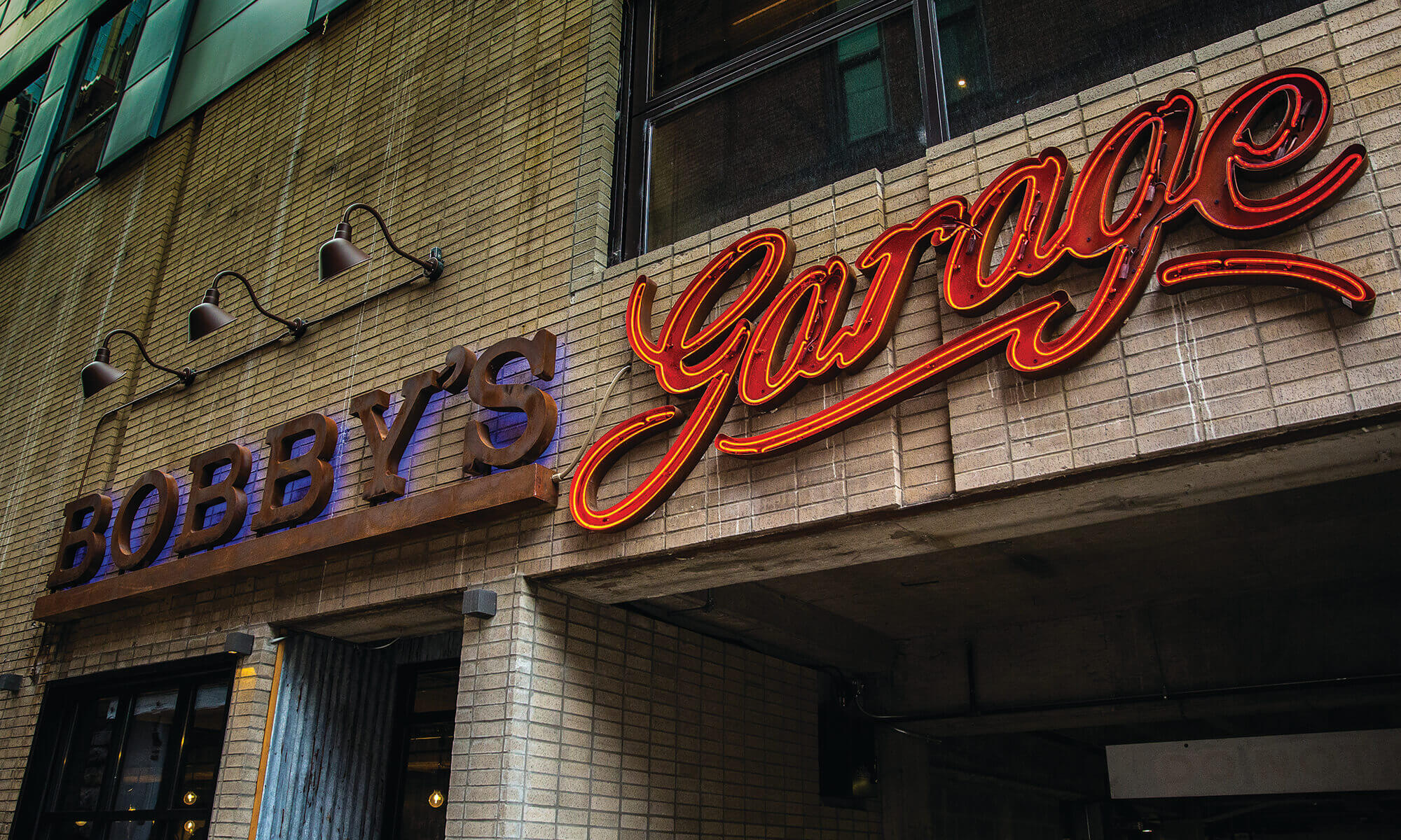
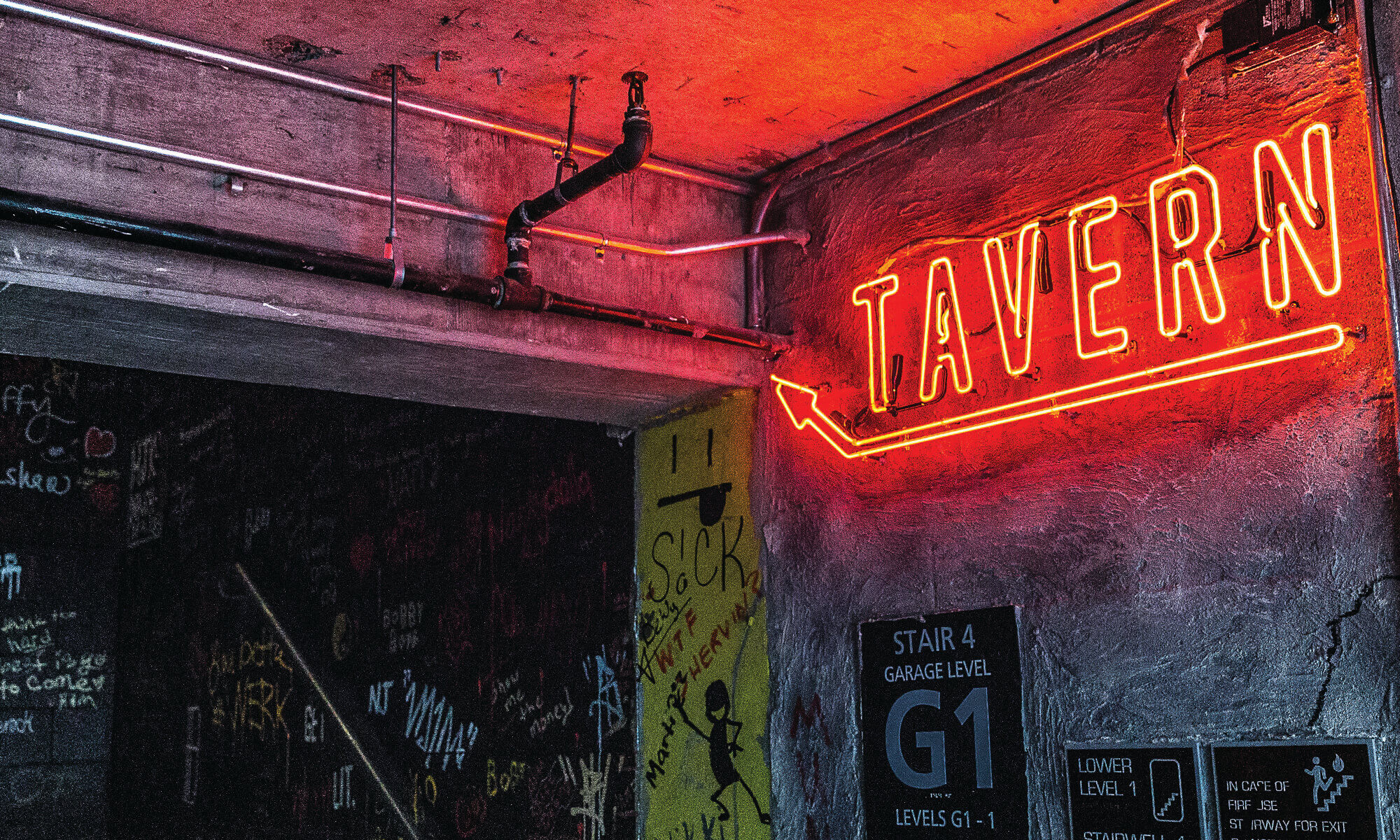
The Bobby’s Garage sign uses materials to tell the story of the moto-themed dive bar. Weathered metal suggests a grungy edge while the neon is reminiscent of beer brand signage commonly found bars. The sign suggests quality and also a laid-back feel, inviting guests to come in for a good time that’s a bit rough around the edges.
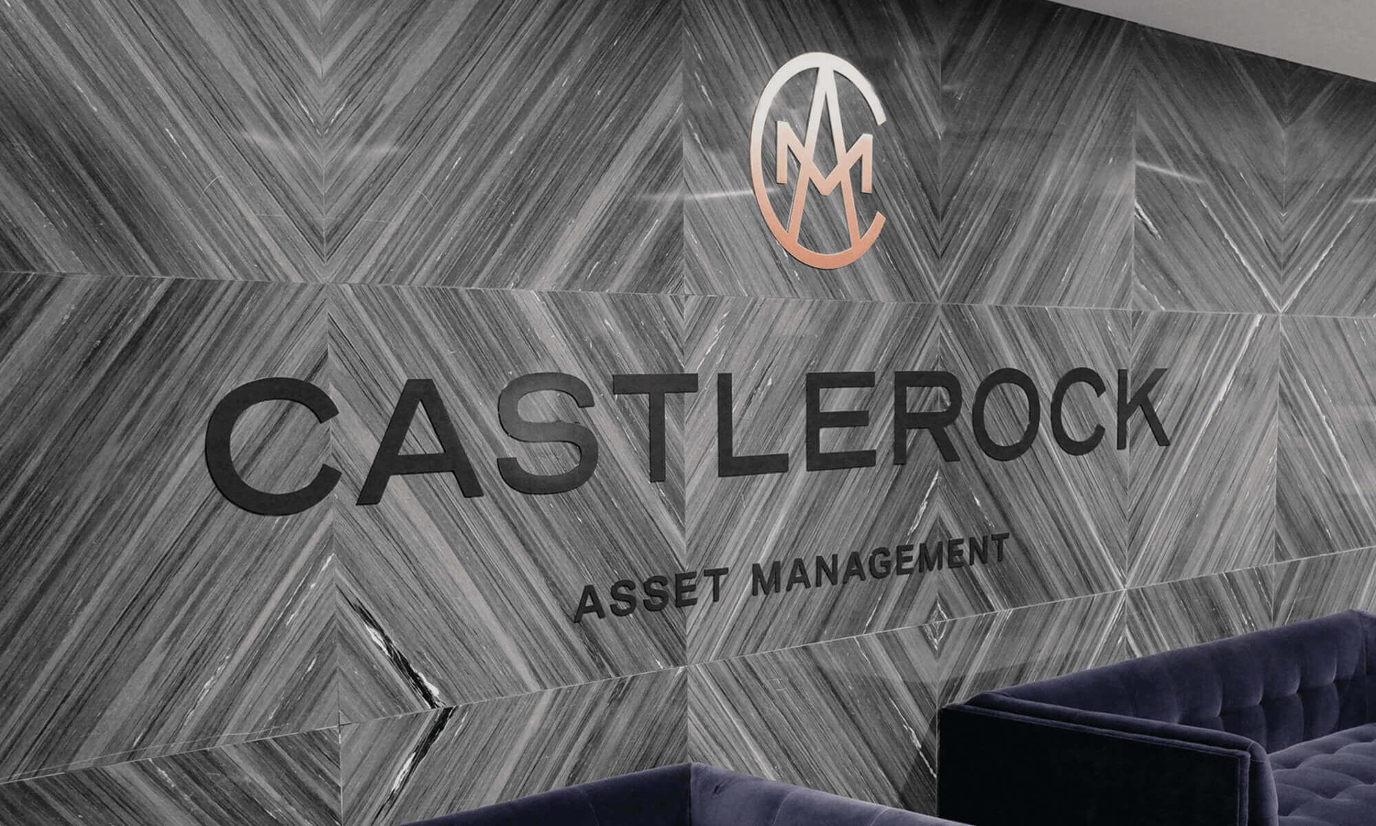
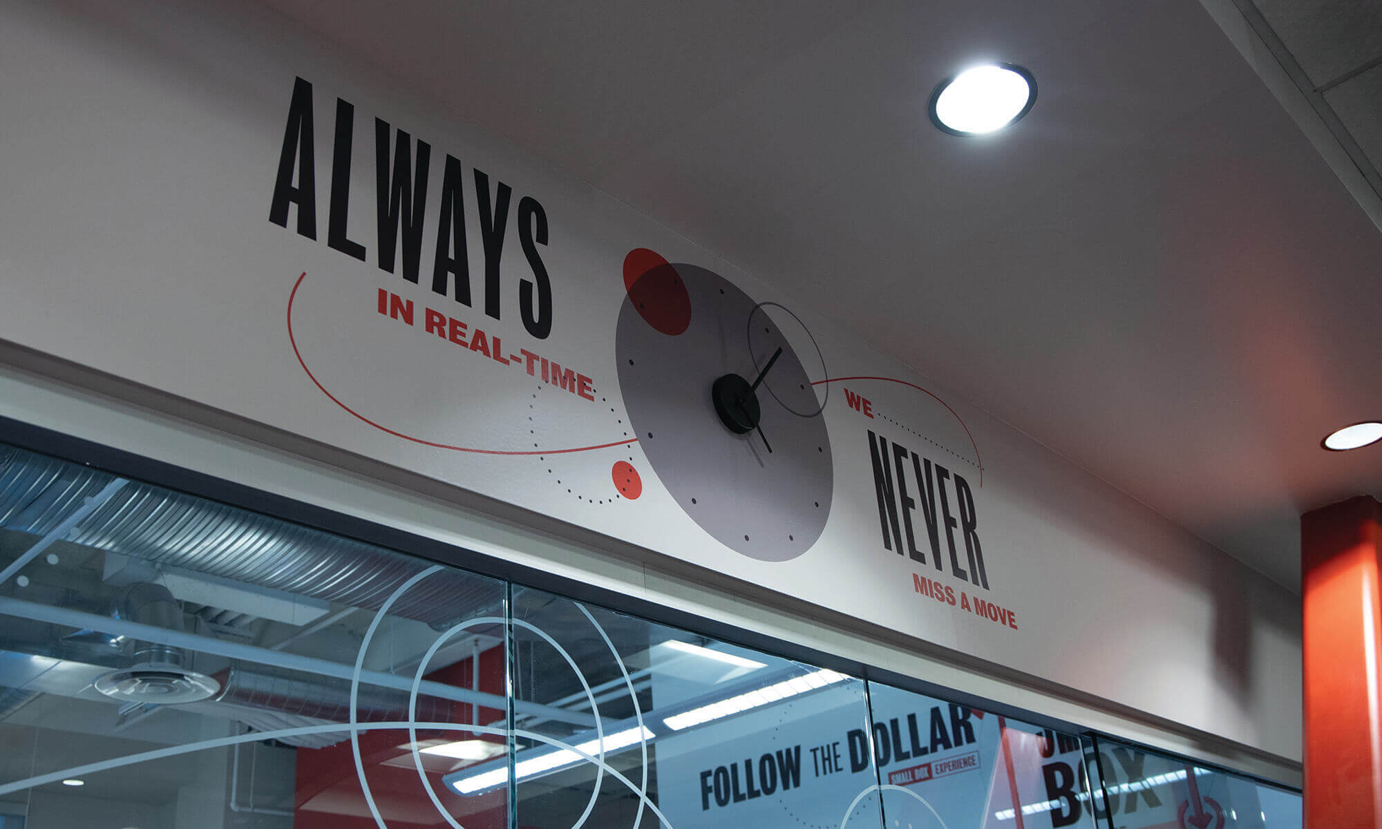
FUNCTION Great signage serves a purpose.
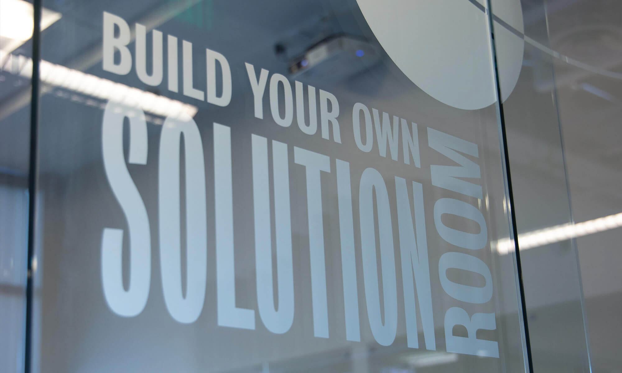
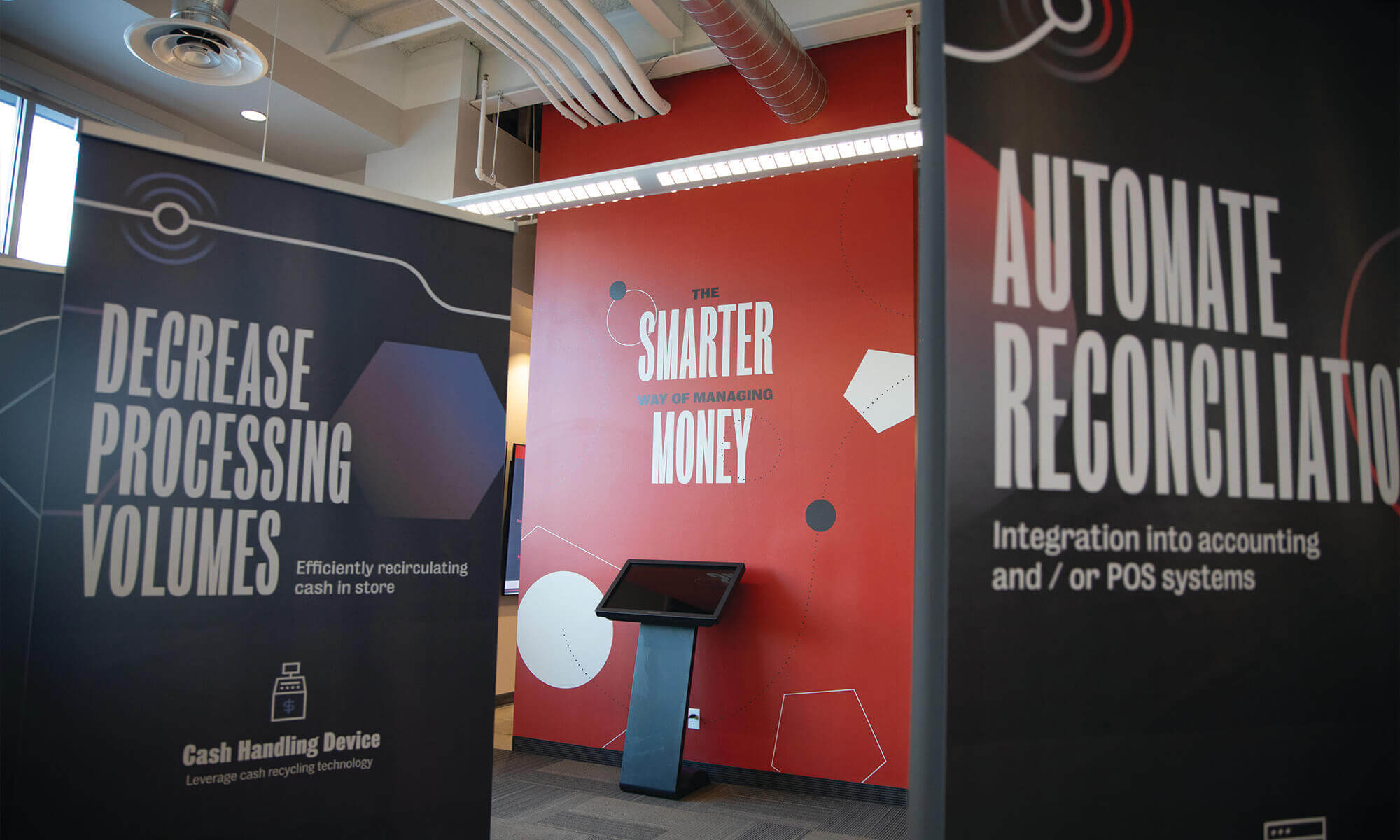
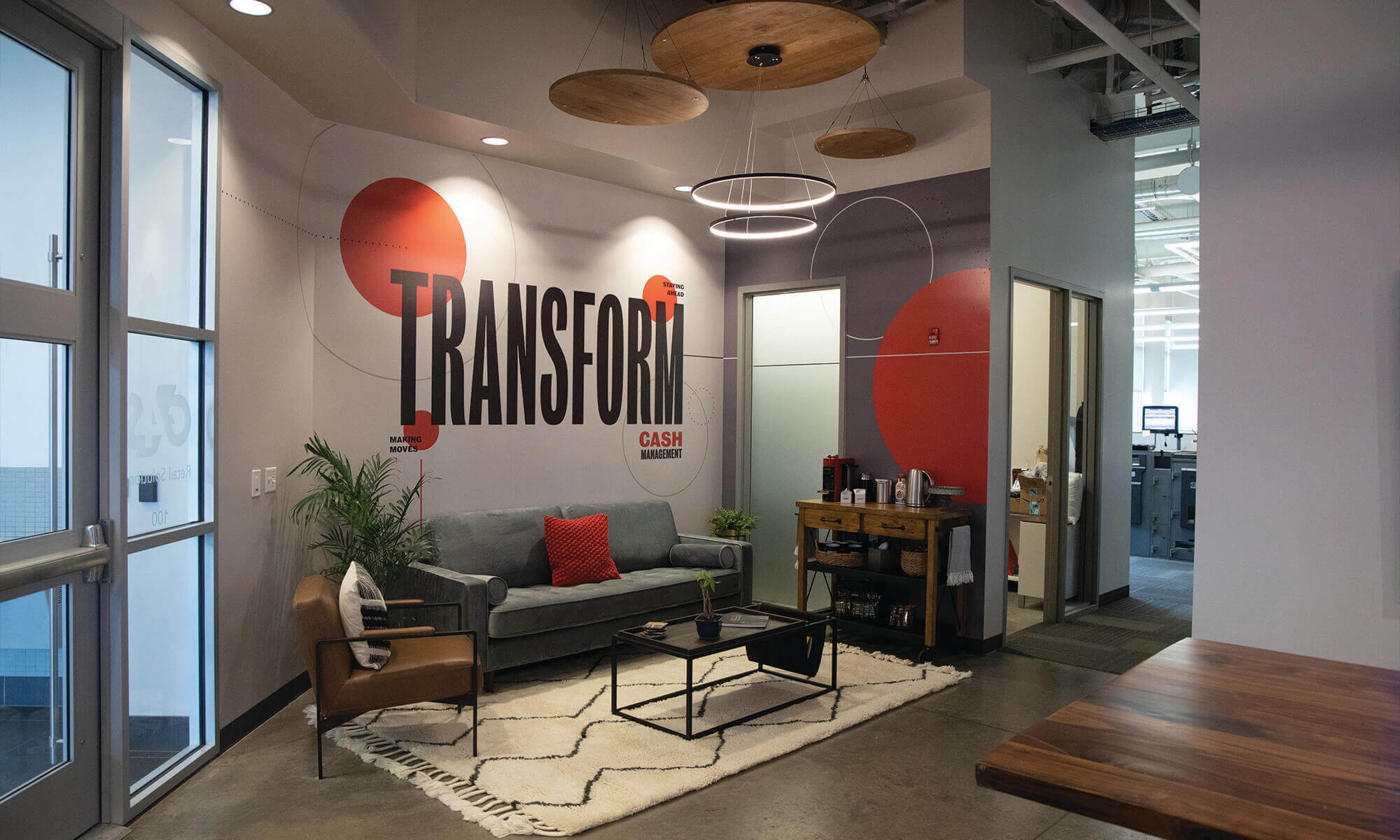
LOCATION Make the most of your surroundings.
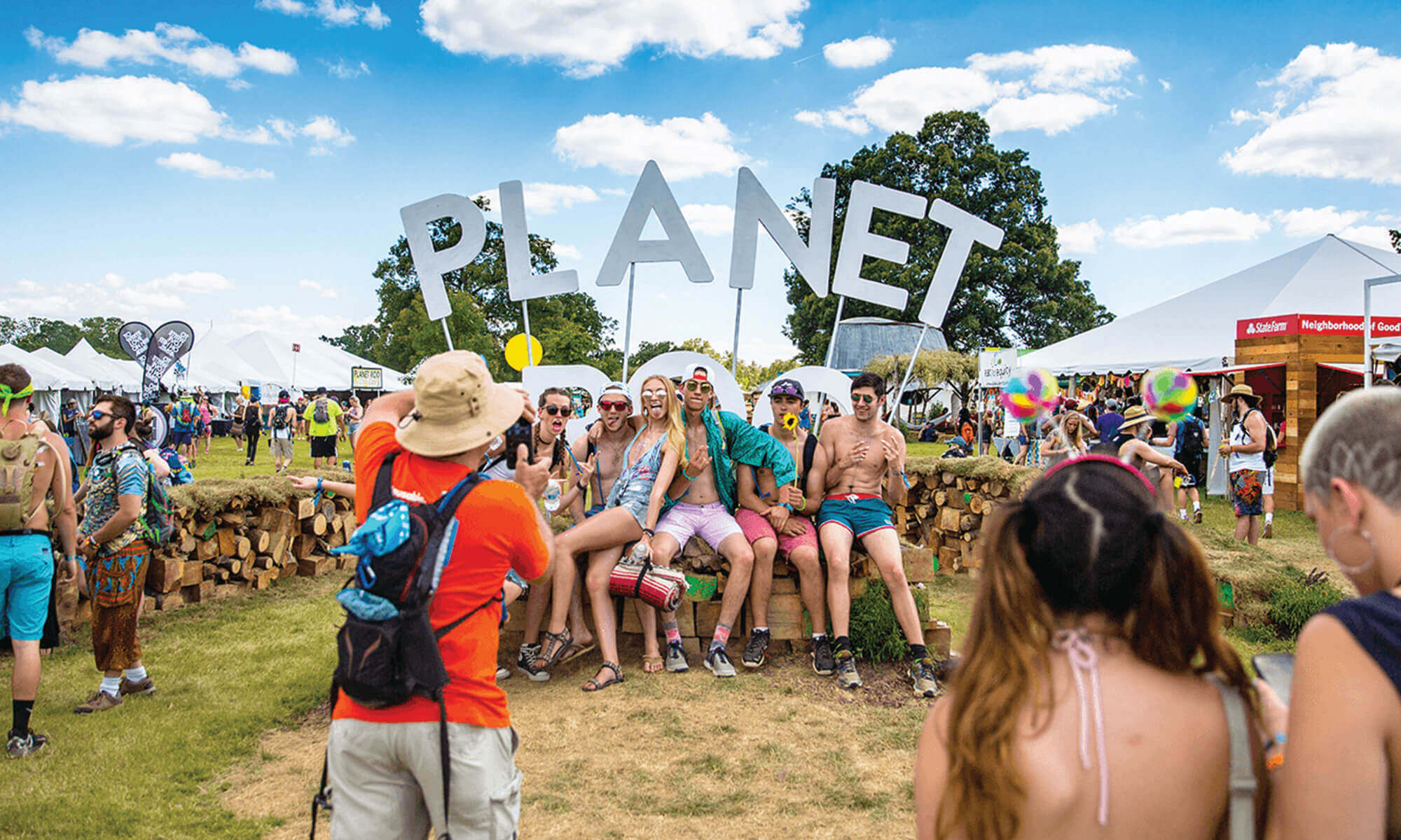
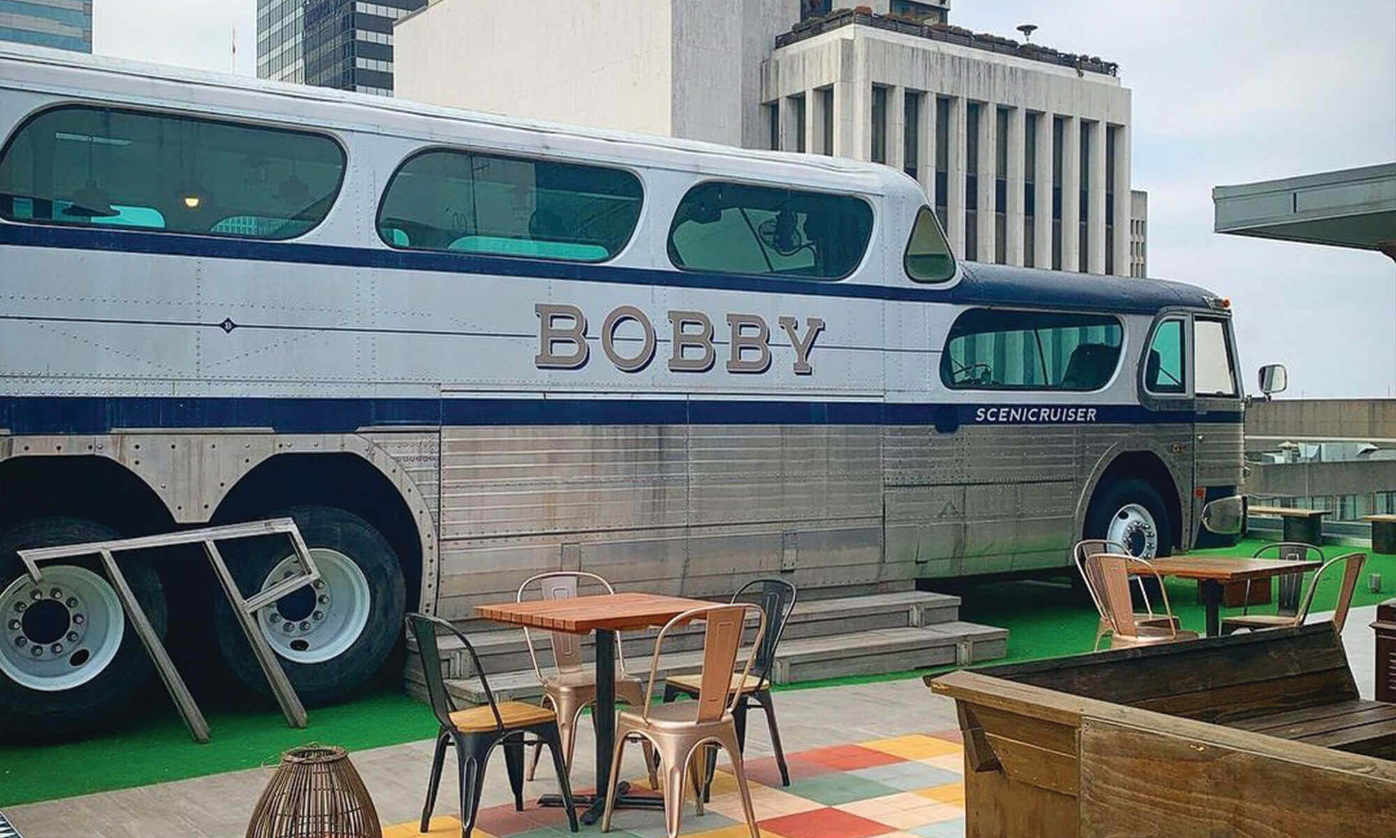
Whether it’s putting a bus on a hotel roof or mounting wooden letterforms for a festival photo op, utilizing your surroundings in an unconventional way will stick in the minds of your audience.
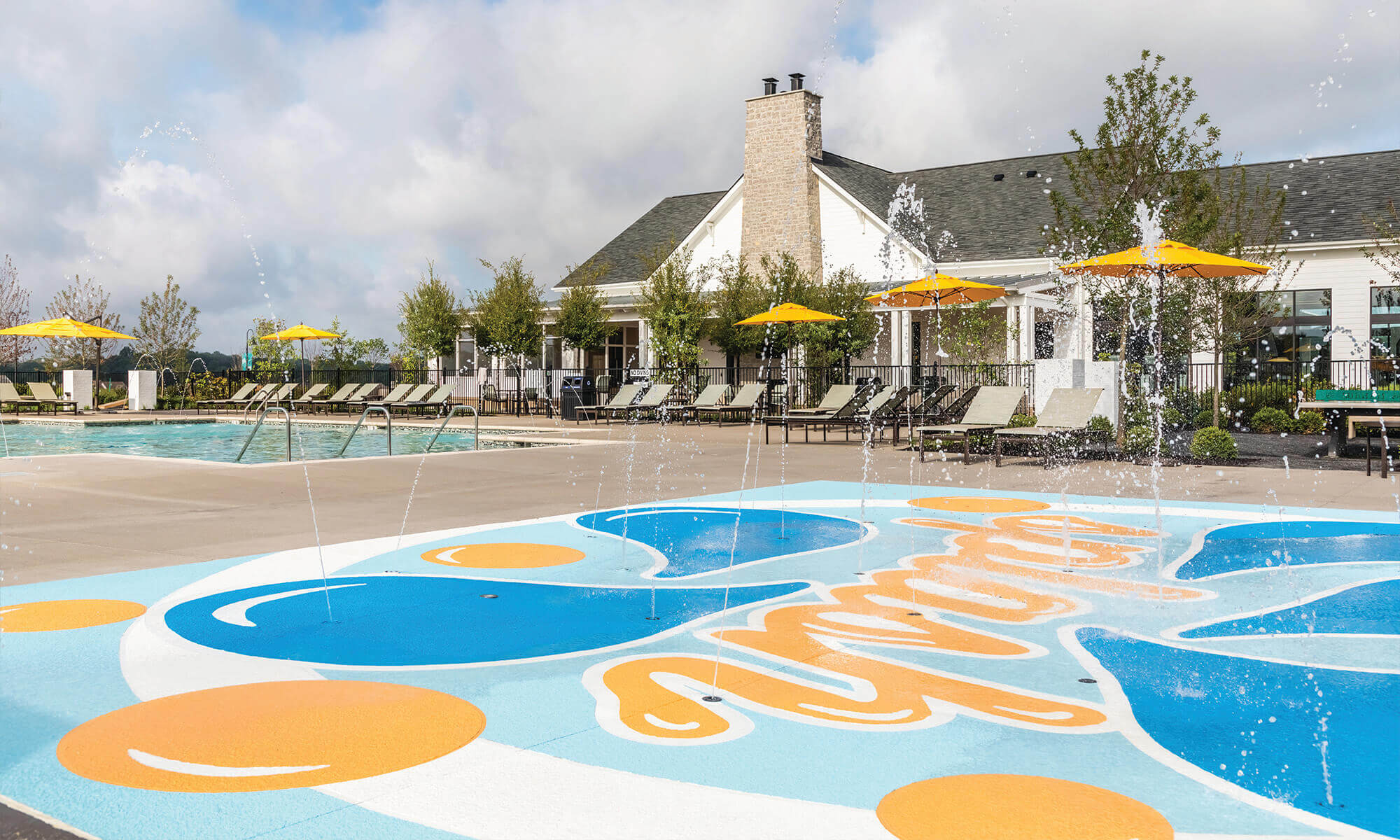
The Durham Farms splash pad would have been a hit with kids without any graphics at all. Who doesn’t like to run through water on a hot day?! Instead, we made the most of the space by putting a vibrantly colored “splash” ground mural design on the splash pad. This clearly marked the area of the splash pad for the community, and accentuates the fun experience for kids and those looking after them.
WAYFINDING Guide your audience.
Clear and concise directional signage needs to do 2 things:
- Guide your audience, giving them clear instructions of what to do or where to go next
- Reinforce your brand through physical aesthetics and messaging tone of voice
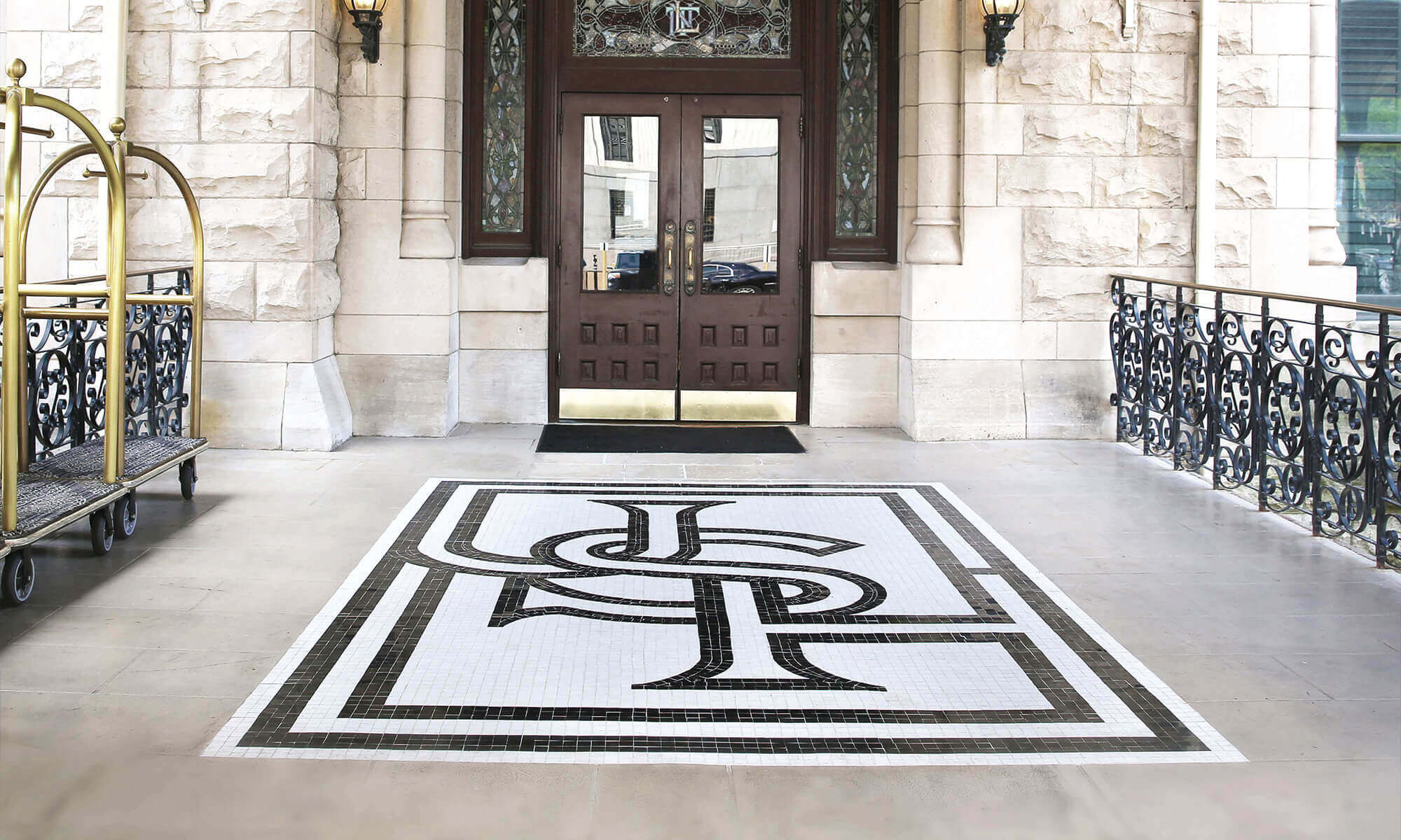
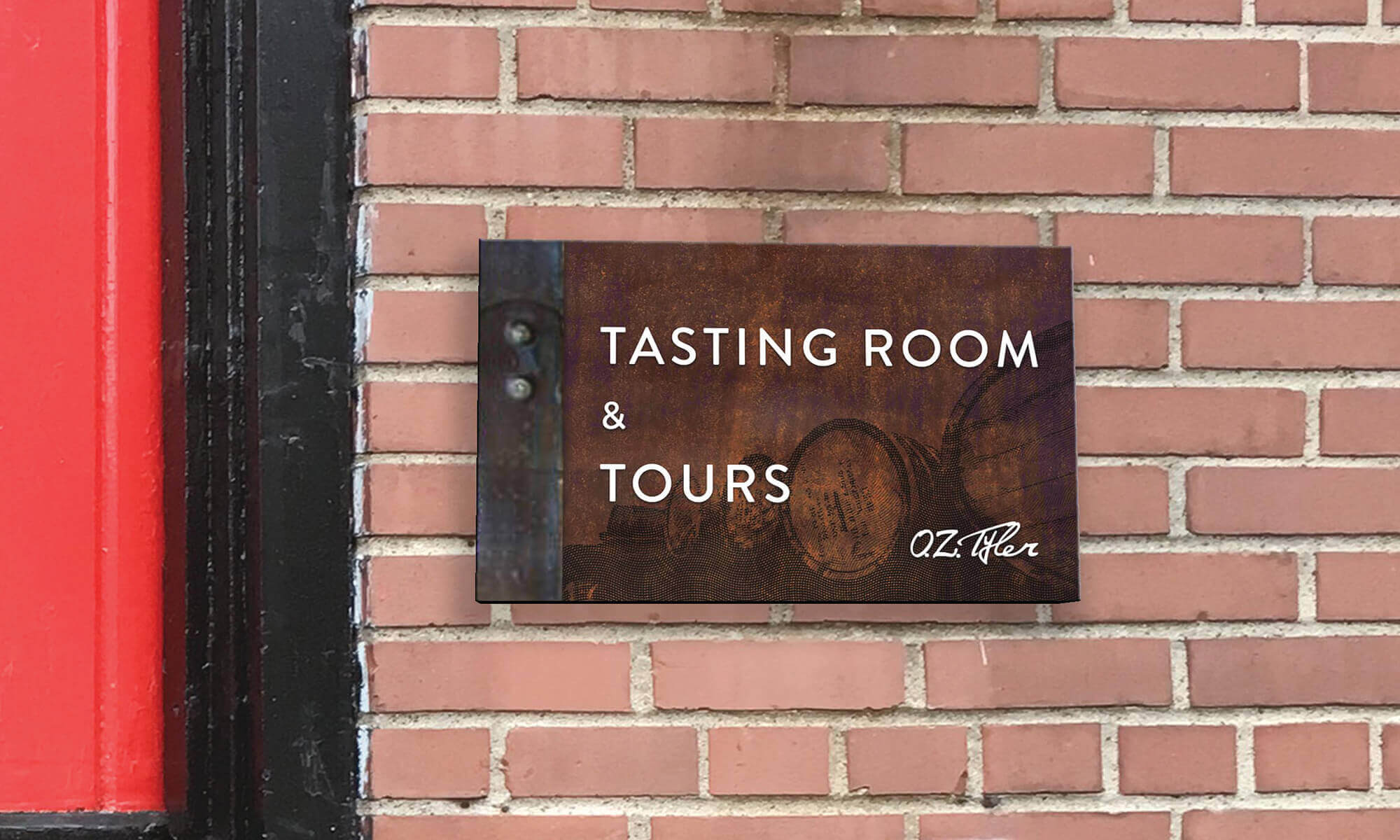
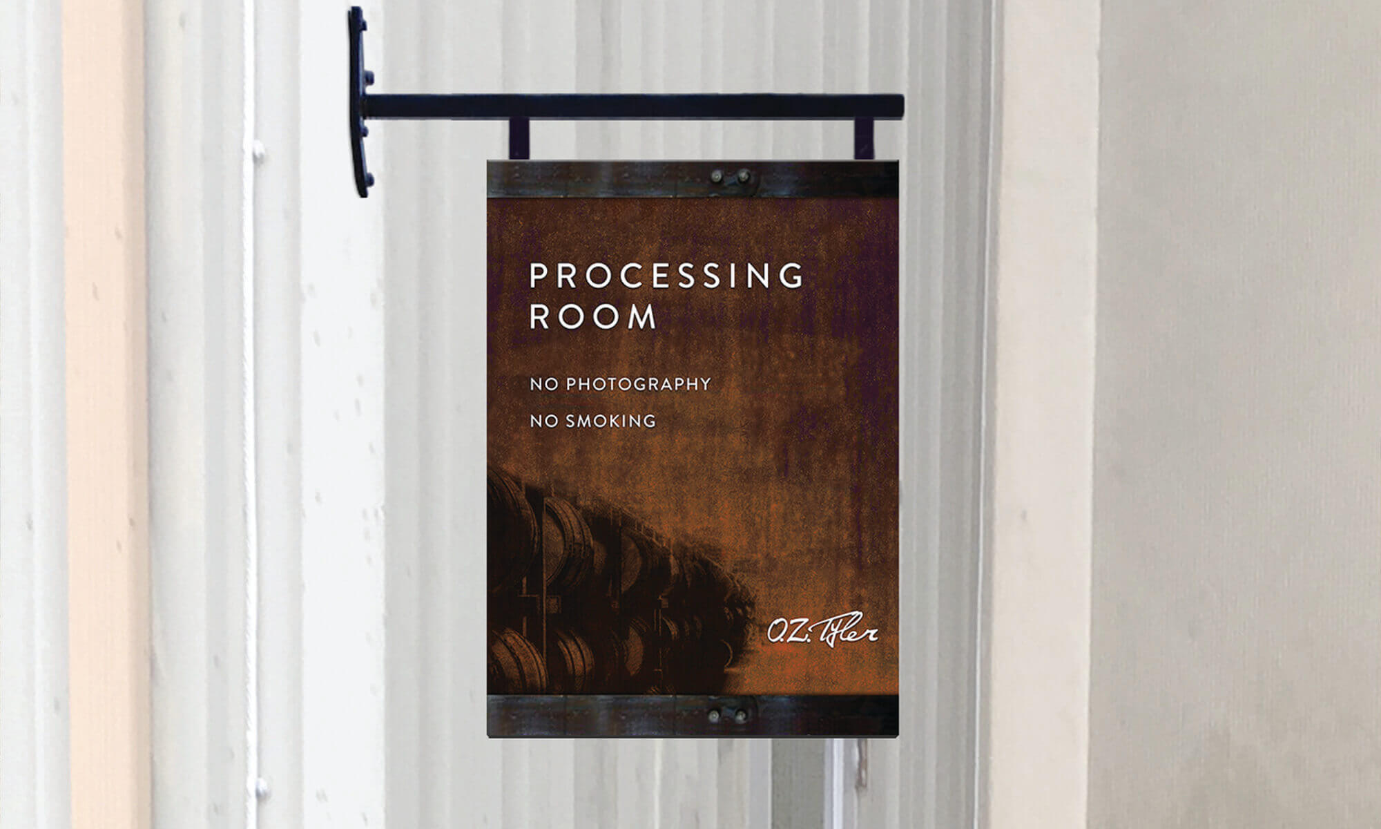
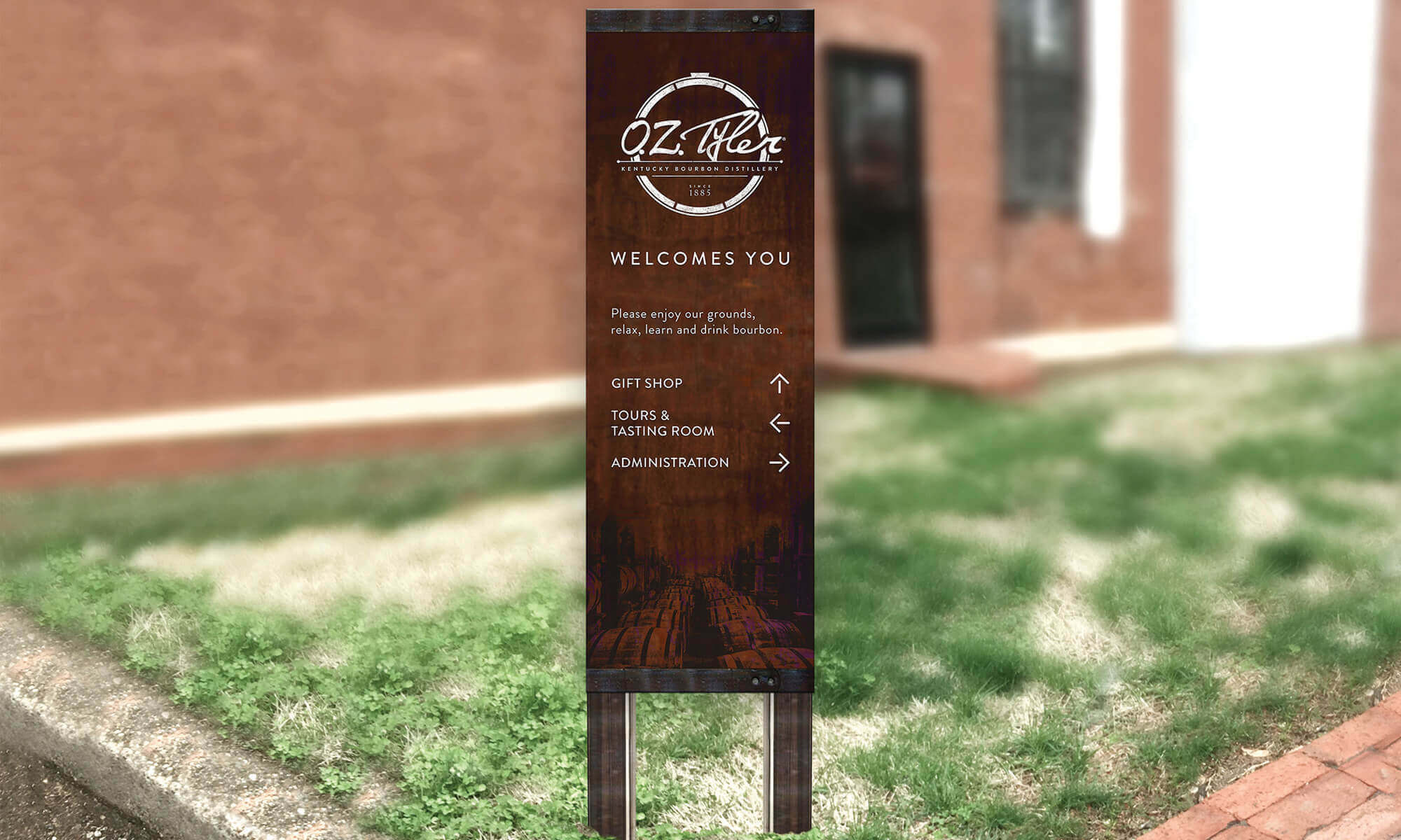
The O.Z. Typer distillery wayfinding signage does just this, using weathered metal and bourbon distilling imagery as the setting for clear directional signage.
TEMPORARY Built to (not) last.
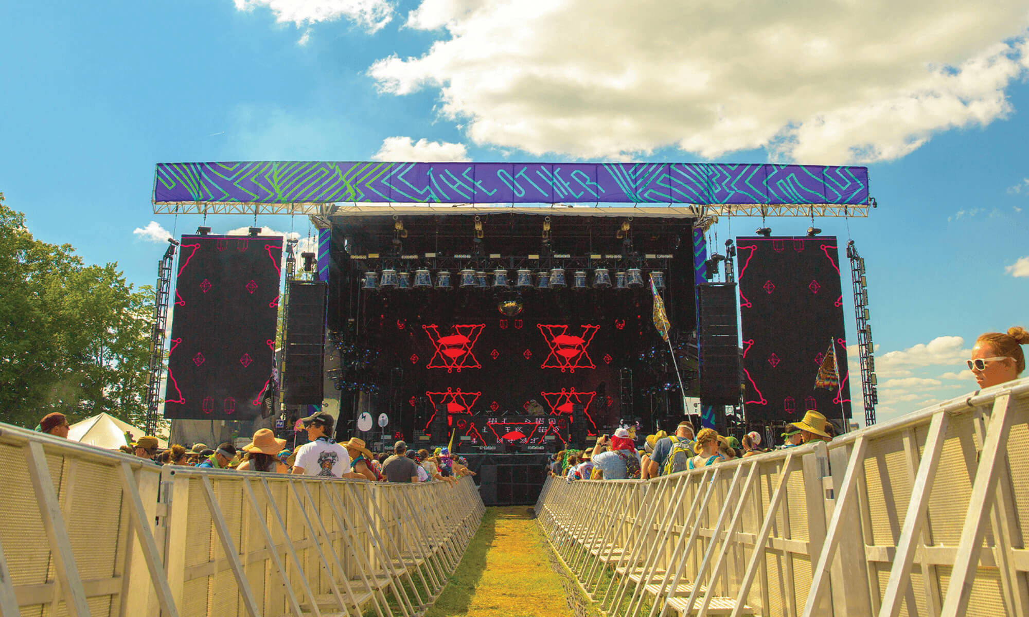
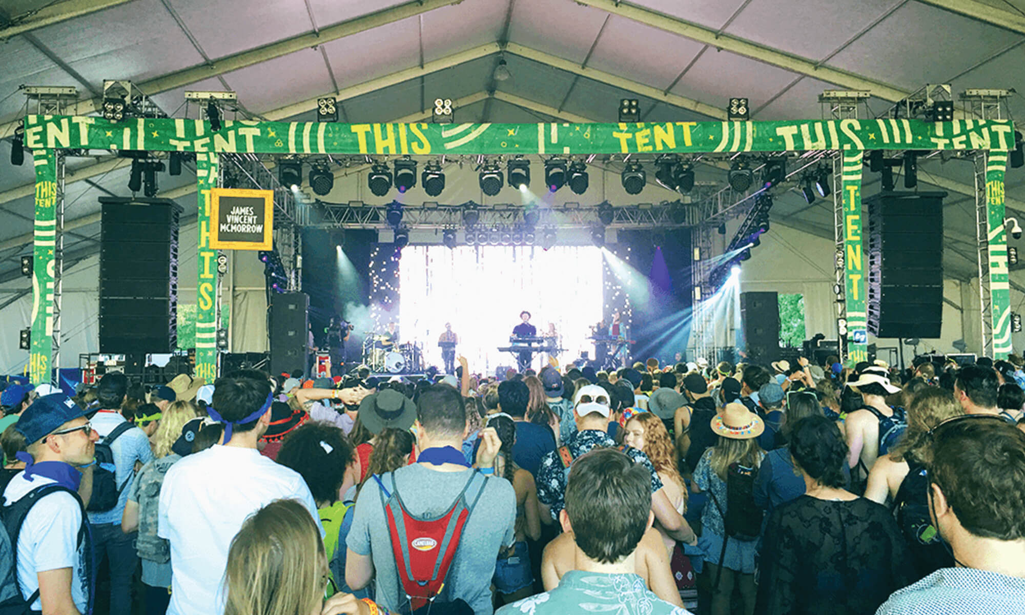
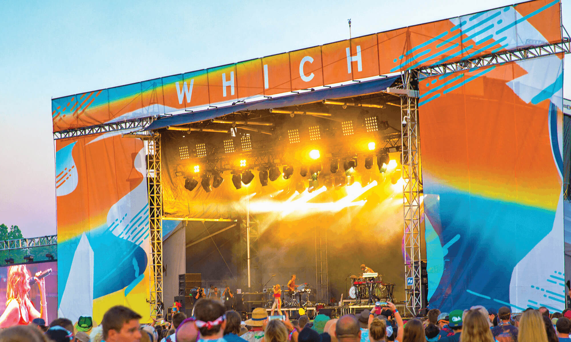
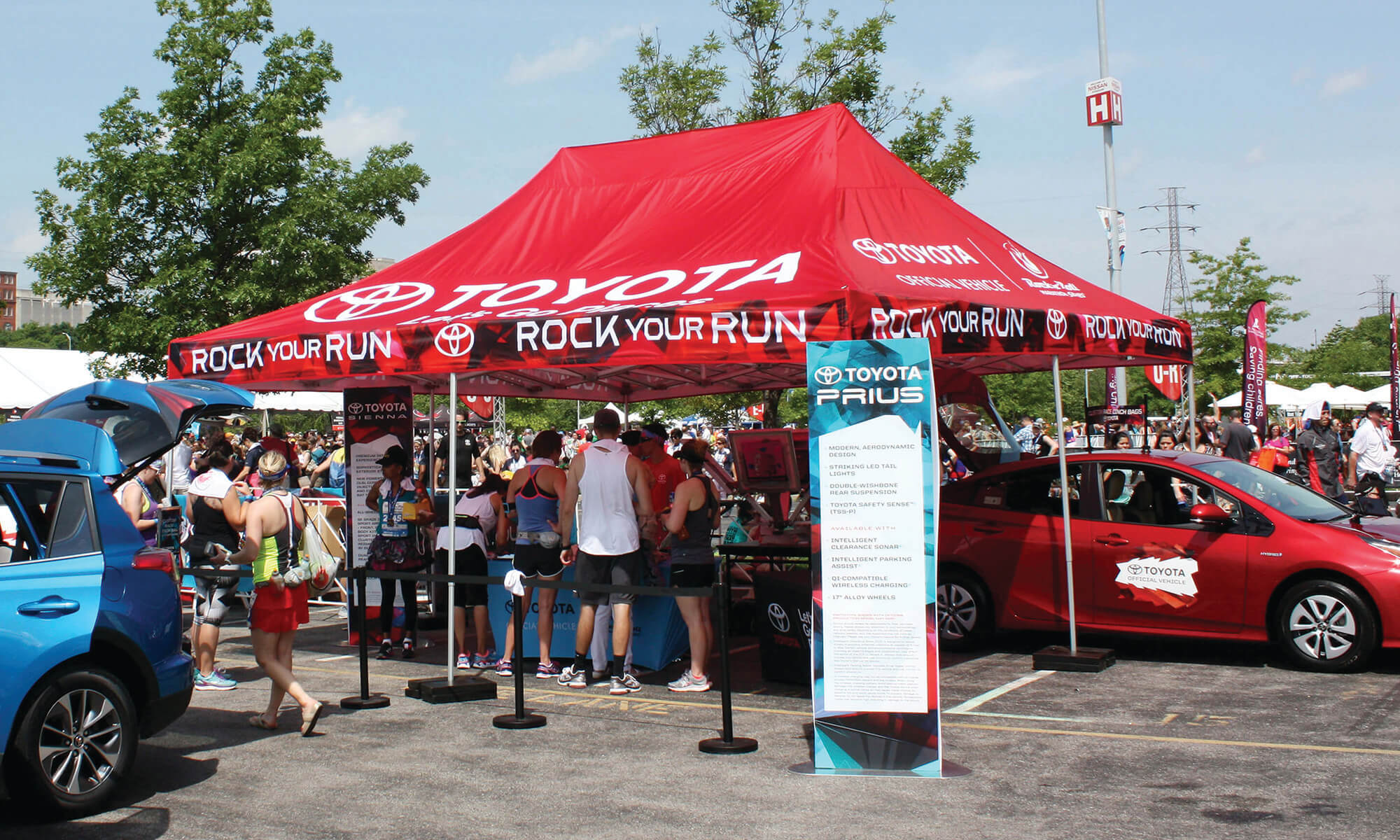
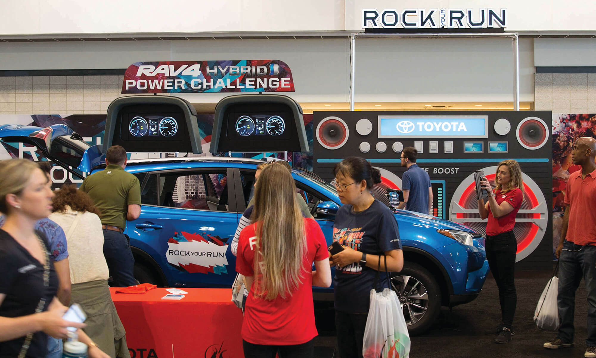
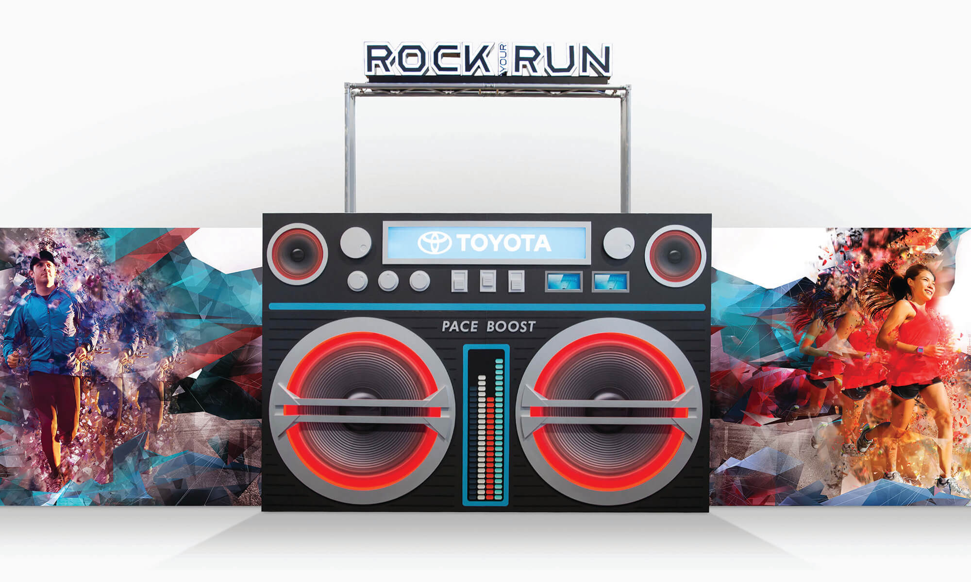
At ST8MNT we’ve had the pleasure of designing countless stage backdrops, tradeshow and event signage graphics and more than one giant boombox. It’s true that most signage needs to be a timeless and an accurate representation of a brand for years to come, temporary signage allows for more exploration into current trends and timely graphics that represent the current landscape.
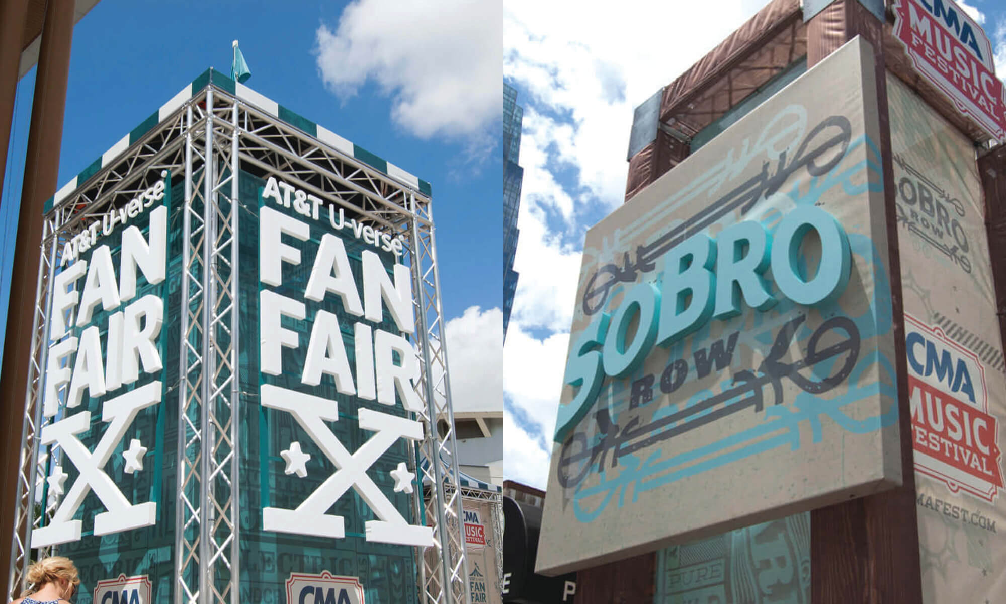
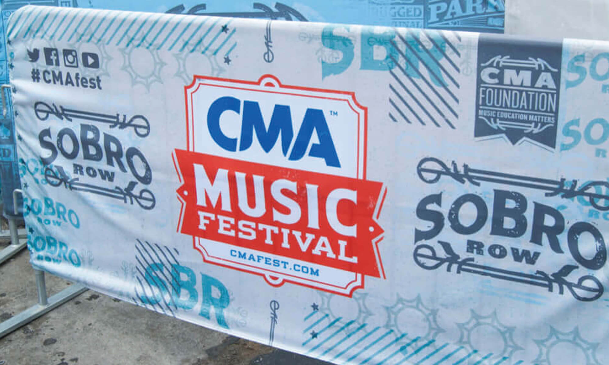
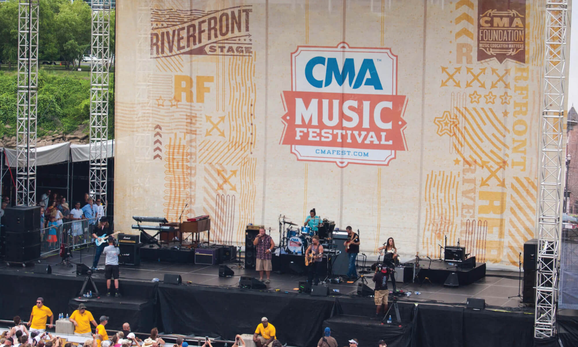
The event signage we created for CMA Fest ran the gamut. Logo lockups were created for each stage under the overarching CMA Fest brand and applied to stage graphics, directional signage and large mesh and acrylic signs to define the festivals spaces. The signage allowed the festival to transform downtown Nashville into every country fan’s dreamland while staying true to the letterpress style and authentic grit of Nashville’s country aesthetic.
So … what’s your sign?
In today’s world where we’re more physically distanced than ever, physical signage remains undeniably relevant. An attractive sign can transcend its physical space and serve as an Instagrammable landmark. Physical representation of a brand is a clear way to establish credibility and serve as a repeated source of exposure for your local audience.

