Reclaiming a historic landmark with an experimental and unique brand. True to Nashville, second to none.
A brand that represents change and conveys transitions
ST8MNT was delighted to be tasked with branding an icon of Nashville. We were ignited by the challenge of paying respect to the history of the train station, honoring what’s true to Nashville (not some outsider’s take on the “Athens of the South”), and breathing the fresh, eclectic energy of a city on the rise.
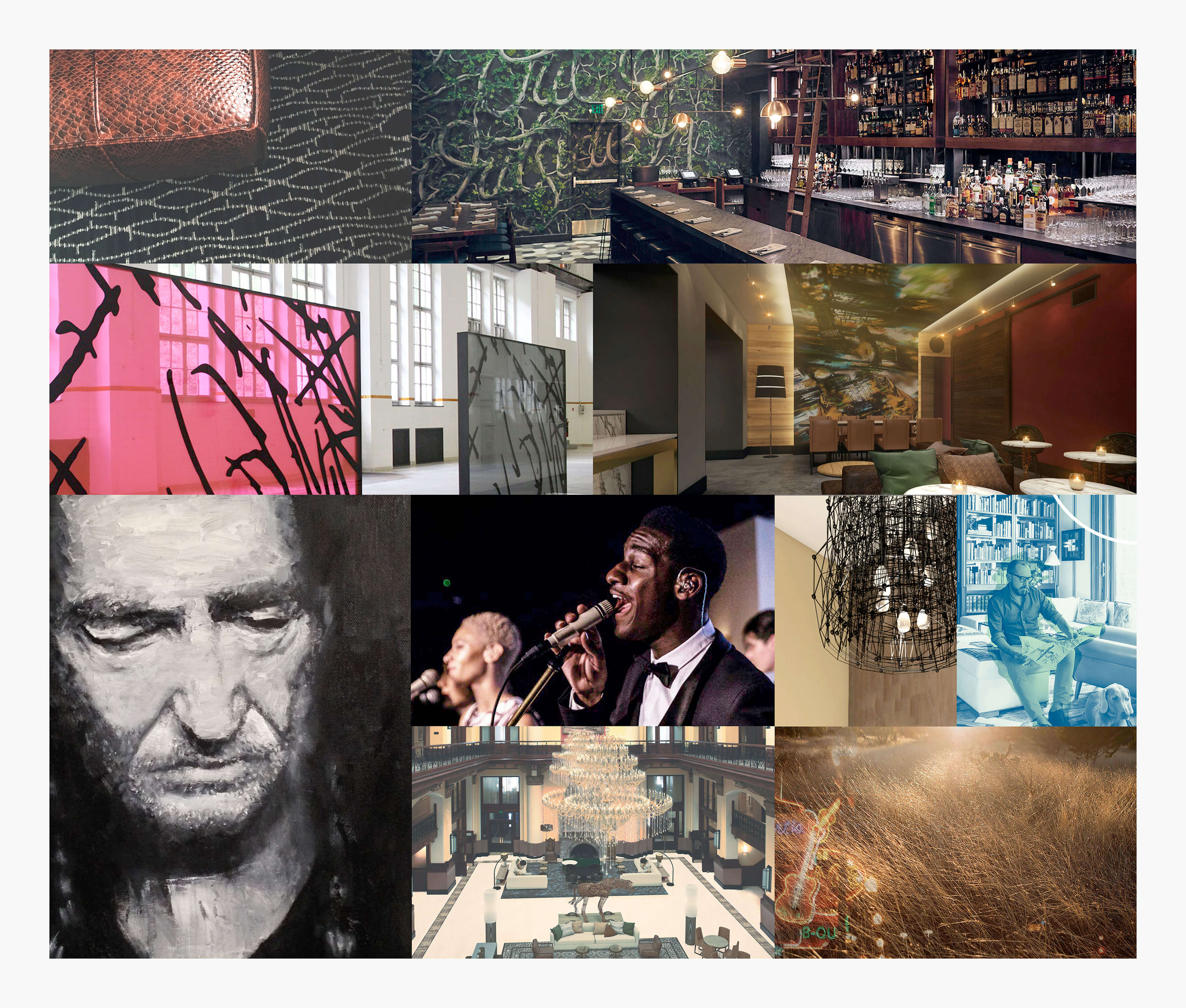
Mapping out the brand’s visual playground
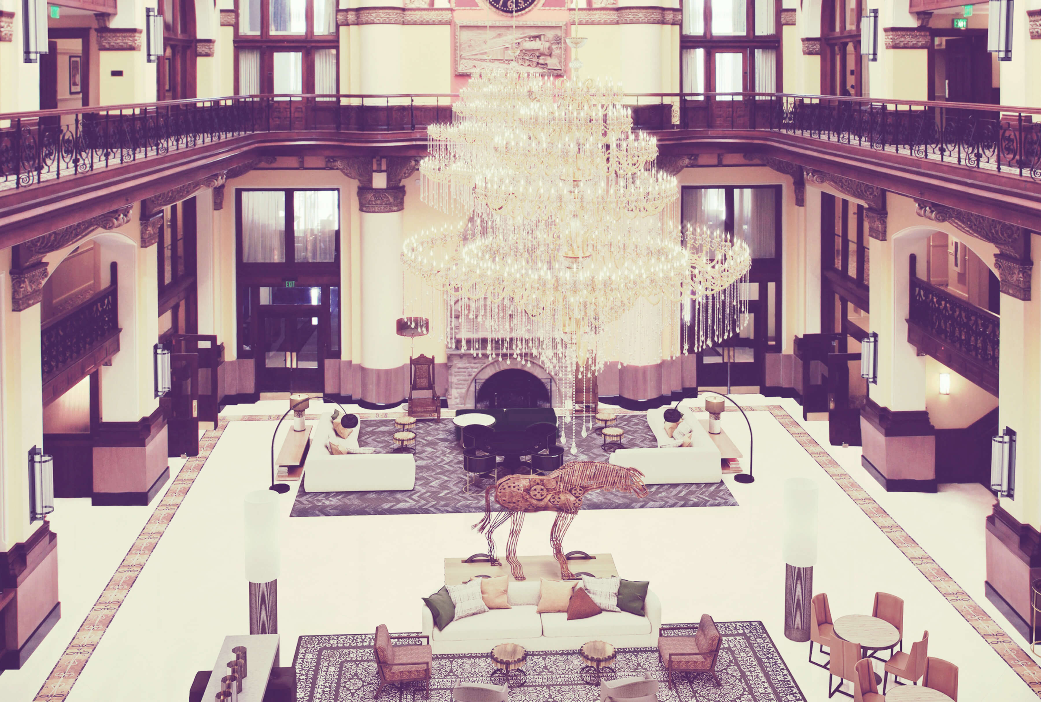
We developed the moodboard from pulled inspiration to represent what is the heart of Nashville as context for the Union Station Hotel brand. It’s contemporary but storied, luxurious but approachable, and polished with a slight grit. This representation of Nashville is for the professional that isn’t afraid of a challenge, but still knows how to unwind. The moodboard is a visual vocabulary set rooted in the artistic and experimental experience yet forged in the past.
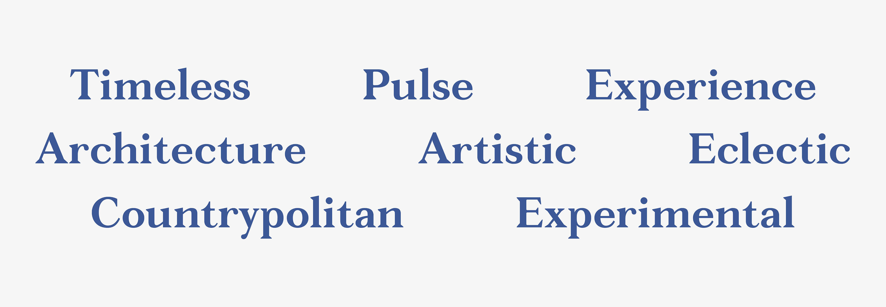
Words to live by
The brand descriptors were put in place to be a constant litmus test for the brand development. Every aspect of the brand should support the descriptor words and reinforce the position of the rebrand.
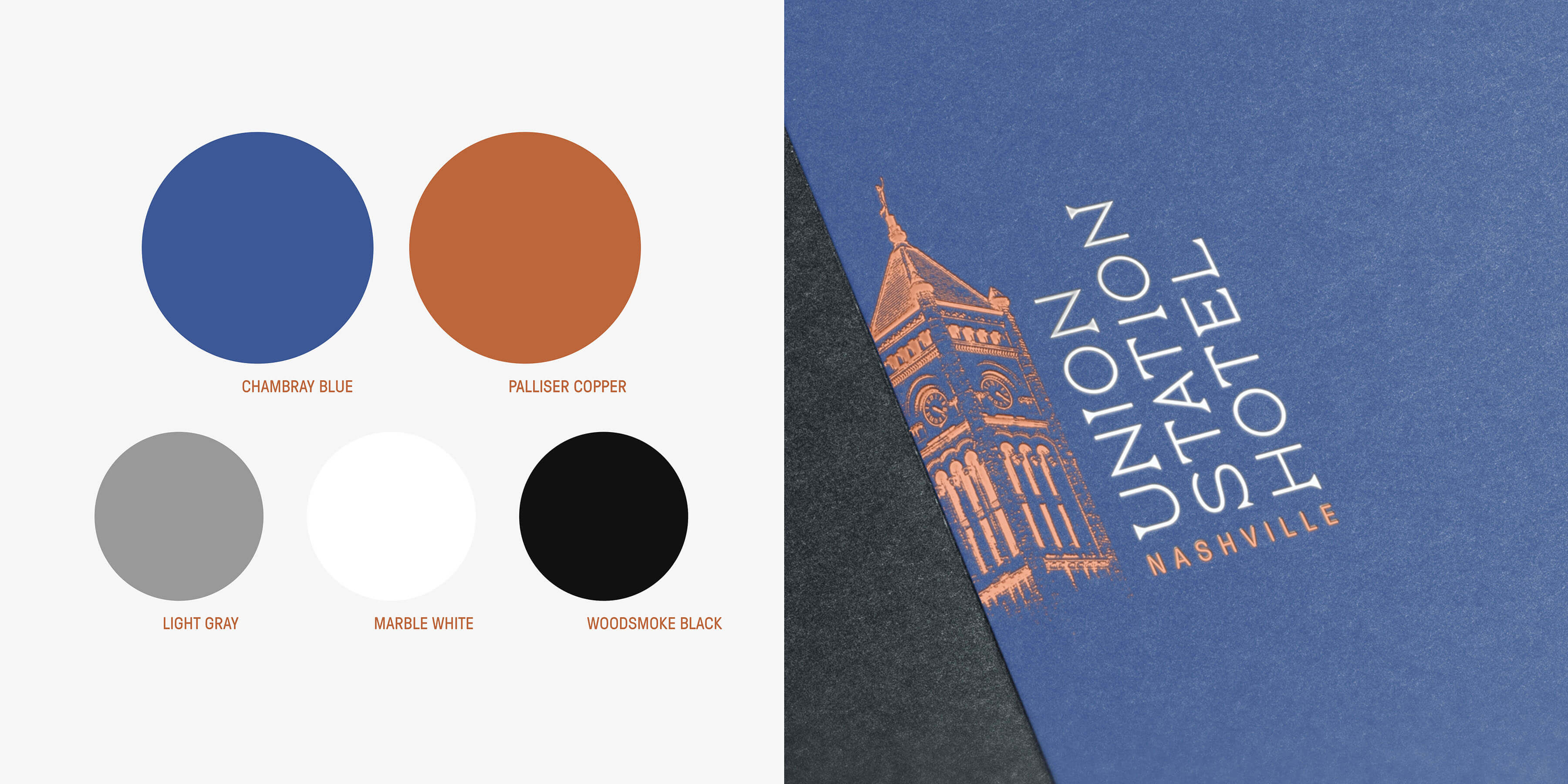
Colors say so much
The bold color scheme is to inspire the viewer to the calm sense of confidence and adventure. It references historic pairings but utilizes them in a loud and contemporary manner
The muted Chambray Blue evokes the sense of security and trust that the hospitality industry is built on. It causes the viewer to be calm and helps transition the guest to begin their relaxing stay at the Union Station.
Hotels are people’s home away from home, hence the importance to convey trust. Hotels also serve to rejuvenate and recharge the guest on their vacation. That’s where the color Palliser Copper comes into play.
Palliser Copper is a nontraditional metallic color. It was chosen to satisfy the unique and experimental attributes of the hotel. Copper helps conveys the emotion of happiness and to inspire the viewer to renewed optimism and energy.
Gray, White, and Black are the secondary support colors and serve to anchor the brand.
The positioning of the tower crop is to break up the brand and to solidify the experimental nature of the brand.
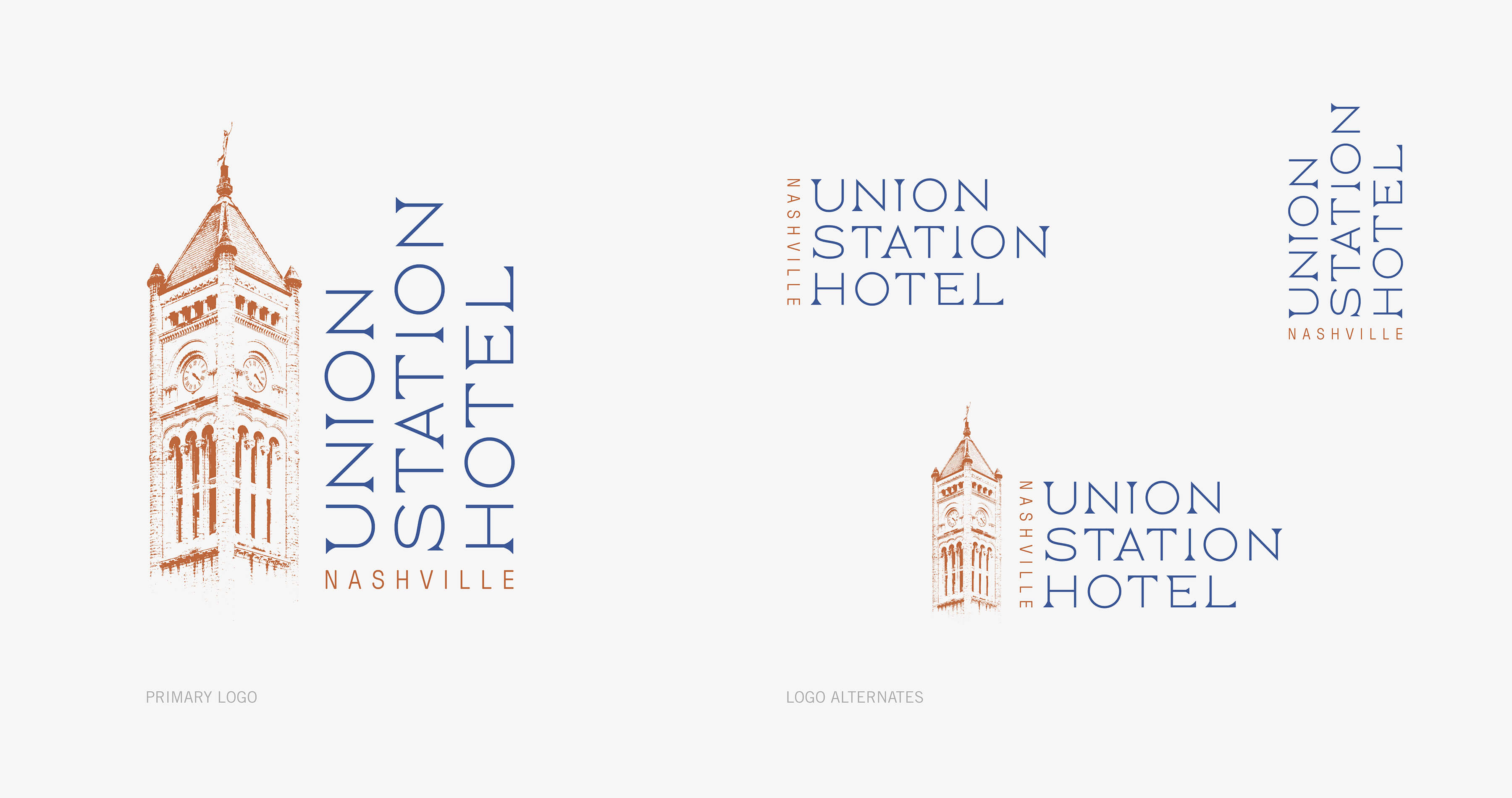
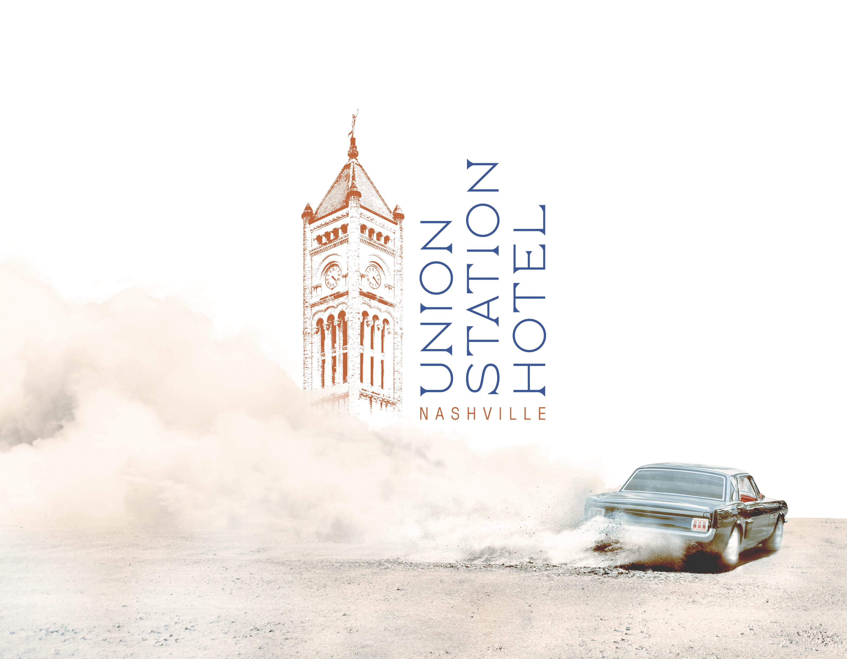
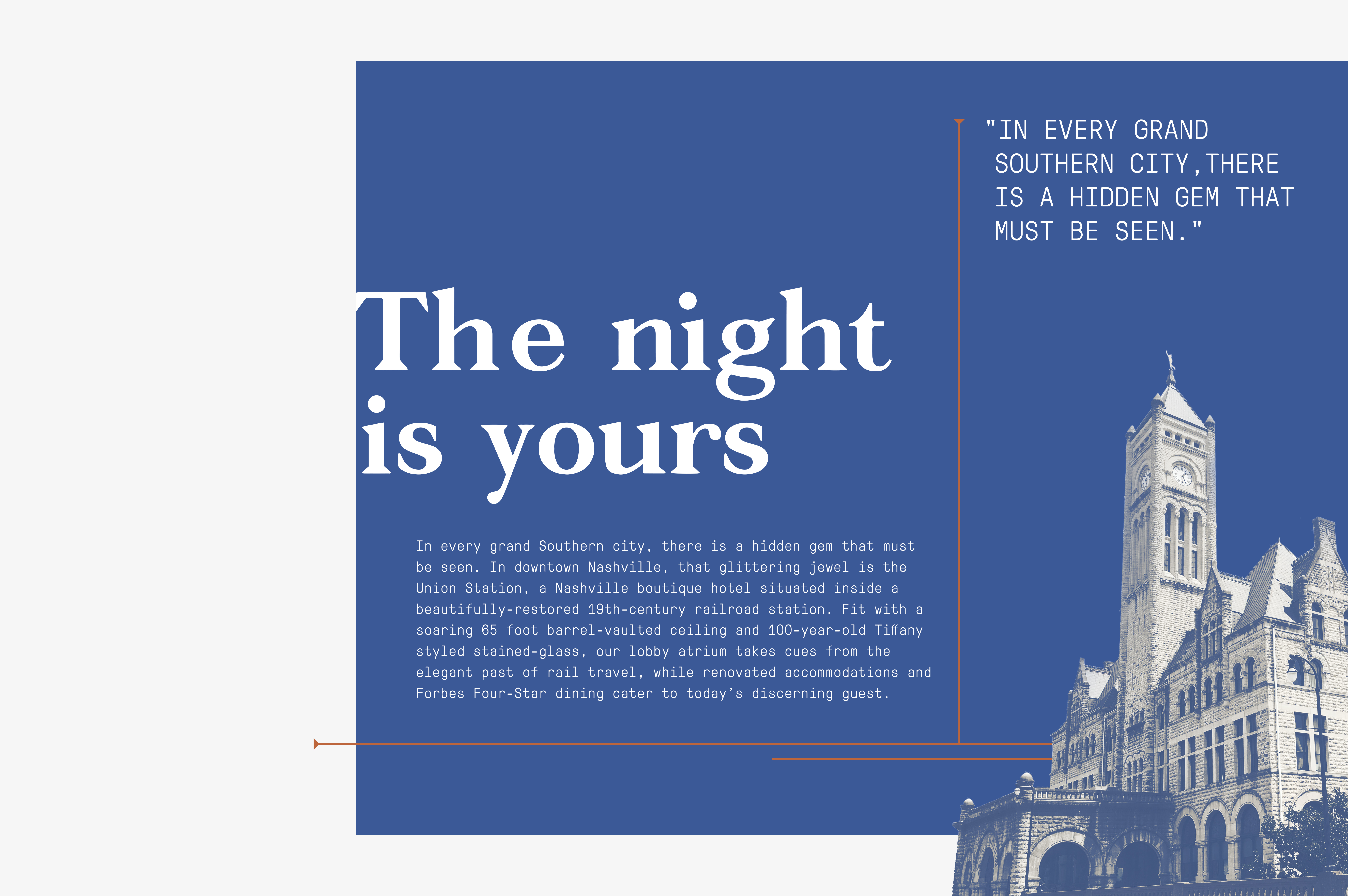
The Union Station Hotel logo subtly represents transition and movement. From point A to B, to new from old, and start to finish. Elements of serifed type fade in and out in this modern inspired geometric custom wordmark. The iconic clocktower that shapes downtown Nashville’s skyline is embraced, and history remembered. The brand’s essence is to reclaim historic elements and appropriate them for the new Nashville visitor.
The logo turns normal constraints and notions on its side. It’s unique, subtly unconventional, and eccentric while remaining timeless and legible. The concept is to juxtapose opposites, marry them together to yield an inspired and bold brand.
The voice and tone of the Union Station Hotel brand is confident, conversational, clever, and fast-witted to attract it’s audience to the Union Station brand.
We crafted a brand experience for guests to travel to, not through. The Union Station Hotel is the destination.
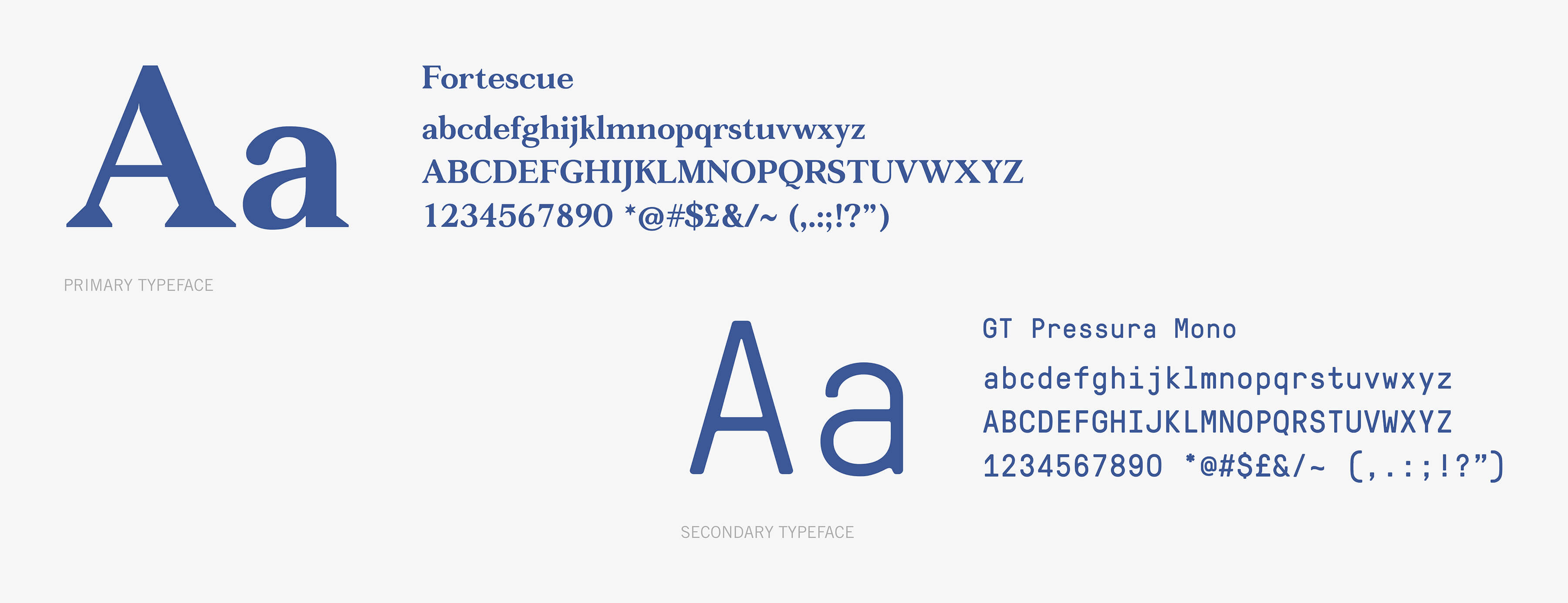
Artistic and experimental type selections that convey a sense of rhythm and play off the hotel’s history
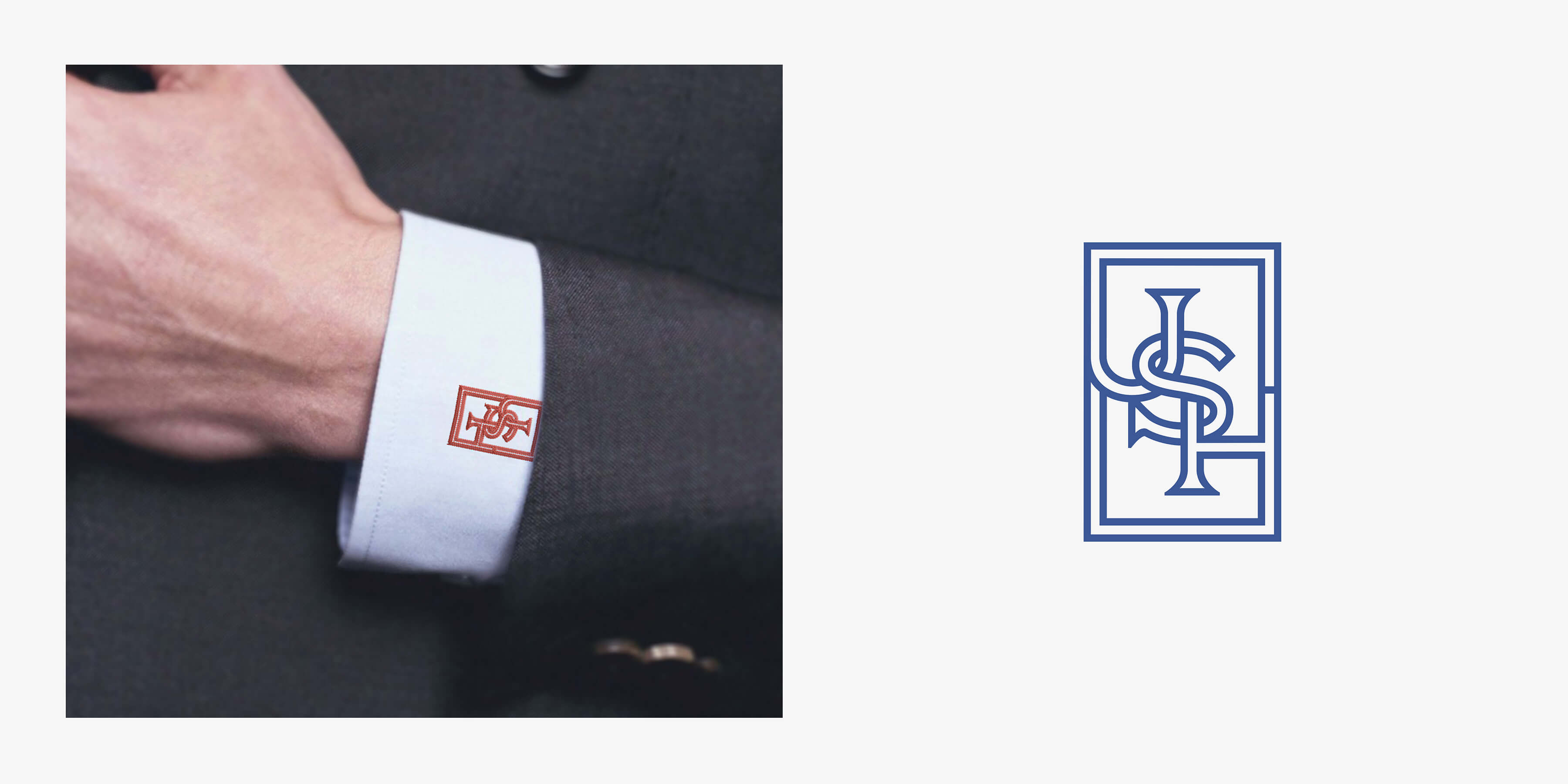
A monogram to compliment the logo
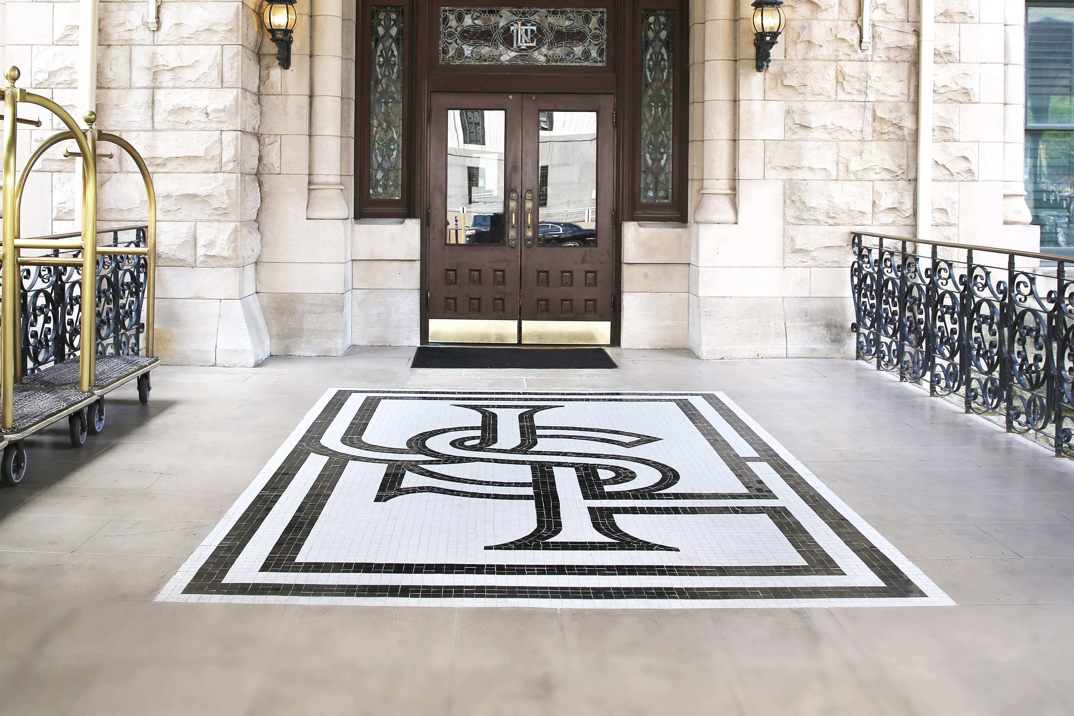
The USH monogram is an appropriation of southern (by way of Europe) heraldry and is executed in an in-line format to reference the rail nature of the hotel. It serves the brand to reinforce the logo for instances when the full logotype isn’t needed. The mark is strong, but delicate and a contemporary execution to compliment the full logo.
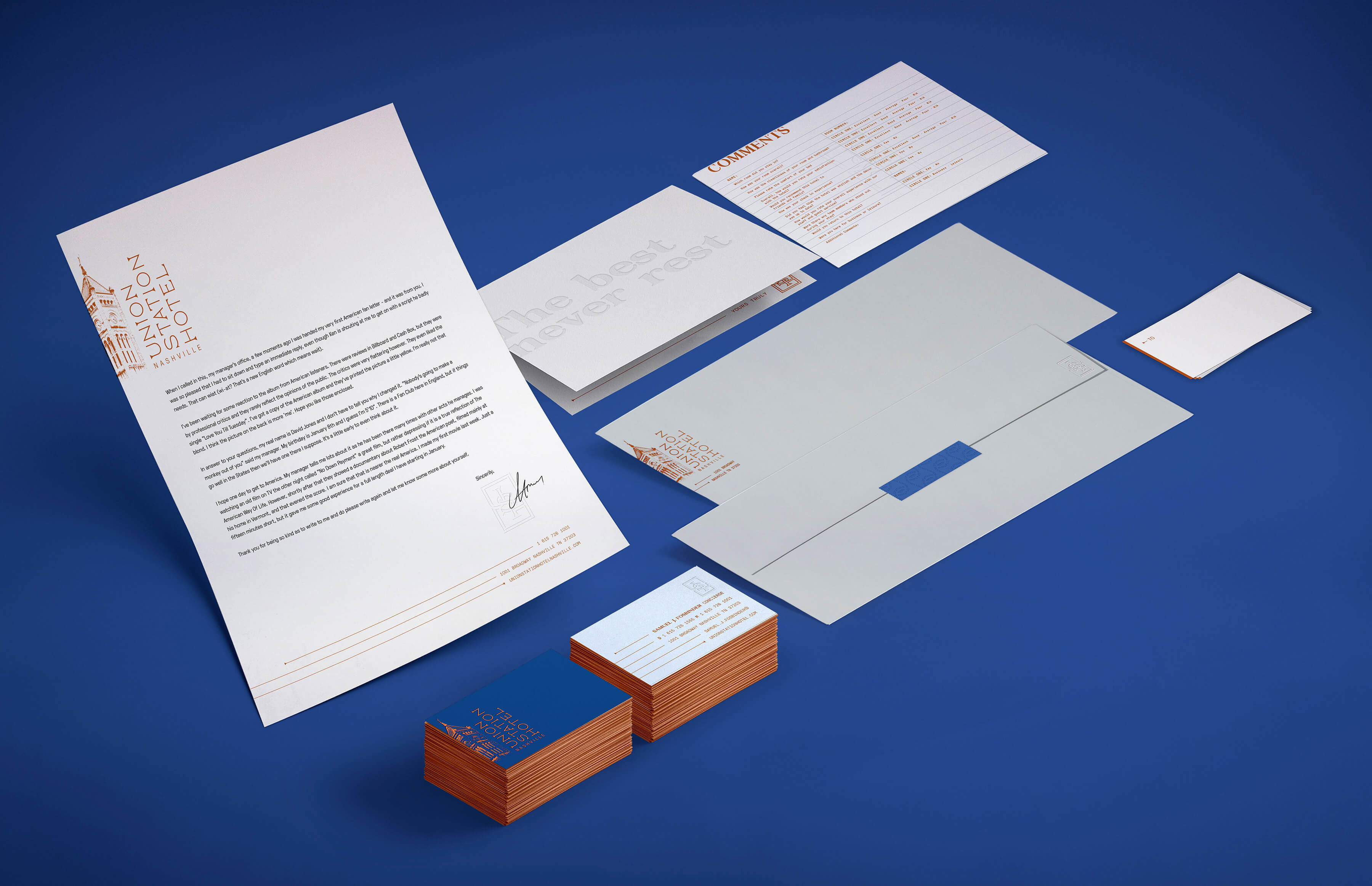
A communication system worthy of the brand
The Union Station Hotel stationery features interesting crops and usages that highlight the architectural integrity of the hotel with the approachable tone of the brand. The type is forward and highly strutted to convoke the sense of professionalism. Business cards have a blind emboss of the monogram and gilded edges to restate the brand’s high-end nature.

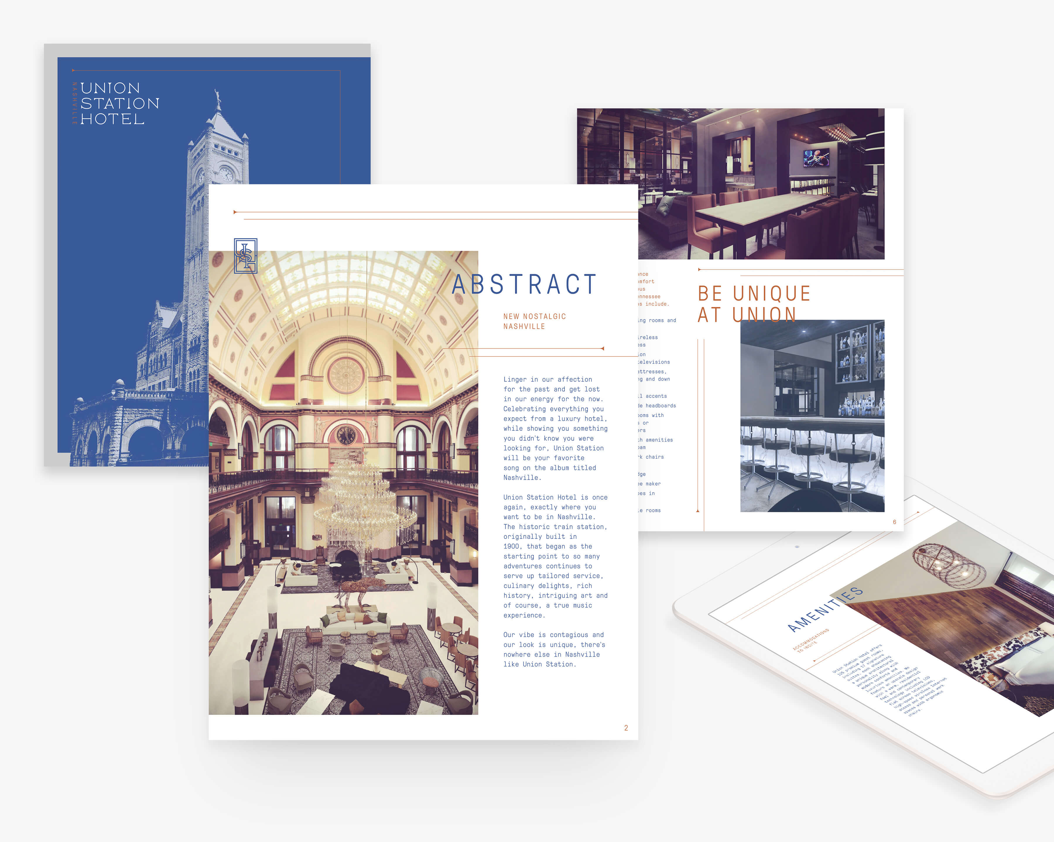
How to sell with style
The digital press kit is Union Station’s tool to market the hotel’s unique offerings for events, weddings, meetings and performances. The feeling of a contemporary, artistic and inspired hosting space like no other is the impression left by design.
Unique rooms, amenities and features, beautiful photos and renderings, and precise details are all outlined and showcased to inform the interested reader.
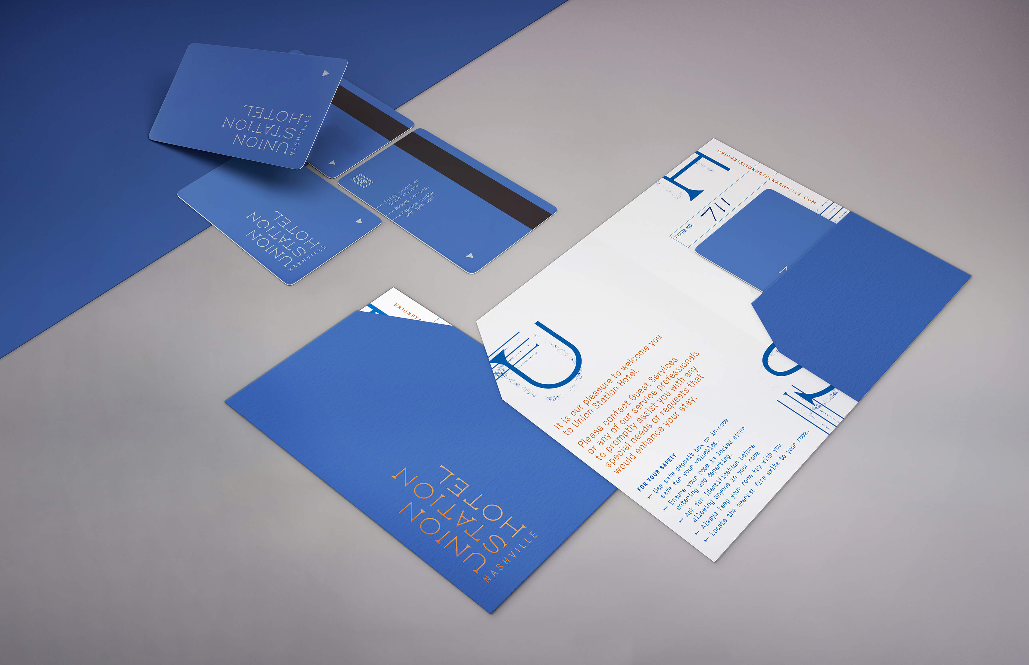
The keys to your destination
The key card is perhaps the most used guest touch point for a hotel. It’s carried by the guest and is as personal to the beholder as purse or wallet. We designed the key card as a field of blue with the logo in gray on the front.
Each card is delivered with small card folder to enclose the card as well as the room number or a hand-written message. This simple elegance really lets the brand shine.
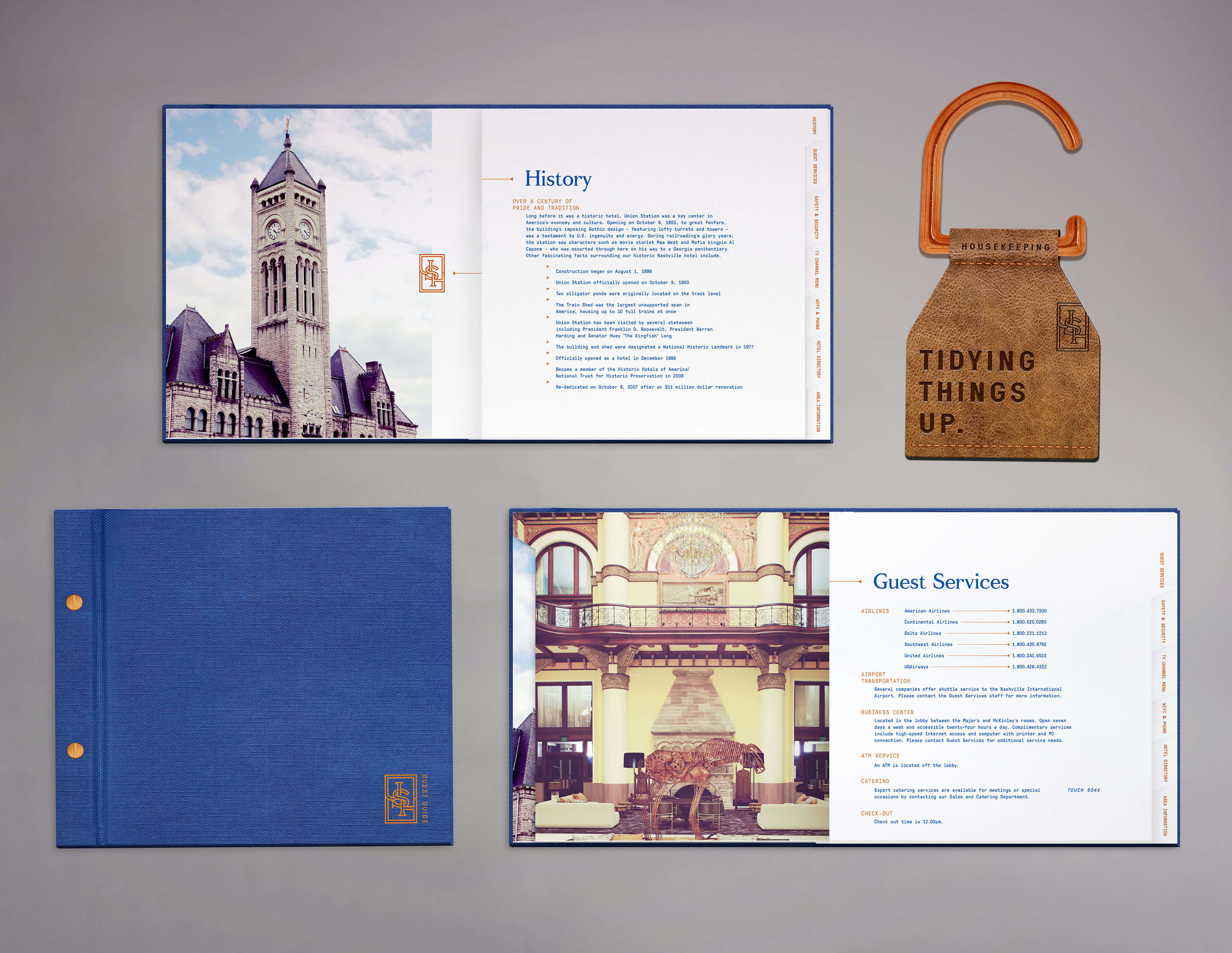
Guiding the guest during their stay
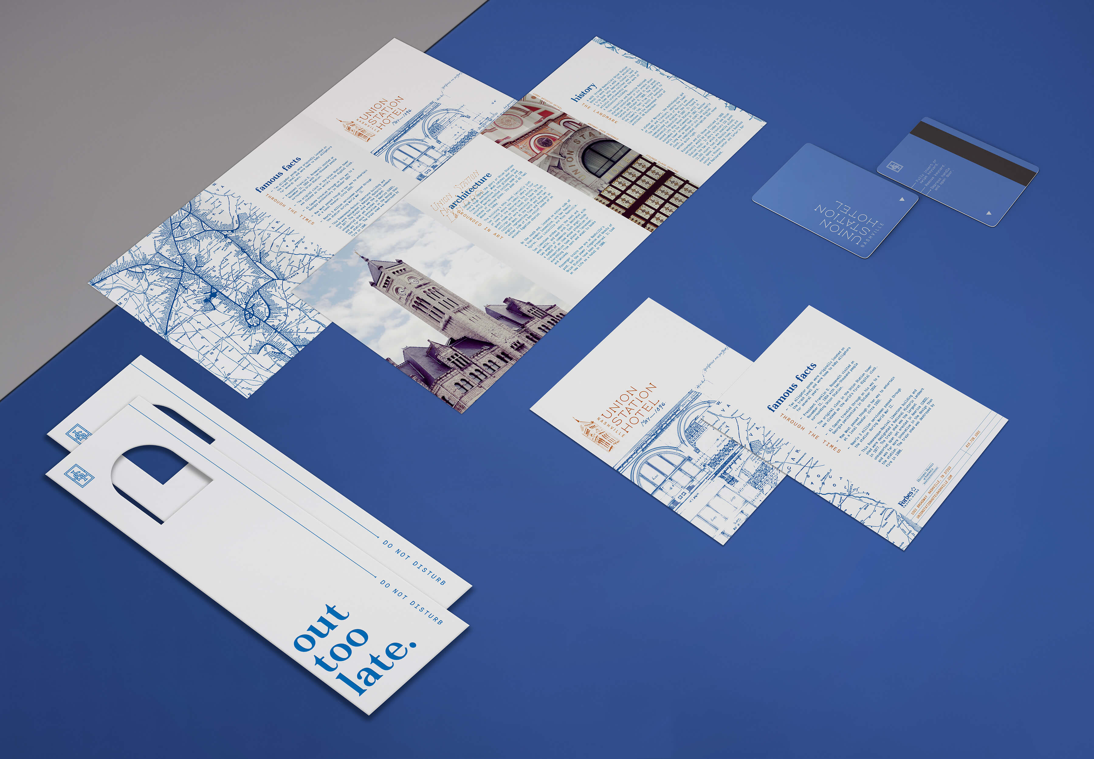
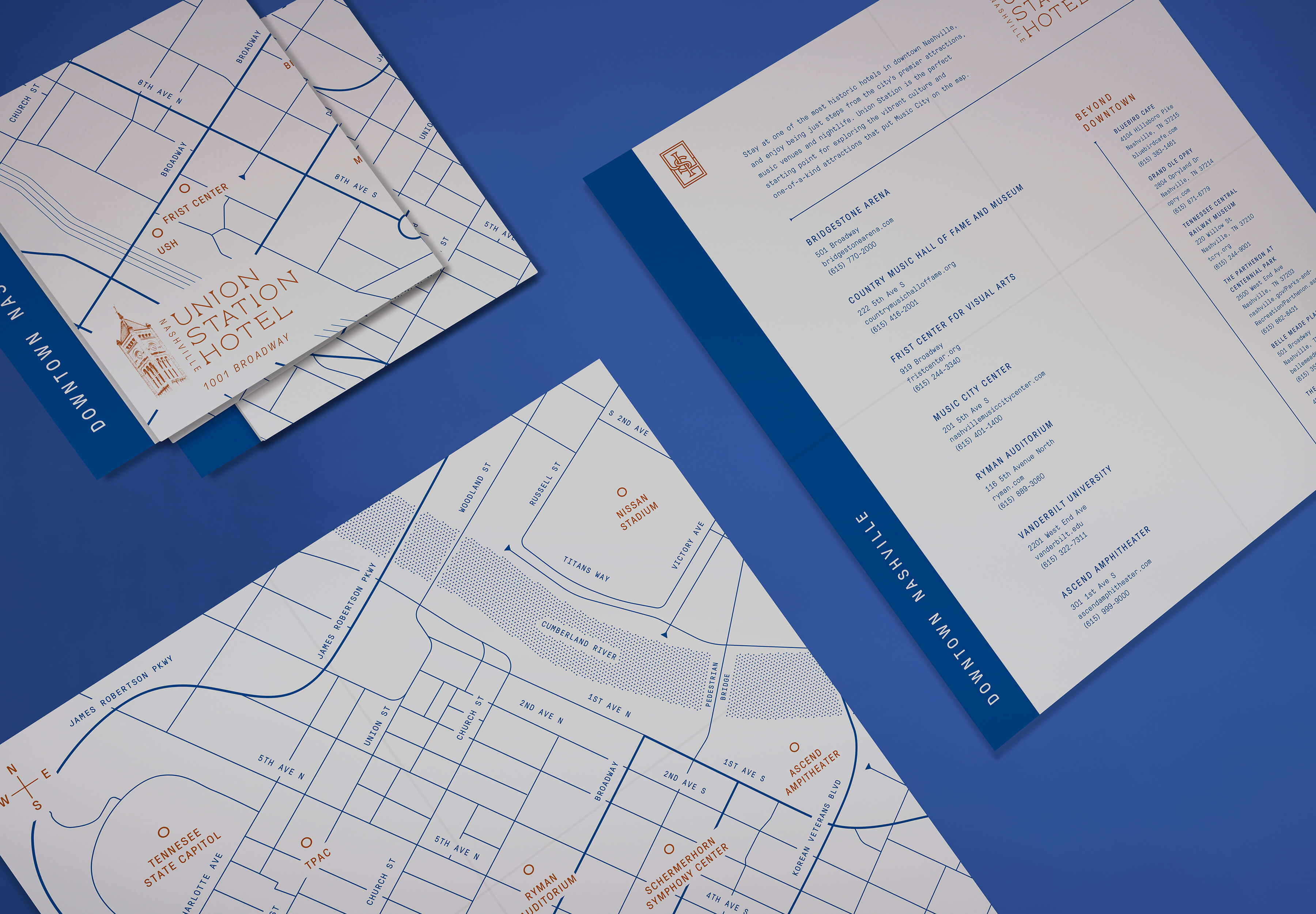
The Guest Services Guide was designed to feel substantial, like the building, with artistic touches. The contents range from a history of the hotel to airline contacts and details about Nashville. The guide is constructed with screw post binding for its polished nature as well as ease of updating.
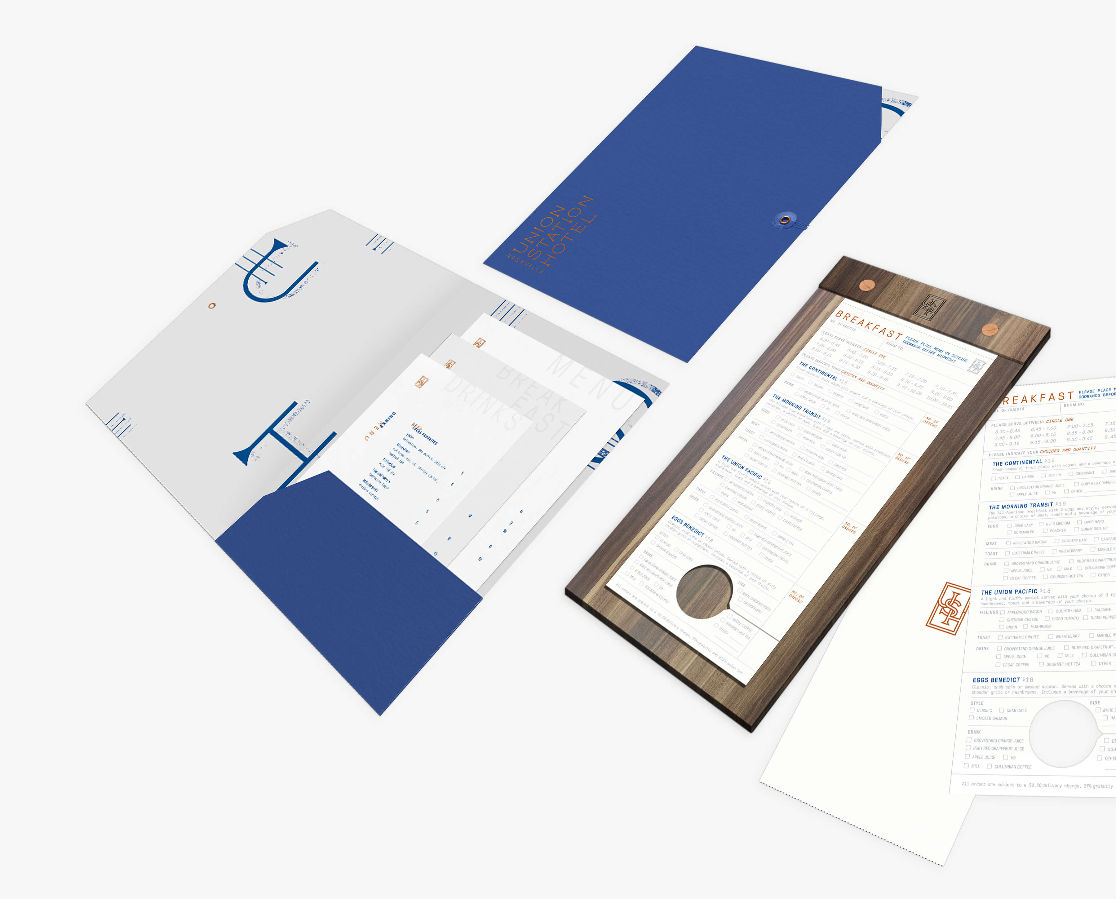
A full set of menus is provided in each room for the hungry traveler. The breakfast order form is perforated and printed with hang tag slot at the bottom as a smart solution for ordering in advance.
Fine-Tuned Hospitality
The history of the hotel is paramount and enriches the guest’s visit. We designed an engaging brochure to bring the guest into the history.
Do-not-disturb tags were designed with a custom and witty message, and are meant to be noticed and used often.
A user-friendly guest guide map was created to travel quartered easily and when unfolded the viewer opens up the map to all the opportunities that downtown Nashville has to offer.
Dressed to welcome
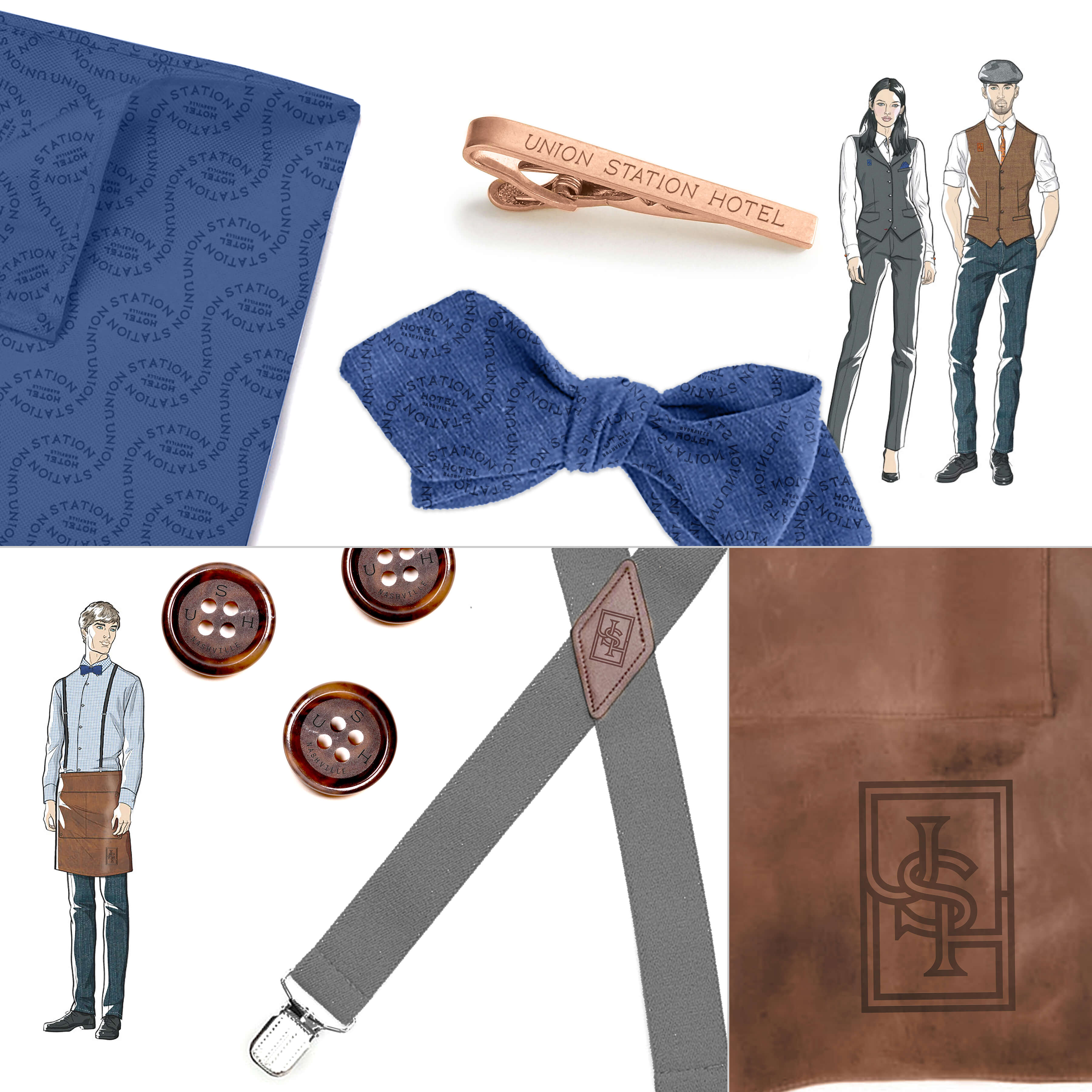
Union Station’s uniforms went through a redesign and brand audit. ST8MNT brought in elements of the brand to accent and elevate the well-dressed employees. Bowties, buttons, shoelaces and leather aprons were all thought out to incorporate the brand and vision of the hotel.
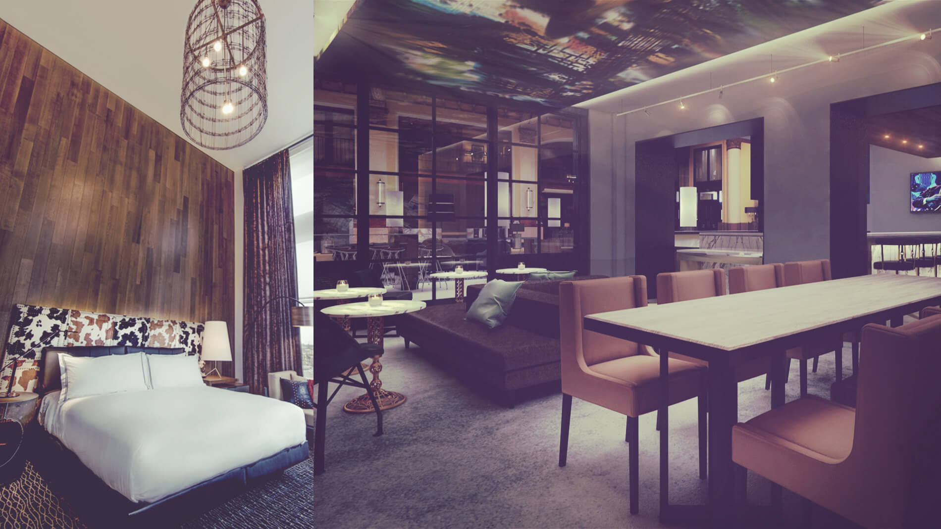
Wining and dining with form and function
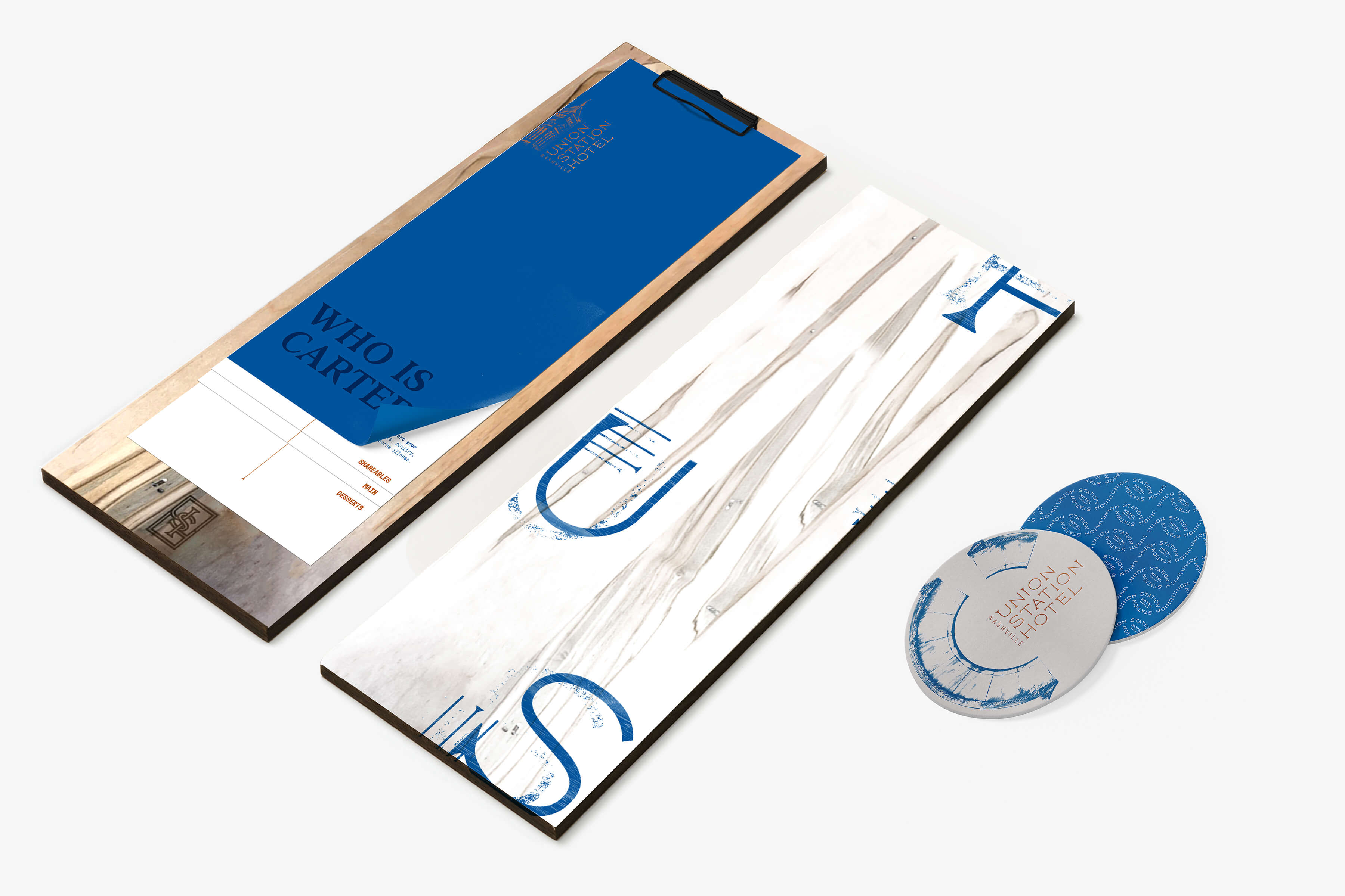
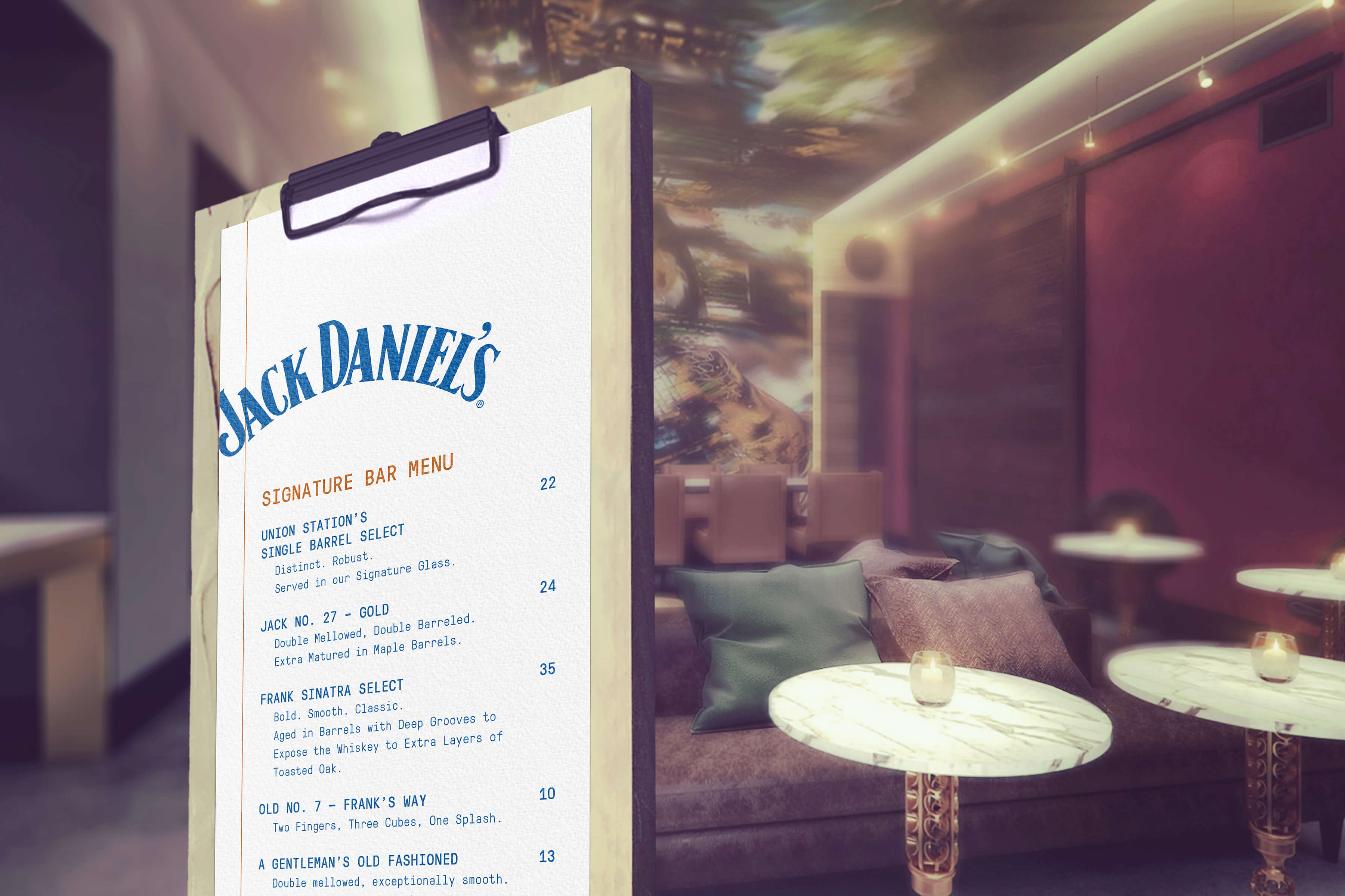
Friendly, eclectic menus were designed to reflect the artistic qualities of the hotel and space, as well as being updatable by the staff daily to accommodate the variable nature of their offerings. A double sided table topper was developed to be easily changed and promote featured drinks and snacks unique to Union Station Hotel.
It all starts with a sign
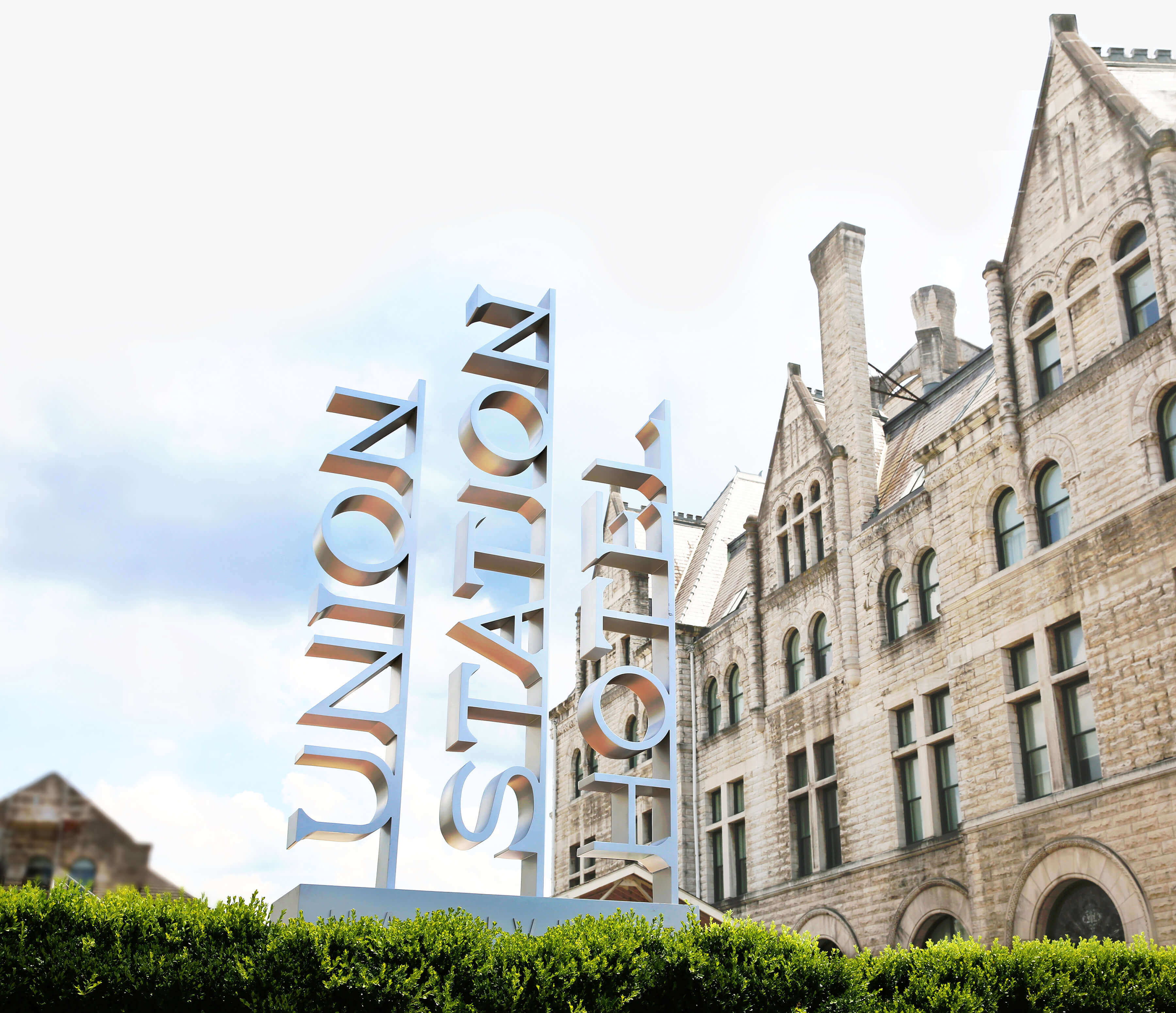
A good sign is welcoming, get’s noticed and informs the user what is in store for their experience. It is the first brand touch point and impression a viewer receives. The exterior sign is the statement piece of the hotel and nods to it’s railroad history with sophistication.
The design of the sign is self-confident and artistically crafted. It’s constructed to appear formed out of one solid piece of polished metal and compliment the historic building. The monument is sized to impress, work within the space and convey the USH brand.
Sign fabricated by I C U Outdoor Advertising
