

 Abby Murdock
Spoiler: I’m No Michelangelo
This past August, I spent two weeks traveling through Italy (per the ST8MNT tradition of sending employees on a sabbatical once you hit your 5 year anniversary). During the two weeks we travelled from Venice to Florence, down the coast to Cinque Terre, and ended in Rome. While the trip was a chance to step away from the day-to-day, it also became something else entirely: an opportunity to slow down and reconnect with creativity in a more analog, observational way.
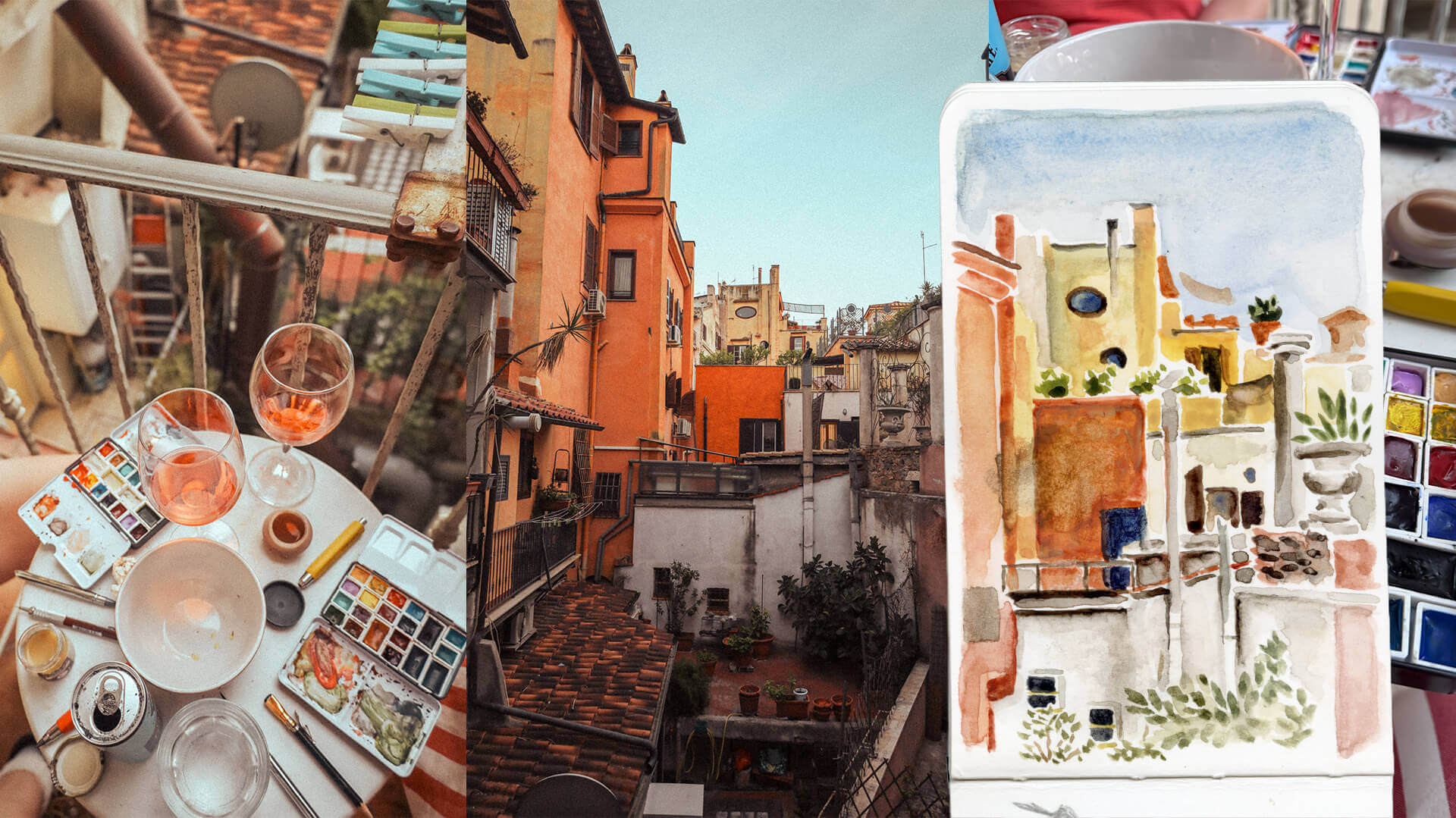
I brought along a small watercolor kit I built myself with Winsor & Newton paints arranged into a travel tin, a few pens for line work, some compact brushes, and a sketchbook. My water cup was whatever I had on hand at the moment—water, beer, even an Aperol spritz once or twice. It was simple, portable, and served me well.
What I didn’t expect was how much that small act—sitting down and painting—would reshape how I think about design.
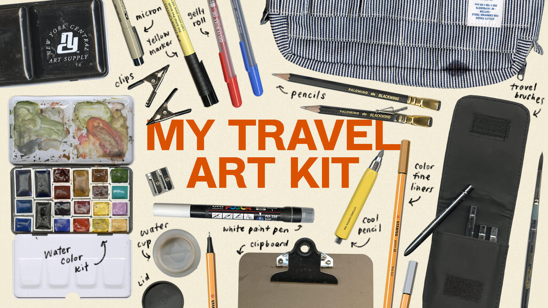
Slowing Down to See More
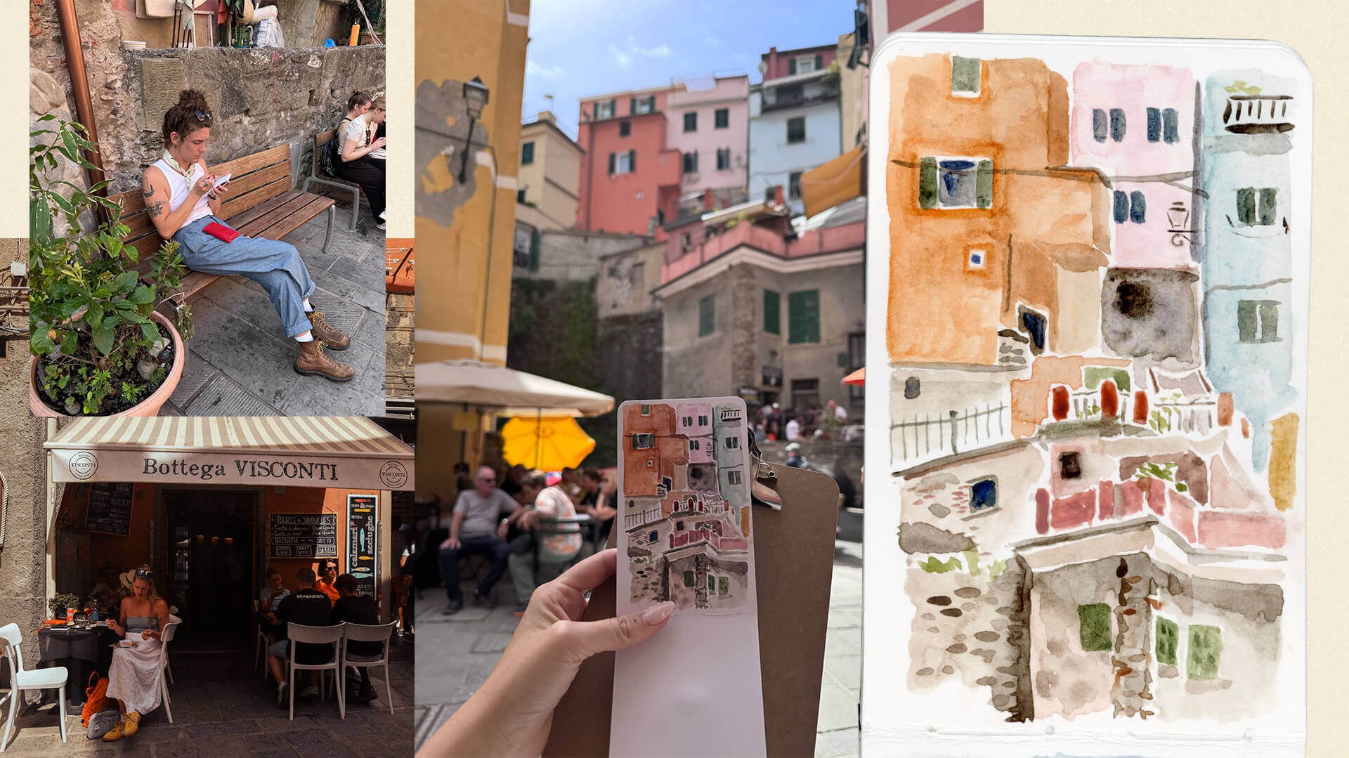
Most of my painting happened while we were on the go: sitting in piazzas with an aperitivo, tucked along canals in Venice (spritz in hand), at the rocky beaches in Monterosso, in the Boboli Gardens, or on the balconies of our Airbnbs. Each environment a delightful mix of architecture, humans, sounds, textures, etc.
Painting forced me to slow down in a way that photography never quite does. You can’t rush a watercolor. You have to look longer. You have to decide what matters.
As designers, we often move quickly—scanning, selecting, refining. But this process reminded me that observation is a skill, and it gets stronger the more time you give it. The longer I sat with a scene, the more I noticed: subtle color shifts, the way shadows softened edges, how textures layered on top of one another.
That kind of seeing translates directly into design.
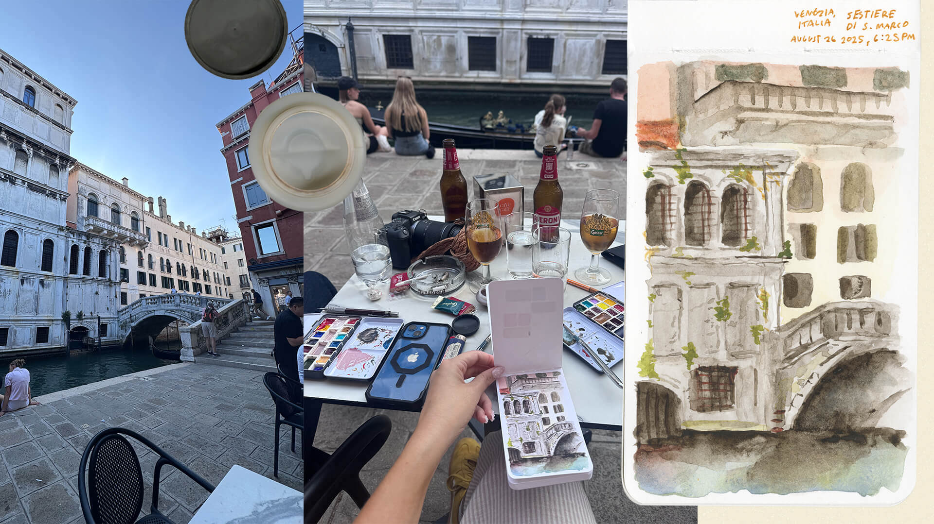
Italy as a Living Collage
One of the most striking things about Europe in general is how layered everything feels. The design of each building is like a living archive. Generations have added to them: signage, repairs, paint, graffiti, ornamentation. Nothing feels overly precious, but everything feels meaningful.
It’s a collage of time.
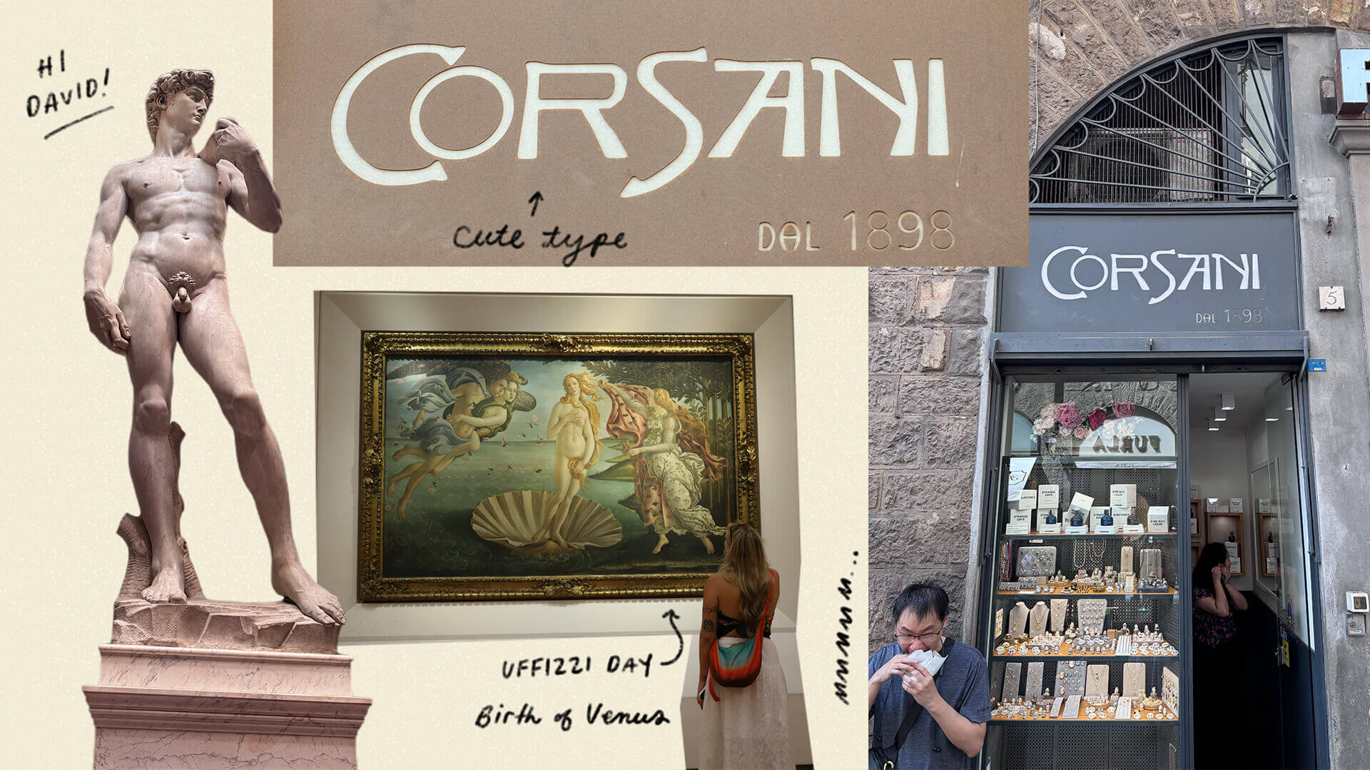
In Florence, I noticed a stone shop sign for Corsani carved with a custom typeface that had a modern flair, yet felt like it could have been there forever. Nearby, a hand-painted Tipografia sign carried a completely different energy—more immediate, more expressive. Both coexisted naturally.
There were hand-painted gold window signs on restaurants, vintage exterior signage like Mario, layered street art, and record shops that kept their original signage from decades ago alongside newer updates. At Santa Croce, even the floor tiles told stories—ornate typography and skull mosaics woven into the space.
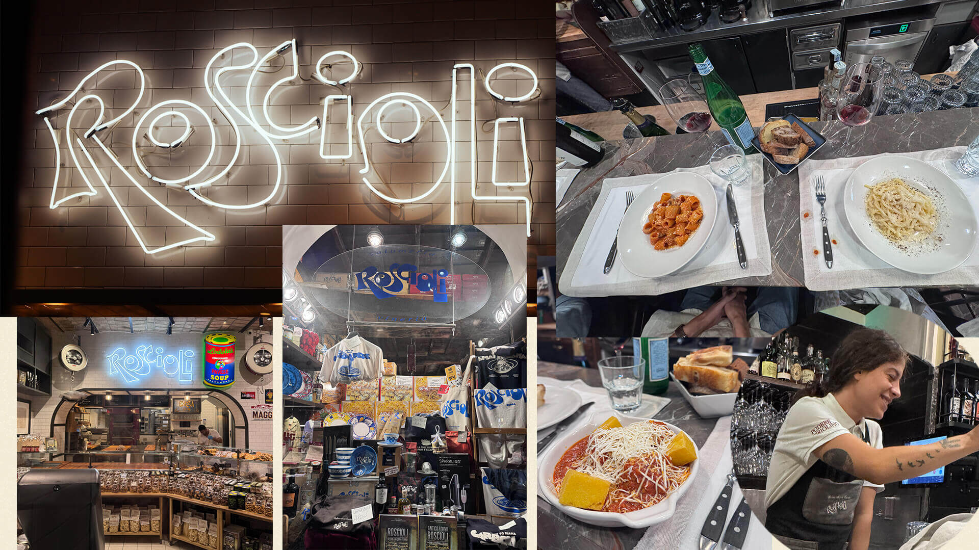
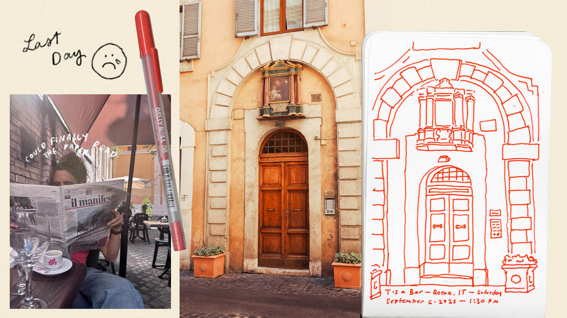
In Rome, Roscioli’s branding stood out immediately—a refined logotype that translated seamlessly into neon signage and extended into beautifully designed collateral throughout their salumeria. At the Vatican Museums, I was struck by handwritten notes from Matisse—surrounded by delicate, spontaneous drawings of filigree and flowers.
In Venice, I found small street shrines covered in layers of paint, offerings, and time. Restaurants like Ristorante da Ivo used stained glass lanterns as signage—function, storytelling, and identity all wrapped into one object.
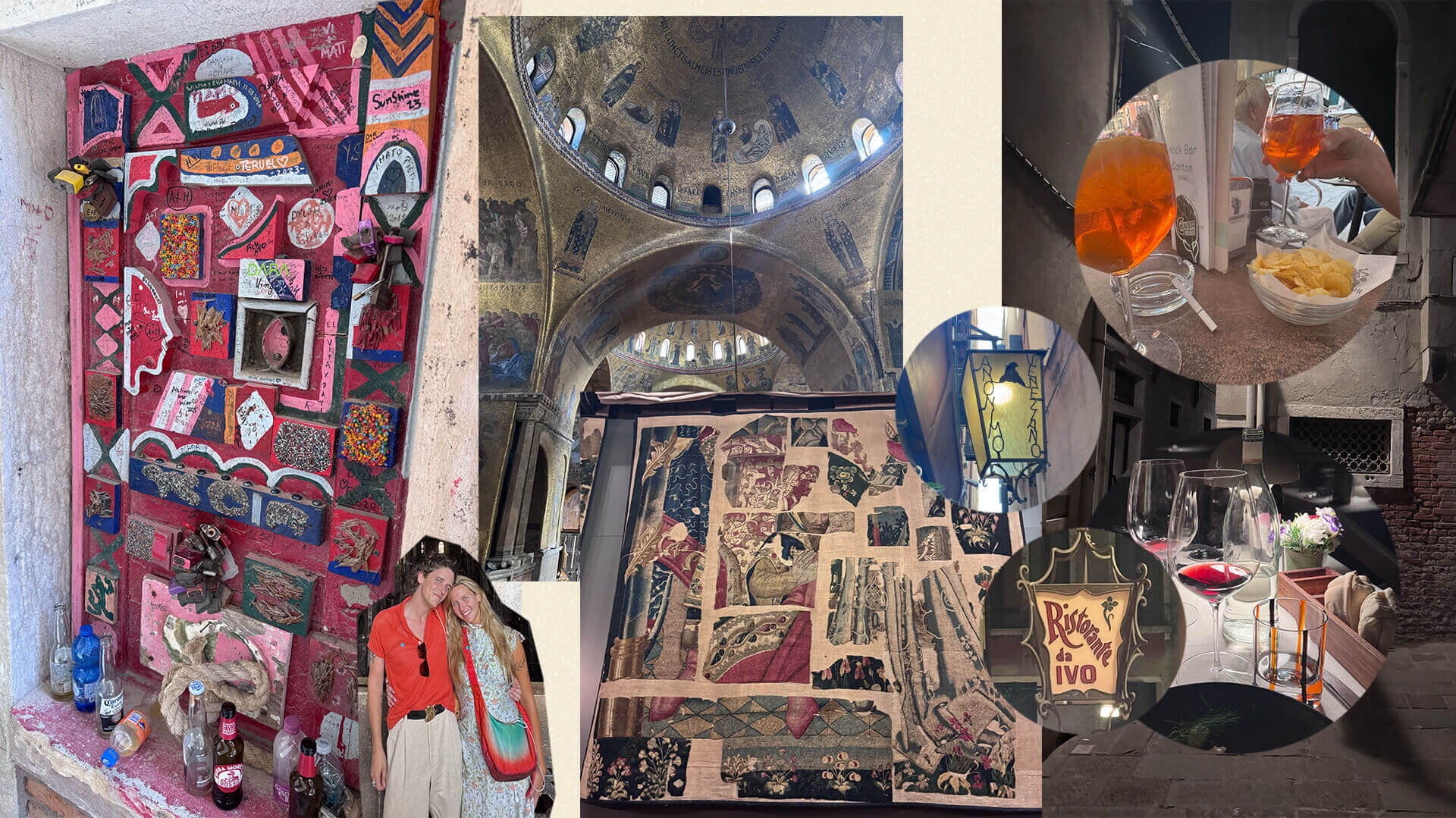
None of these elements felt isolated. They built on each other.
That idea, that design doesn’t exist in a vacuum, but instead lives within layers of context—is something I want to carry into every project.
Let the Medium Free You
Watercolor is unforgiving in a way that digital design isn’t. You can’t Command+Z your way out of a bad stroke. You have to adapt. Work with it.

With this, I found myself making quicker decisions, trusting instinct more, and embracing imperfections as part of the final piece. Color relationships became more intuitive, less about exact values and more about feeling. Composition became about balance and movement, not perfection.

As an art director, it reminded me that not everything needs to be over-refined to be effective. Sometimes the energy of the idea matters more than the precision of the execution.

Design is in the Details
Beyond the landscapes, design compositions were catching my eye left and right.
It’s no secret that Italian package design is known for it’s extravagance. All of the packaging on the shelves felt considered down to the smallest detail. Candy tins that were so well designed they felt like keepsakes (and they became keepsakes in my case). Restaurant identities that extended into menus, signage, interiors, and merchandise without feeling overbranded.
That sense of cohesion—of branding that feels embedded rather than applied—is definitely something we strive for at ST8MNT. Seeing it executed so naturally reinforced how powerful that approach can be.
Stepping away from screens and working with your hands changes how you think. It reconnects you to fundamentals: observation, composition, storytelling.
Traveling through Italy reminded me that great design isn’t just about aesthetics, it’s about context, history, and human experience. It’s about how things live, breathe, and grow over time.
Creative travel fuels better design.
Observation is a designer’s superpower.
And sometimes, the best way to grow digitally is to step back into something analog.