You are not your user is a phrase used frequently when explaining the importance of user research when working on any design project. Whether it be a website, an ad campaign, packaging design, environment design, a digital marketing campaign… The list goes on and on, but you get the idea. No matter what the project is, user research is a key ingredient to its success. For the sake of this blog though, we will focus on user research when it comes to website design.
First and foremost, what is user research and how does it benefit our design?
User research helps us to understand how people go about performing tasks and achieving goals that are important to them. It gives us context and perspective and puts us in a position to respond with useful, simplified, and productive design solutions.
Arin Bhowmick
The vital role of user research in design
In short: user research helps us to eliminate our own biases and streamlines the design process, helping us to create a product that meets the intended user’s needs. Sounds great, right?
Maybe you’re still not sold.
Let me explain the inherent risk of cutting the user out of the design process. As a designer, you know your project inside and out. From initial sketches to wireframes and prototypes, your design choices are deeply ingrained in the final product. To you, the flow of the site, language on the buttons, and links included in the main navigation make complete sense. But what about to your user? Are they able to get from Point A to Point B on your site seamlessly? Or are there unforeseen pain points causing the user to leave the site as quickly as they came?
Let’s add some context to this conversation.
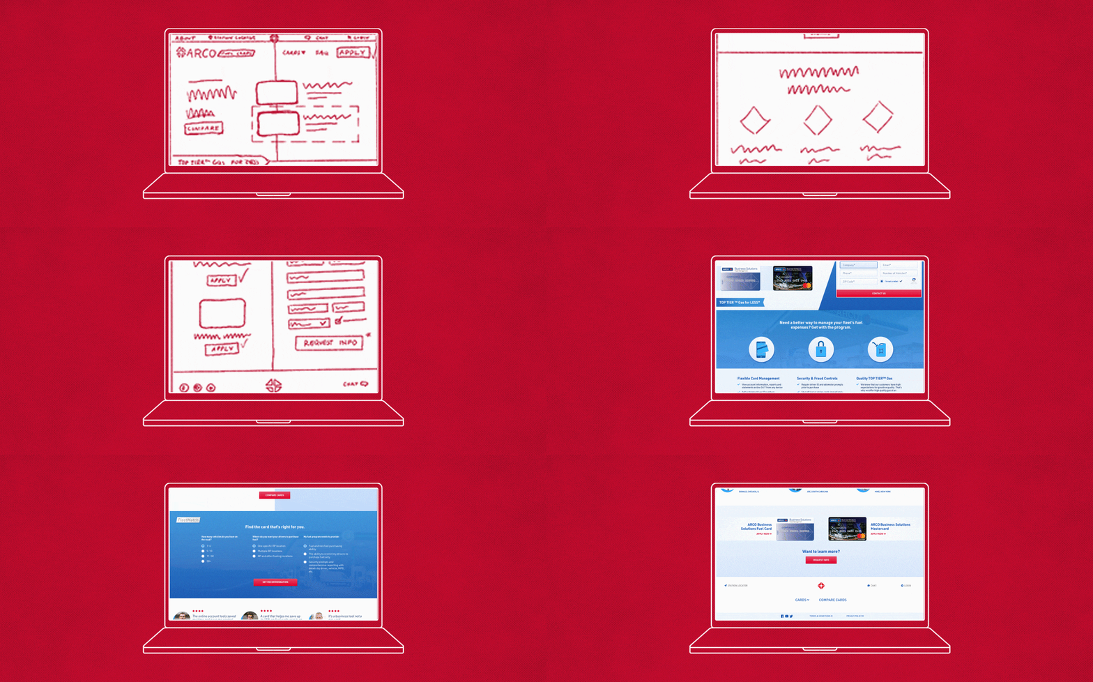
When Fleetcor approached our team and asked us to devise a template for their portfolio of Fuel Card sites, we immediately set out to get to know the user. Utilizing the client’s historical data from paid and organic search we examined the different touchpoints for the user as they entered the site. Once we understood what their journey looked like, we started asking how we could improve it, jotting down questions that would go on to shape the final design.

As we uncovered the answers to these questions, the user’s needs became more apparent, and we were able to pinpoint key features to focus on in our designs. Once we felt confident that we understood who Fleetcor’s user was, we were ready to break out our design tools and start bringing the new template to life.
What is the user thinking as they go through the customer acquisition journey?
What information aids the user in deciding which fuel card to purchase?
Is there anything we can do to speed up the decision making process?

The result? Not only did Fleetcor grow their new customer acquisition results over 100% year over year, but they also did it at a lower cost to acquire these results as users converted at a higher rate via a faster, more efficient experience.
“You are not your user” – and that’s a great thing, because getting to know your user can push a good design to a great design.

