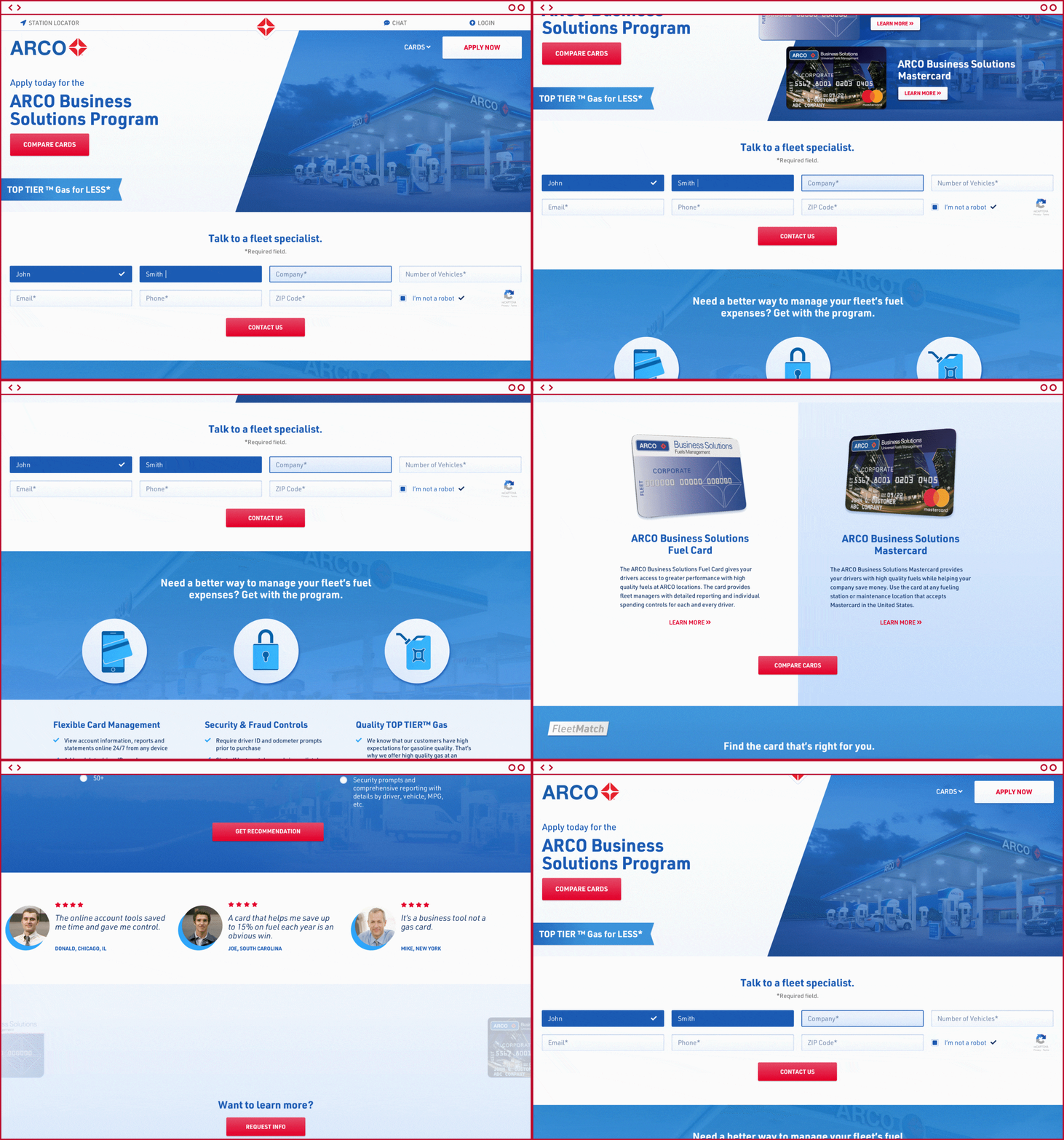
How do you grow sales on the biggest Fuel Card site in the world?
To start, you make it easier to compare and select the best fuel card for business seeking a new/better commercial card program. For small and large fleet customers alike working with Fleetcor, we reset the framework and interface for their largest portal in their fuel card portfolio. Using research to understand what users like in an interface, how they are acquired in the first place was key here. It wasn’t simply growing traffic; it was activating that traffic to make quicker decisions via a vastly improved experience!
Why mobile is important
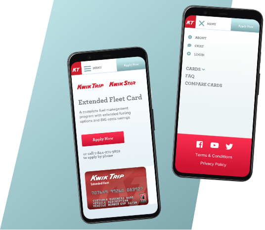
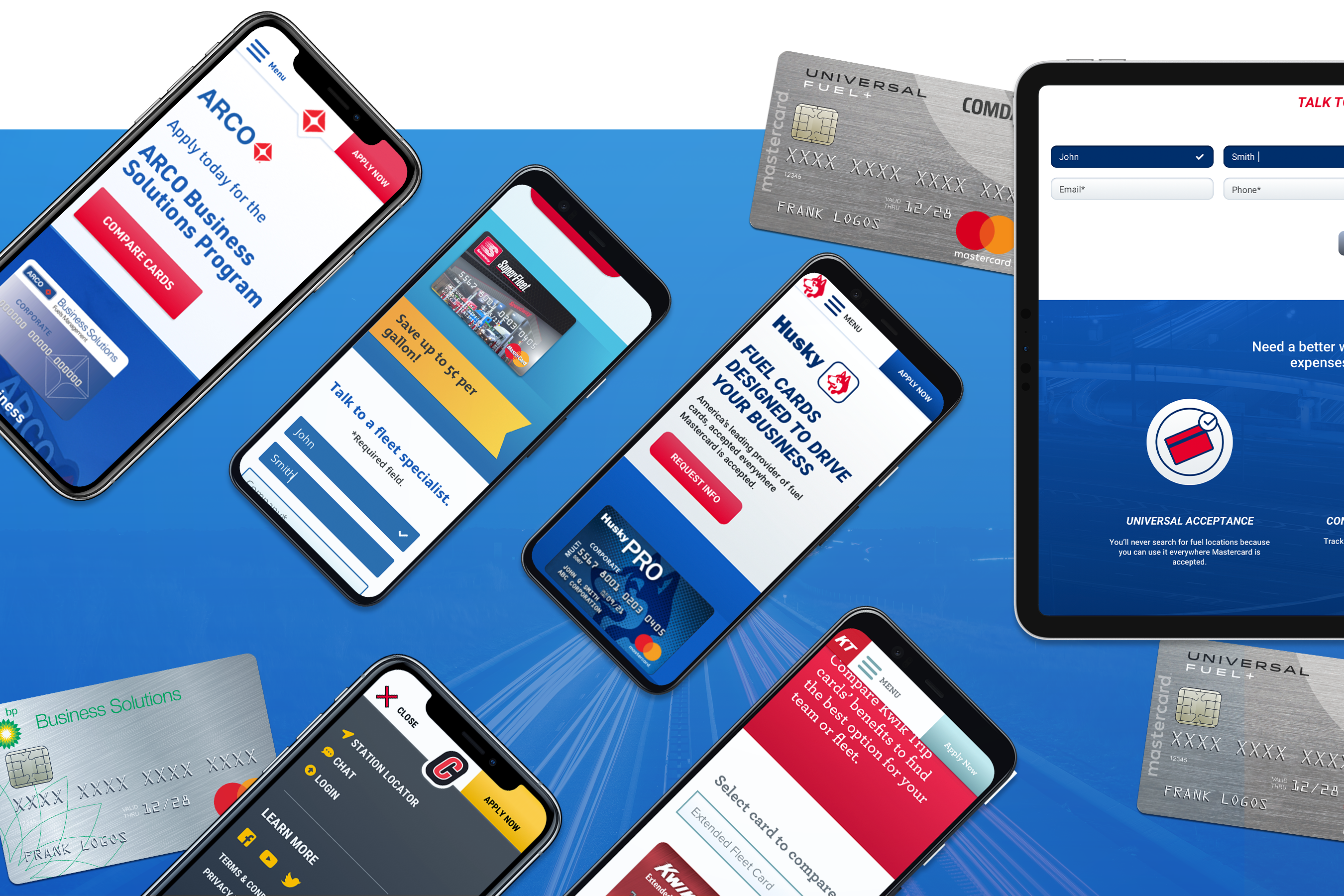
We all know the percentage of mobile users is going up consistently, making an interface that matches a “traditional” experience is crucial. The core audience was shifting rapidly to mobile for applying for new fuel cards, so our team completely streamlined the mobile experience, reducing abandonment and increasing successful new client engagements.
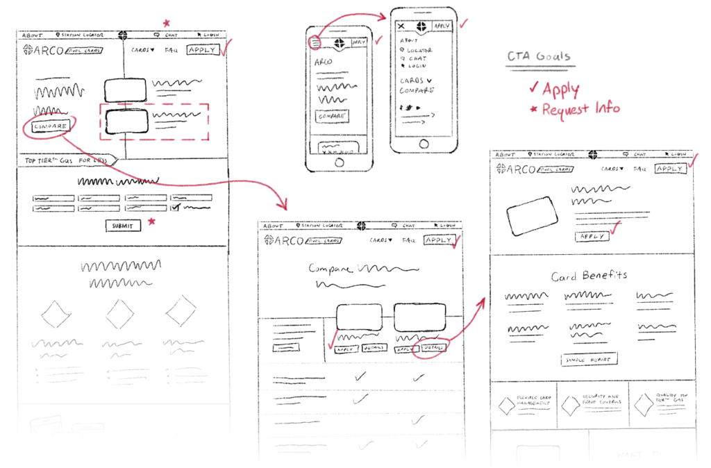
Discovering the best UX Flow
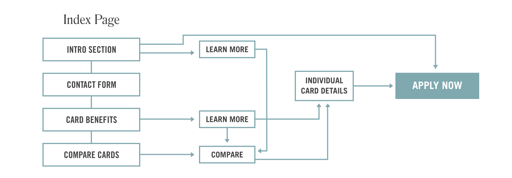
To better understand User Experience flow, you must understand the type of customer you’re communicating with, and how they discovered you in the first place. We used historical data from paid and organic search to design the most efficient path for users. What are their touchpoints?
What are they thinking as they go through the customer acquisition journey? What has traditionally helped them make their decision? How could we speed that up for them? A user focused experience was the mandate here. Learning to anticipate what a user is looking for is key in engagement.
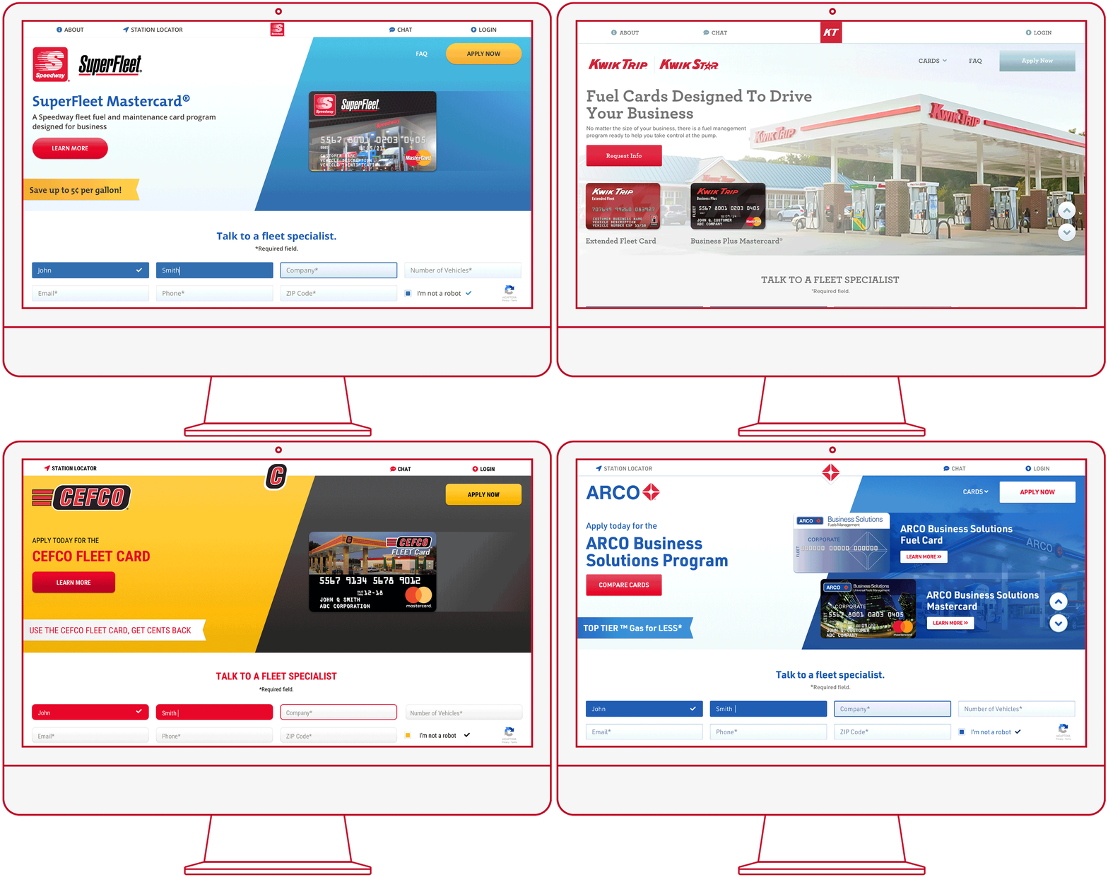
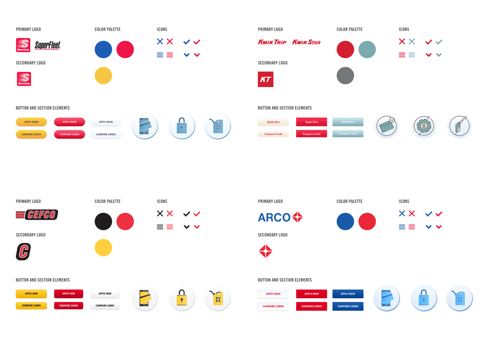
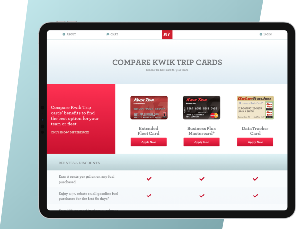
Helping people make decisions
Presenting “feature sets” for fuel cards assisted users in choosing the best card program for their business. Discovering the type of customer you’re speaking to is vital. Aligning card types with persona research assisted Fleetcor in presenting the best solution for their potential customers. Who wouldn’t want the best suggestions for what you’re looking for? Making this process more efficient for users grew their digital portion of their business significantly.
Not only did they grow their new customer acquisition results over 100% year over year, they did it at a lower cost to acquire these results as users converted at a higher rate via a faster, more efficient experience.
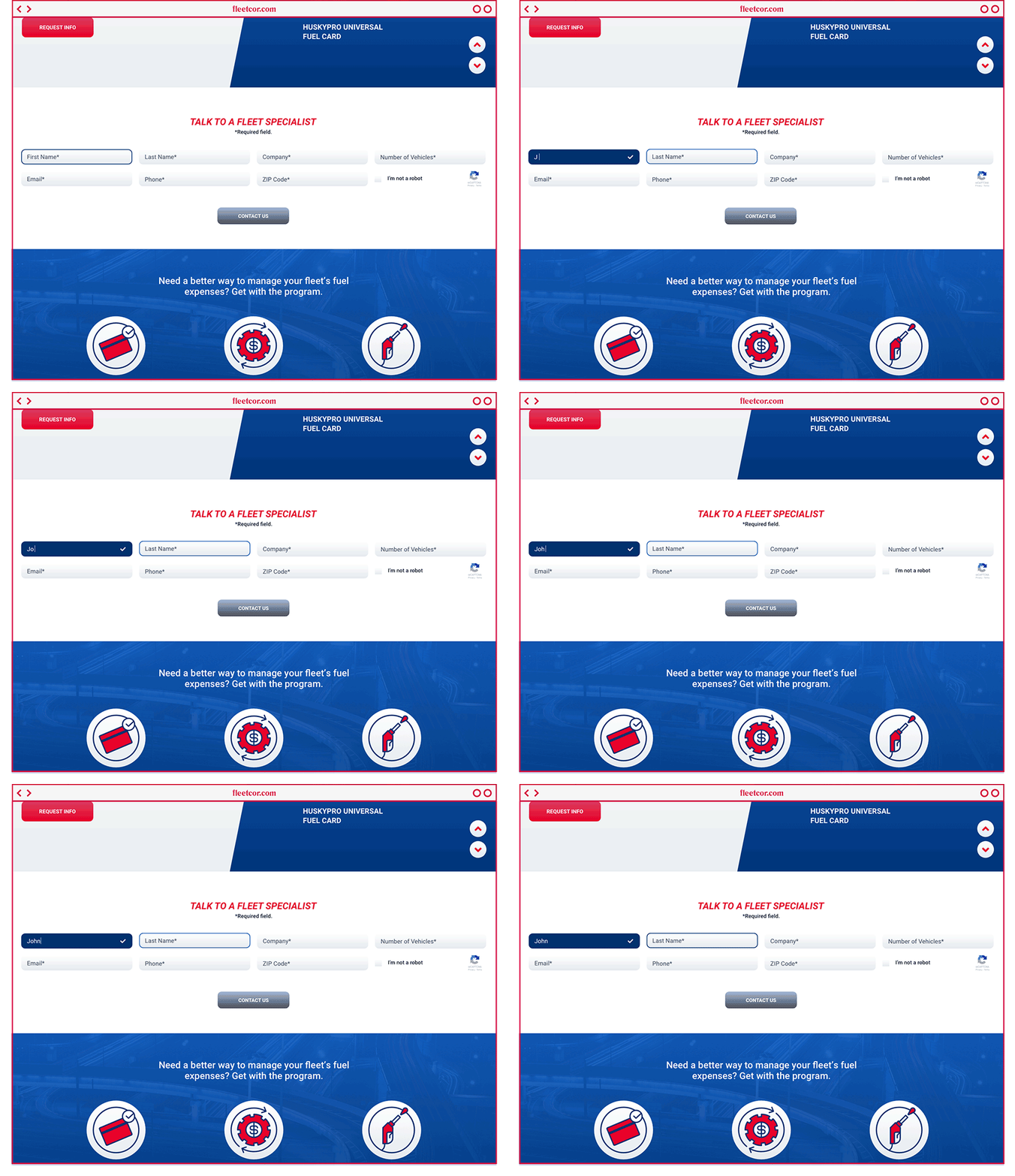
Setting the Stage for the Future
Tying this all into an ecosystem that benefits customers and users while improving results for our clients is always the goal. This engagement allowed us to build a sustainable and dynamic framework of lead generation assets including landing pages, full blown websites and other visual and strategic elements and experiences that are firmly in place today, being tweaked and massaged via new data and insights daily. Generating enterprise level work this size requires proper planning, and the analysis and commitment to continuous discovery and improvement.
More Fleetcor Work
