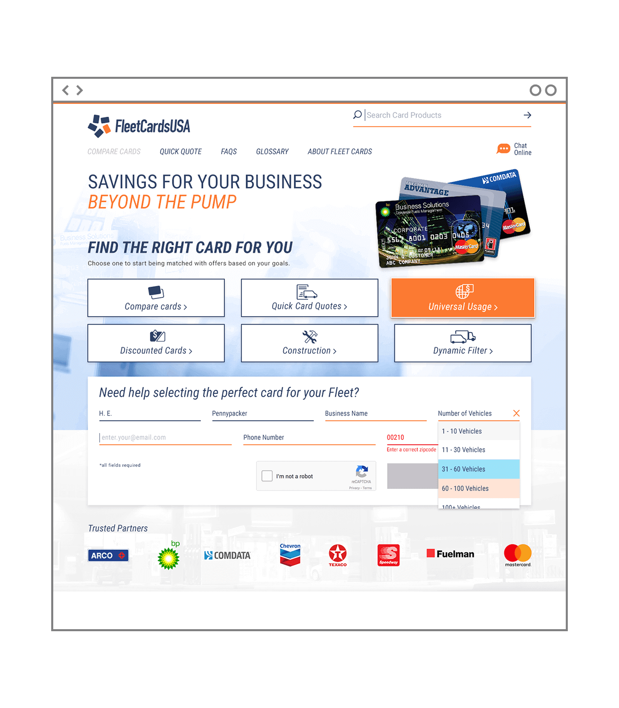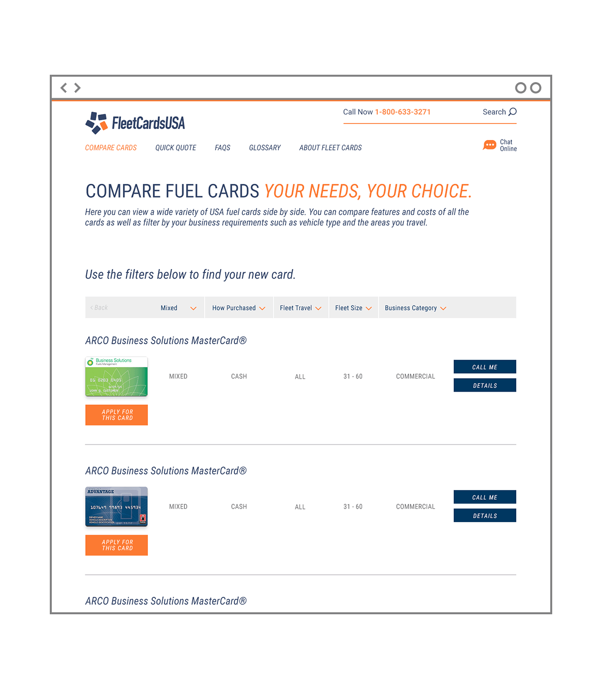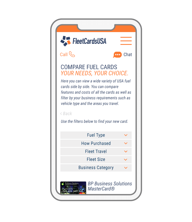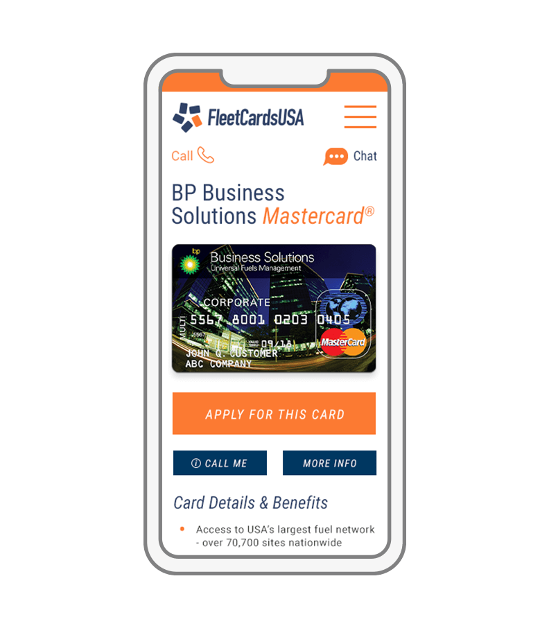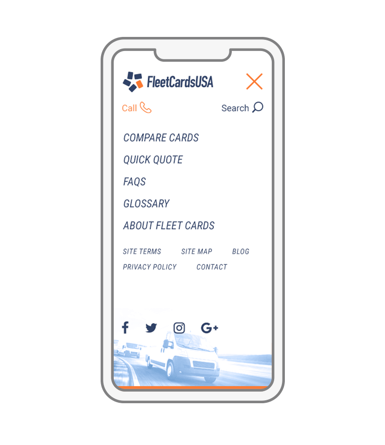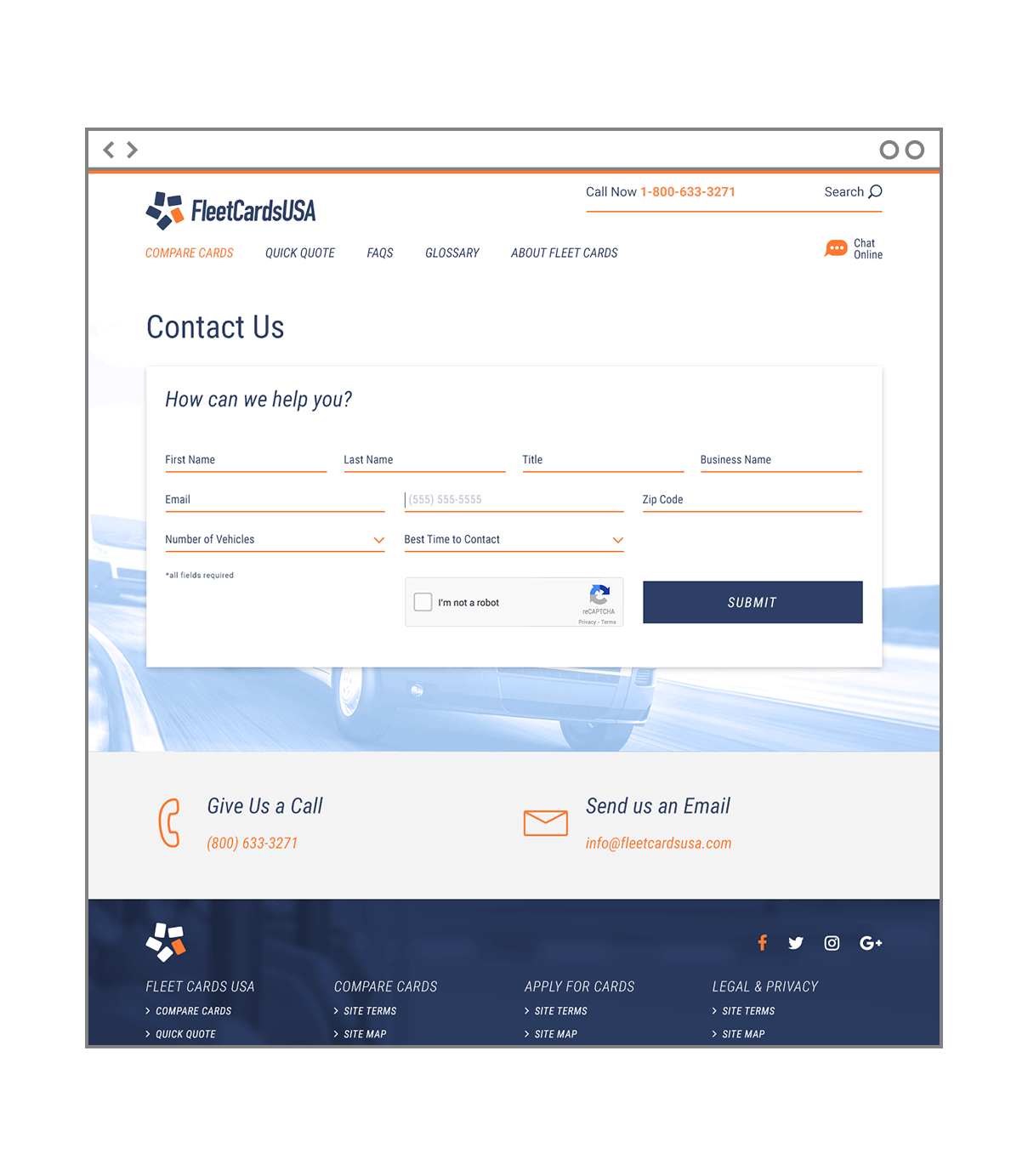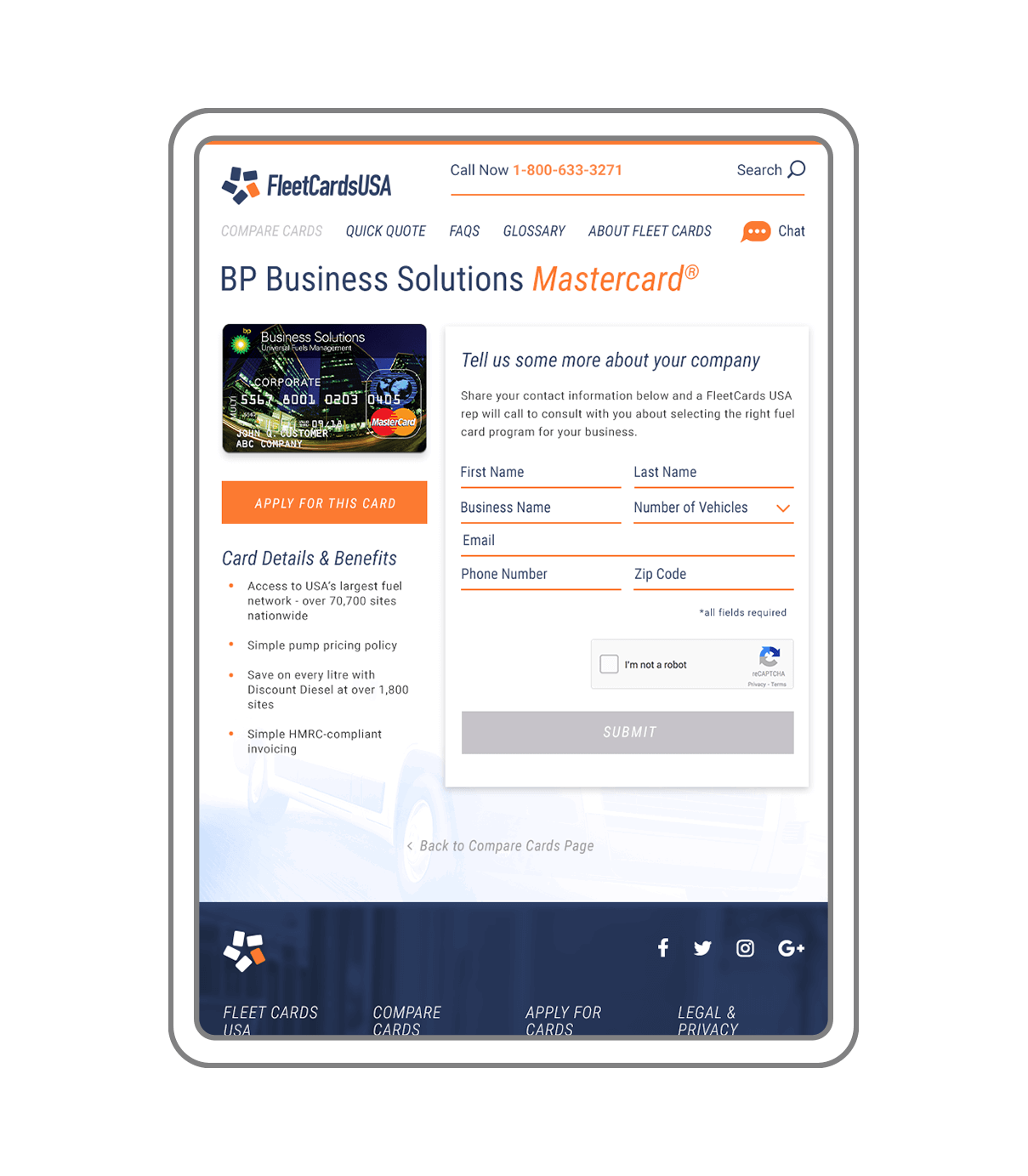
For FleetCardsUSA, the cards are always the star. With so many different options for fuel cards, it’s difficult for fleet operators to research and find a fuel card that will meet their specific needs. ST8MNT addressed this challenge with thoughtful organizational design. The website’s strategic user experience makes it easy to search for and compare different fuel cards in order to select the best card for your fleet.
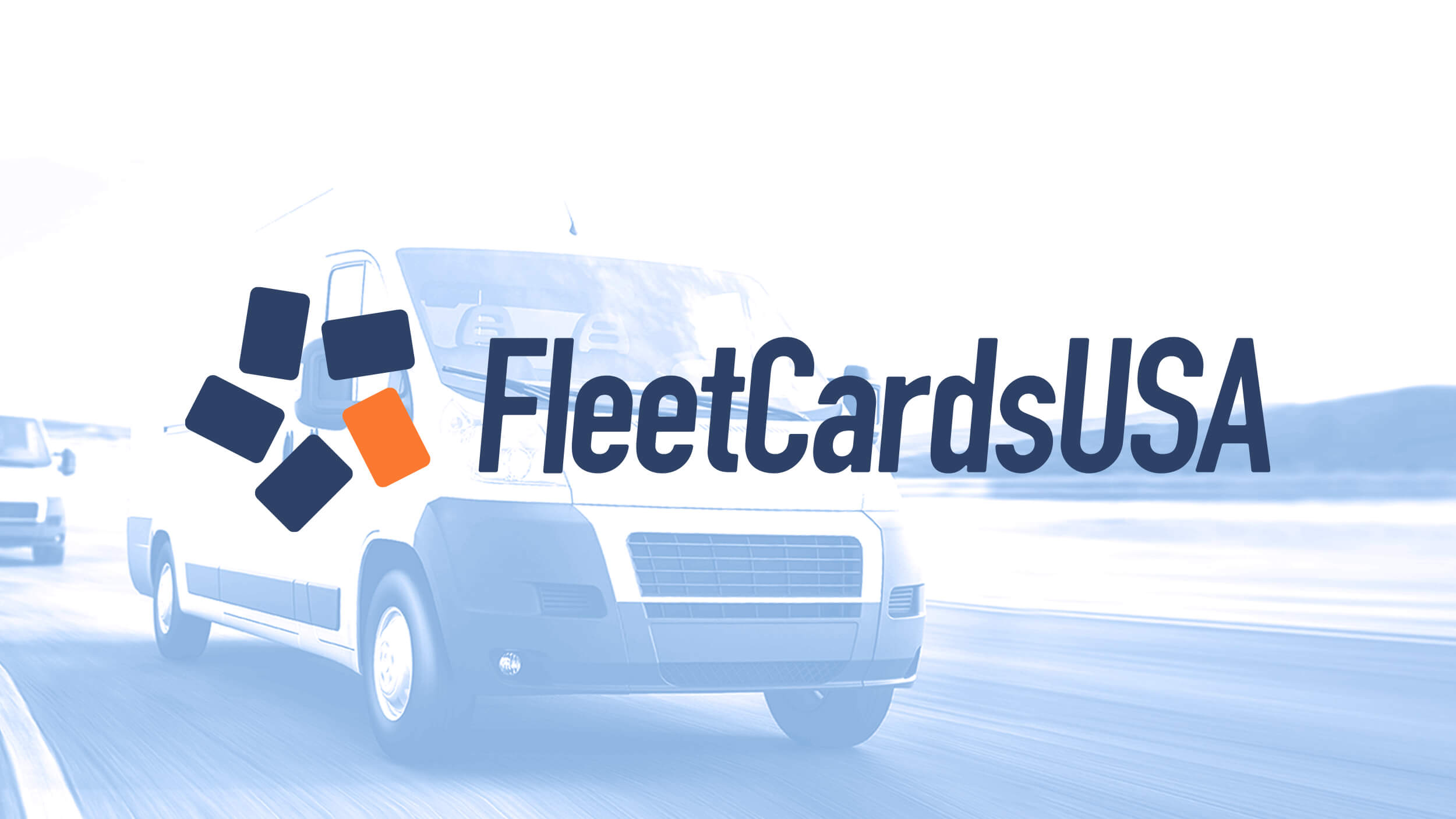
The FleetCardsUSA rebrand and logo visualizes the idea of the premier card selection tool by showing cards in a formation that create a unified star. The company’s name is set in a condensed, italic sans that conveys forward motion without sacrificing too much horizontal space. The identity system portrays the brand a credible source and supports a visual language that translates to a clear user interface.


