close

The Wayward at River North

identity / environmental / naming

Urban multifamily living at The Wayward captures the creativity of Nashville’s arts and cultural scenes. Located in the River North development in northeast Downtown Nashville, the luxury apartment brand needed to remain authentic to Nashville and attract a young professional audience. Original and free-spirited, “The Wayward” depicts the ideal living environment for the creative-at-heart. The name suggests that the location is perfect place to live for those who seek adventure. The typography mixes strong sans-serifs with whimsical script and the colors are inspired by the nature found on the riverside trails near the building. Along with the name and identity system, we designed place-setting signage and a parking structure mural to further establish the look and feel of The Wayward.
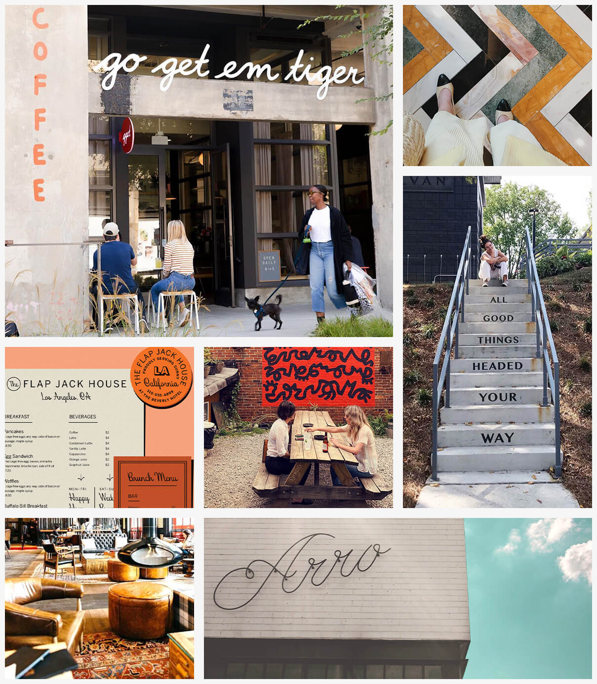
 

The Wayward moodboard featuring a colorful tile pattern, painted exterior mural art and signage
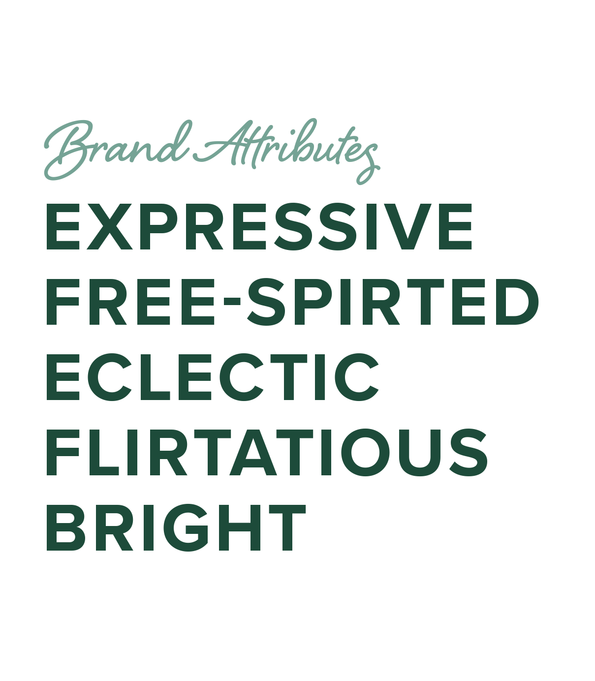
The Wayward brand attributes: expressive, free-spirited, eclectic, flirtatious, bright
The Wayward brand graphics including W monogram with no. 2108 unit number and don't wait get going type lockup
The Wayward brand colors and names including clay, cream, evergreen, marigold, white, mint
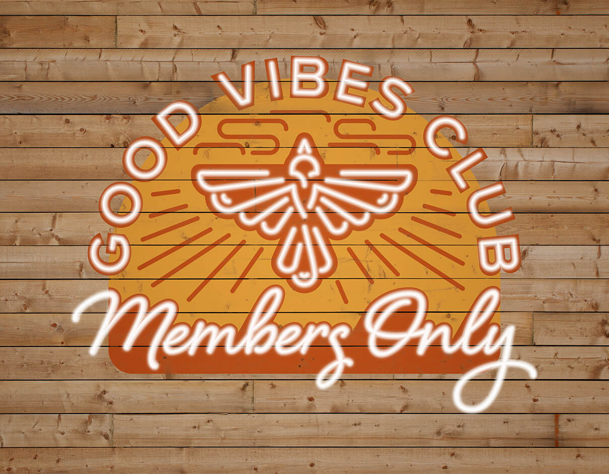
Good vibes club members only neon and painted sign on wooden background featuring bird illustration
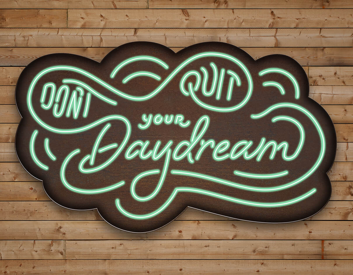
Don't quit your daydream neon and metal signage on wooden background
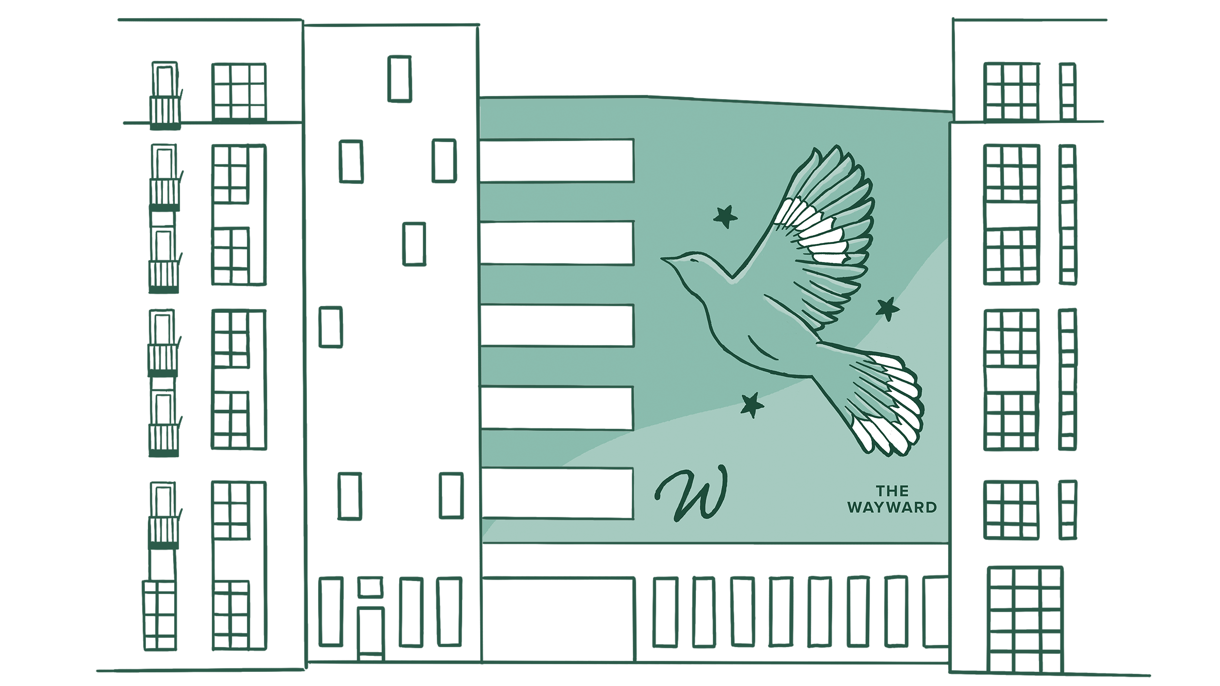
Green mockingbird large mural on parking structure
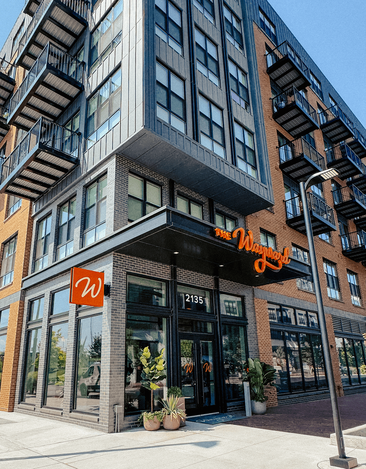
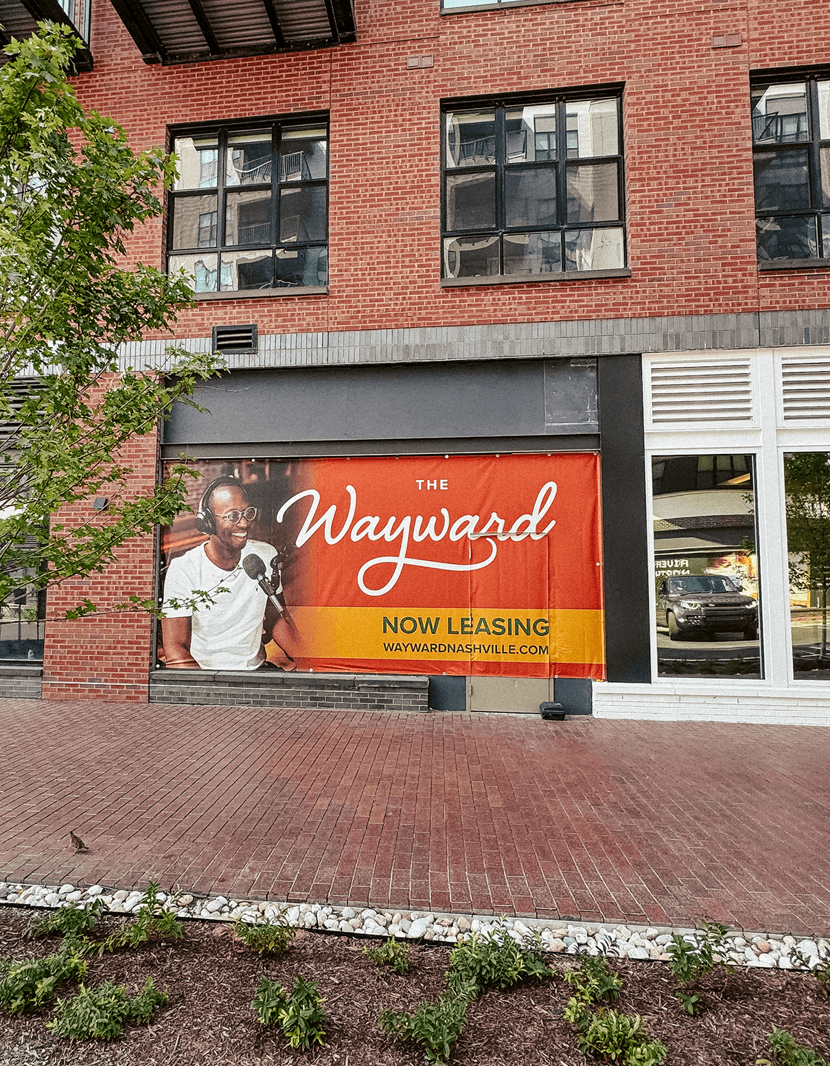
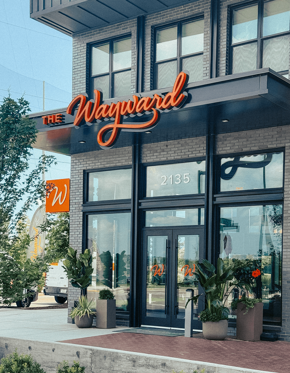
The Wayward rustic multifamily apartment signage on brick wall
Let's stay in neon and metal signage on wood background
Let's go out neon and metal signage on wood background