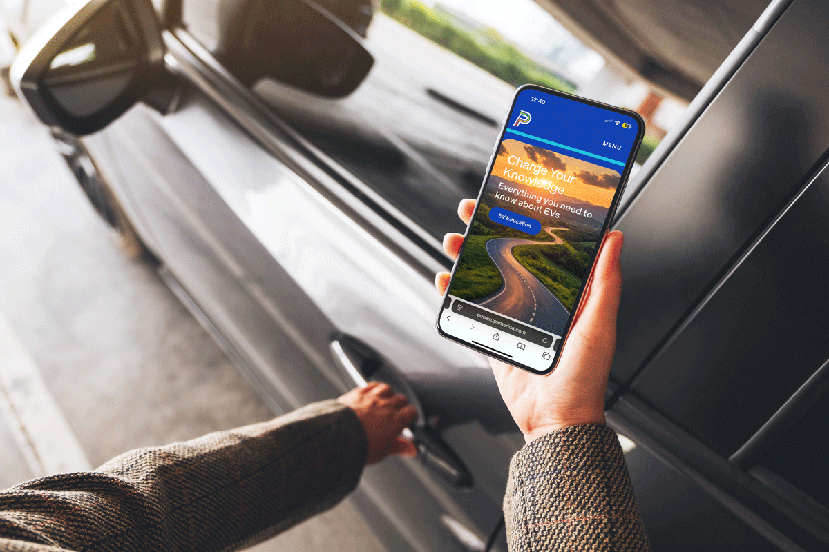
PowerUp America came to ST8MNT to develop a brand identity, website and branded environment that could keep pace with the fast-moving energy industry. We crafted a brand experience that drives EV charging into the future.
Brand Identity
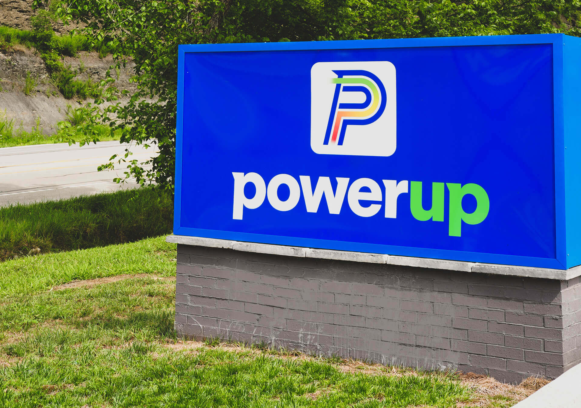
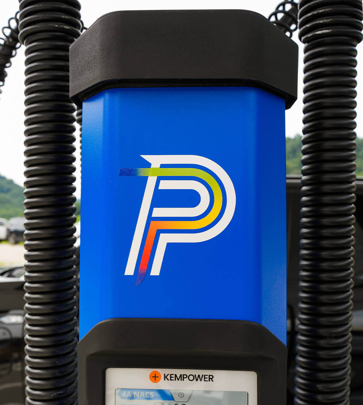
The PowerUp brand was designed to feel strong, dependable, and instantly recognizable—mirroring the confidence drivers need when choosing where to charge. The visual system balances bold structure with approachability, using clean typography, high-contrast color, and purposeful restraint to communicate clarity and trust.






Brand Messaging
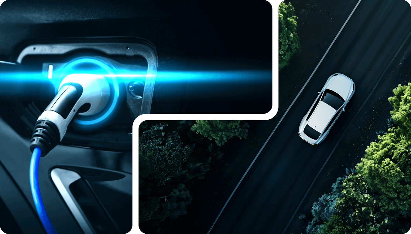
ST8MNT helped position PowerUp as more than a charging station network. The messaging emphasizes dependable infrastructure, intuitive experiences, and thoughtful placement. PowerUp meets drivers where they are and supports both everyday travel and long-distance adventure. Rather than leaning on sustainability jargon or future-forward hype, the voice stays grounded, practical, and reassuring.

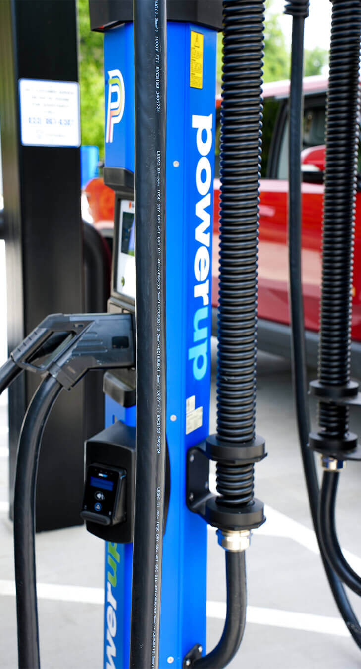
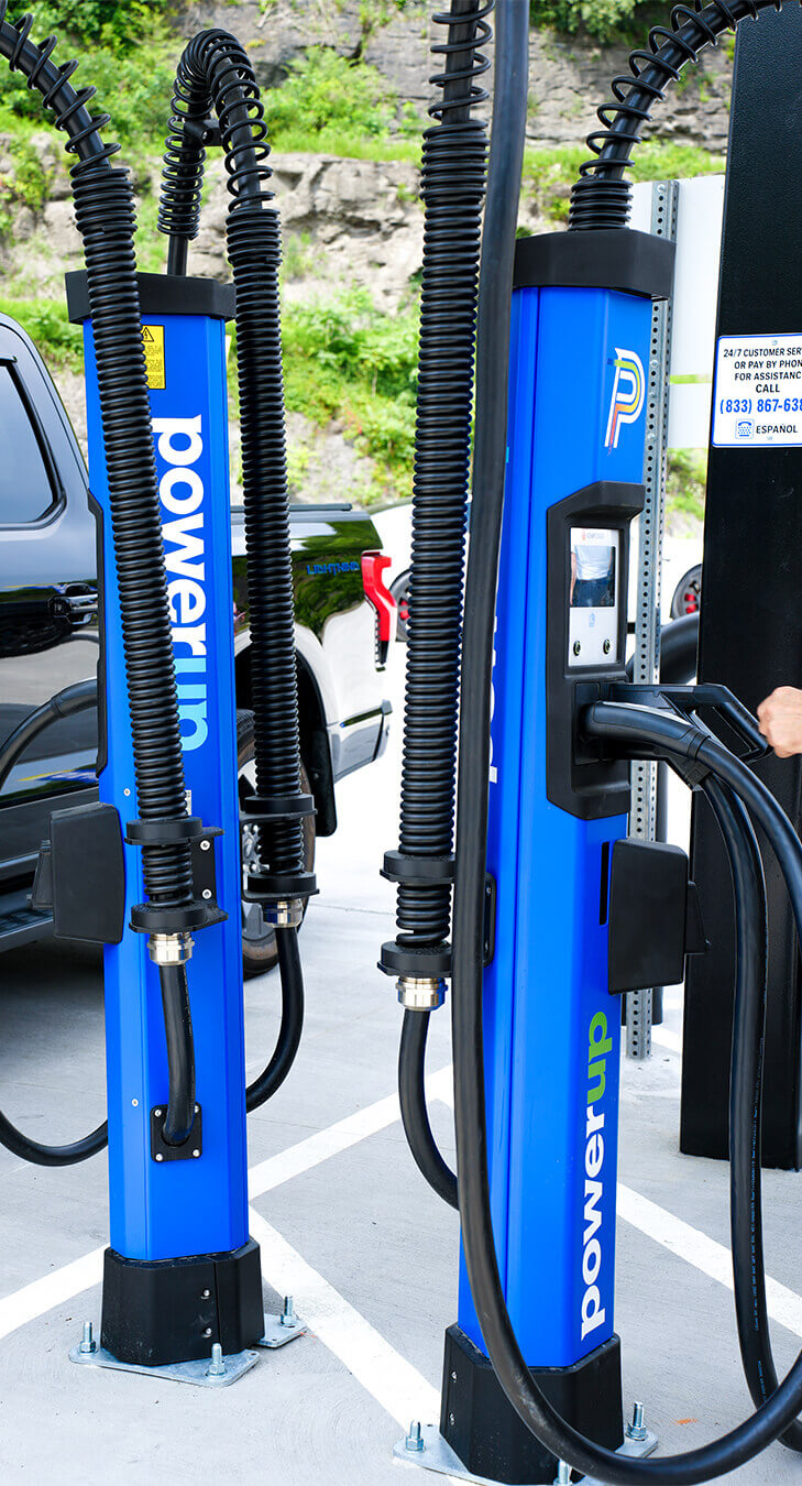
From Environment Design Concepts
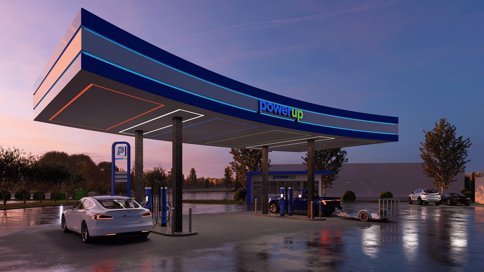
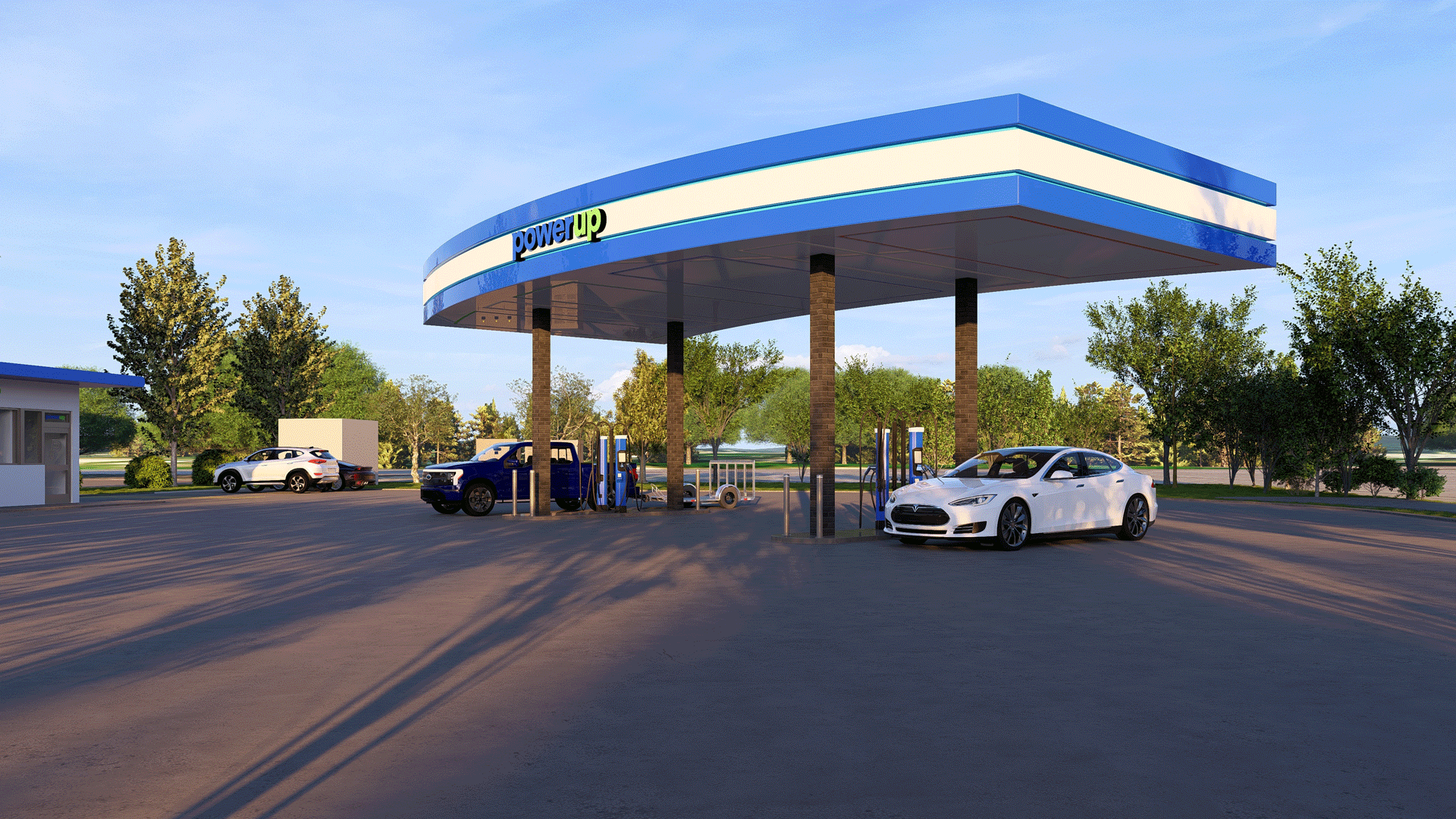
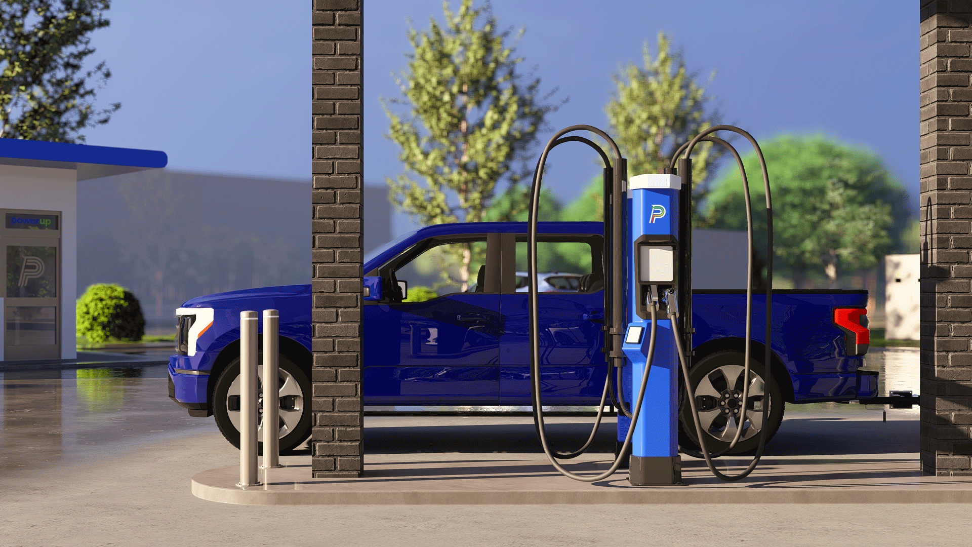

To The Grand Opening



Web Design
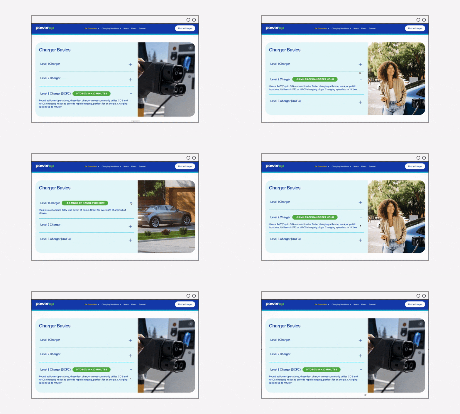
The PowerUp America website emphasizes scanability and hierarchy, guiding users quickly to the information they need. Clean visuals, confident messaging, and a frictionless user experience work together to make EV charging feel simple, accessible, and built for real-world use.