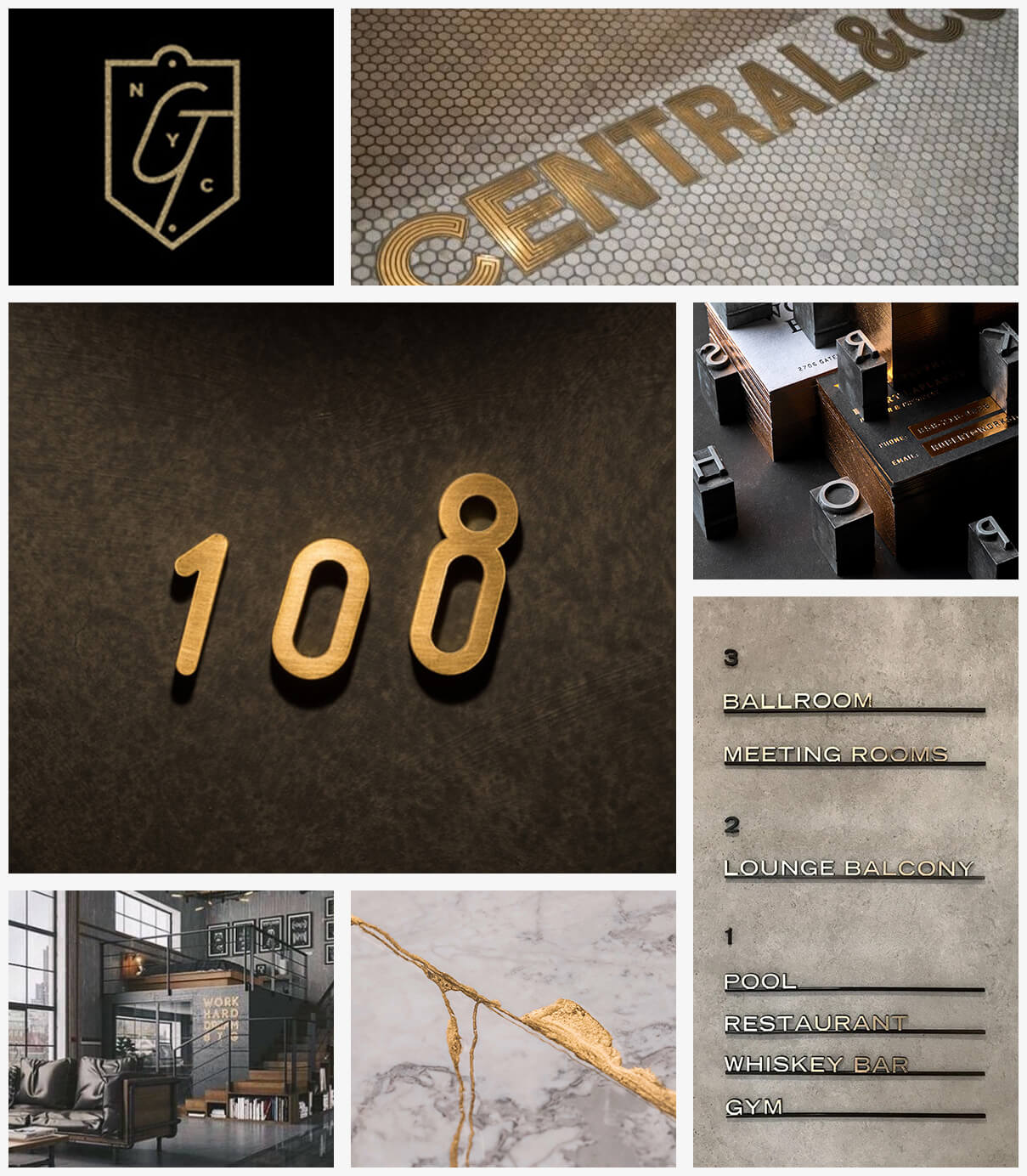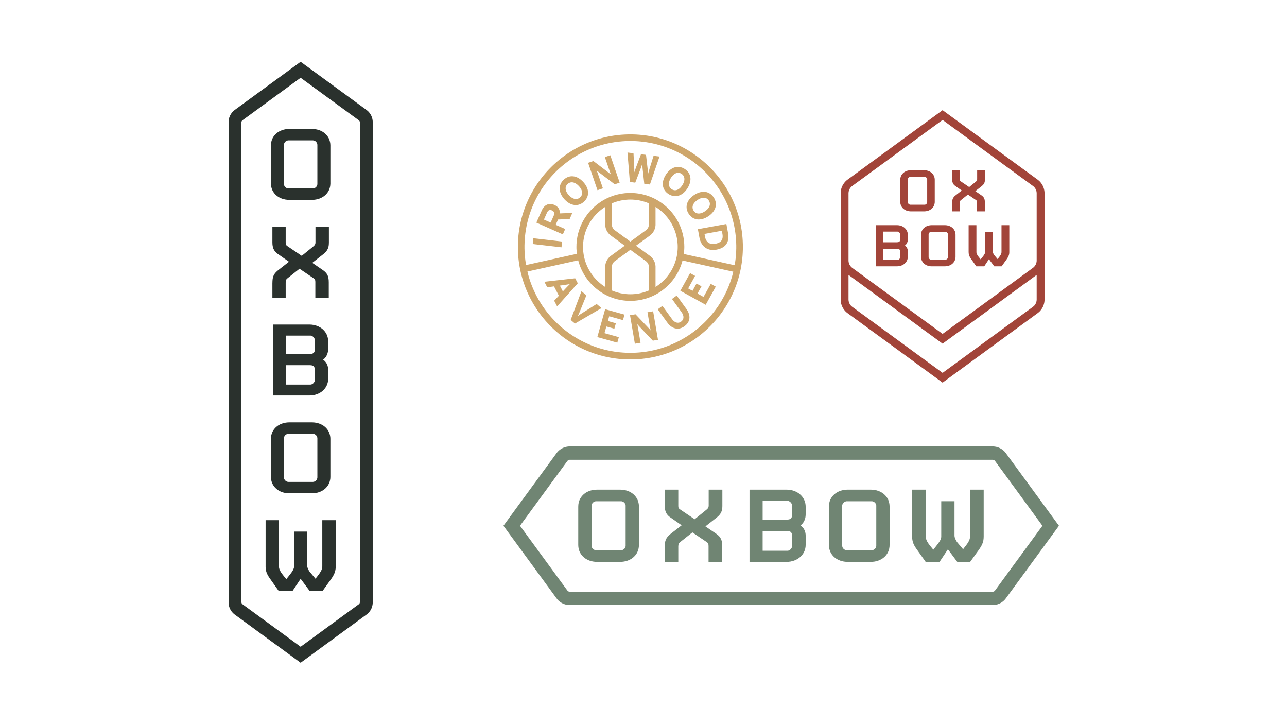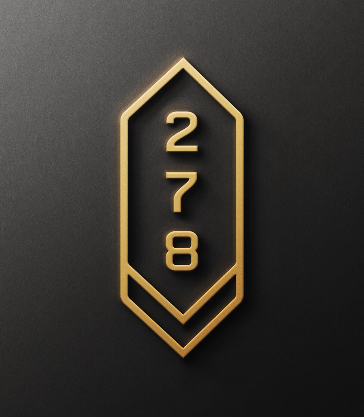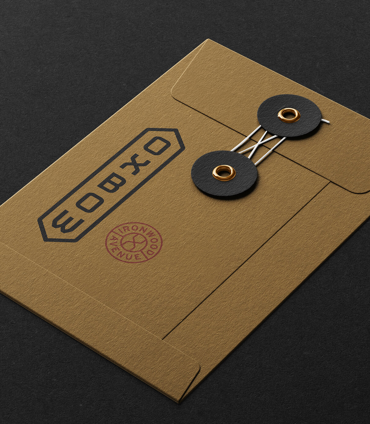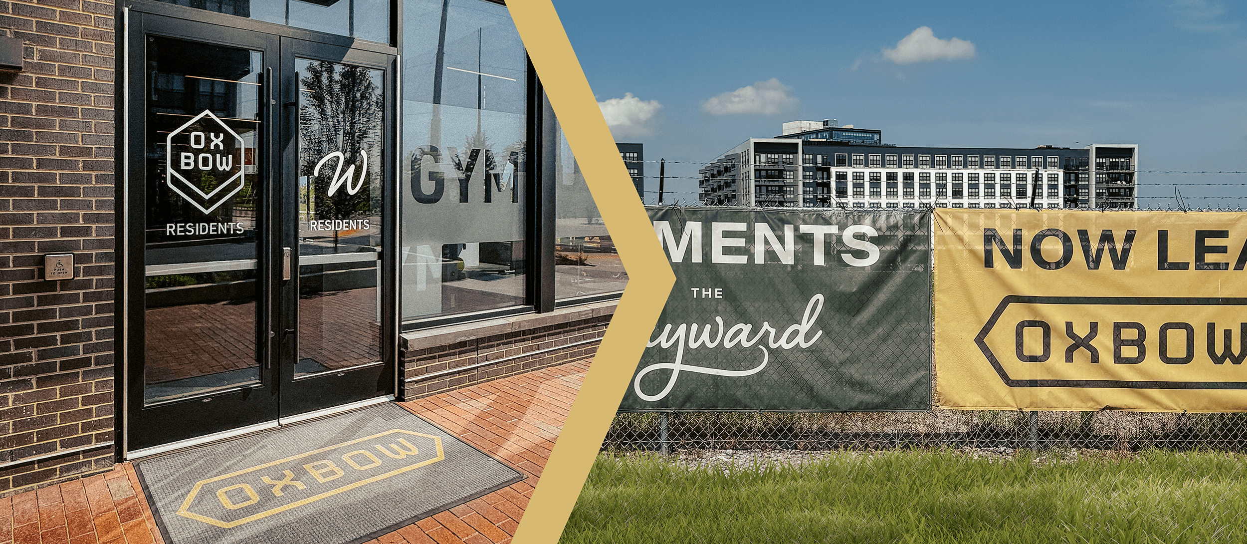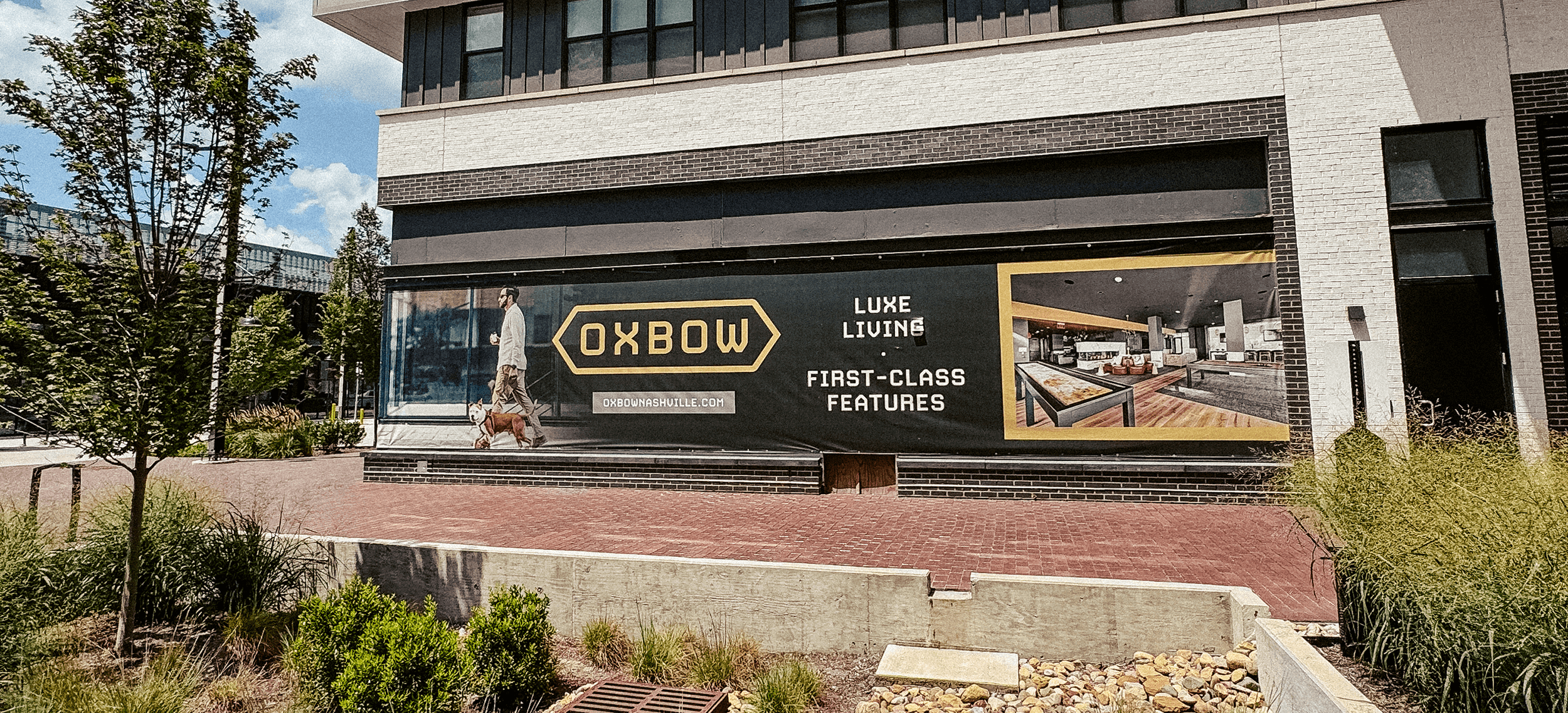
Oxbow offers elevated, urban apartment living at the River North development in northeast Downtown Nashville. The name and visual identity needed to be authentic to Nashville and attractive to a more established audience of urban dwellers. The name “Oxbow” offers a refined feel and refers to a U-shaped bend in the river, much like the curve of the Cumberland where Oxbow sits. An upscale living option, Oxbow boasts a multifamily brand identity that attracts those who appreciate the finer things. The sturdy design is the perfect compliment to the apartment building’s industrial setting.
