An Earthly Identity Approach
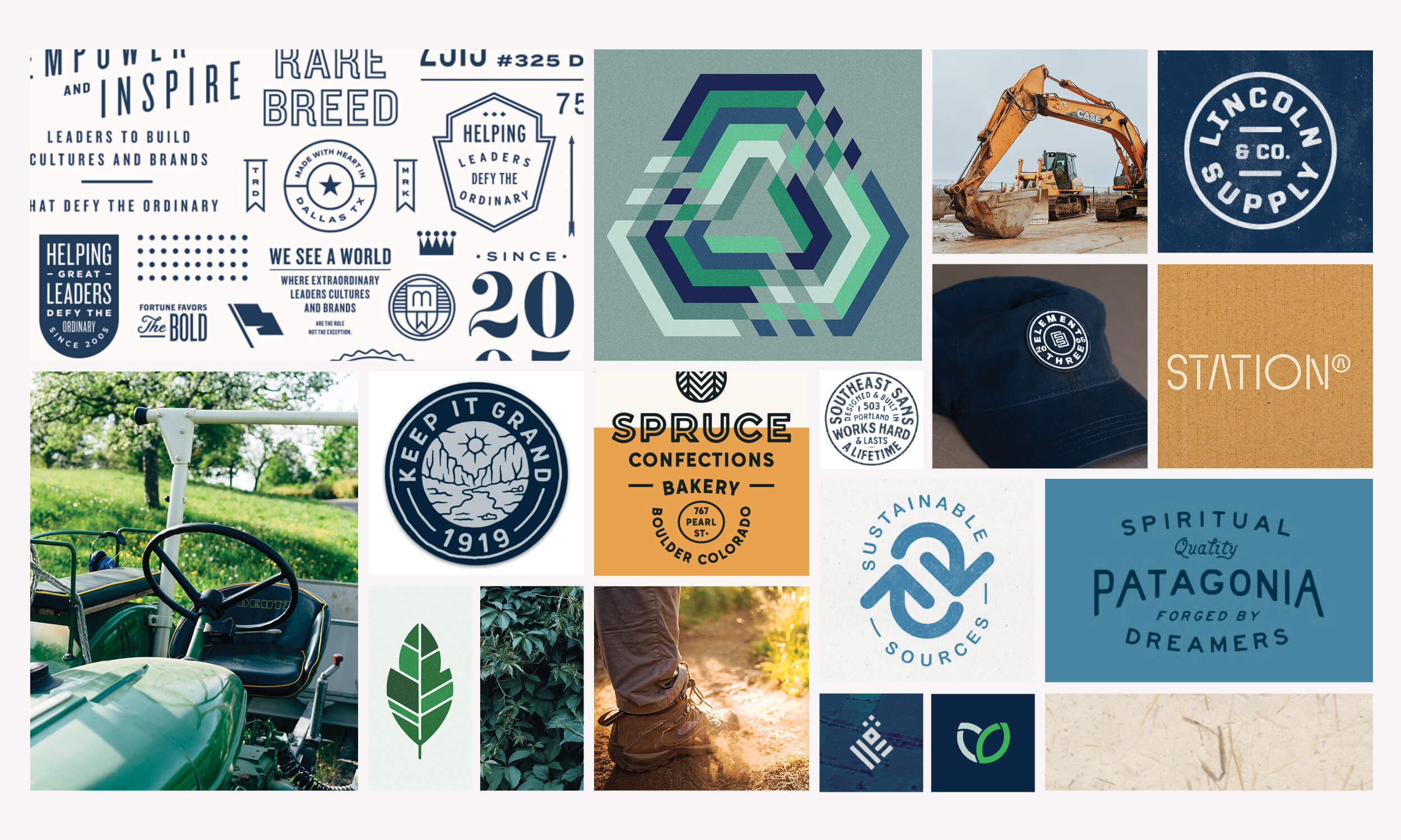
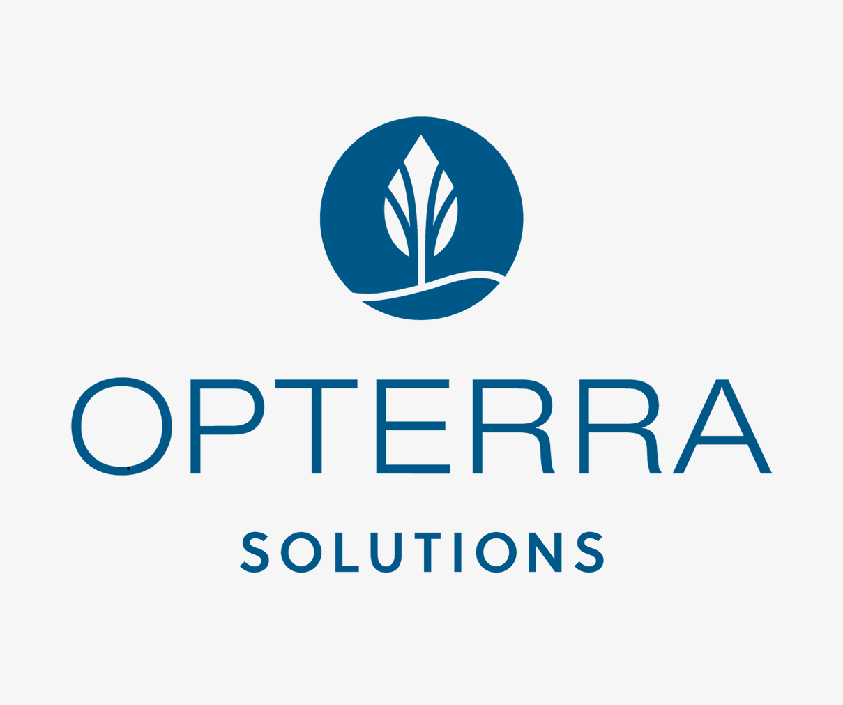
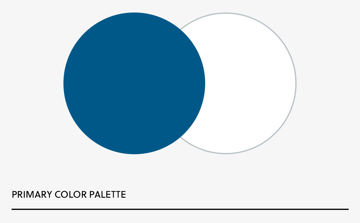
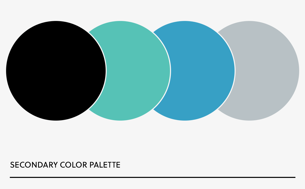
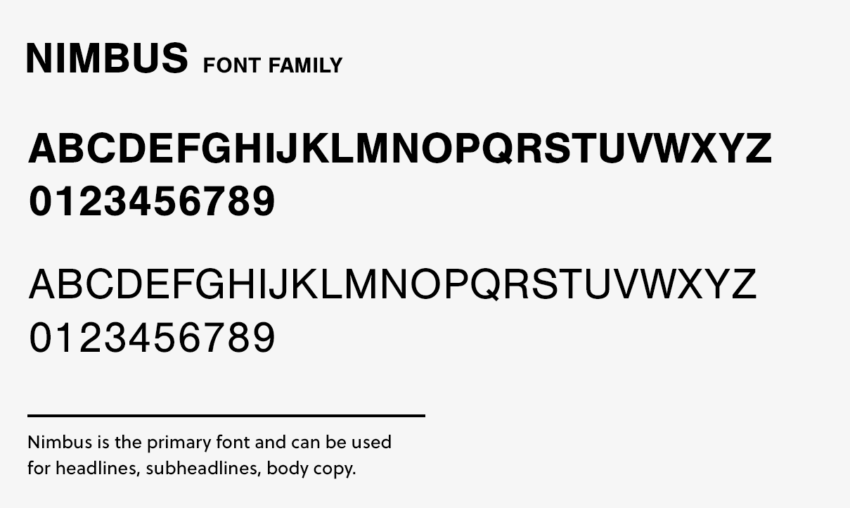
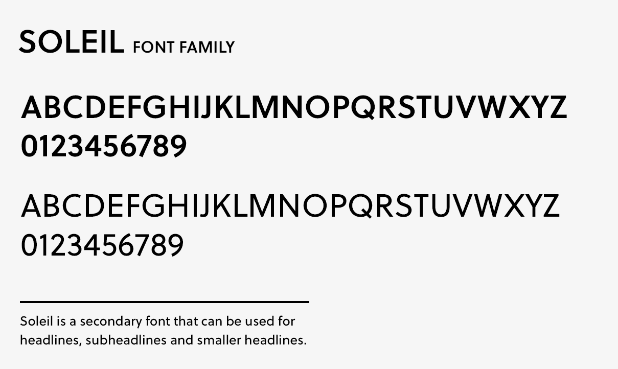
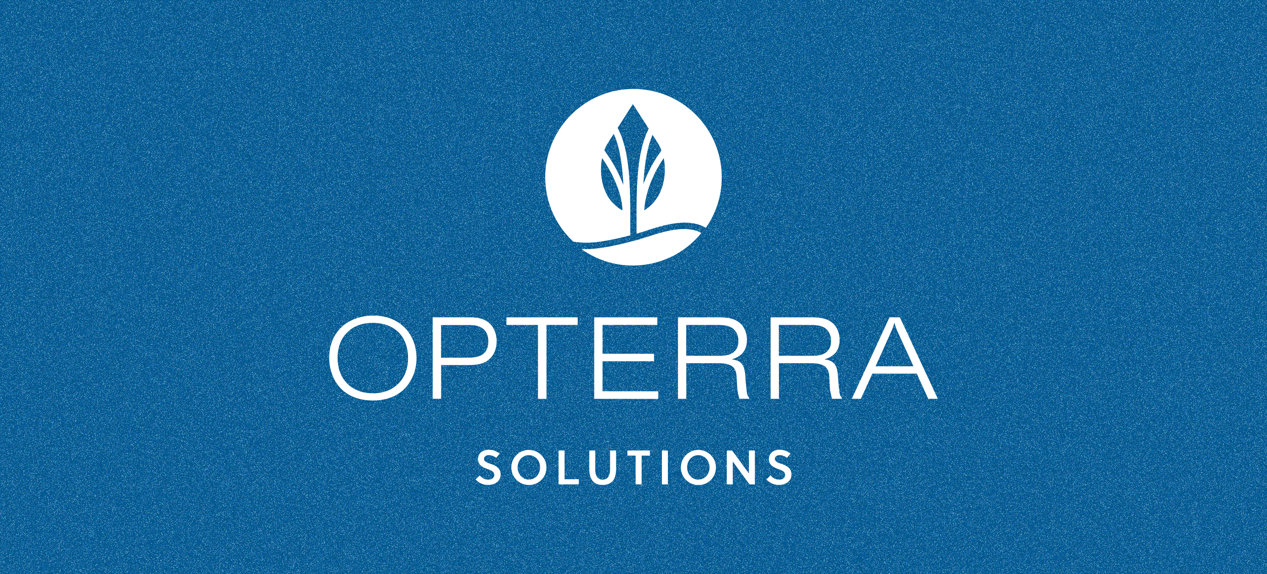
NaturChem came to us needing a total brand refresh, from the name to the visuals. Their previous name had an environmentally-negative connotation that didn’t communicate their future vision. Through our robust naming development, Opterra Solutions, a positive and earth-focused name, was born. After that, we moved into the design of the identity and creation of the brand system, including the attributes, logo system, color palette and typography.

