close

Reba‘s Place

identity / print / merch
A moody image of a cowgirl with her horse is textured with a leather overlay, on top sits

Welcome to Reba’s Place. Kick off your boots and feel right at home at this restaurant, live music venue and retail store brought to life in Reba’s hometown of Atoka, Oklahoma. Influenced by Reba’s upbringing and welcoming spirit, ST8MNT created a full hospitality brand system for this one-of-a-kind spot. The evergreen logotype lockup was already established, so our team dug into Reba’s heritage to build a full brand system from there. The full execution included a robust style guide of alternate marks and additional logos, brand attributes, a vivid color palette, tone of voice and typography, along with branded graphics and patterns to be integrated throughout venue interiors, on exclusive merchandise and diverse pieces of collateral.
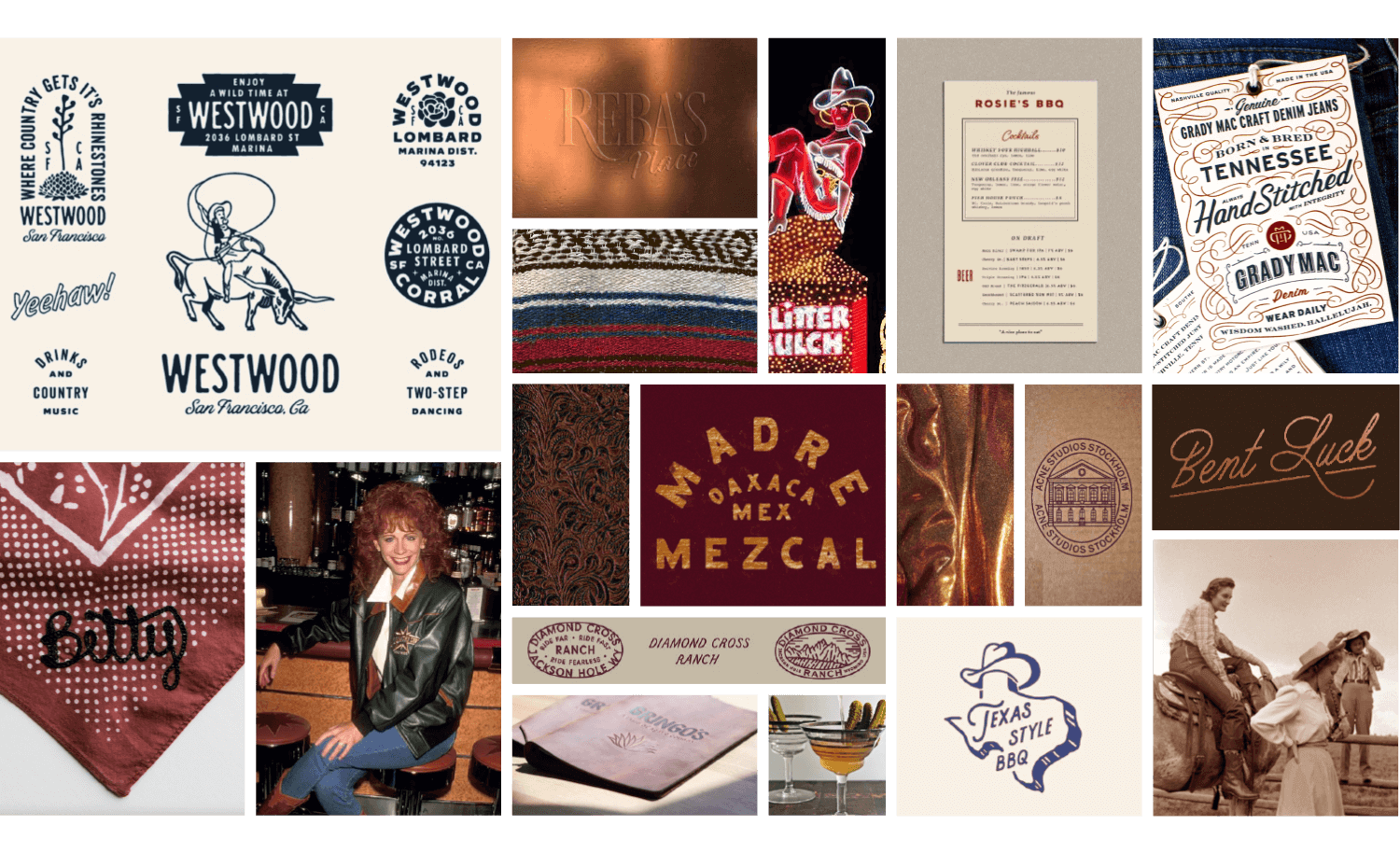
Moodboard of images serving as inspiration for Reba's Place

Developing a deep and varied Brand System

With such a lively venue offering a variety of experiences, our brand system needed to fully reflect this essential energy. We needed to include flexibility for application and new elements that live harmoniously with the evergreen Reba logo. We developed fun monogram options, multiple alternate logos and entertaining patterns to carry Reba’s charm throughout a cohesive brand.
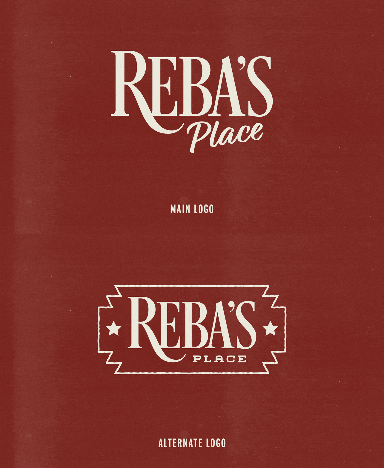
 

GIF alternating between established main logo and the alternate logo we designed on red textured background
GIF alternating different inline and fill versions of the rectangular R monogram on ochre textured background
GIF alternating different inline and fill versions of the circle R monogram on blue textured background
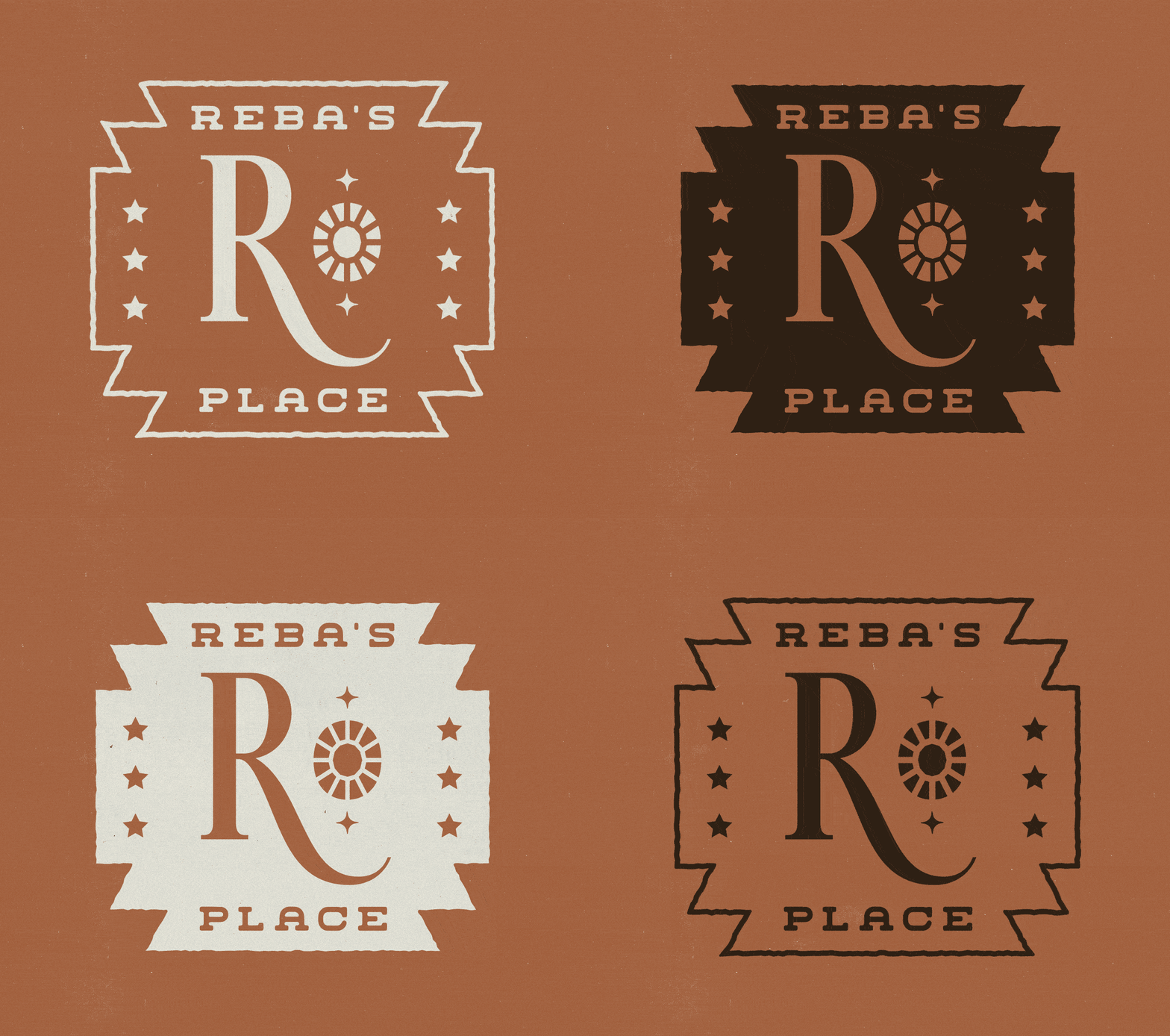
RP monogram marks are in a line showing different color variations of 2 versions that include a gem and star on brown textured background
Colors
Typography
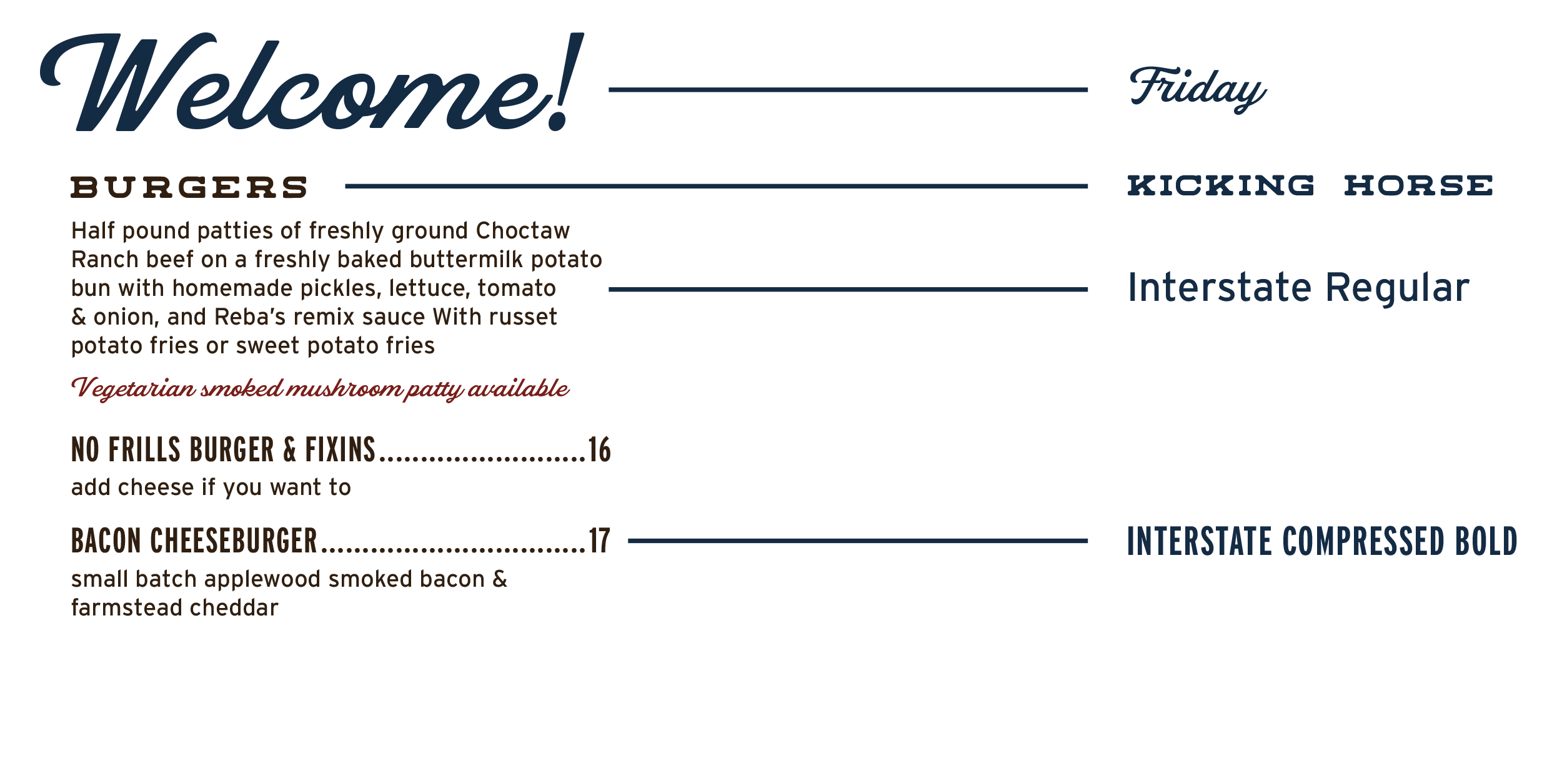
Reba's Place typography laid out in the example of a menu format. The text reads:
Tone of Voice
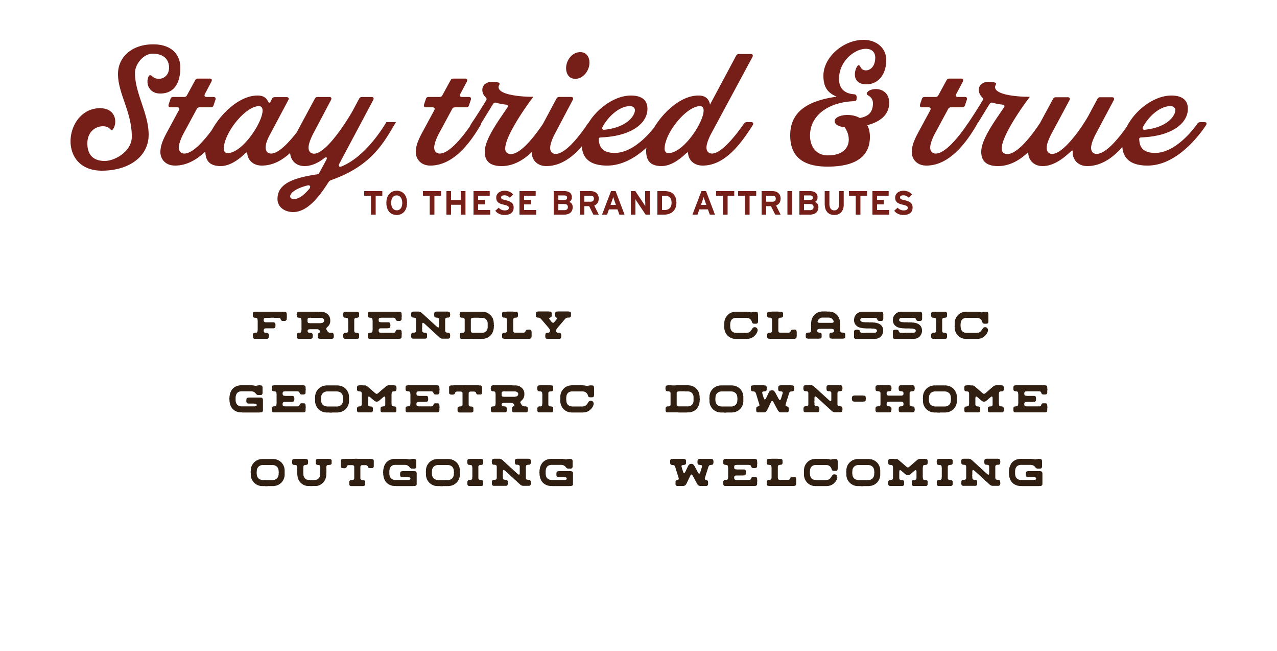
A list of attributes describing Reba's Place Tone of Voice: Country-flair, warm, thoughtful, excited, little bit of sass, hospitable

Brand Graphic Buildout

To capture the personality of Reba’s Place, we built an array of graphics to bring fun and fancy! We focused on the elements of Reba’s Place that were essential to the brand identity including the Masonic roots of the building, the western spirit of Oklahoma and the beloved personality of Reba.
A set of 3 Reba's Place brand graphics including an illustration of a longhorn, a cowboy, and text reading
Patterns
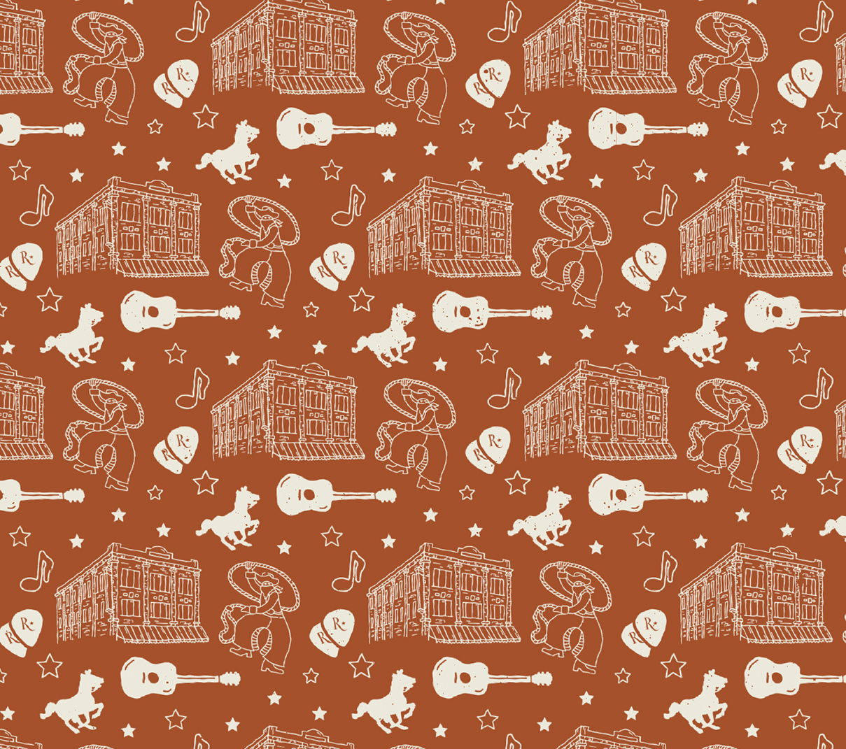
A pattern is created using the brand illustrations of the cowboy and building, along with guitars, guitar picks, horses, and stars
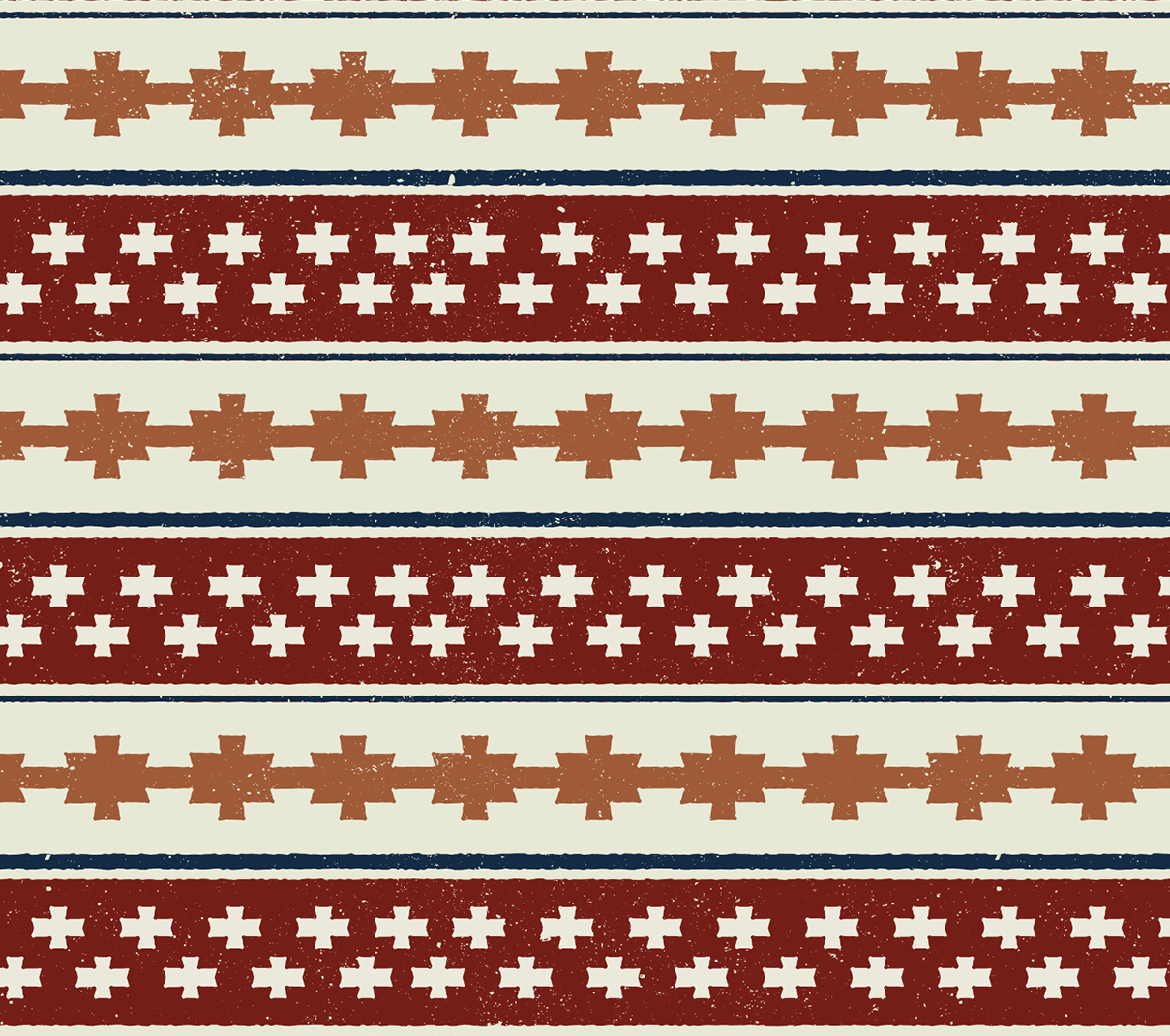
A southwestern pattern is created using shapes, lines, and different brand colors
A southwestern shape is repeated to create a monochromatic blue pattern
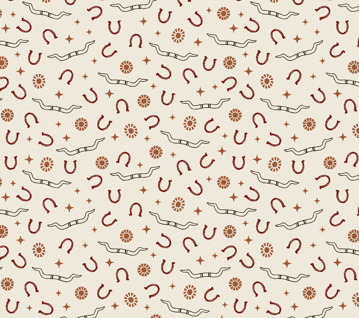
A pattern of horseshoes, gems, stars, and longhorns sits on a cream background
Brand Executions
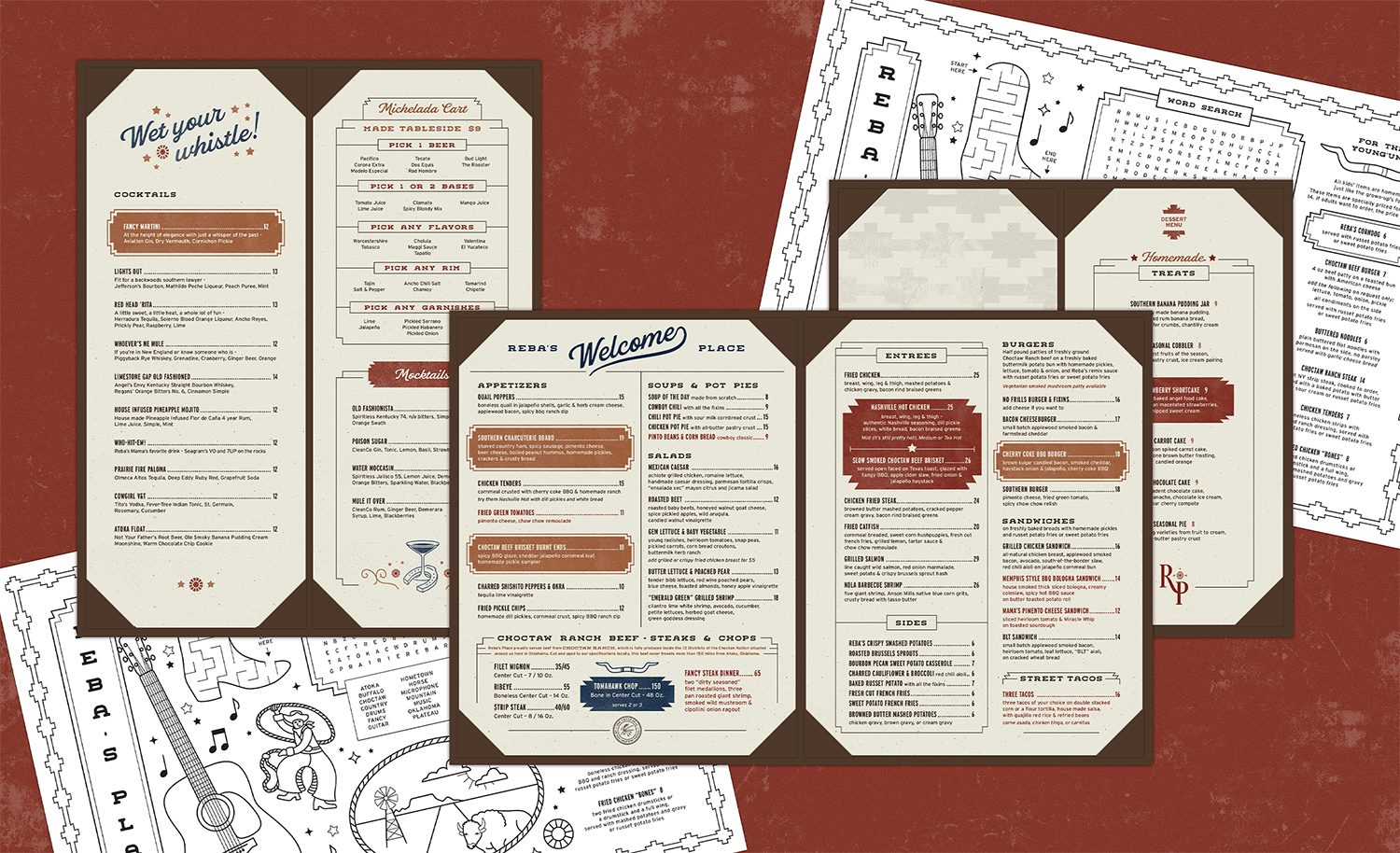
Reba's Place Menu Design shown in a flat lay with kids, drink, main, and dessert menus on textured red background
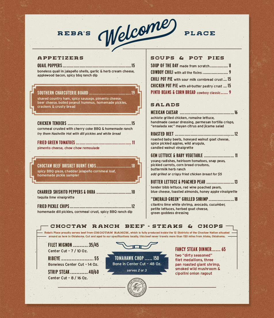
Reba's Place Menu Design for Main Menu lays flat on textured ochre background
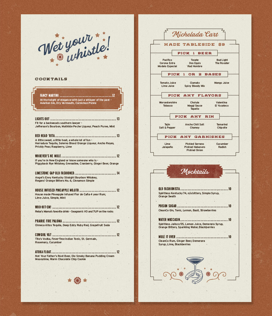
Reba's Place Menu Design for Drink Menu lays flat on textured ochre background
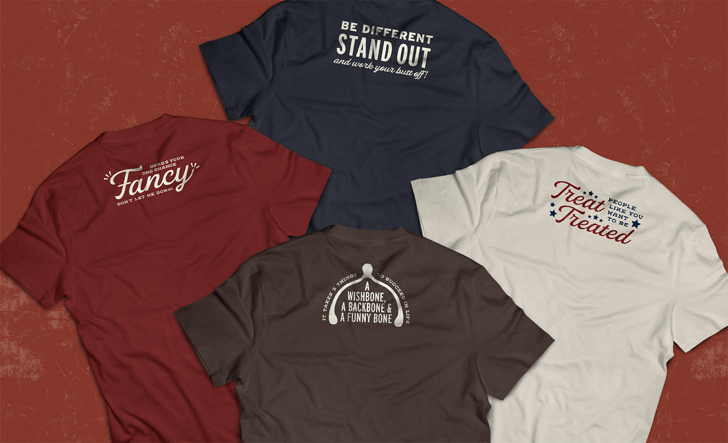
Reba's Place T-Shirt designs laid in flat lay. From left to right: Red shirt with