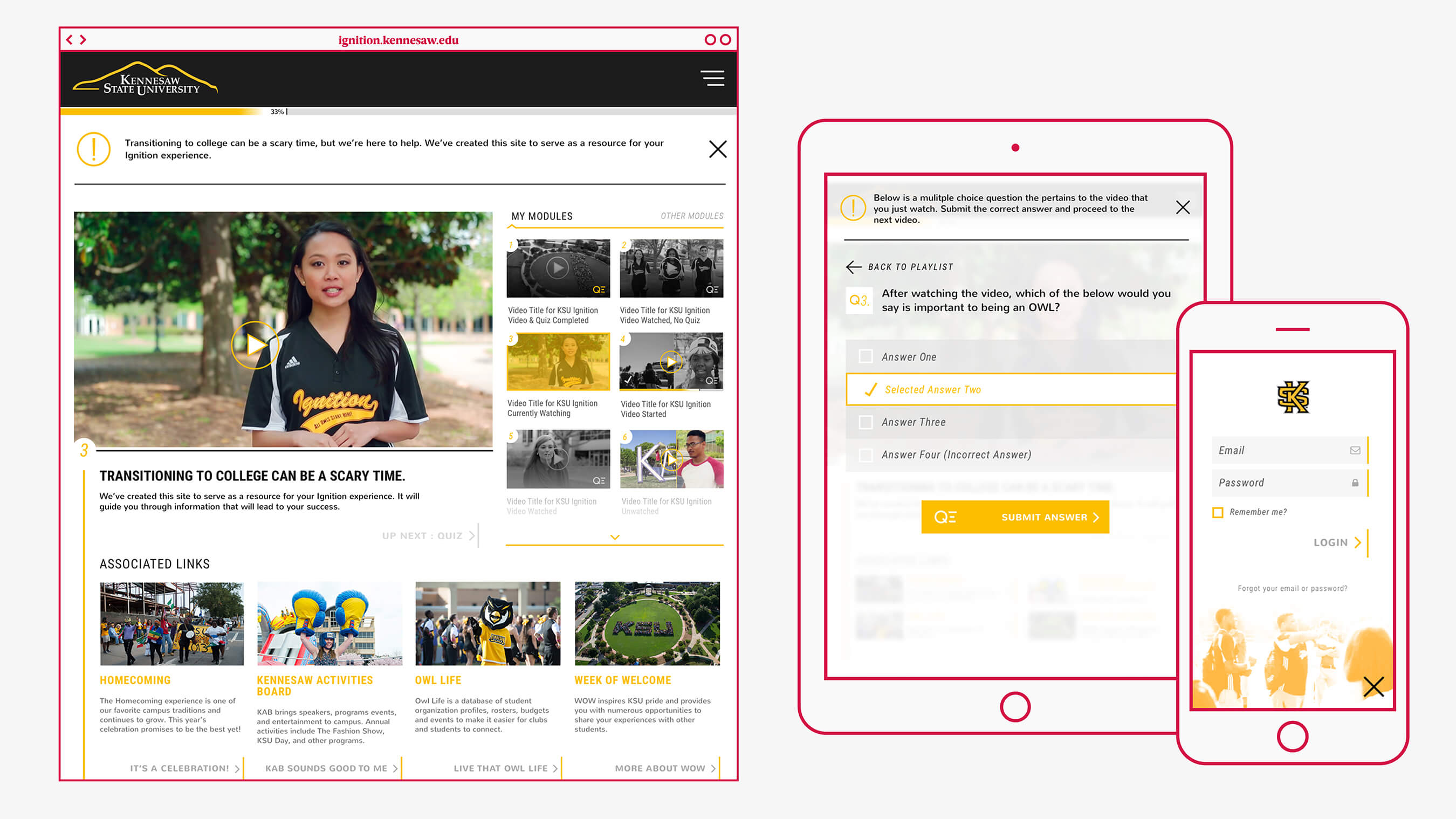
What if we could help users easily navigate a complex orientation progress?
That’s the opportunity we were presented with when our good friends at Between Pixels partnered with us on the user experience and interface design for the Ignition web and mobile app for Kennesaw State University’s online orientation experience. The project included complete working files of the design, a functioning html prototype and a “Kit of Parts” (KOP) for quick and easy design and prototyping of new pages and sections.
What is KSU Ignition? I’m glad you asked…
Ignition serves up personalized orientation videos for recently accepted students to KSU. Before the in-person orientation can be scheduled the student is required to watch a specified collection of videos and correctly answer the quiz question following each video. By filling out a profile, the incoming student is provided with an account that allows the app to target only applicable content for each student. This profile allows for the orientation process to be quick, streamlined and relevant.
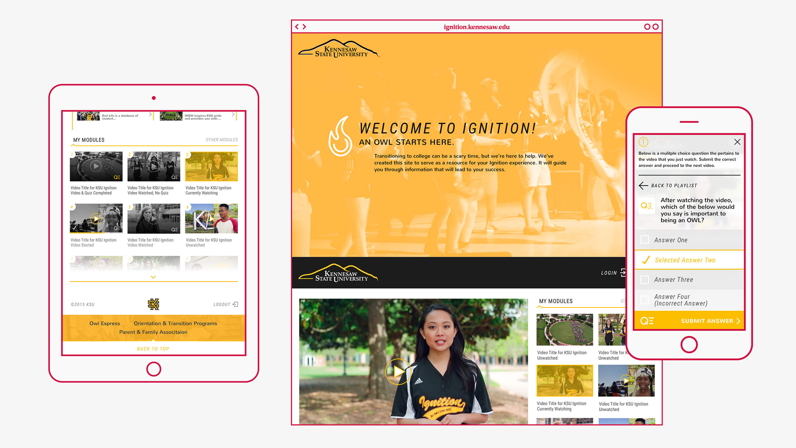
The student can watch the entire orientation video library KSU provides, if desired, but only required to view videos that are pertinent to them as defined by the admin system. Parents can also access the site to stay up-to-date on their OWL knowledge. As a responsive web app it allows students to use any device to complete orientation pausing and picking back up at the user’s discretion.
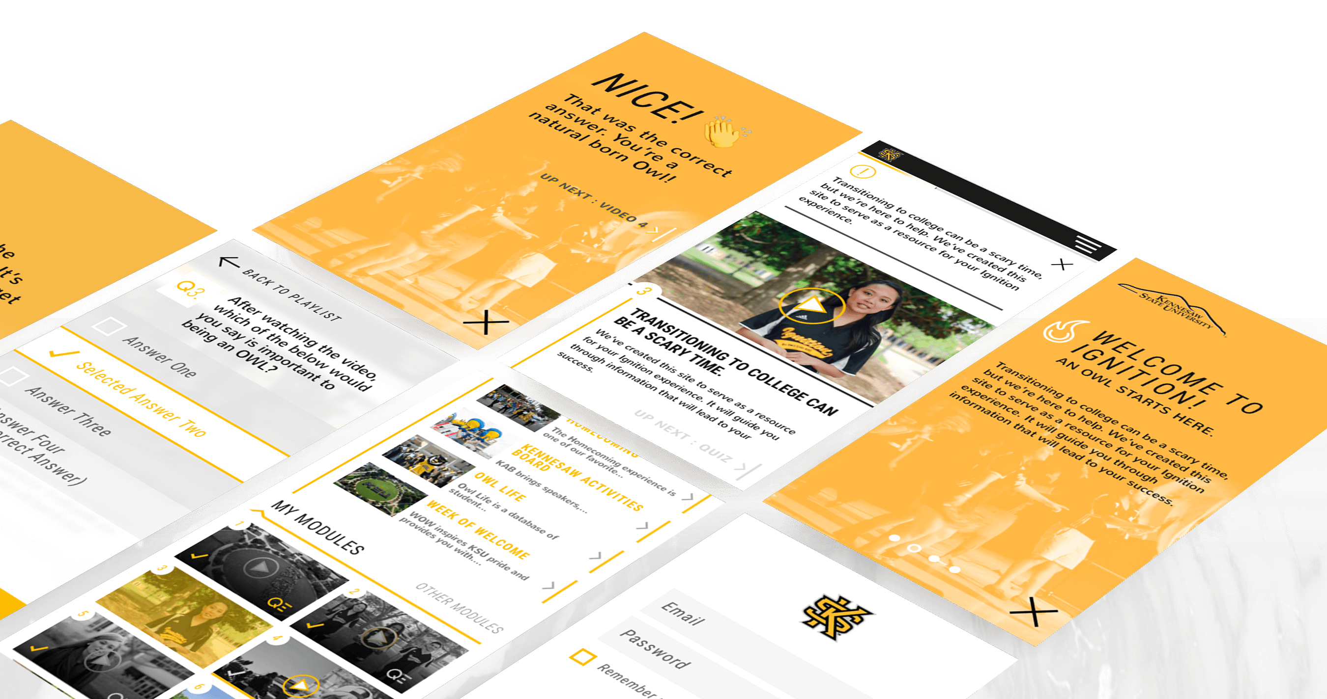
We helped KSU implement a beautiful and targeted experience that simplifies the complex orientation progress of today’s university. After completing Ignition, the student is prepared for a smooth and easy experience transitioning into a KSU student.
In addition to design, we delivered a function html prototype of our interface. This allowed for the developers to focus fully on the backend without having to completely engage on the front-end build.
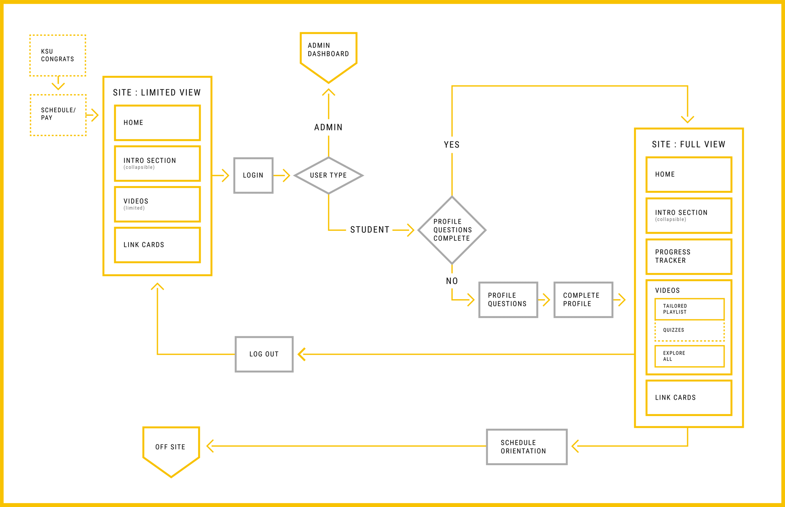
A flow so good, rappers would be jealous.
We carefully crafted user flow for the KSU Ignition web app keeping the students experience front of mind. The User Flow incorporated crucial steps in the user’s process that range from their university acceptance letter to the scheduling of an in-person orientation.
The creation of this chart allows for us to fully understand the Ignition user thought-pattern and the goals of the app prior to design. This is an important part of our process because it ensures that every touch point of the user is considered and thoughtfully planned.
Allow me to introduce you to my good friend, Wire Frame.
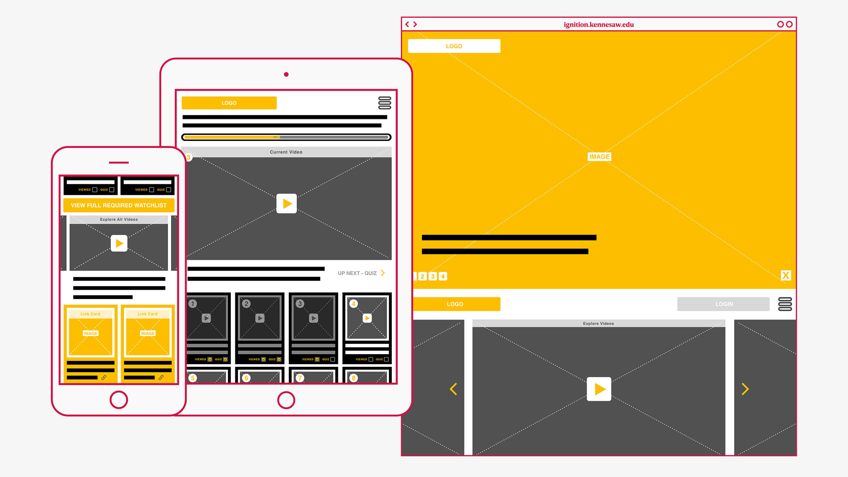
Every good story starts with an outline.
Our outline and plan for a website began with identifying key elements of each experience. We do this by wire framing every page and element of the project. The wire frame works as our hierarchical layout for the experience. Every element and module that makes it to the final design is wired framed and planned before any pixels are pushed or code is written.
We delivered KSU Ignition’s wireframes as a functioning prototype that allowed for quick and easy client comprehension.
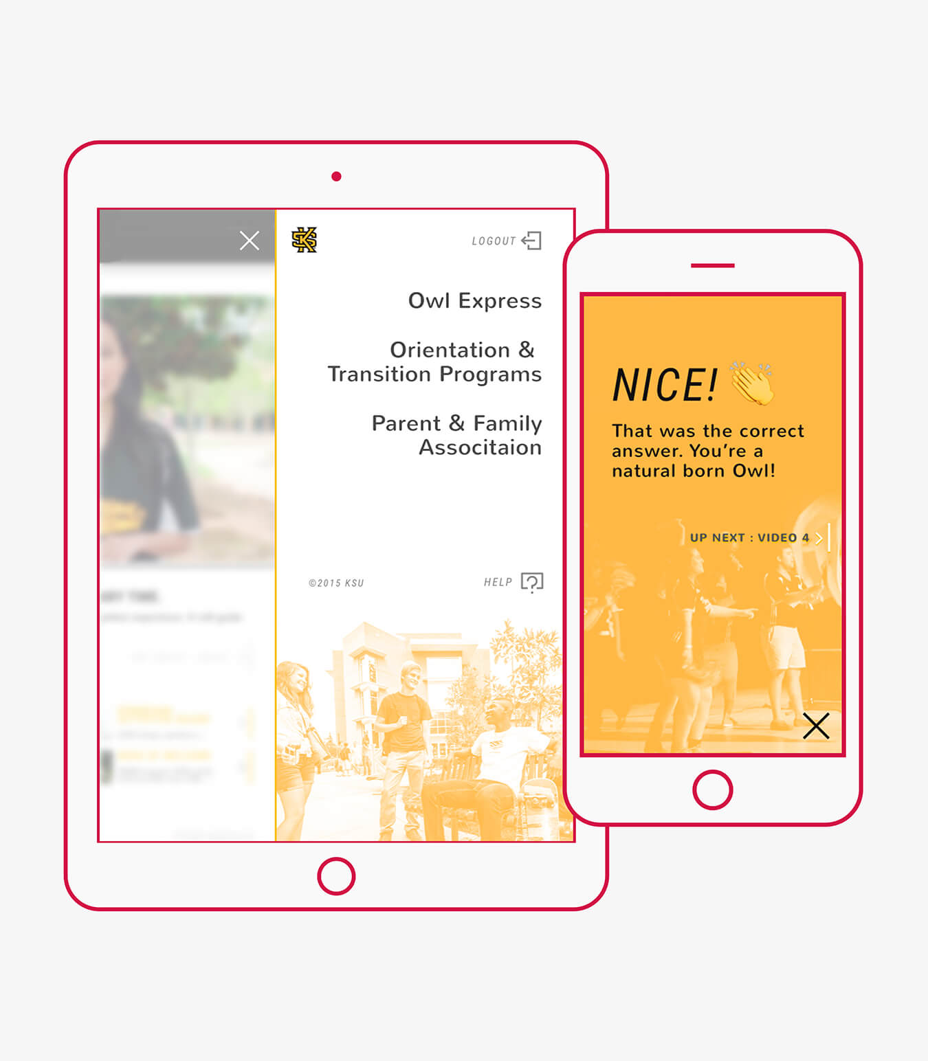
Answer the question. Get a cookie. At least an Emoji.?
Ignition’s interface tastefully incorporates existing elements of the university’s brand. The design is contemporary, intuitive and engaging in execution. We strived for creating an experience that was easy to use and at the same time visually stunning. For the project, we created custom icons, branded image treatments, utilized engaging typography, and established an easily understandable visual language.
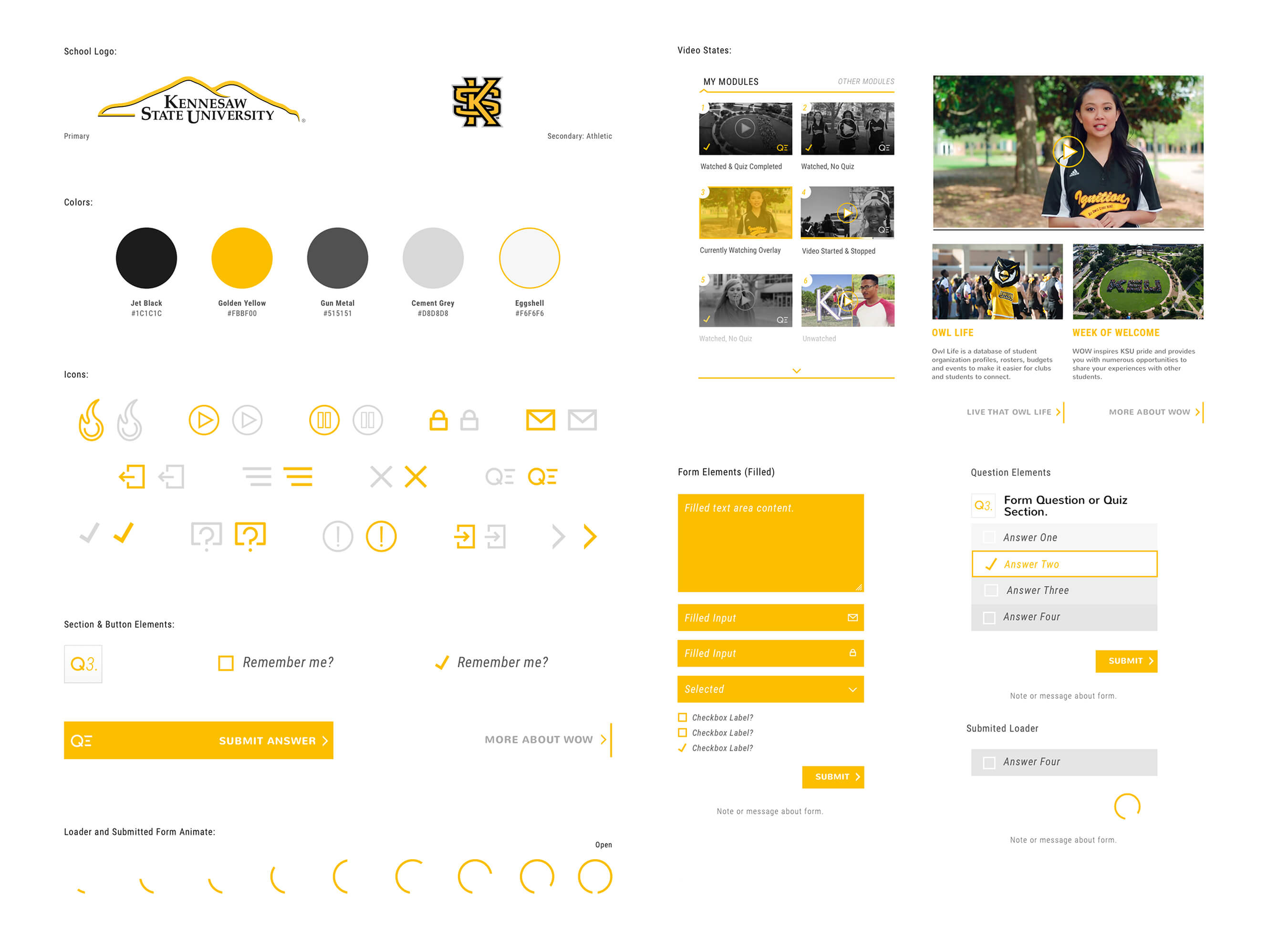
Break in case of emergency.
Every now and then an issue arises and you need a page developed that doesn’t exist. Even with the best planning this still occurs. You can’t win ‘em all.
It’s because of those instances that we delivered a Kit of Parts for KSU Ignition. This allows for pages and parts to be assembled in a quick and easy manner. This also doubles as a loose style guide for the app as it evolves and changes.

