Heavens to Betsy. It’s nice to meet you.
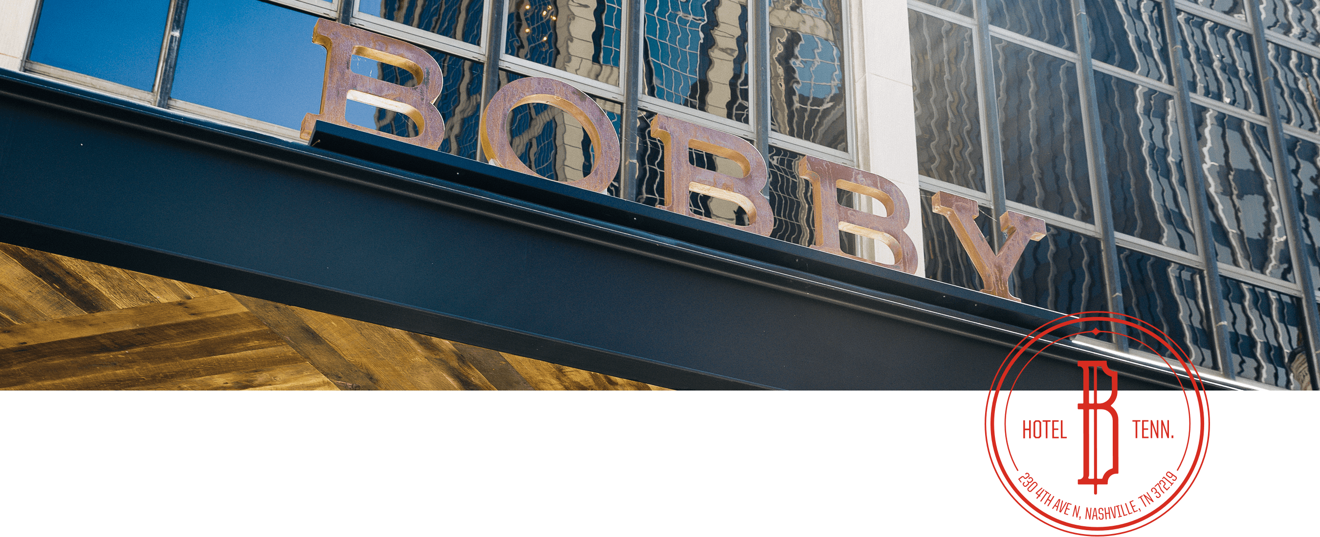
Bobby Hotel’s bespoke experience was designed to be eclectic, charming and full of it’s namesake’s attitude. Years in the making, the boutique hotel brand in downtown Nashville delivers a warm and vivid welcome for guests and locals alike all, while retaining a modest elegance. ST8MNT’s been honored to partner with Castlerock from the brand’s genesis to full roll out. With friends like these, you’ll never want to leave.
MEET BOBBY
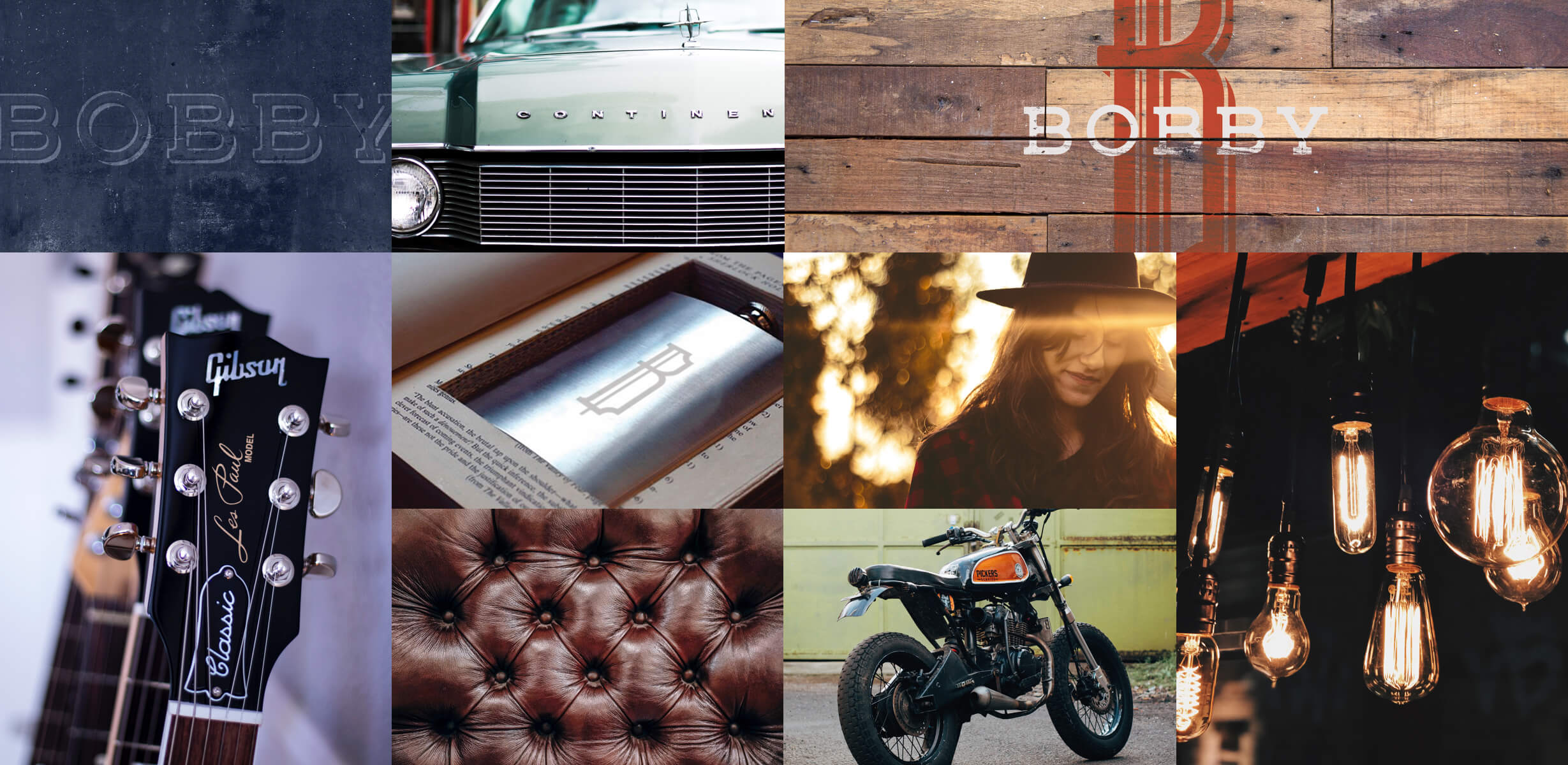
Bobby Hotel is the vibrant lifestyle-driven refuge in the heart of Nashville, welcoming even the most selective of travelers who seek a magnetic blend of Southern hospitality and New South innovation. Ever-mysterious, Bobby is a nomad at heart; whether it’s sipping whiskey on the rocks, commissioning a new painting to add to a wide collection, or scoring vintage records, let Bobby be your guide through Nashville’s creative dynasty. With quirky treasures and collections from Bobby’s travels throughout, the visual vocabulary of the brand needed to reinforce the world-traveler spirit and charm. Bobby is everywhere and no-where at once, exuding Southern warmth, always with grit, true to Nashville of yesterday and today with surprises and delights at every turn for guests.
EXPLORING BOBBY’S VISION
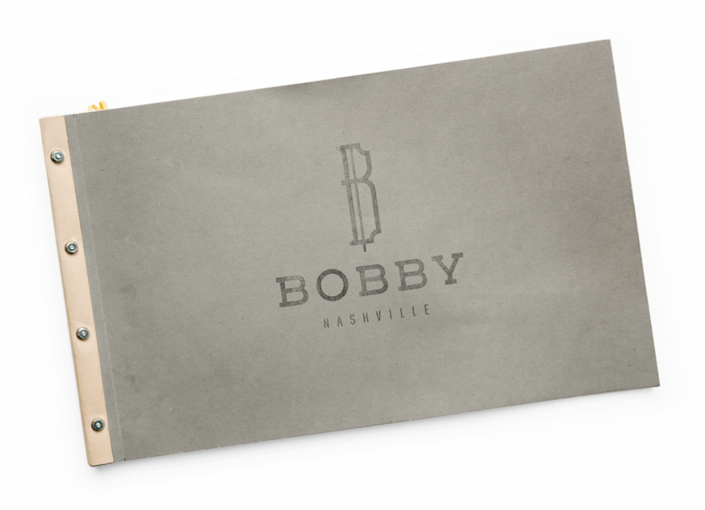
We begun brand development work in the form of a Brand Intro Book with Castlerock years before the cranes got started. Bobby has no fear of mixing traditional design elements with unique and gritty found objects and textures. Intent is to stir the guest’s senses with the layered and vivid details. The brand was developed to appeal to taste-making travelers looking for inspiration. The overall brand essence is inviting, friendly with a colorful personality – yet sophisticated and charming.
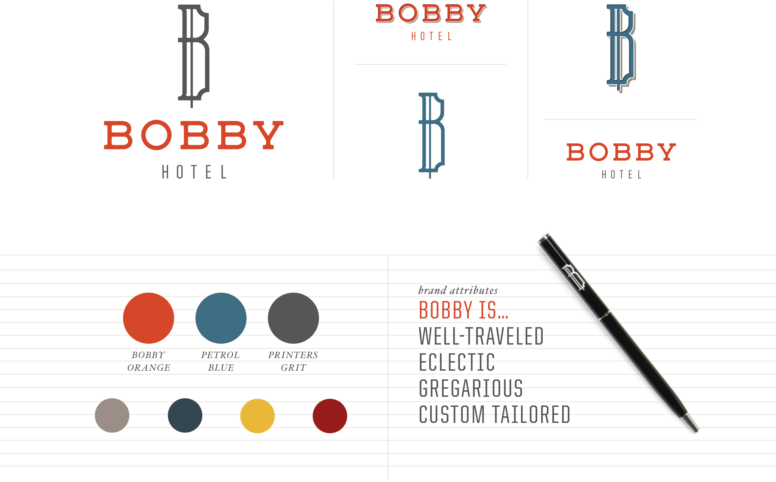

The Bobby Hotel logo is traditional, yet modern. Eclectic, yet refined. Classic, yet versatile.
The logotype letterforms are inspired by woodcut letterforms grounded in the aesthetic roots of Nashville. The “B” mark is reminiscent of a traditional crest and gives nod to the building’s bank past. Its inset corners and unexpected vertical cross-bar convey a sturdy and formal aesthetic, with history and character.
Bobby is a world-traveller, who laid down roots in the American South. The color palette features Americana-inspired colors. The hotel’s brand attributes are inspired by Bobby’s warm and adventurous personality.
The contrasting font choices create a typographic system that are both bold and refined. United Sans Condensed conveys an unexpected attitude of confidence and swagger. By contrast, Hoefler Text is a sophisticated choice that conveys quality and elegance.
BOBBY’S STORY IS IN THE DETAILS
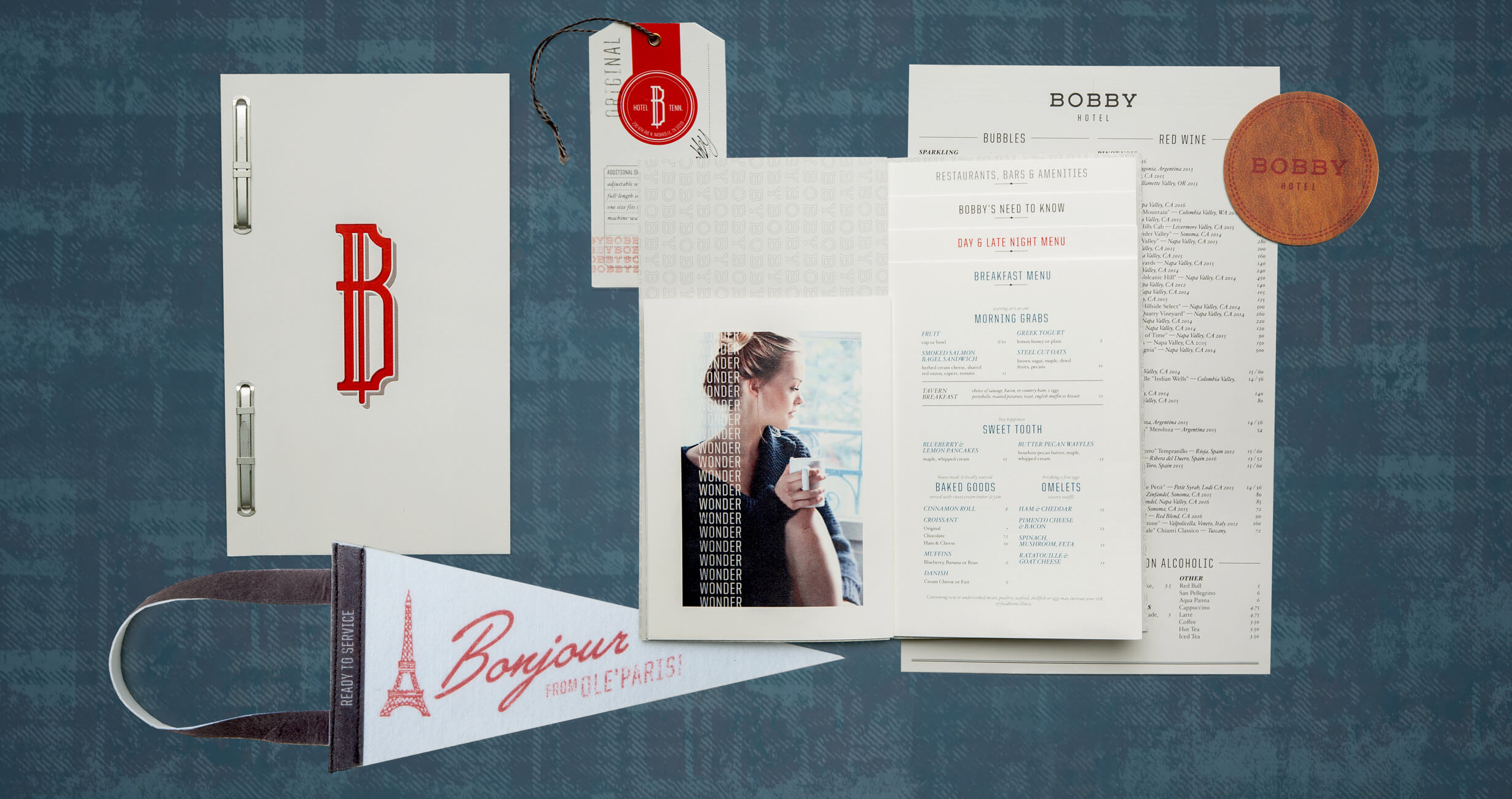
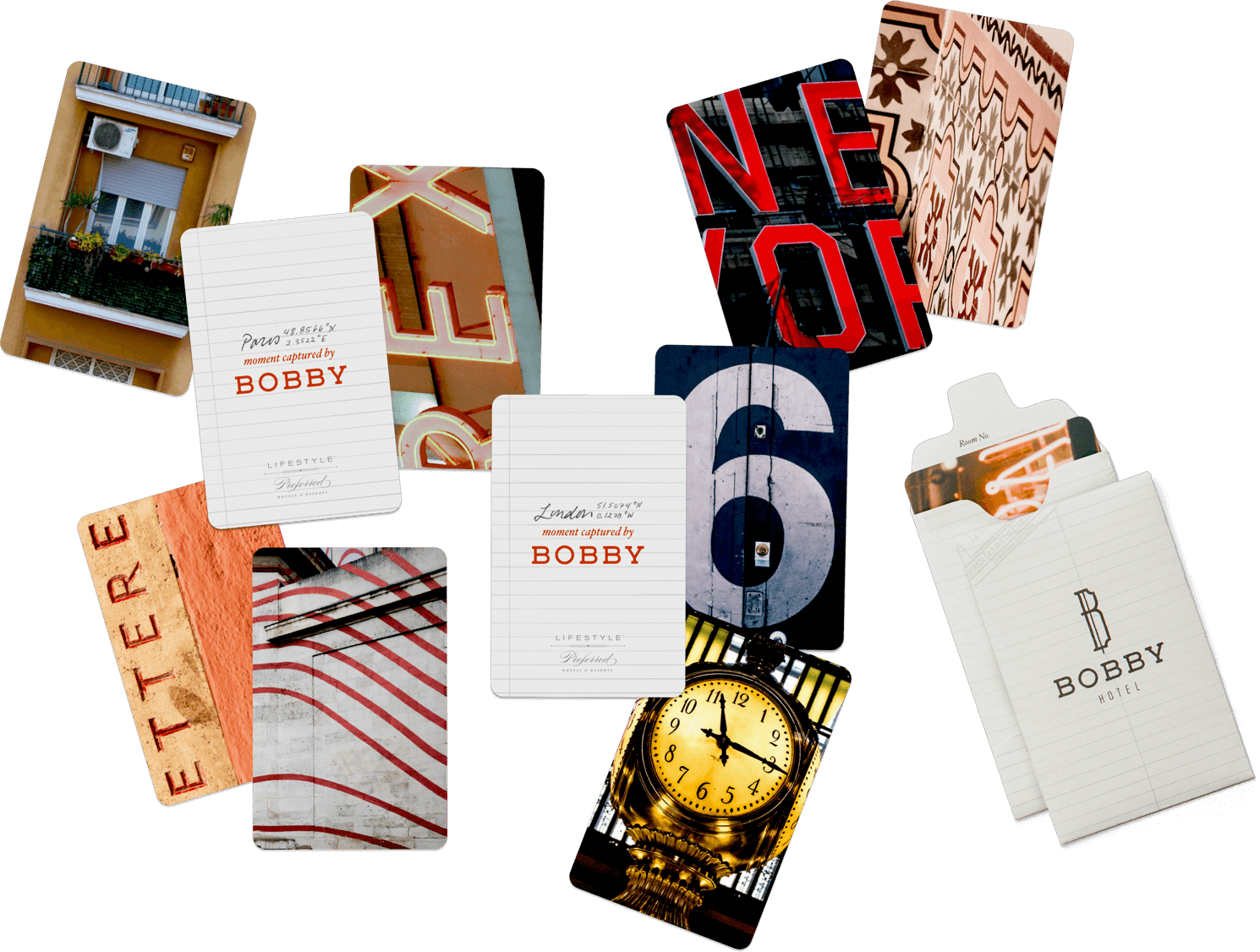
Unique, comfortable, detailed and accurate (but only when it matters most), otherwise consistently inconsistent. Collectibles, artwork and found elements from world travels are scattered throughout the hotel, waiting to be discovered. This was an important nuance to carry through all brand and guest touch-points. Key cards feature photos and coordinates taken from Bobby’s travels around the world – from places like Paris, London, and Marrakech. An antique travel pennant with worn away from travels, serves as a door hanger – one side saying “Bonjour” for “ready for service”, And the other saying “No Way” worn away from the word Norway for “do not disturb.”

MEET SASHA, EVERYONE’S FAVORITE HOTEL DOG.
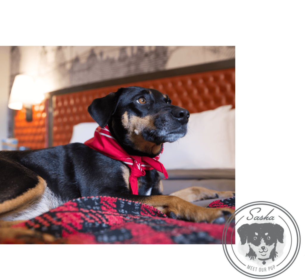
Sasha loves to greet guests, ring the service bell and proudly sport her Bobby-branded bandana. She was adopted from Country Road Animal Rescue, and a quirky illustrated hand towel in the guest bathrooms can be purchased with proceeds going to the rescue center.
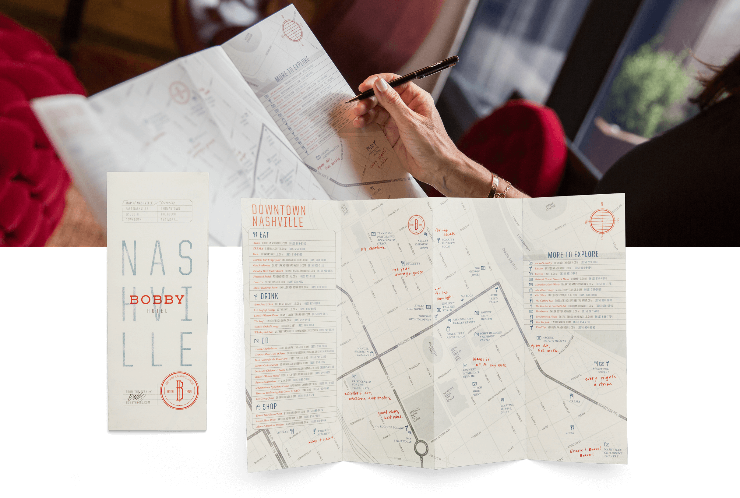
From the moment guests check in at Bobby Hotel, they’re immersed with artifacts that tell Bobby’s story. Each branded piece contains personal touches, such as a hand-written note, or a map of Nashville, taken from Bobby’s desk. The concept behind the map is rooted in Bobby’s explorations; it’s designed to look like a personal map — with notes and travel tips from Bobby. All artifacts disclose different aspects of Bobby’s story, and were designed to compliment Bobby’s elegance and swagger.
WALK THE BOBBY WALK.TALK THE BOBBY TALK.
The official Bobby Hotel Playbook and Pocket Guide is given to new employees of the hotel. The design is in the style of Bobby’s personal journal, while evading the typical humdrum employee manuals. The book provides guidelines on employee dos and don’t’s, including handwritten advice from Bobby.
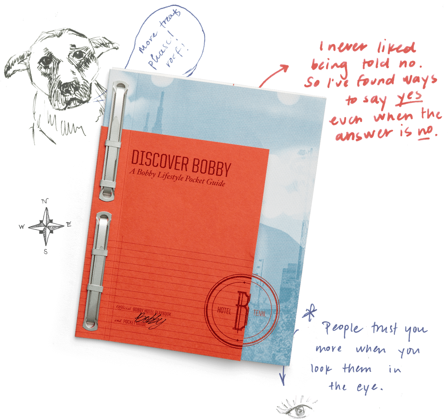
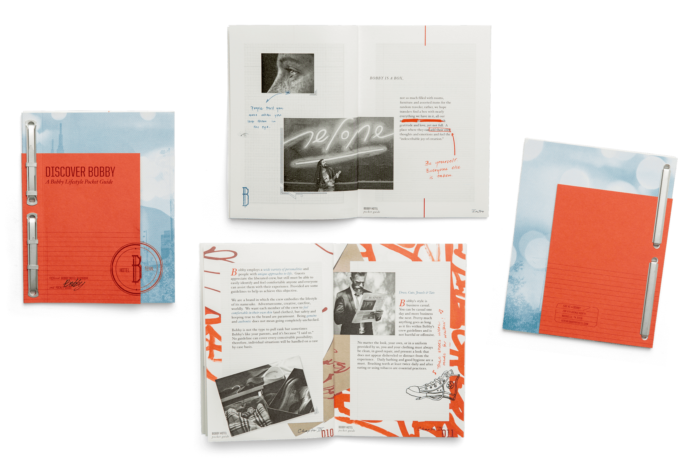
Bobby, ever an eccentric genius, world traveler, nomad, artisan and character; Bobby is meant to be discovered and through experience and conversation. Bobby’s tone is friendly, confident, welcoming, direct, with Southern roots but always with a hint of brass. Bobby is personified not only through the hotel, but in words (both to guests and employees).
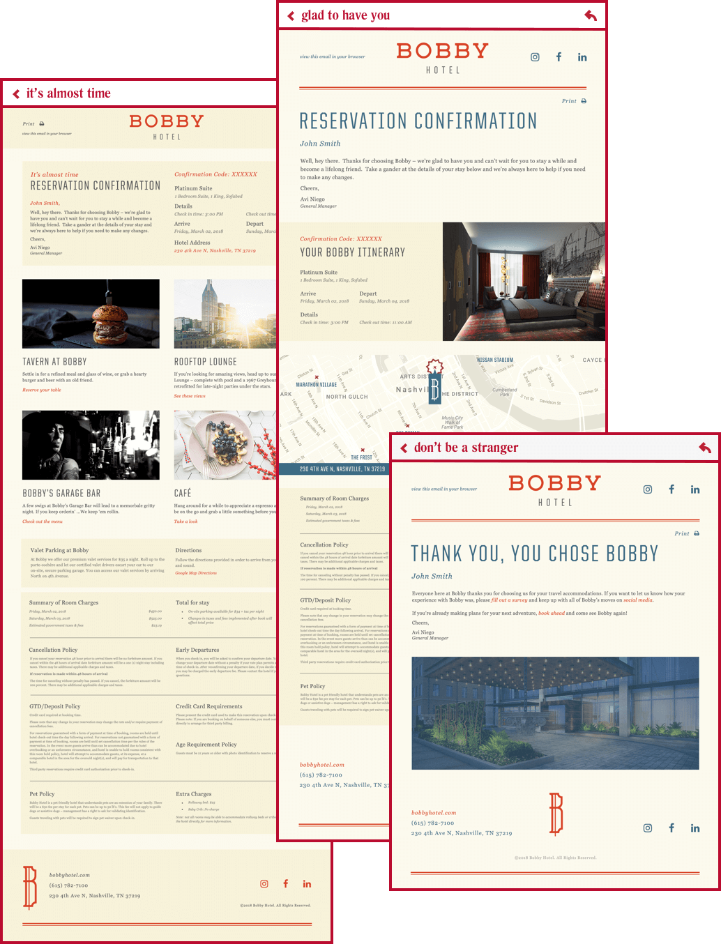
Once the vision, brand attributes and tone were clear, we began to develop target personas to truly understand the relationship between Bobby and the guests. Messaging was then written and refined for accurate descriptions, marketing needs, guest relations and internal training. We established both internal and external messaging guides so that from all touch-points, the brand tone was first and foremost and always true North. Guides ensure that with every step of the way, Bobby is heard.

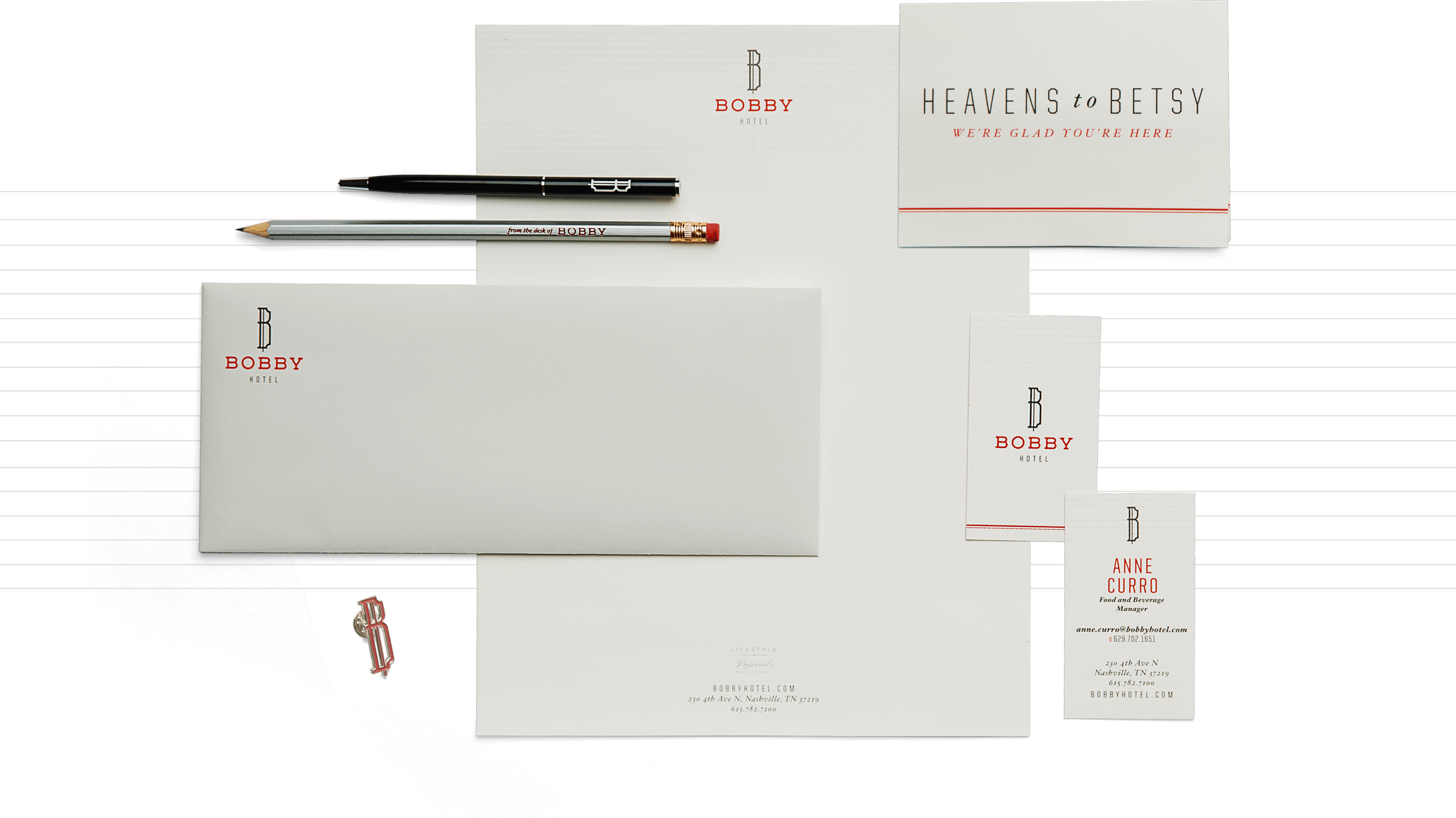
All details were considered when creating the stationery set to represent the Bobby brand. The off white paper with light gray envelopes give an eclectic, but refined feel. Personal touches, such as the “from the desk of Bobby” text on pencils and “Heavens to Betsy” messaging on the notecards, make the piece feel like the guest is receiving a copy of Bobby’s personal stationery.
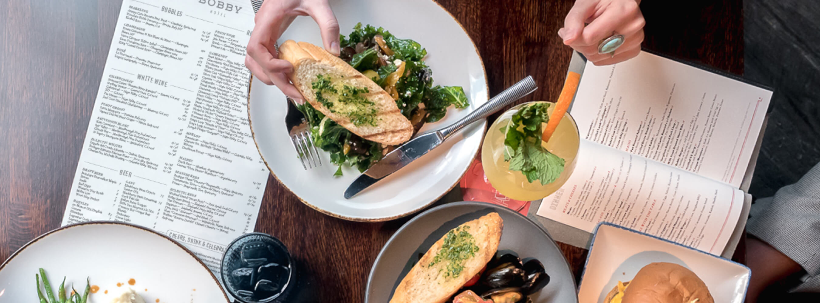
Tavern at Bobby
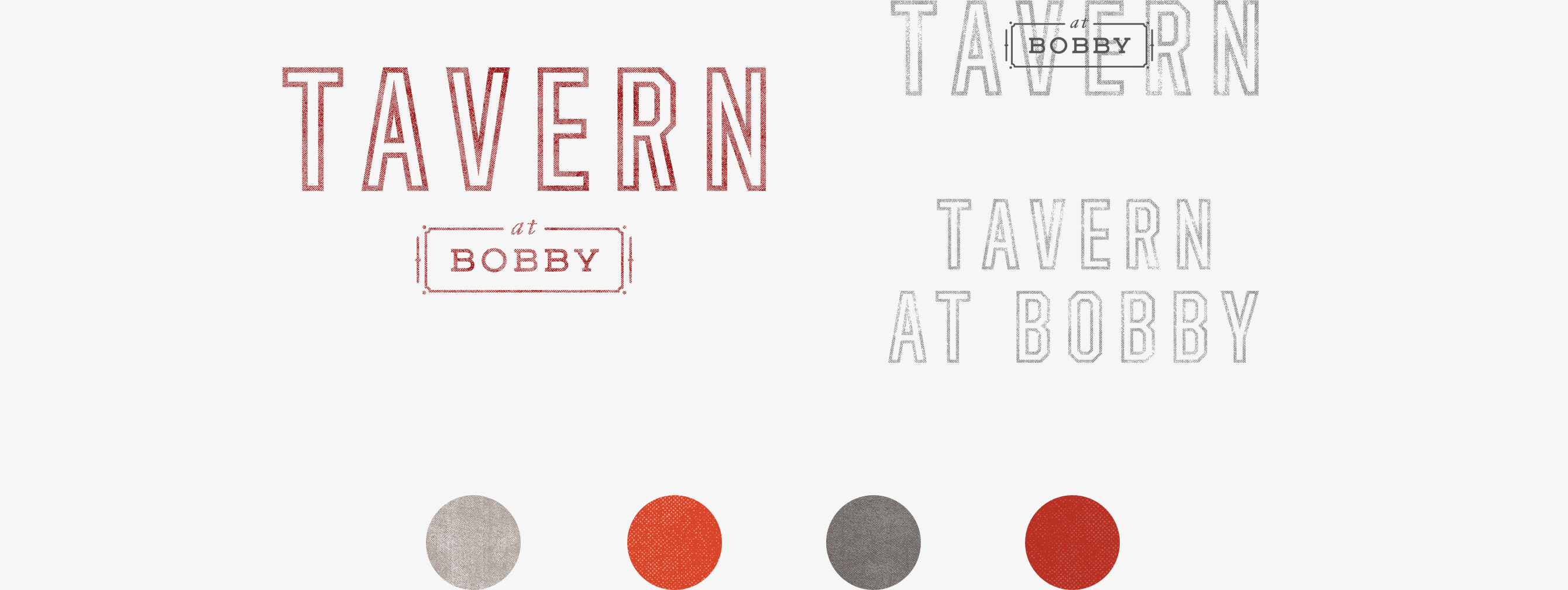
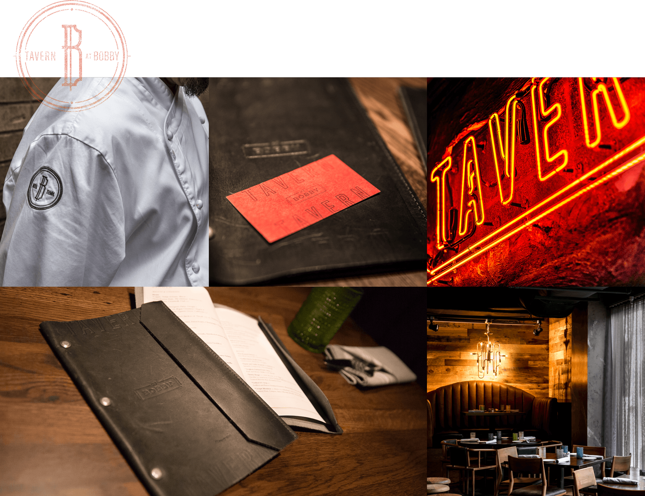
Tavern at Bobby’s brand pairs elegance with grit. The logo features strong letterforms that align with Bobby Hotel’s brand, and an “at Bobby” stamp that adds character to the brand. Tactile materials such as leather are used to create an established look that’s familiar yet intriguing. The colors are rich, warm, but never too heavy in application. Type usage is elevated in style, a nod to the high-quality food and service.
SUIT YOUR FANCY.
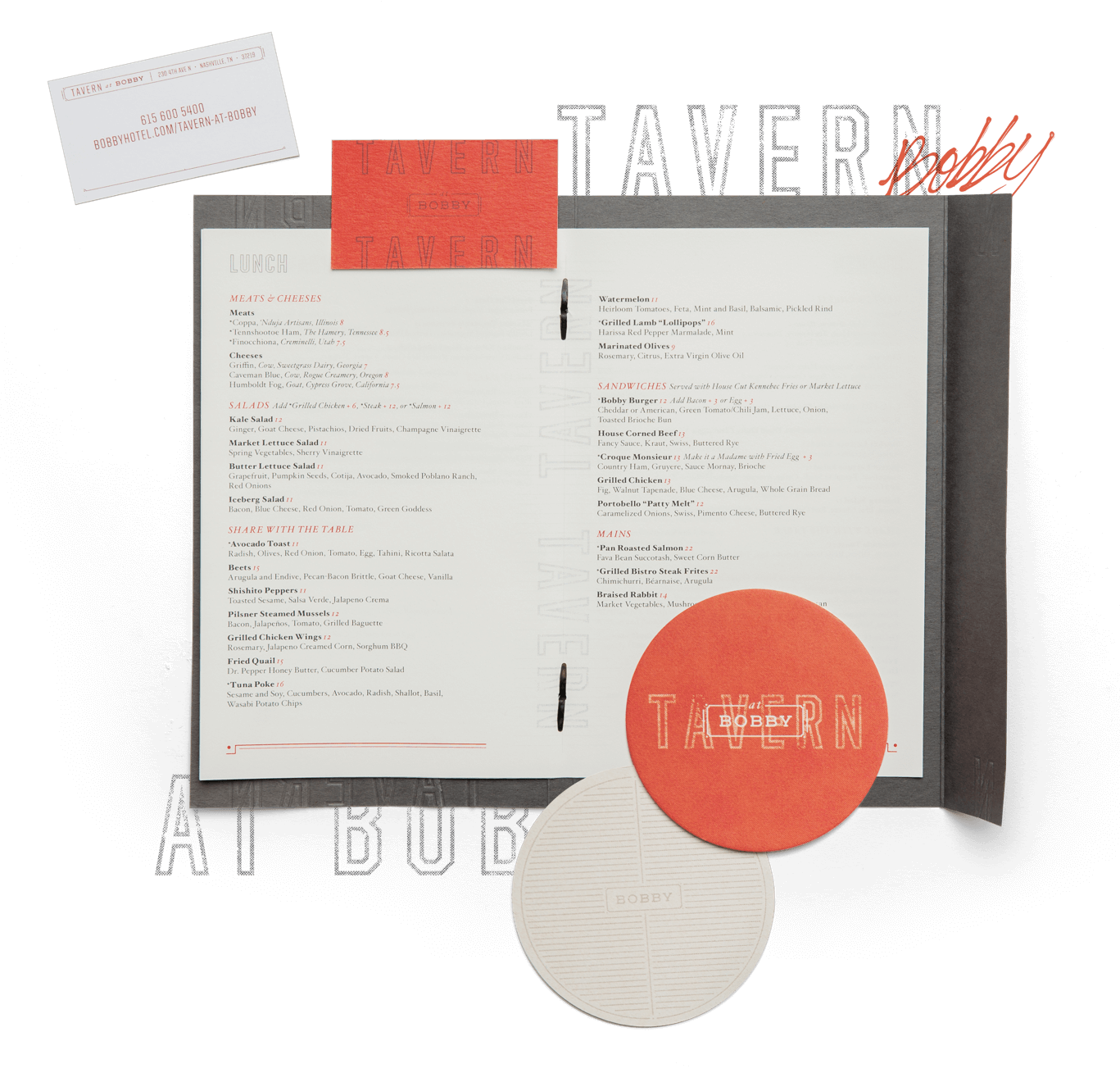
No part of the Tavern at Bobby brand is overstated. Sophisticated, yet relaxed, the brand for the signature restaurant compliments Bobby Hotel with approachable elegance. Tavern is a restaurant serving 5-star creative offerings by Chef Jeff, with no pretense or stiff formality.
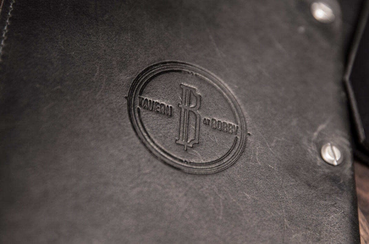
CHEERS AND ENJOY.
The leather menu, featuring a blind emboss, is elegant, yet understated. Our leather menu design was brought to life by our local friends at Lockeland Leatherworks.

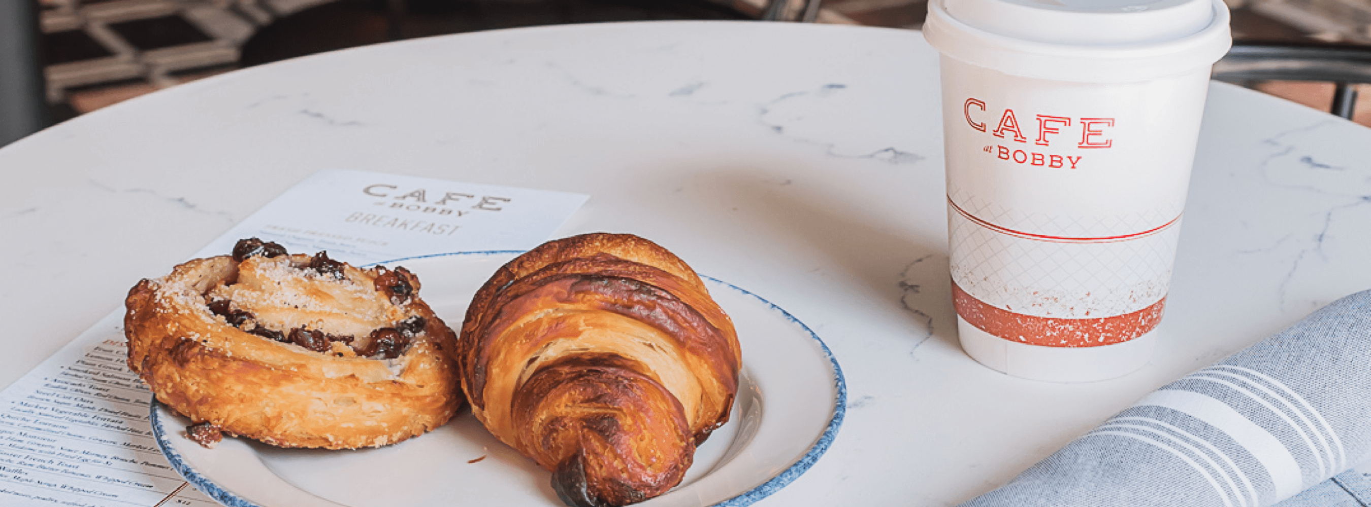
Cafe at Bobby
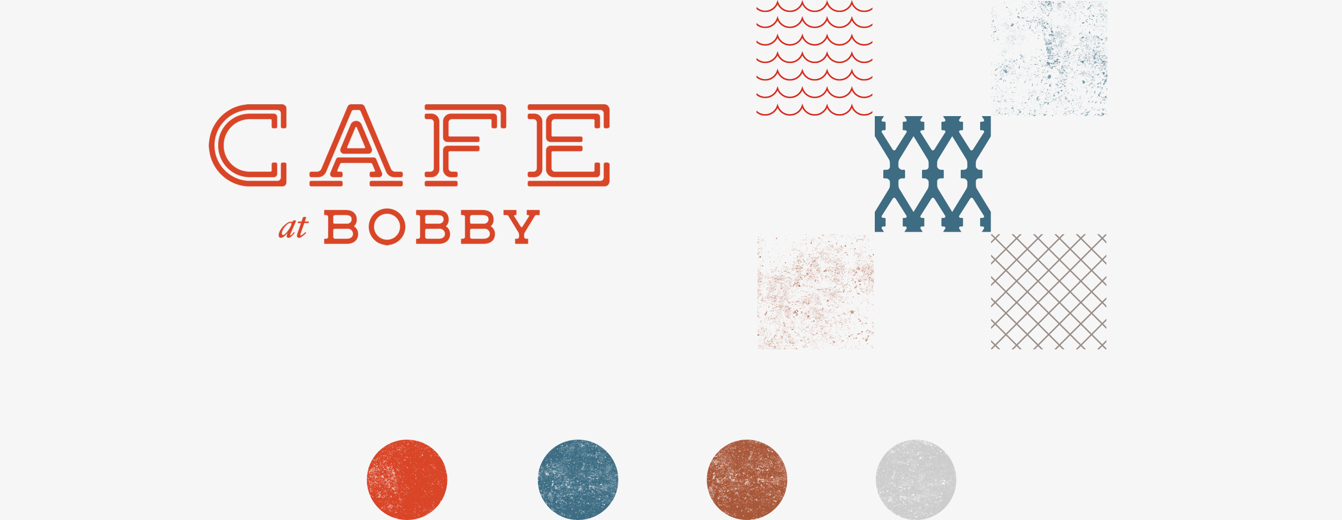
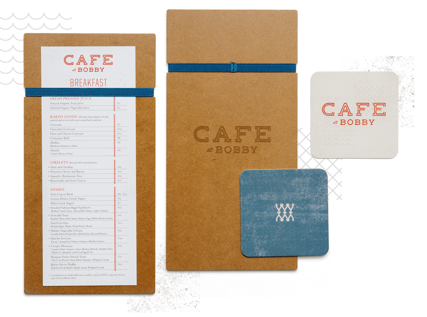
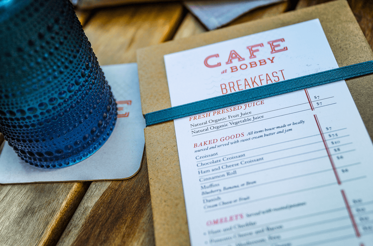
Cafe’s brand design has a warm and charming feeling, as if you’re at a sidewalk cafe in Europe. The logotype was built from the Bobby logo letterforms with an open approach. The brand uses simple but eclectic patterns with light touches of red and dappled textures inspired by the dishware. All printed items are light in color, a conscious choice made to reflect the open-air environment of the sidewalk cafe.
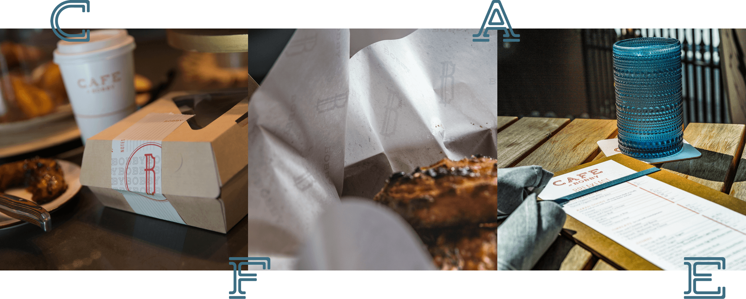
KEEP IT CASUAL.
Cafe at Bobby invites visitors to hang around for a while if they please for cocktail or espresso or they can easily grab something if they have to dash.
SIT & SIP, OR GRAB & GO.
Cafe at Bobby is fast casual for the refined palette. The mixed-and-matched branded patterns and textures reflect the varied culinary offerings of the menu.

Rooftop Lounge
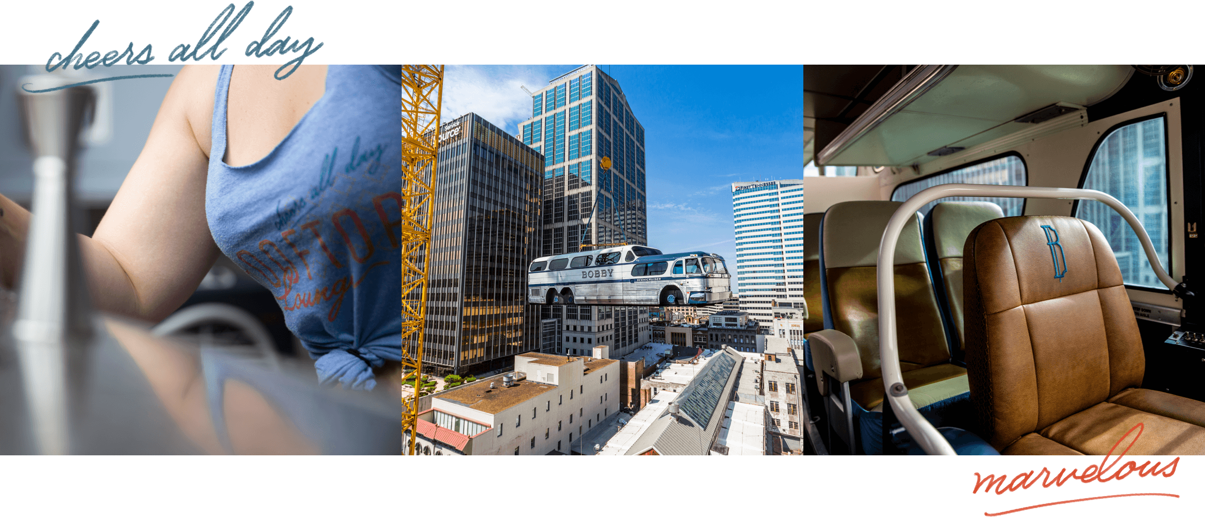
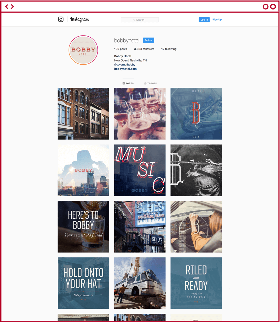
The Rooftop Lounge at Bobby provides an awe-inspiring atmosphere that appeals to anyone wanting to have a good time. How to you gain attention for happy hour from surrounding taller buildings around downtown, and strengthen the brand? How about putting a vintage Greyhound bus on the roof (custom branded and retrofitted for space for additional lounge seating)… since Bobby is a world traveller and music / culture lover. “The Hotel With A Bus On The Roof” gets plenty of attention, not to mention a perfect setting for social media influencer feeds.
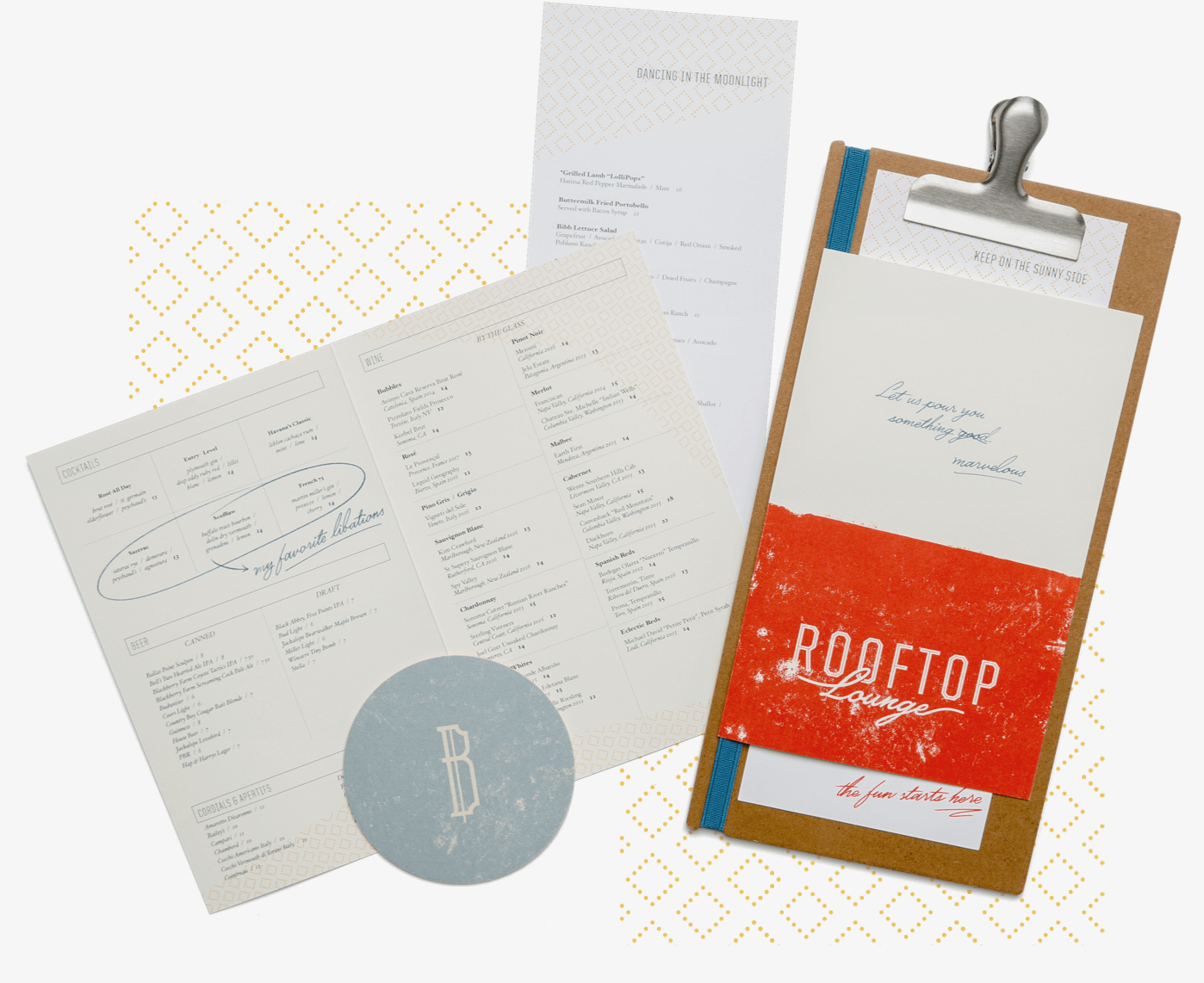
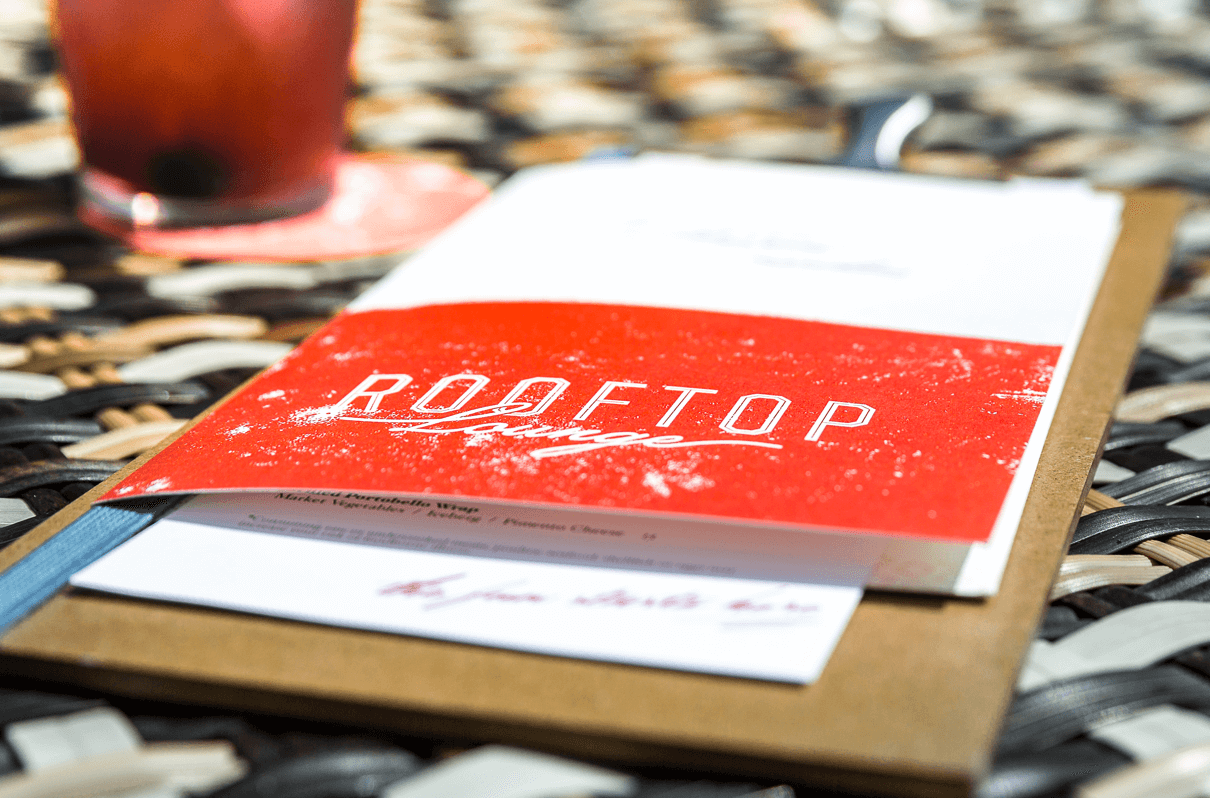
The Rooftop Lounge’s logo and design elements create a visual language that feels effortless, giving lounge party vibes with a laid back tone. The extended color palette gets more “colorful” like the crowd. The “Lounge” script and handwritten messages add a personal (and party swagger) touch for Bobby’s new and old friends alike.

KEEP ON THE SUNNY SIDE, OR DANCE IN THE MOONLIGHT.
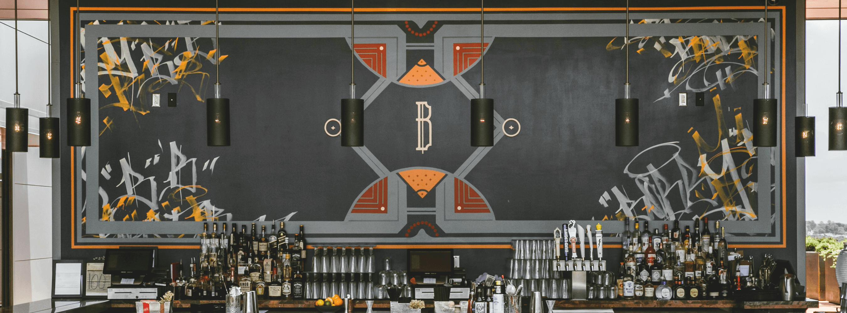
During the day, the brand design language takes on more of a coastal vibe. As the sun sets, and the rooftop transforms, it plays into a dark and cozy cocktail lounge feel. A custom mural was designed and hand painted above the bar to pull together the brand with all of the interior design finishes.
TOP SHELF TASTES.
The clipboard menu houses the drinks list, including several of Bobby’s favorites, as well as the day and night food menus. Handwritten messages offer a personal touch to lounge experience.

Bobby’s Garage
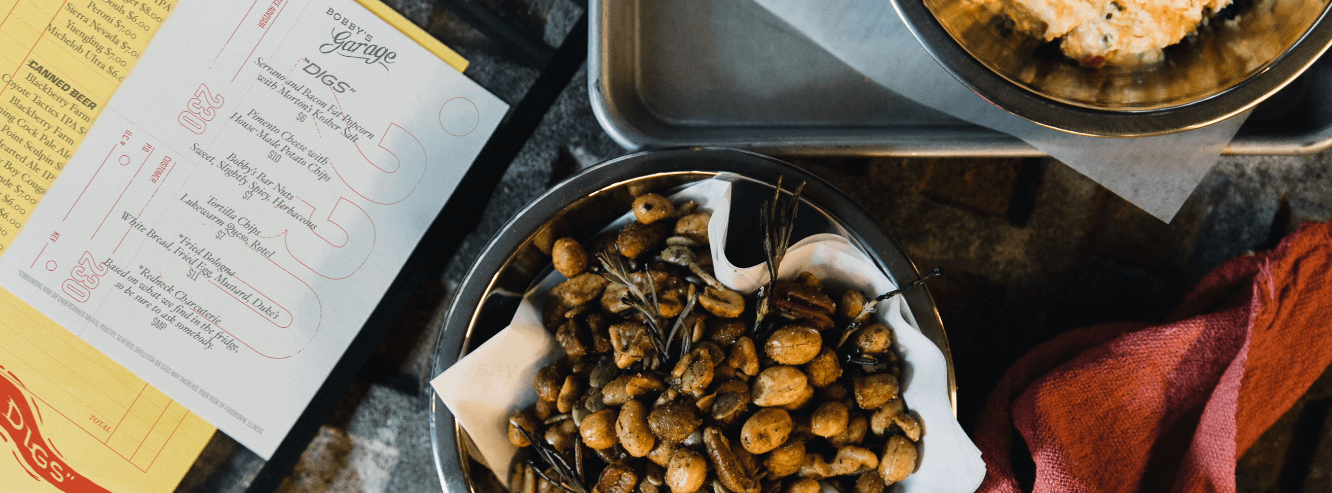
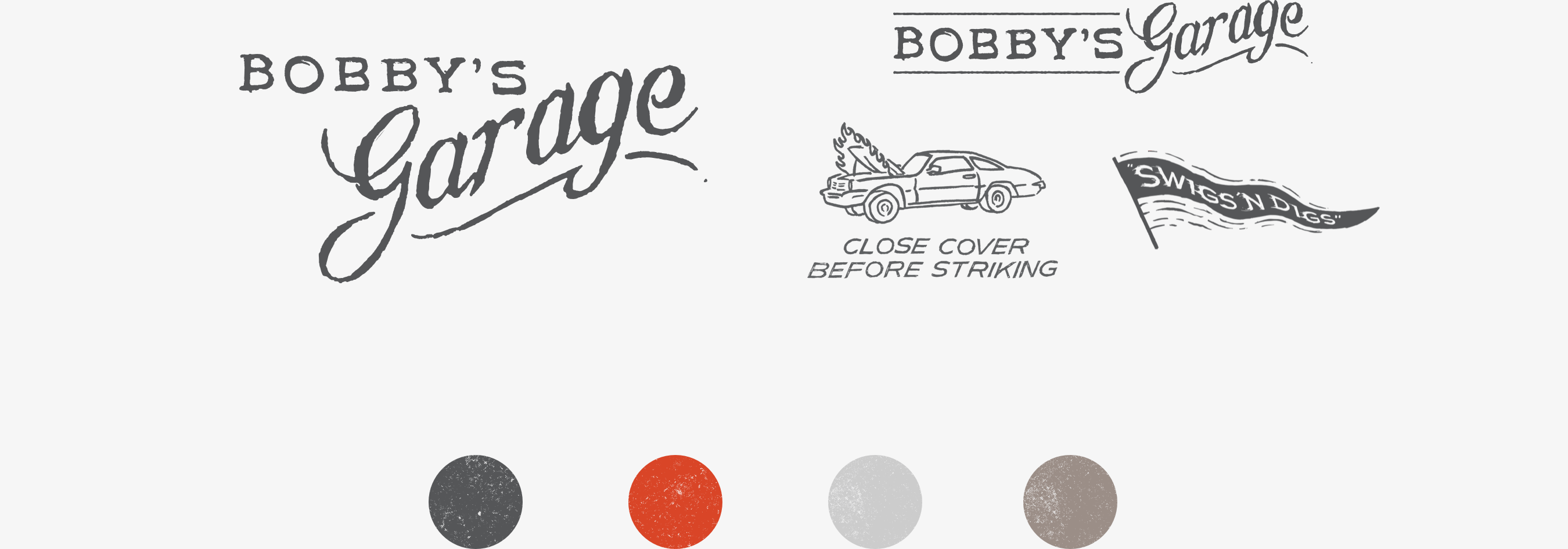
Located off Printer’s Alley, Bobby’s Garage mixes dive-bar vibes with vintage moto-club graphics to give patrons a true Nashville experience. Cold swigs, and tasty digs. Illustration and hand-rendered typography position the brand around its well-loved and gritty service garage theme. Material choices, such as bright yellow paper with plastic sleeves, add to the dive bar feel. The tone is friendly, but never short on attitude.
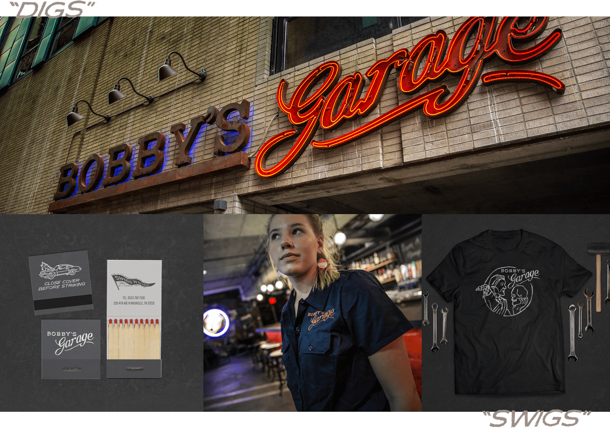
SERVICE AND MAYBE YOU GET A SMILE.
Meander into Bobby’s Garage and you’ll experience a cozy dive bar that’s rough around the edges. Brand visuals accentuate this feeling, and stay true to the service garage theme.
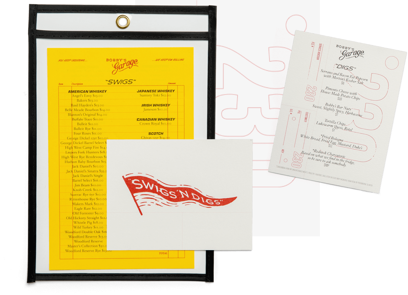
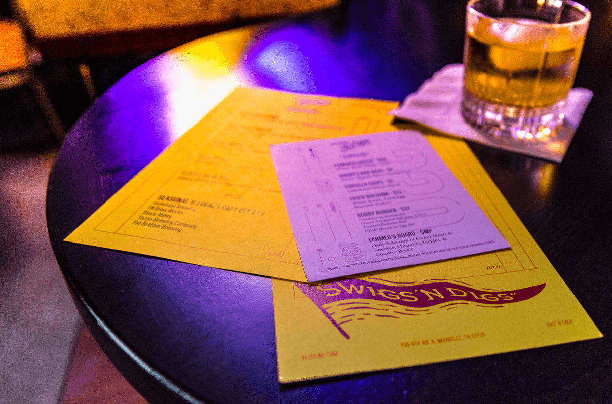
KEEP ‘EM ROLLIN’.
The food menu is printed on a re-created vehicle service ticket, and the drinks menu on a receipt. Cheeky messaging is used to enhance the experience. “You keep ordering… we keep ‘em rollin’.”

Nobody puts Bobby in a corner. The Bobby Hotel brand was built for continuous growth and ecclectic adaptation. No artifact is the same. What binds the visuals together is an attitude of exploration.
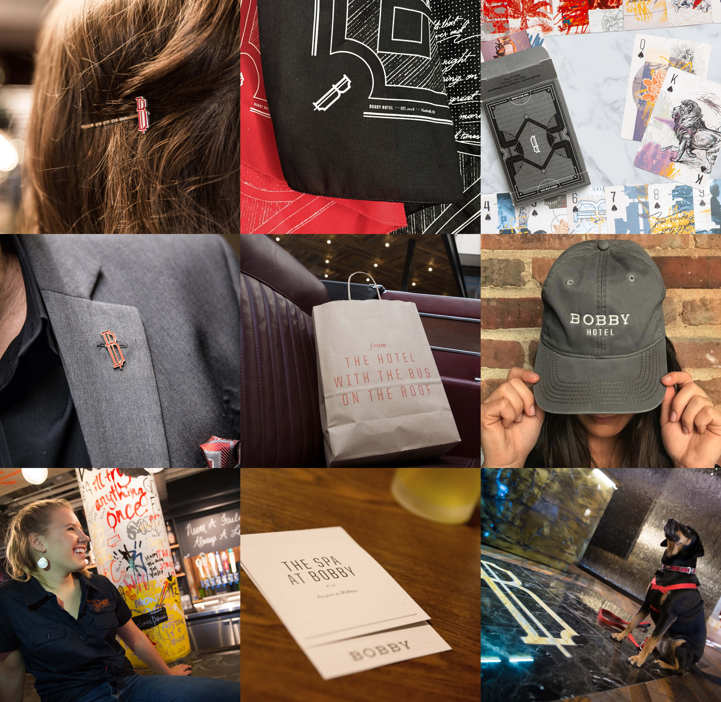
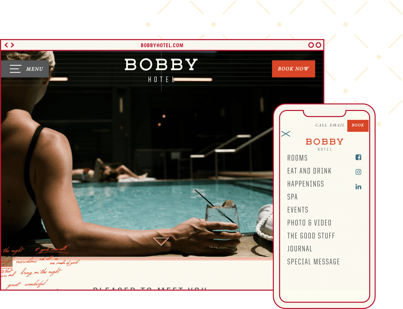
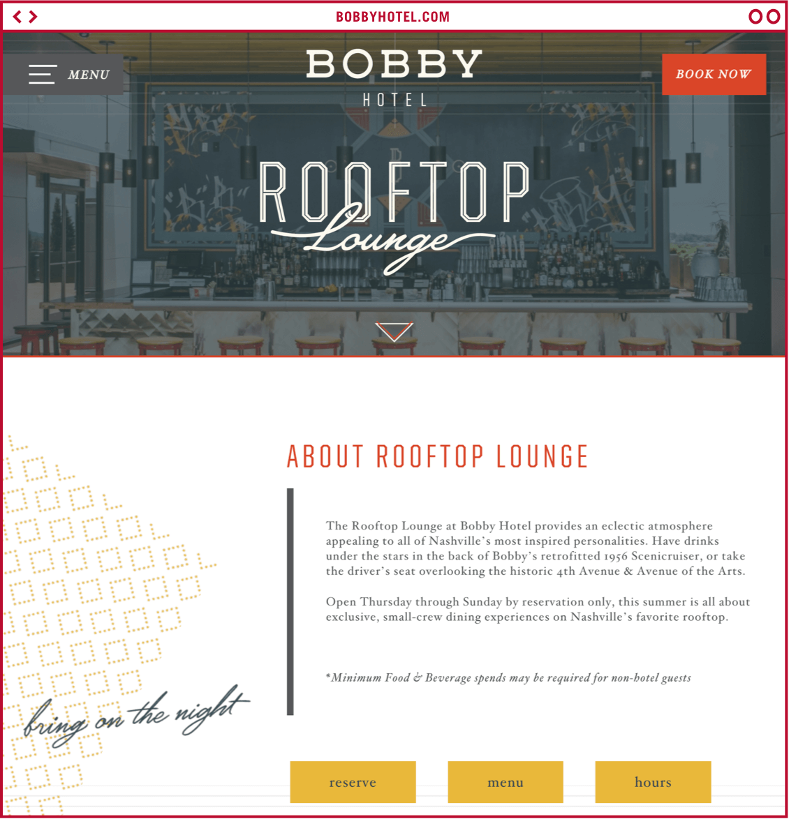
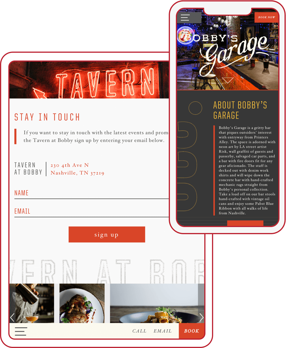
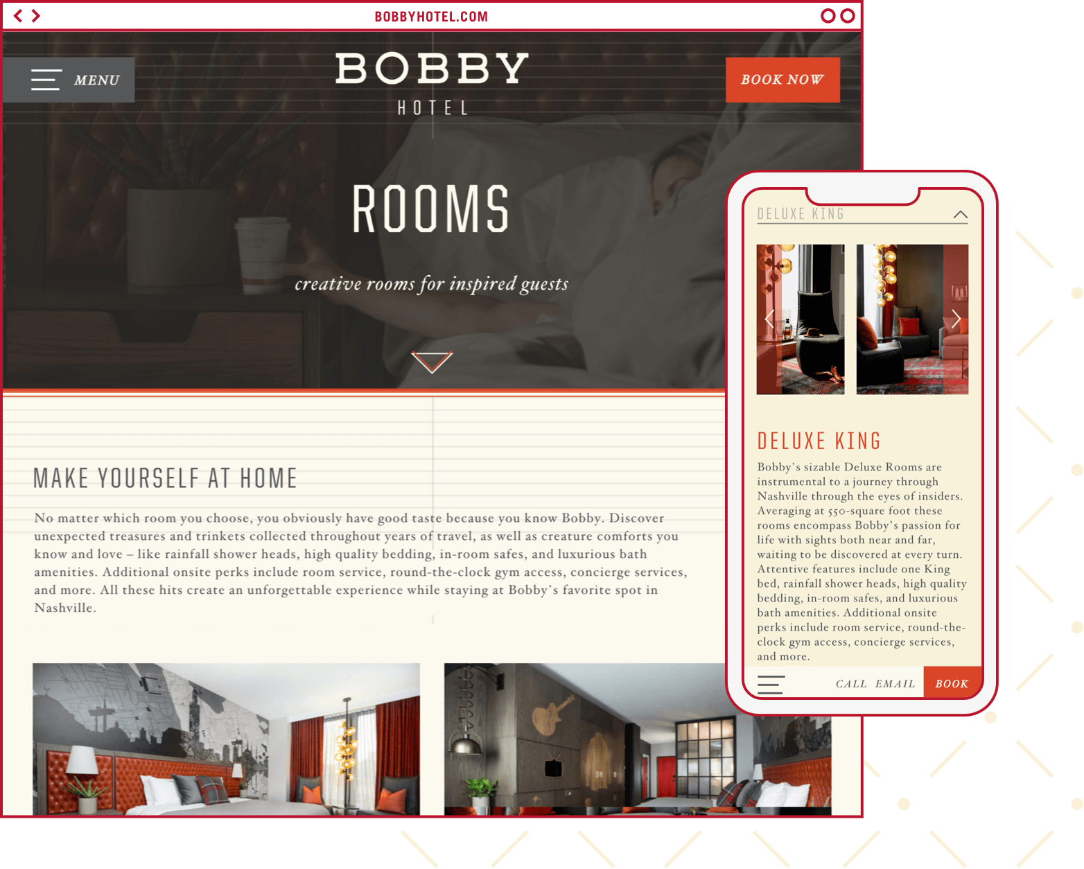
A SITE AS CUSTOM AS BOBBY.
The Bobby Hotel website allows users to easily navigate to the information they’re looking for. What sets the site apart from it’s competition is the unconventional layouts, subtle graphic treatments and impactful type pairings.
bobbyhotel.com
More Bobby Hotel Work

