close

Old Hickory Steakhouse

identity / environmental
Old Hickory Steakhouse restaurant logo embossed on a green background
Description of Old Hickory Steakhouse

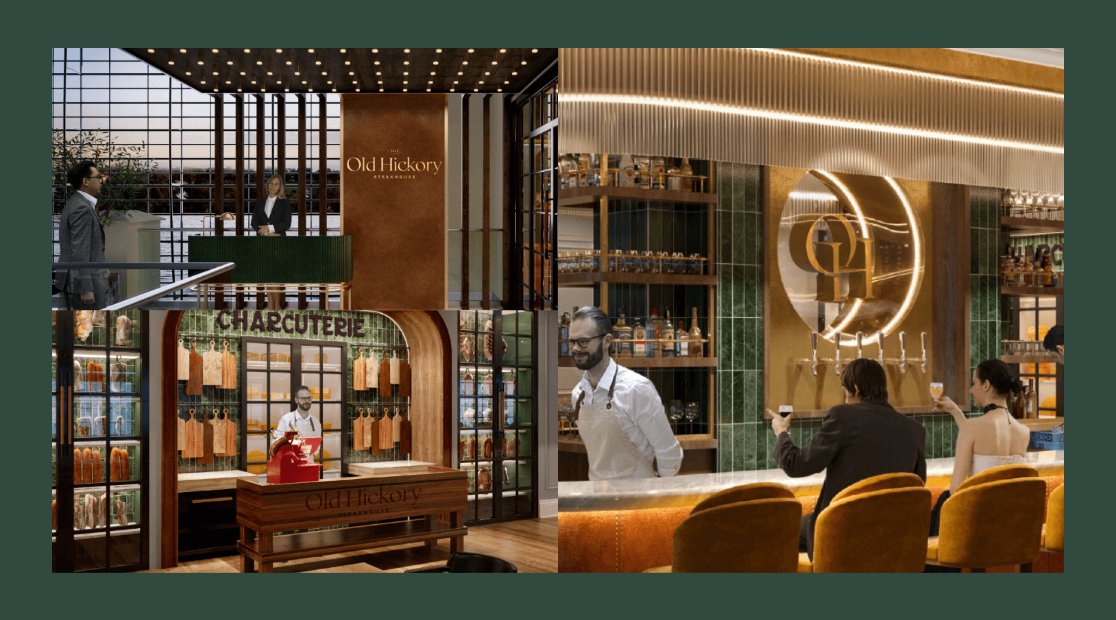
Setting the stage for growth, Old Hickory Steakhouse needed a refreshed brand direction worthy of the updated food programming and redesigned interior spaces to a luxurious and timeless future for the restaurant that was originally opened in 1977. ST8MNT worked with Gaylord Hotels, Marriott and Ryman Hospitality Group to refresh the brand for the future while preserving it’s brand equity. ST8MNT developed a location-specific visual mark system for the current five locations and several on the horizon, as each location takes on local attributes. The elegant steakhouse boasts sustainably-sourced American beef, locally-sourced ingredients, hand-crafted cocktails and bespoke charcuterie. Without sacrificing its long-established credibility, the rebrand pushes the classic look into the contemporary. The updated restaurant brand lives in a space that is high-end yet approachable, reflecting excellent quality, sophistication and pleasant dining experiences.
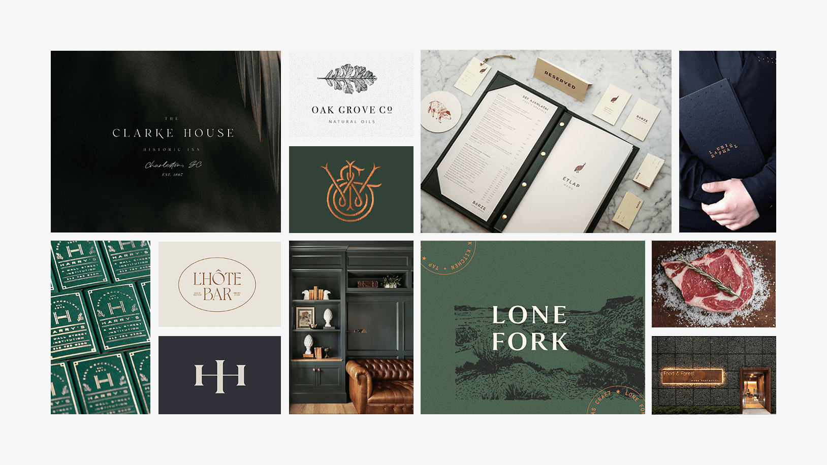
 

Old Hickory inspiration moodboard
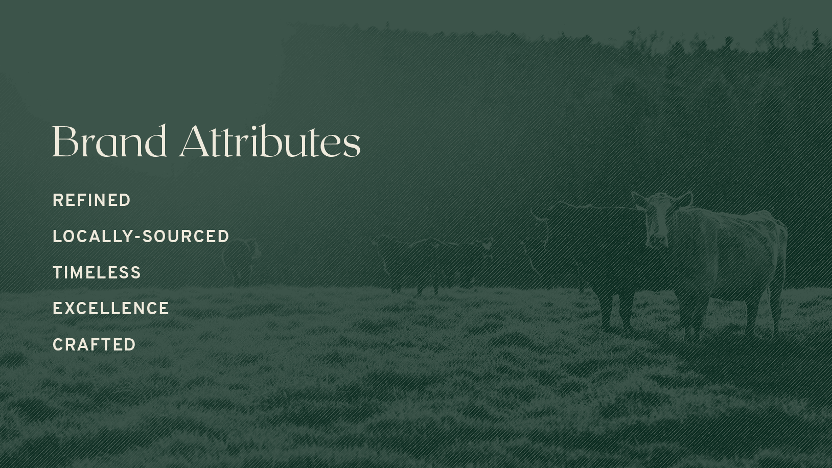
Old Hickory attributes: Refined, Locally-Sourced, Timeless, Excellence, and Crafted.
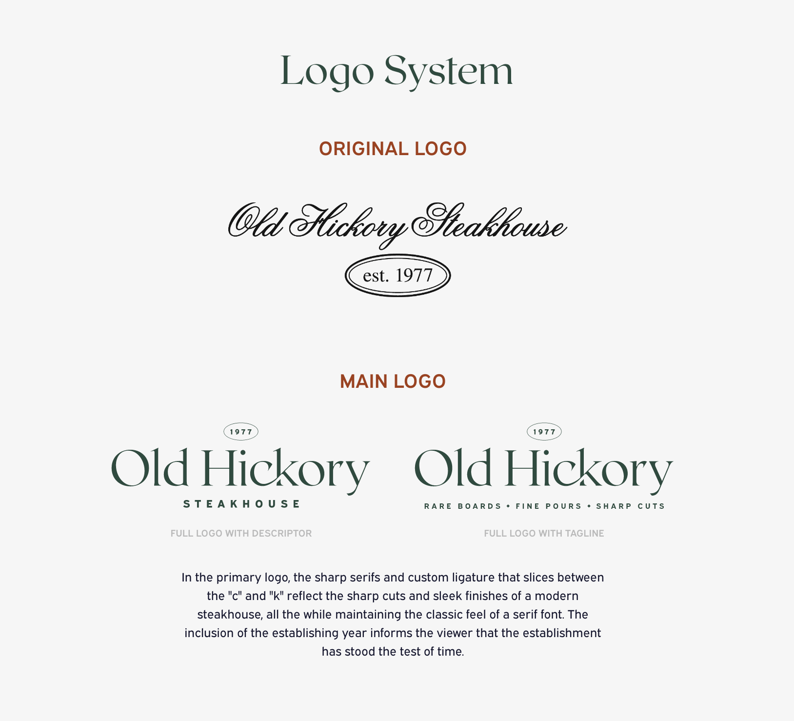
Logo system showing original logos and main logos with two versions, one with descriptor and one with tagline. The text below reads: In the primary logo, the sharp serifs and custom ligature that slices between the
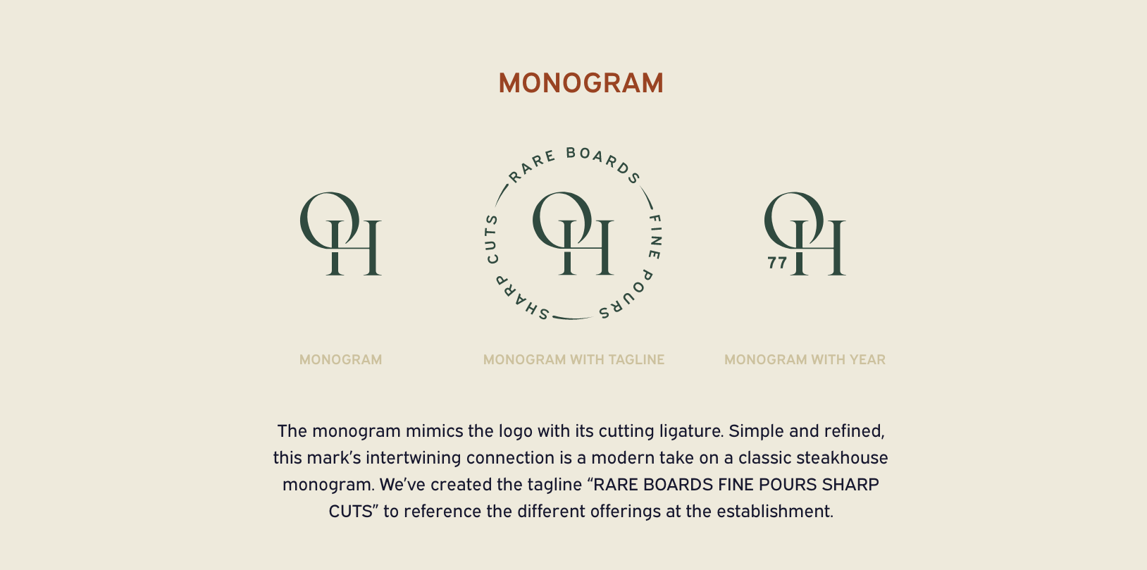
Old Hickory monograms showing three versions, monogram, monogram with tagline and monogram with date. below the text reads: The monogram mimics the logo with its cutting ligature. Simple and refined, this mark’s intertwining connection is a modern take on a classic steakhouse monogram. We’ve created the tagline “RARE BOARDS FINE POURS SHARP CUTS” to reference the different offerings at the establishment.
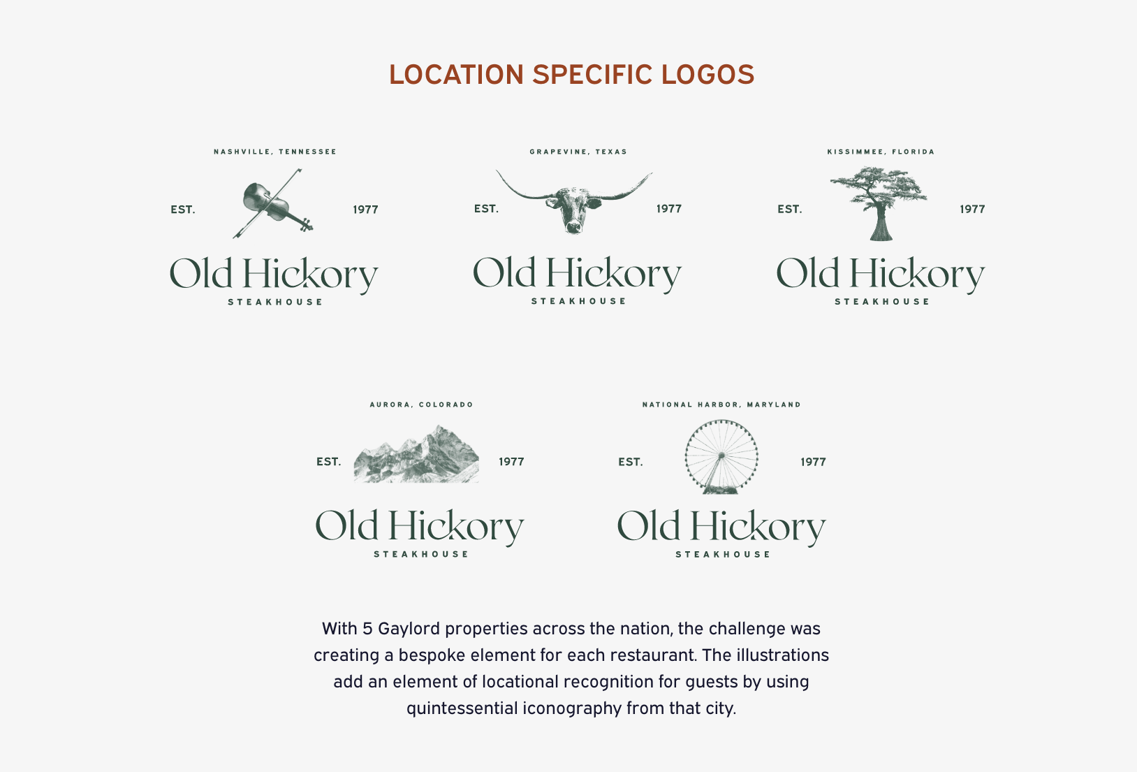
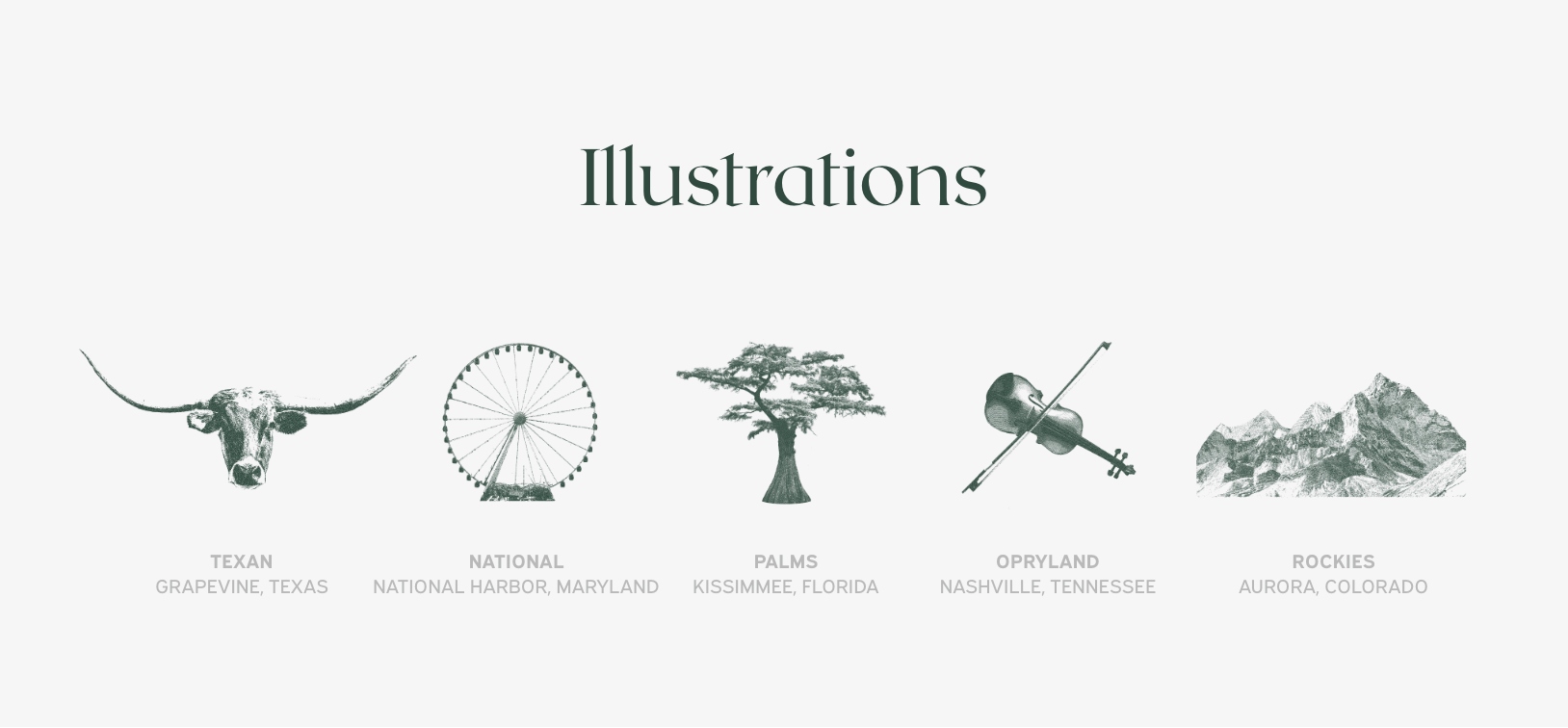
Old Hickory location specific logos for Nashville, Grapevine, Kissimmee, Aurora, and National Harbor. The text below reads: With 5 Gaylord properties across the nation, the challenge was creating a bespoke element for each restaurant. The illustrations add an element of locational recognition for guests by using quintessential iconography from that city.
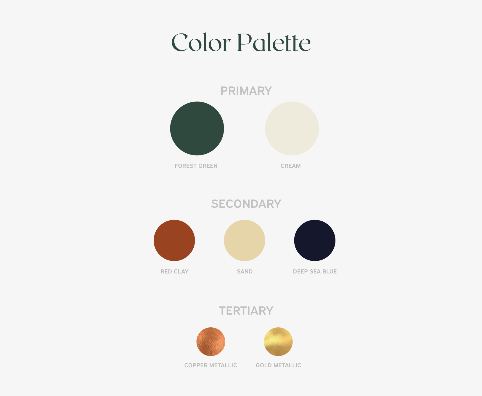
color palette showing primary colors: forest green and cream; secondary colors: red clay, sand, and deep sea blue; and tertiary colors: metallic copper and metallic gold
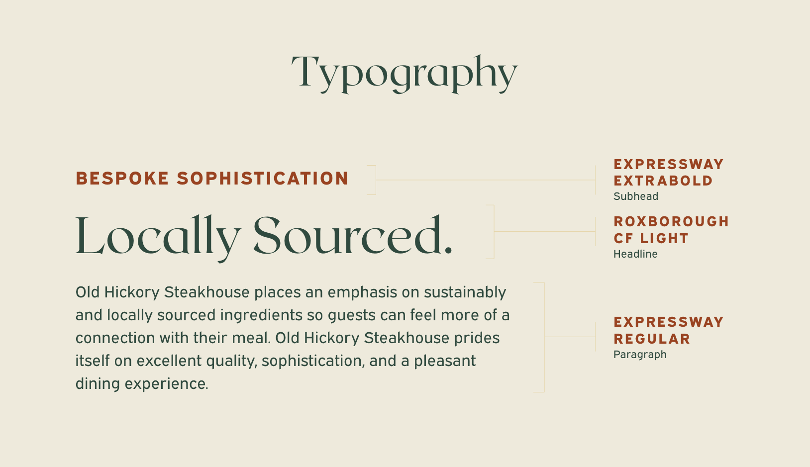
Old hickory typography usage reading:
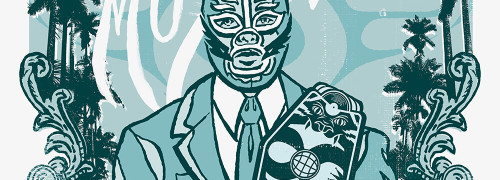
Illustrations for Texan in Grapevine, Texas; Nationals in National Harbor, Maryland; Palms in Kissimmee, Florida; Opryland in Nashville, Tennessee; and Rockies in Aurora, Colorado
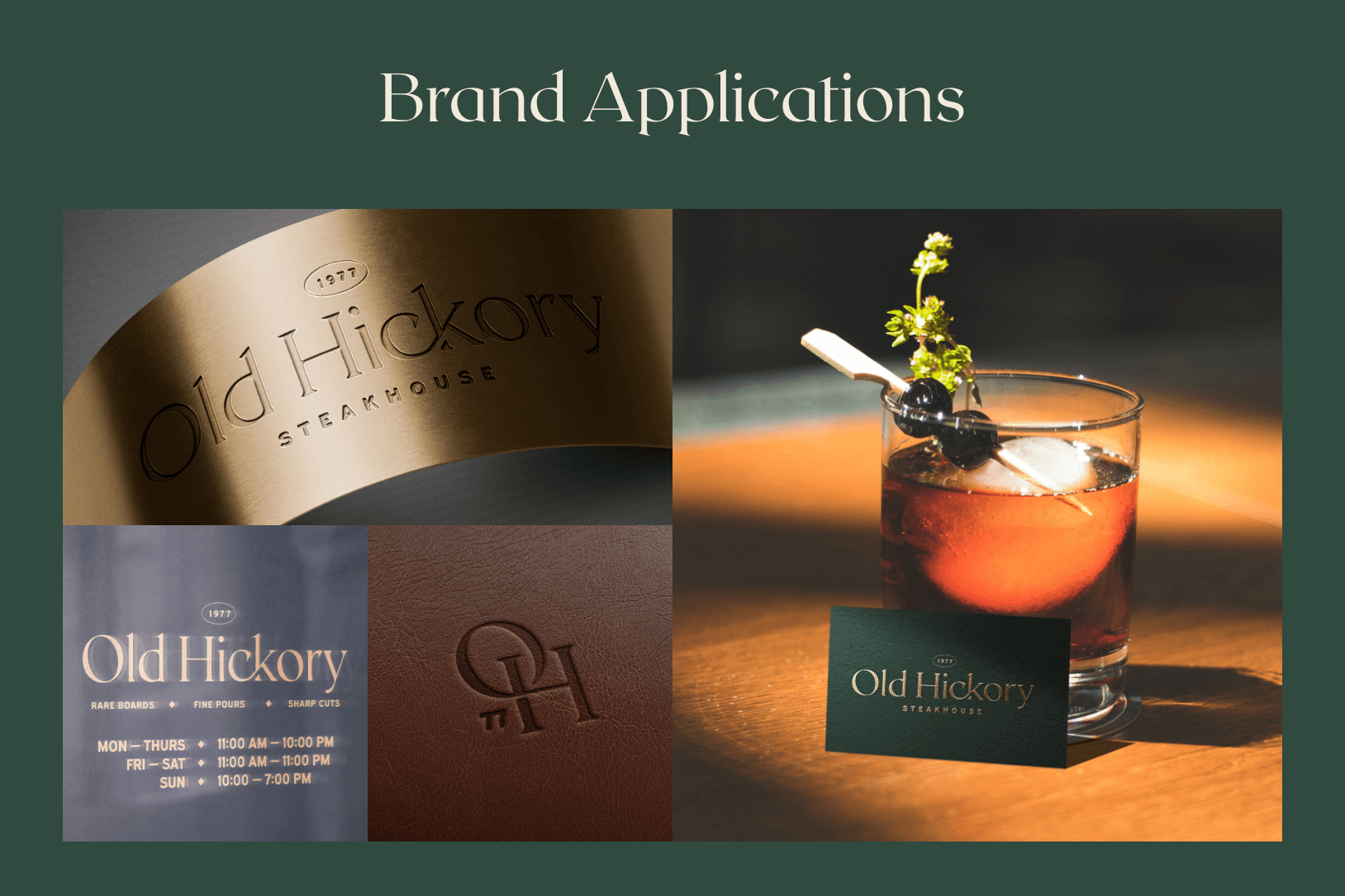
Brand applications showing a gold sign, a vinyl sticker on a window, a leather stamped menu cover, and a business card leaning against an upscale cocktail.
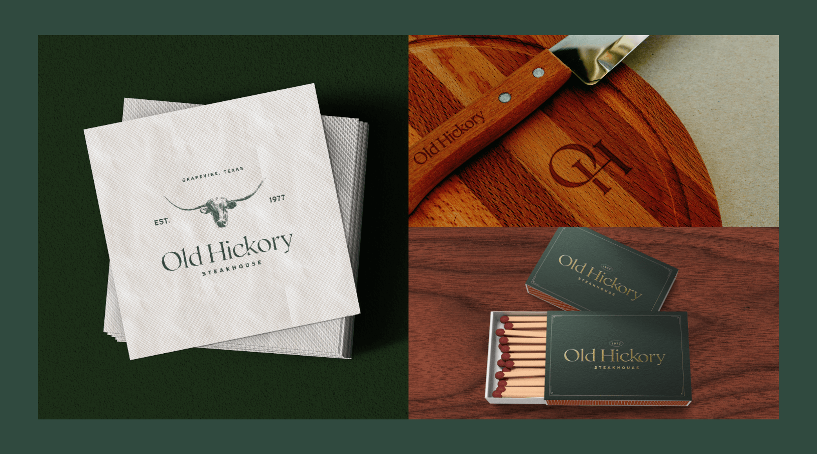
Brand applications showing a cocktail napkin, a charcuterie board and knife, and a match box.
Brand applications shown in renders of the Old Hickory in National Harbor.