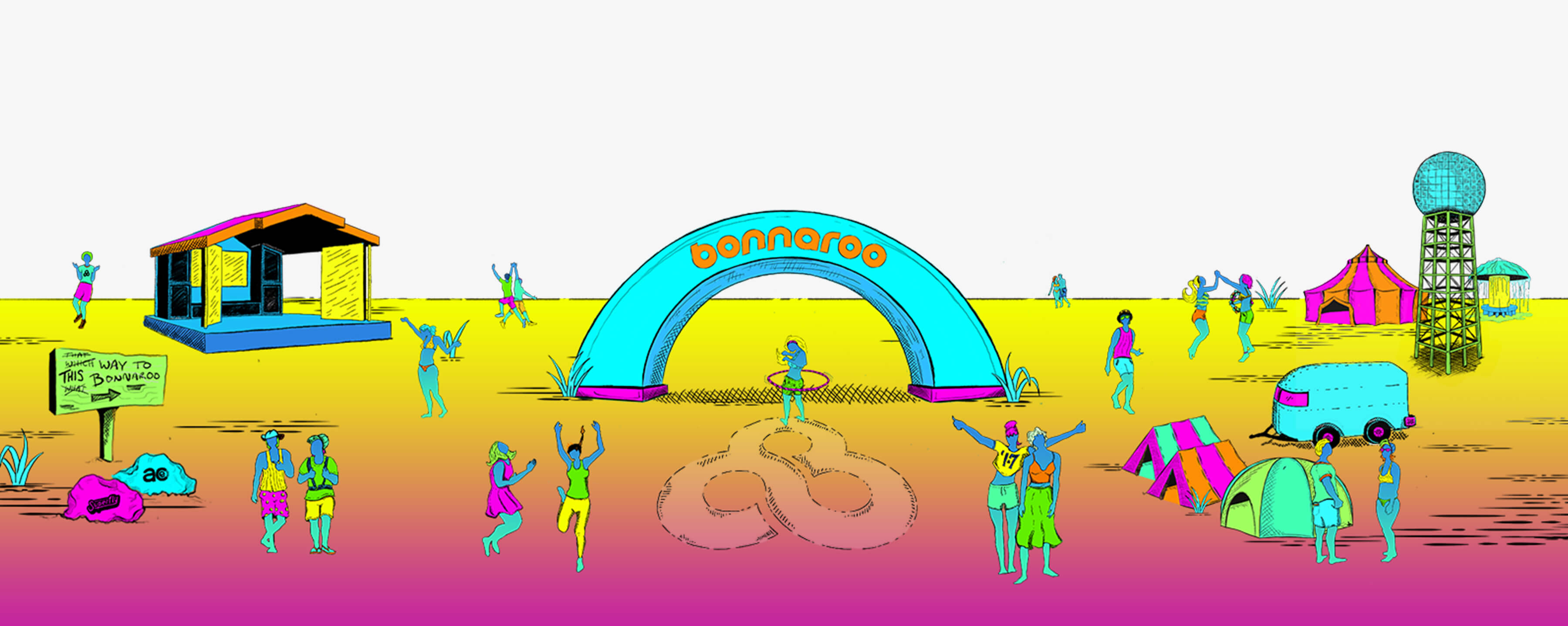
The folks at Bonnaroo approached us with a single primary charge; unite 15 years of Bonnaroo brand magic visually and apply it to a new annual theme.
Affect, Not Reimagine – Rally, Not Alienate
Previously, the Bonnaroo brand’s logo and identity system was redone each year. Moving forward they wished to create a new logo and identity that would not change yearly, but instead be refreshed by a yearly theme. This would, in turn, create a system that was evergreen. ST8MNT was brought on to create a fully integrated theme that would carry through, year over year, and create the feeling of a refresh simply through changes to color and select elements. We needed to provide fans a refreshed version of the “once-in-a-lifetime” experience that did not alienate long-time attendees and created something that could be rallied around by all.

Research, Experience & MoodBoards
After digging into the research stage including interviews with long-time fans, gathering years of our experience in the festival and music industry, a lot of white boarding, and the review of all past materials, the ST8MNT team had landed on our project lens and concept. The next step would be moodboard creation, that would ultimately start a collaboration with the project stakeholders, allow us to get into their heads a bit, and find the illustration style and inspiration that would best serve the concept.
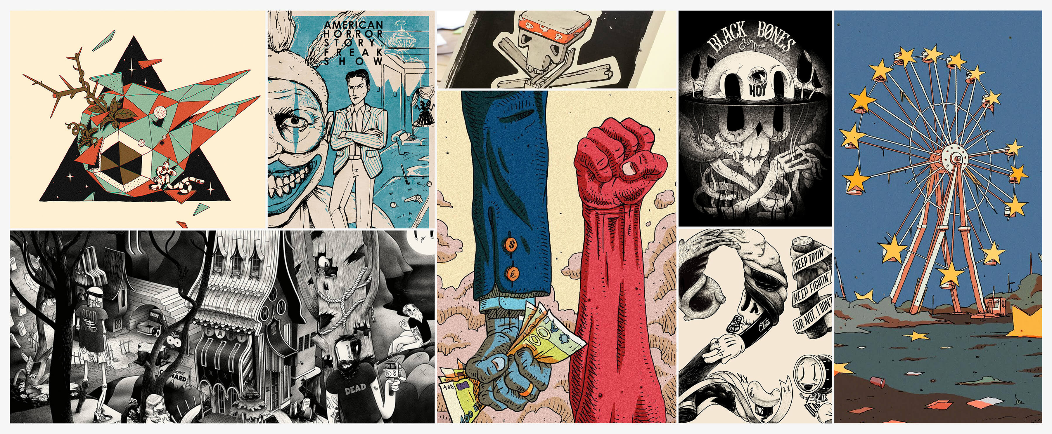
On To Lineup Poster & Sketching
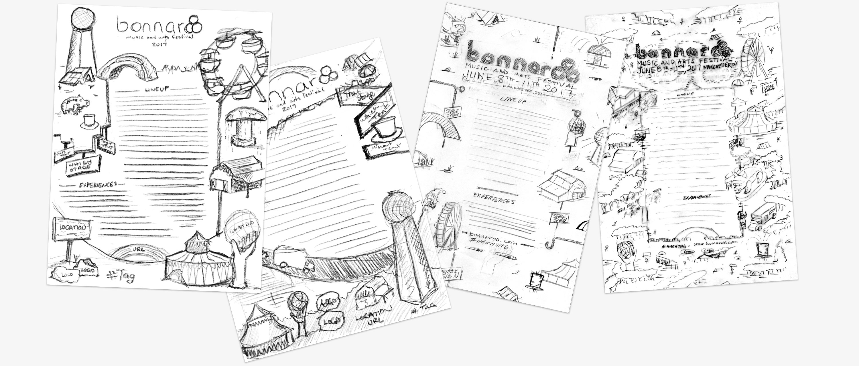
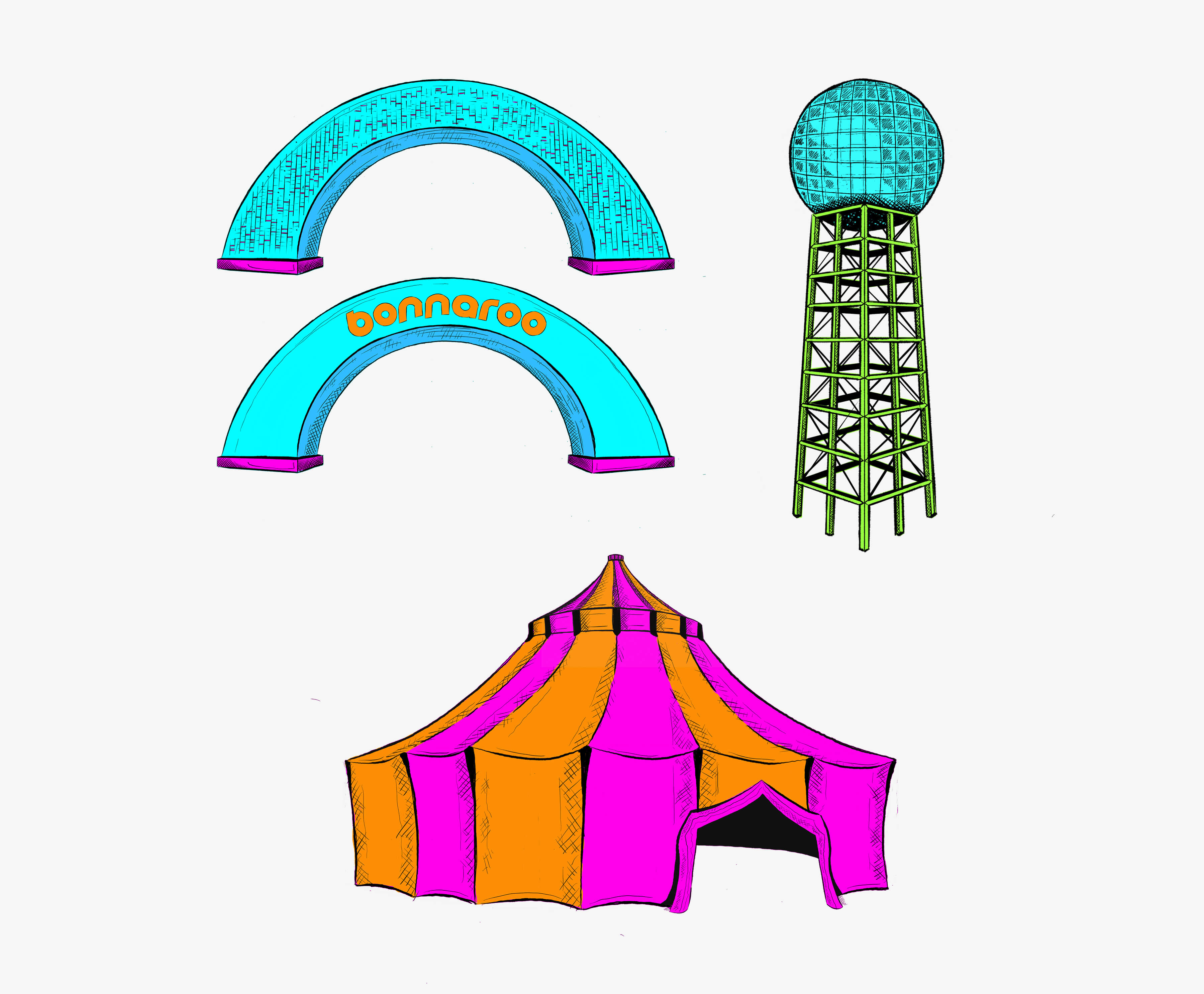
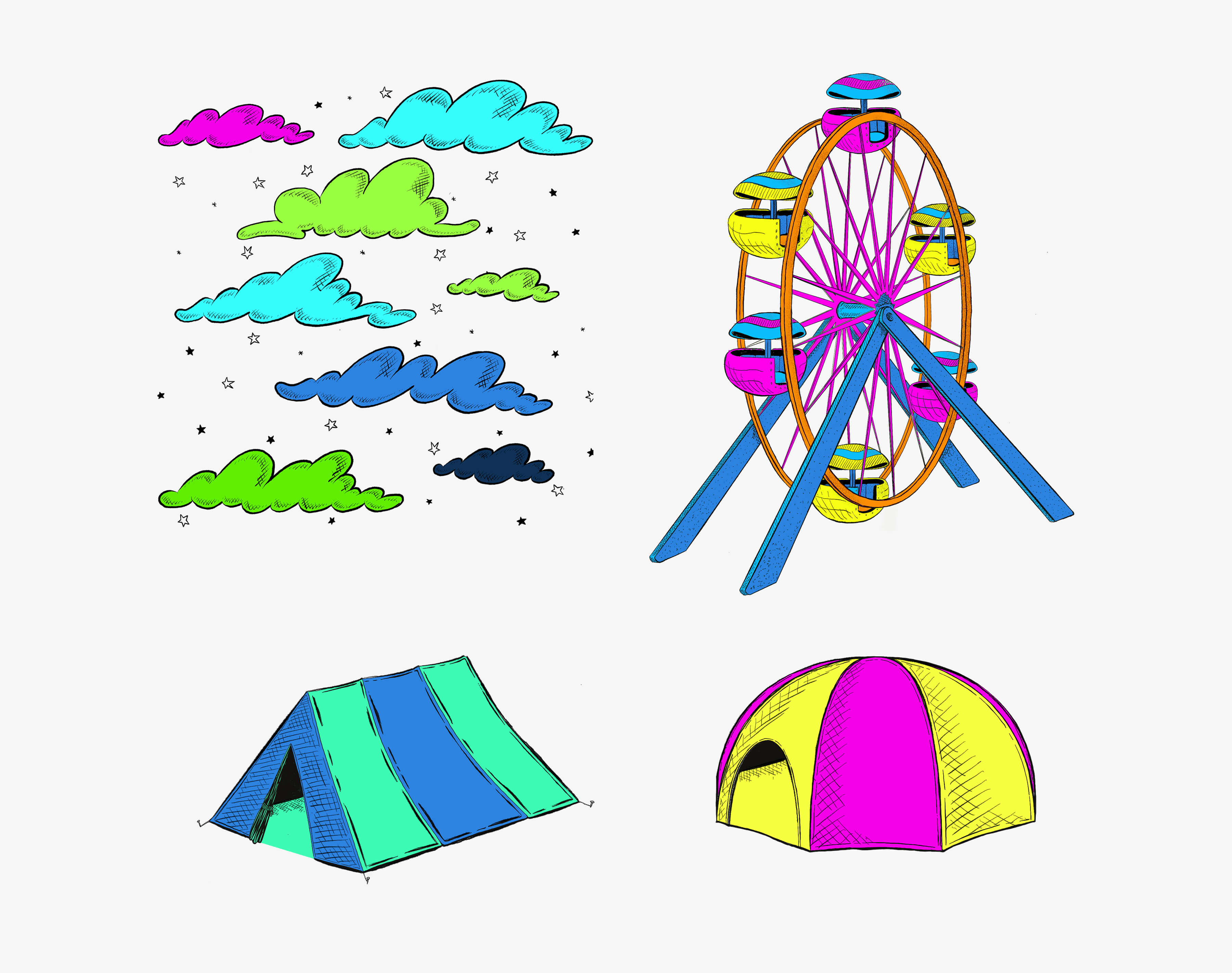
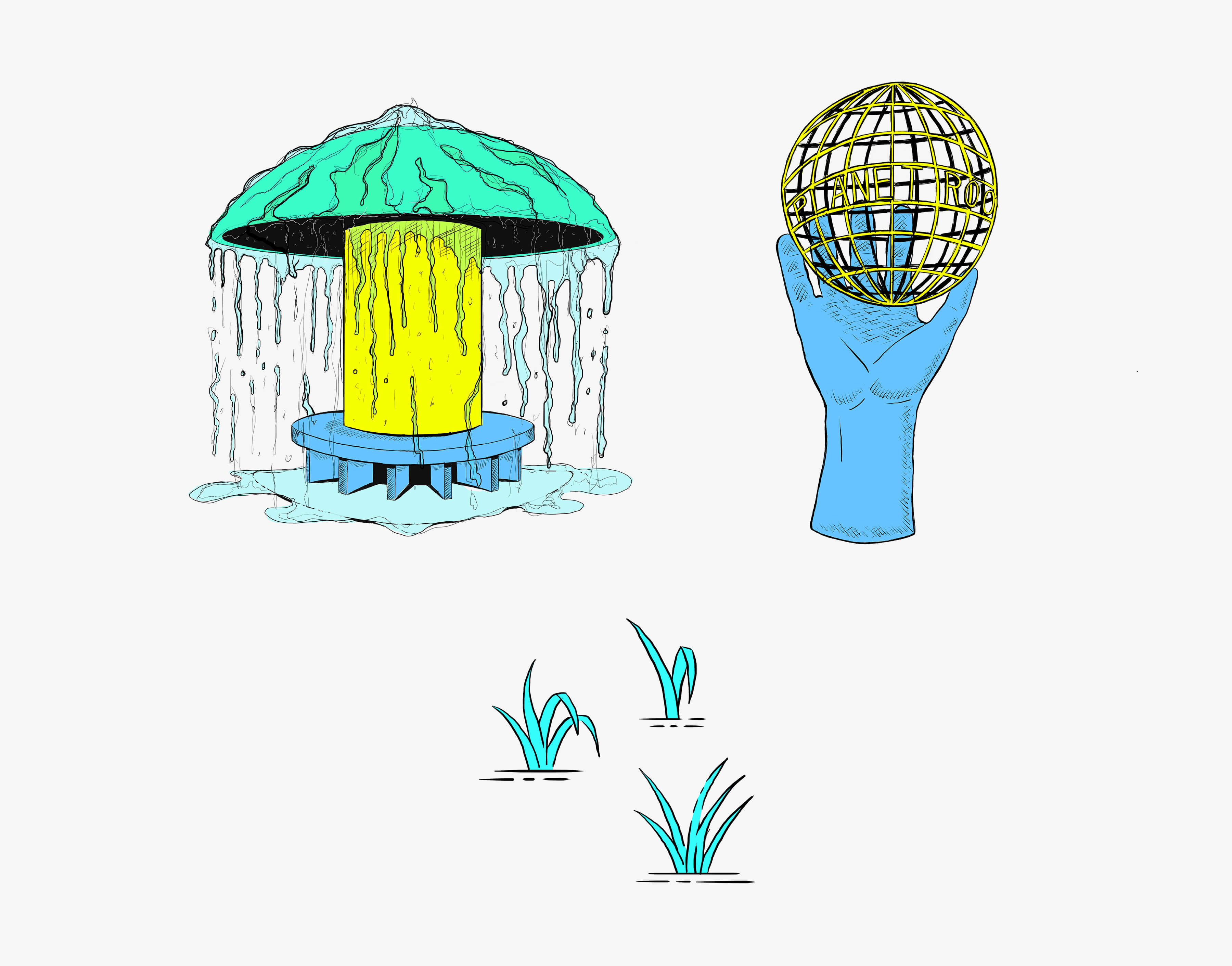
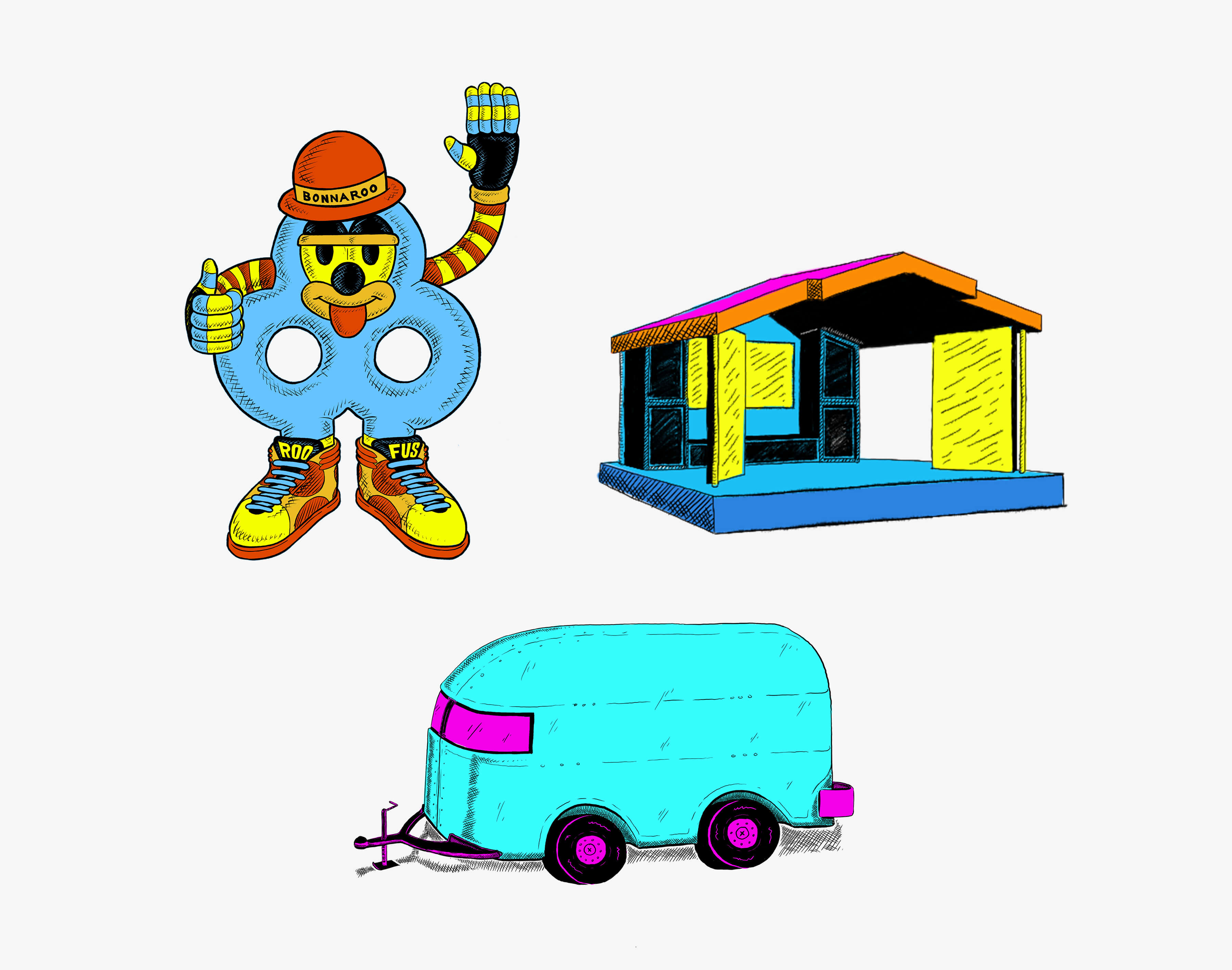
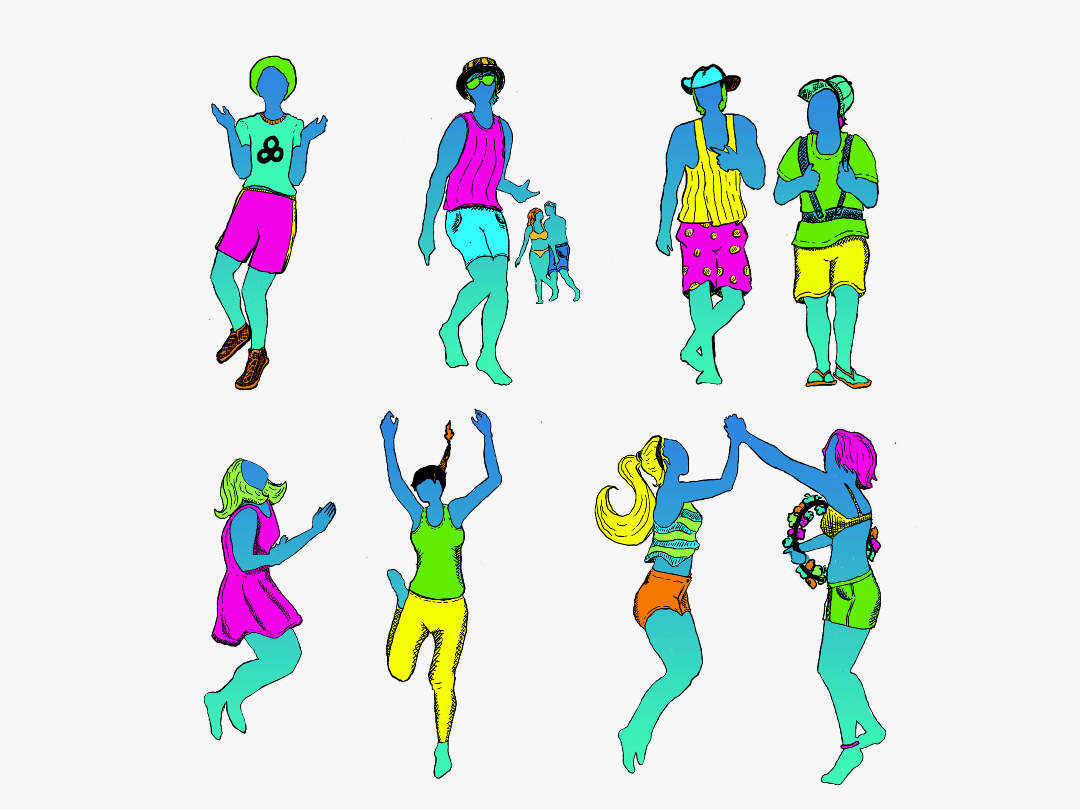
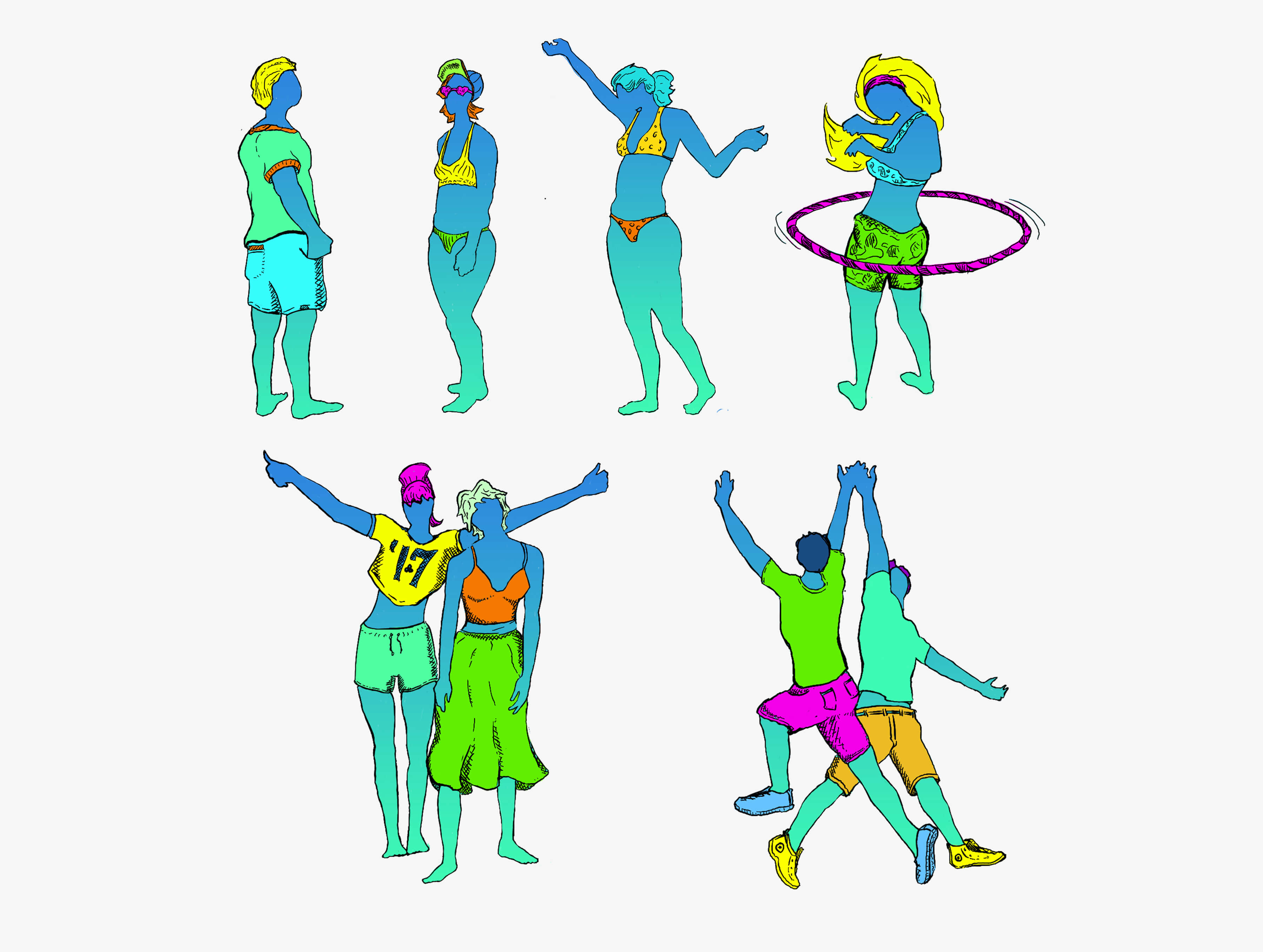
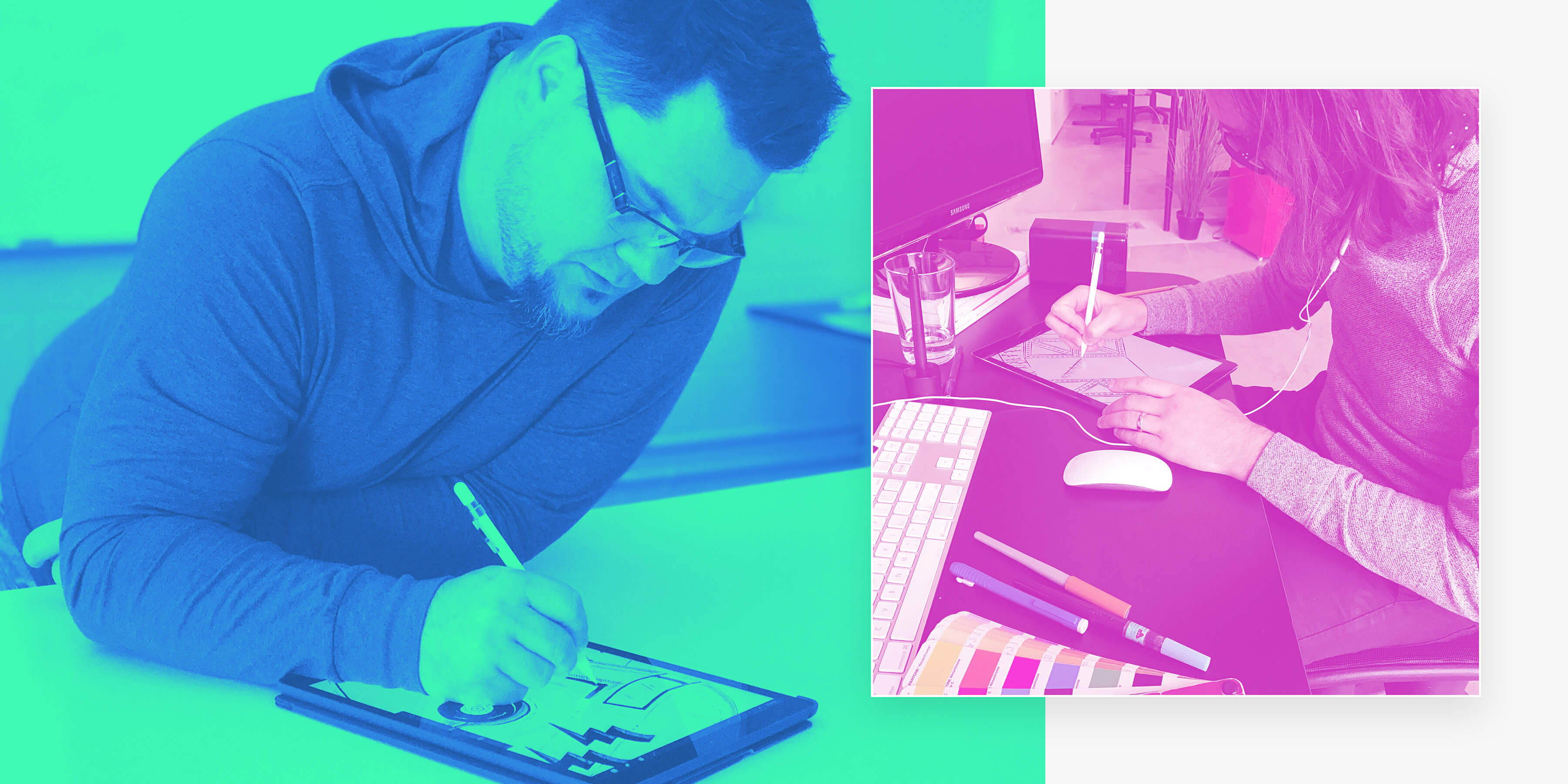
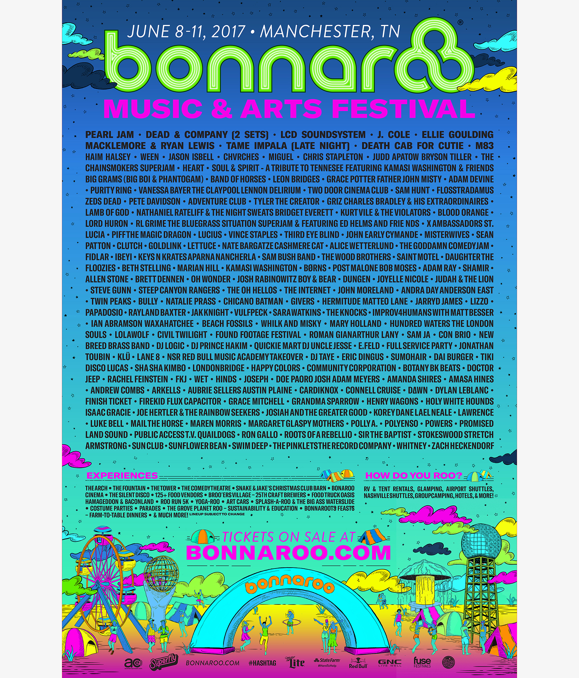
Once the moodboard was approved and we had an idea of aesthetic direction, it was time to begin sketching – both manually and later digitally. The lineup poster is the hero of the theme each year, and really introduces the year’s festival with a bang. Once we landed on a poster layout, the team began illustrating elements, experimenting with color spectrum and typography. With each iteration, we went back to the brand pillars to be sure it was in sync and radiating positivity.
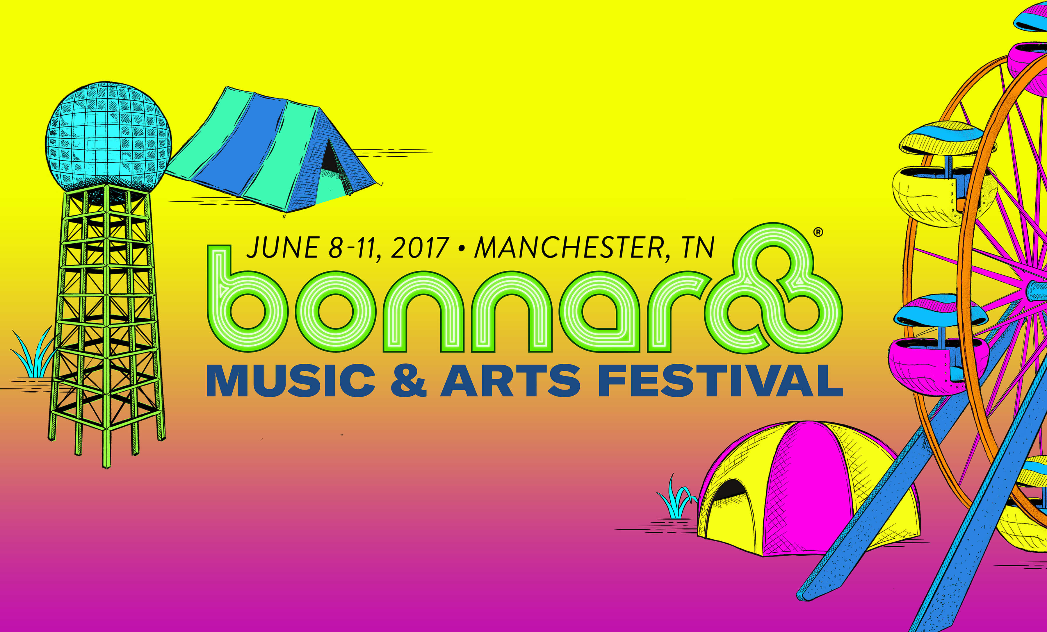
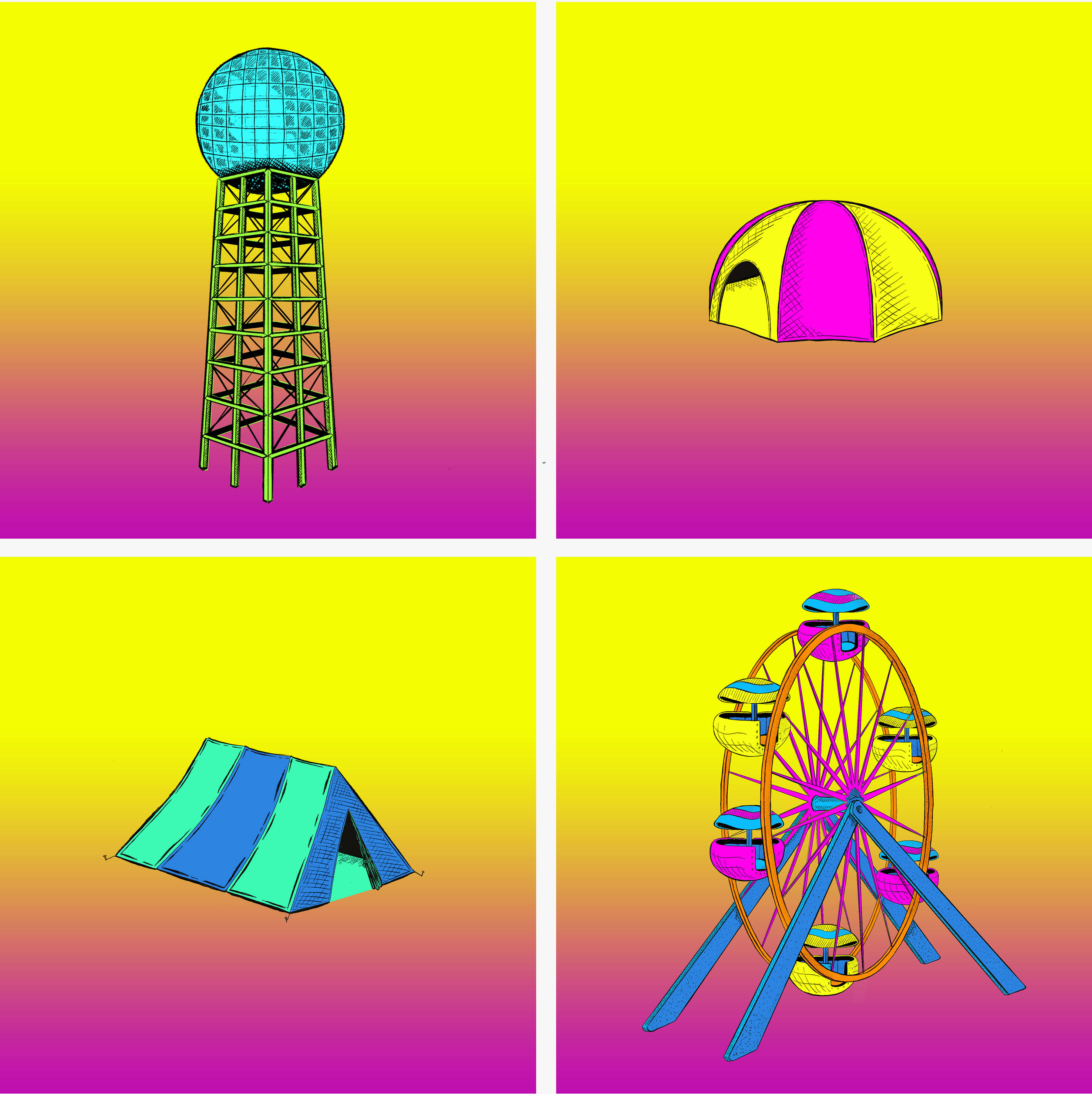
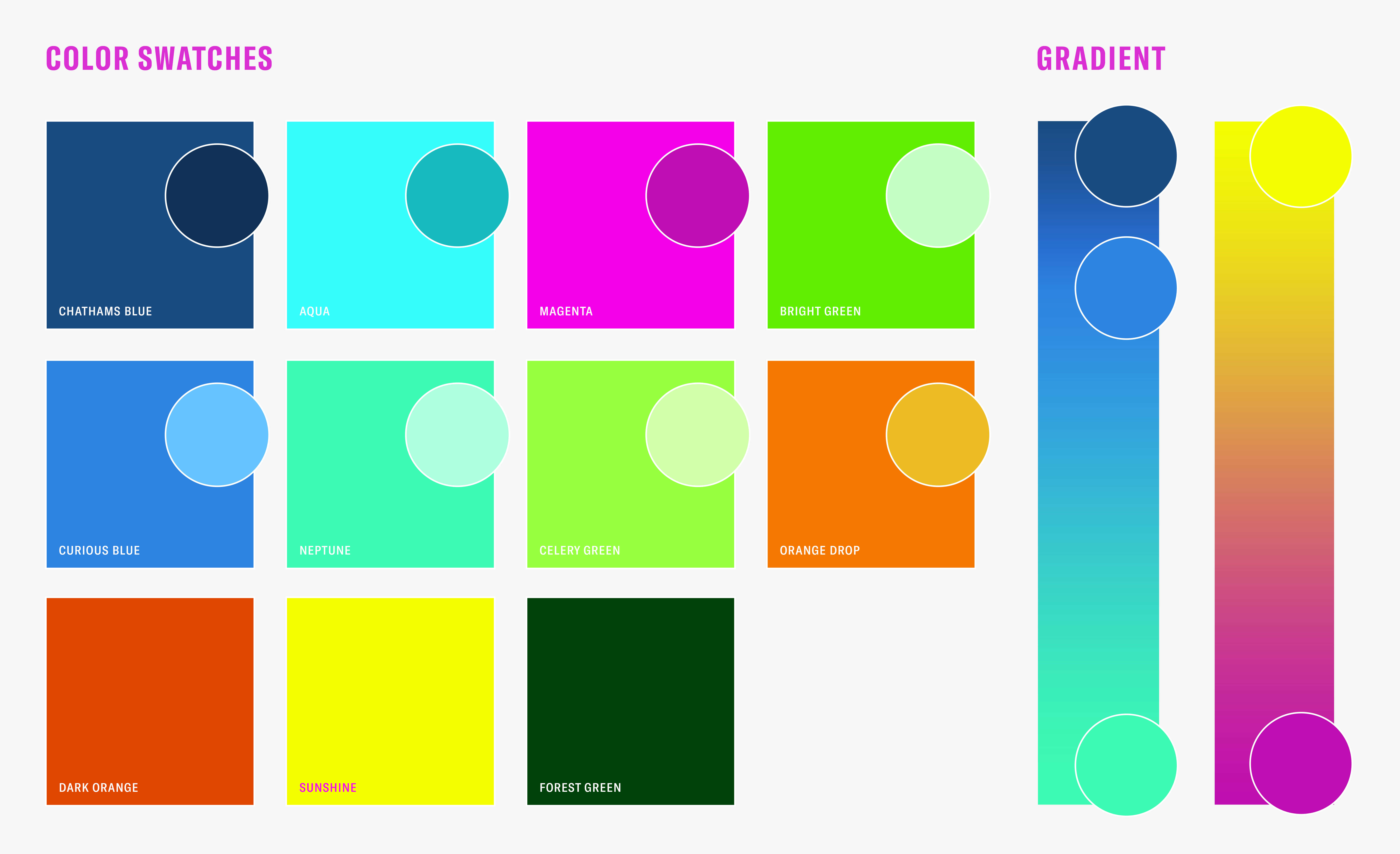
ST8MNT created a color palette that exudes joy, movement and party; and had plenty of depth for the multitude of branding needs.
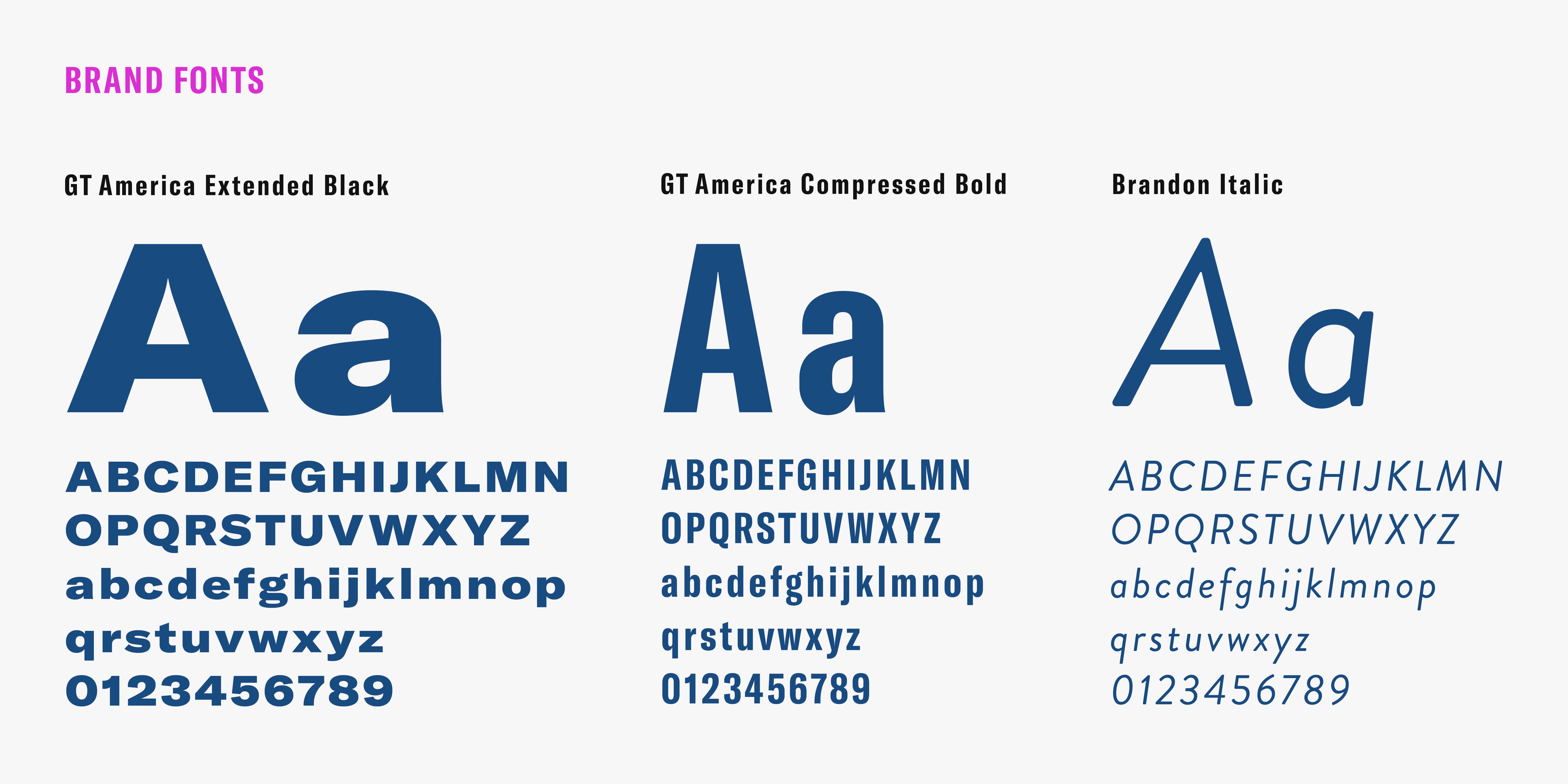
When it came to font selection it was about so much more than personality. The fonts had to allow for variation and legibility, while serving up both classic and forward aesthetic to match the brand and have longevity for future years.

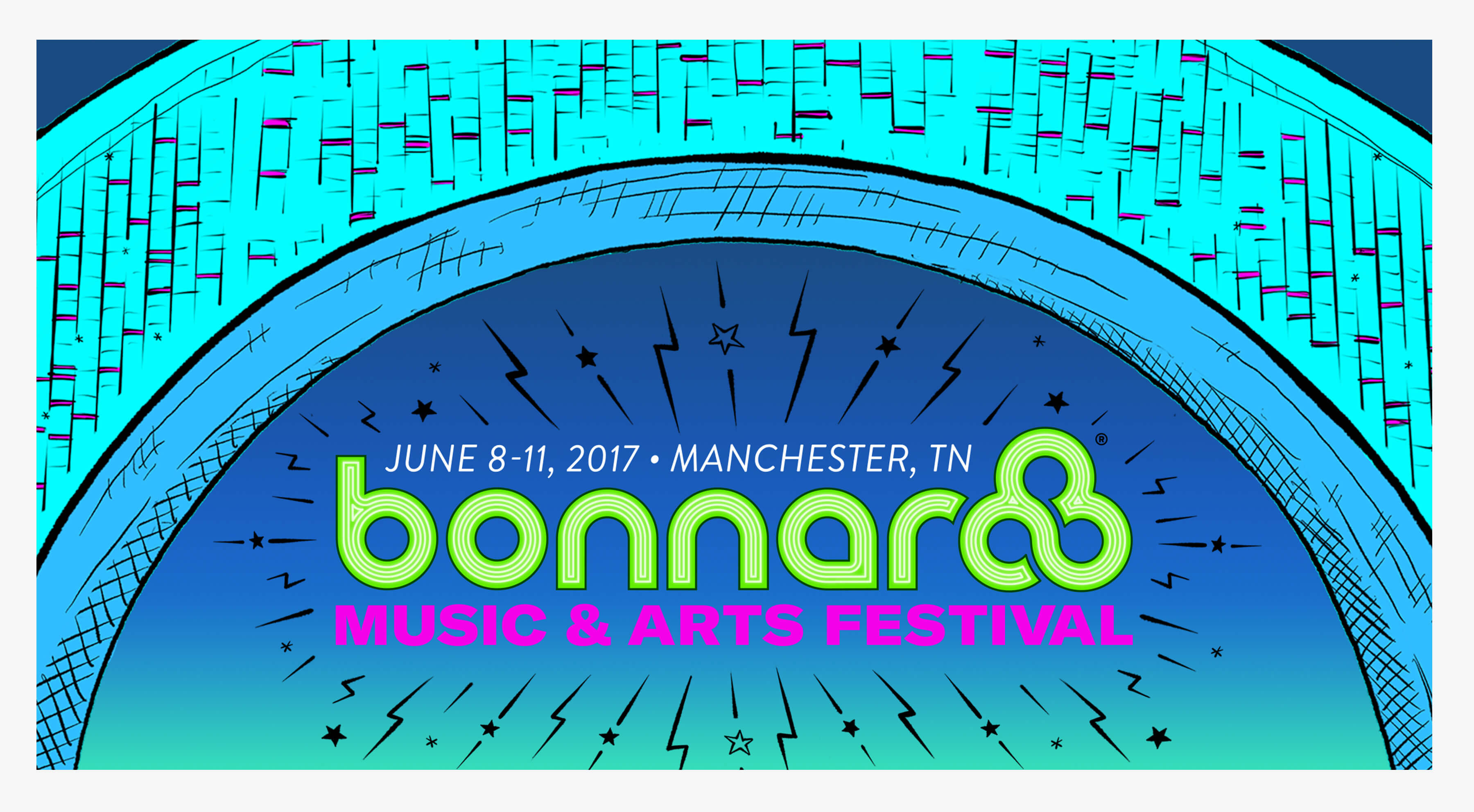
ST8MNT crafted a neon treatment to the logo that felt like the existing neon stage signs fans see and love year after year.
It Takes a Village
To achieve success on a full visual theme like this, it takes a team. This is not the type of project one artist takes on in a silo. At any given point, from start to finish, we had a group of 10 people working to make sure everything was executed at the highest level of quality.
As music, arts and festival lovers, we couldn’t have been more psyched for the opportunity to work on the “good stuff.”
Hero Completion & Extrapolation
With the poster complete, ST8MNT began the process of pulling the various hero and supporting illustrations, along with type and color choices, to use to construct the various marketing needs.
Responsive Website Design
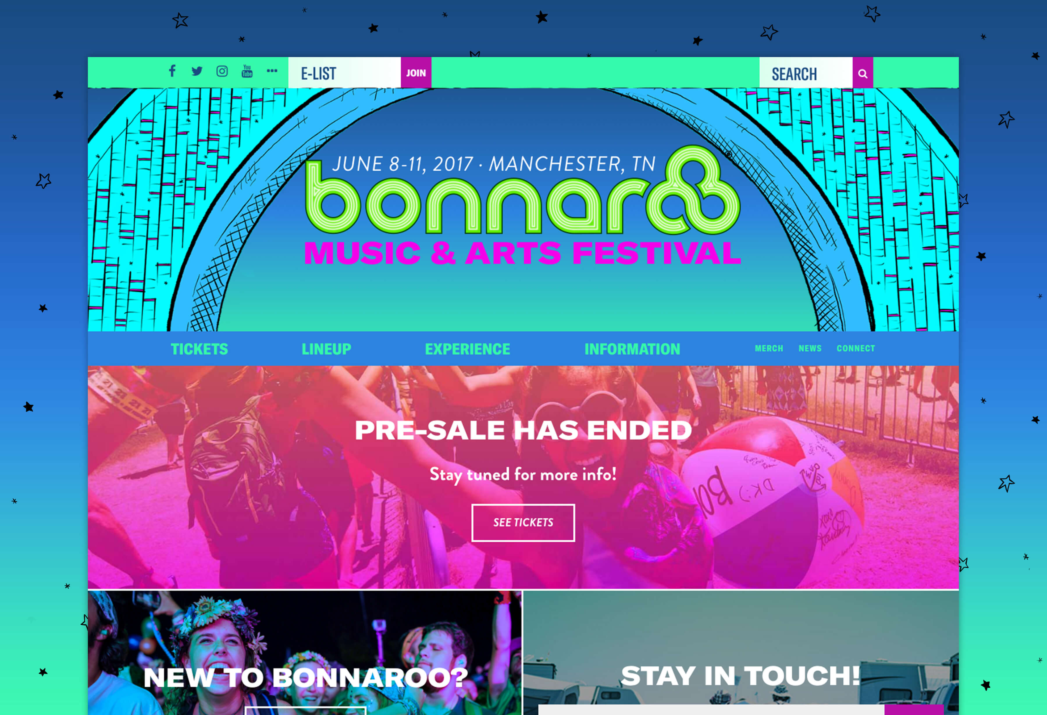
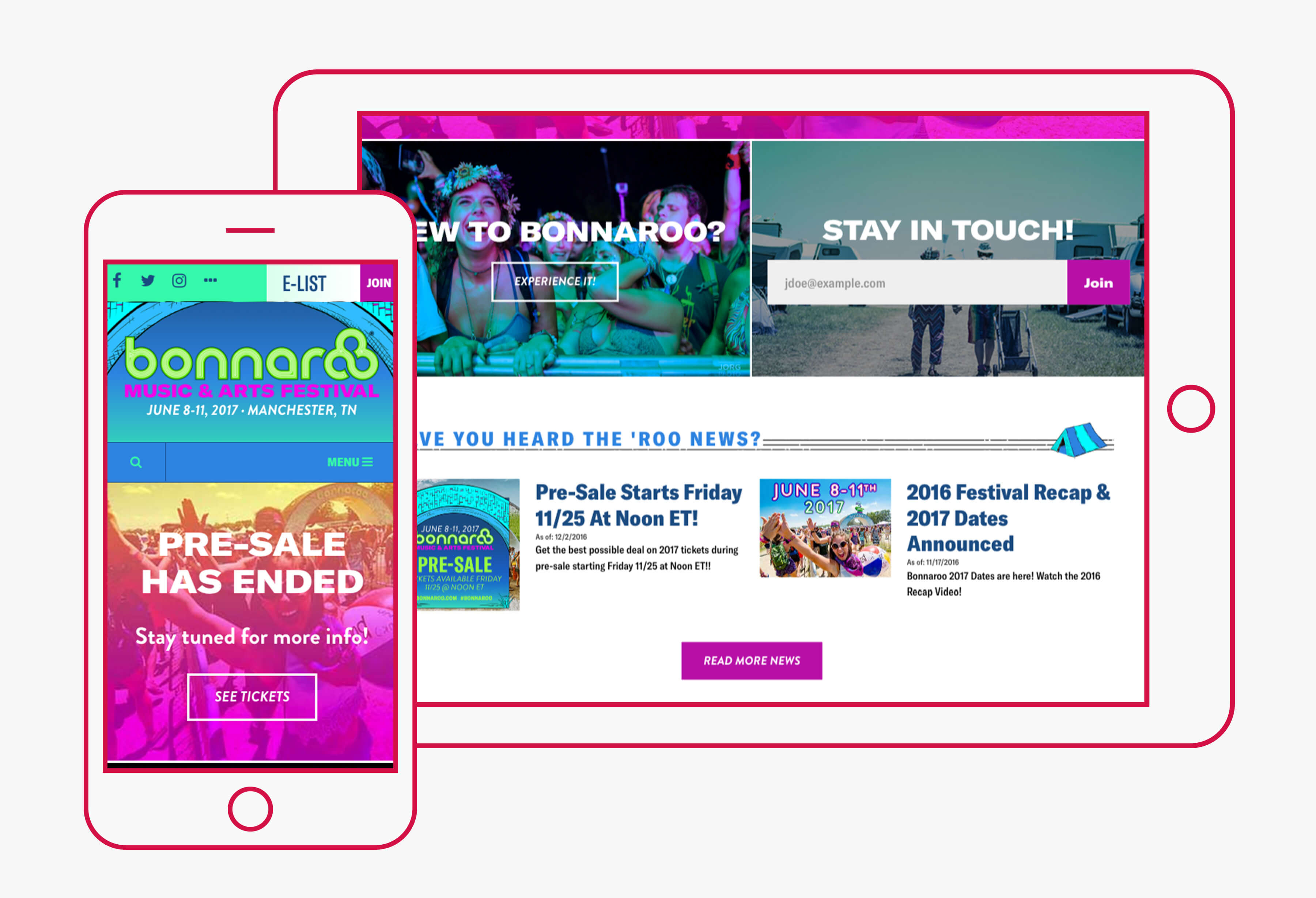
Working collaboratively with the team behind the Bonnaroo website framework and CMS, ST8MNT created all the graphics, skins and digital style guide for the responsive website and digital deliverables.
bonnaroo.com

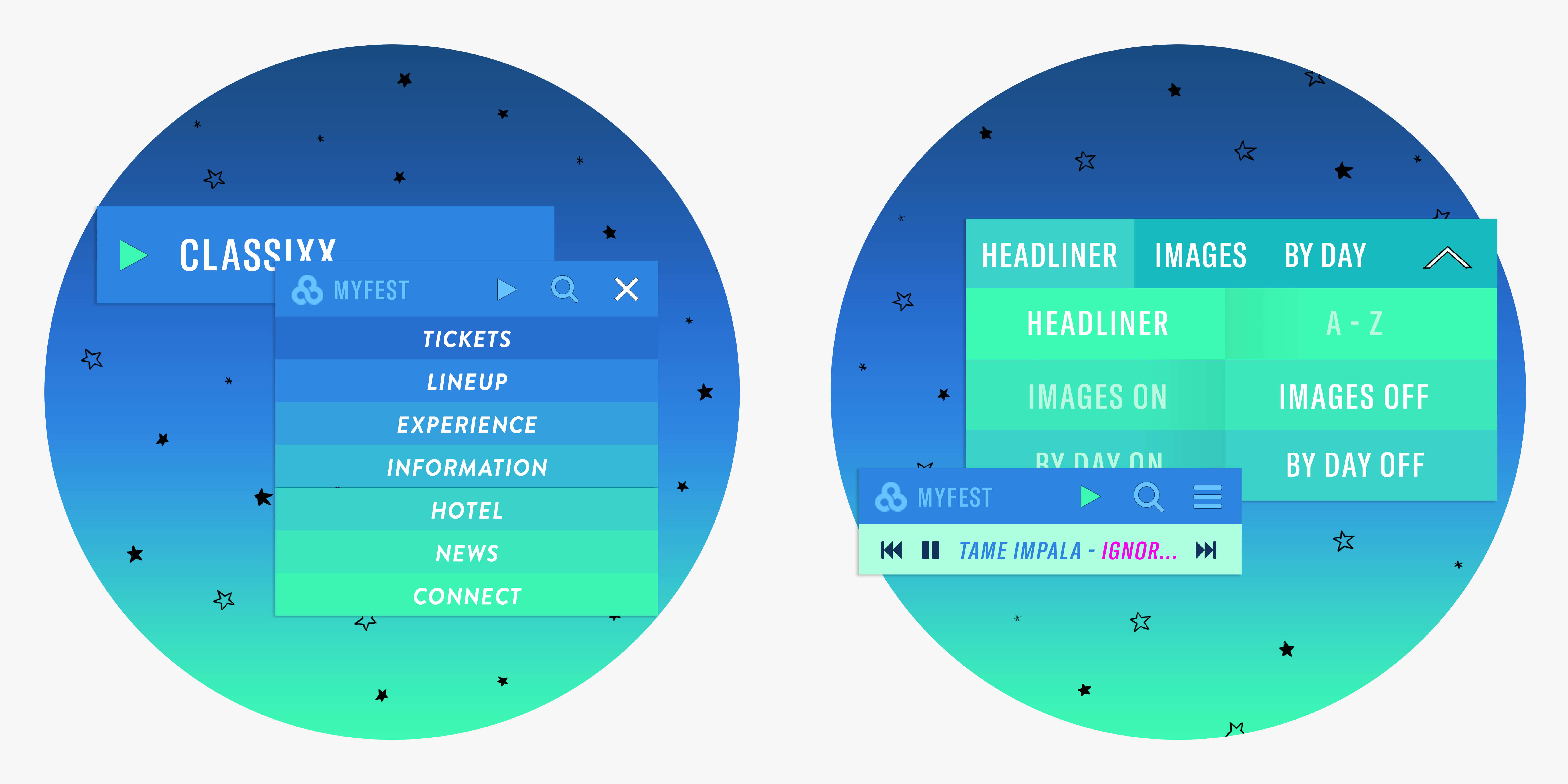
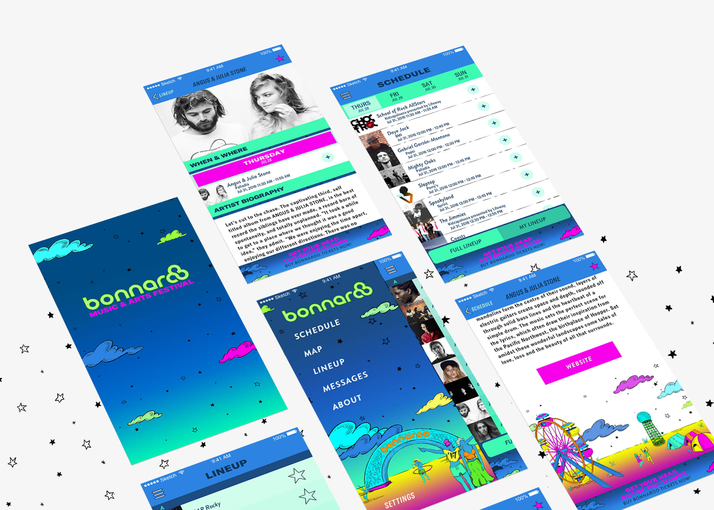
Mobile App Skinning
Social Media, Ticketing & PR Assets
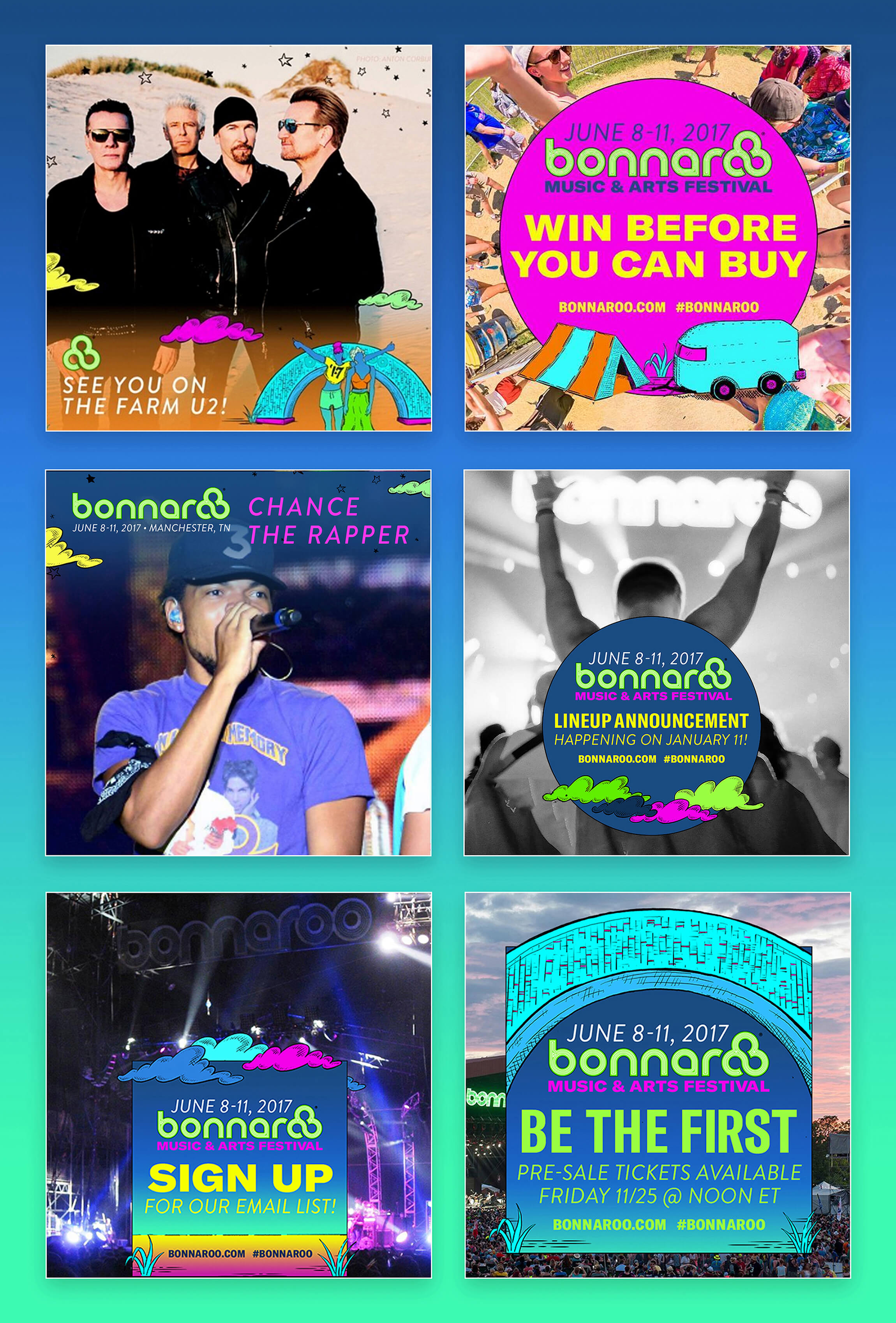
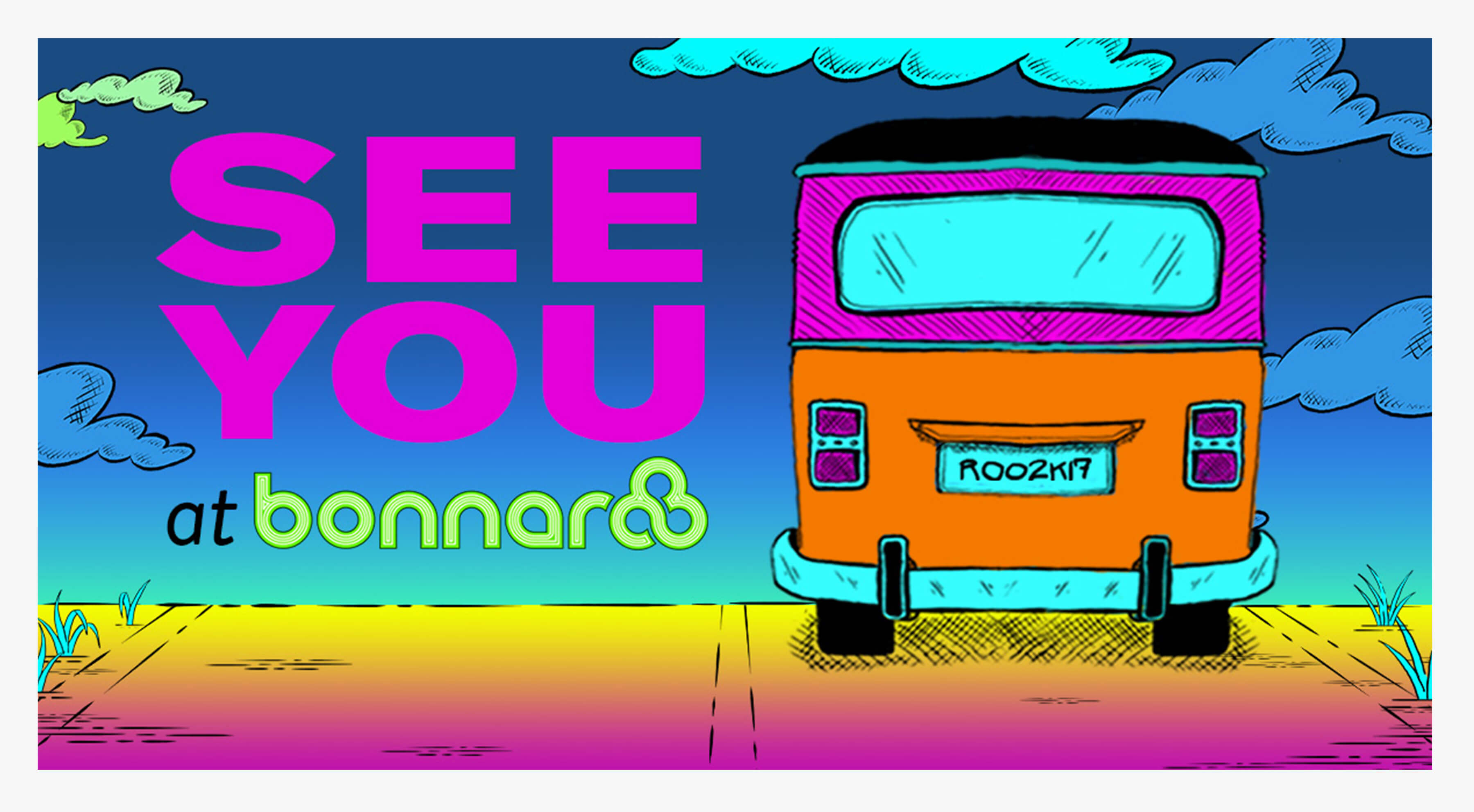
The announcement phase for a festival like Bonnaroo is incredibly important as well as exciting time for fans. For this portion of the launch we created various templates that could be used by the festival and by the artists to announce their participation via their personal social channels.
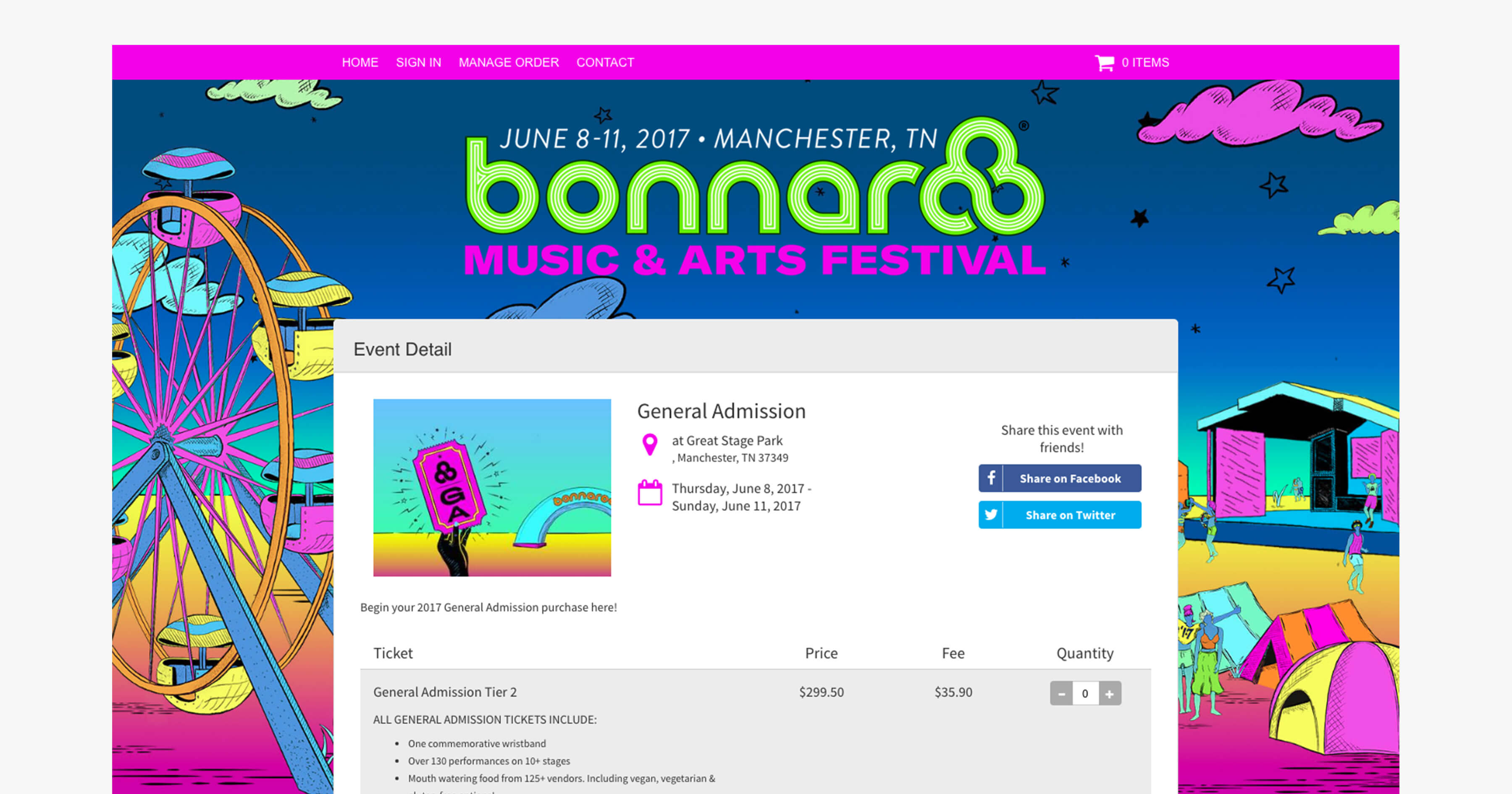
Iconography for Ticketing Needs
Holiday E-Card & Interactive Stickers
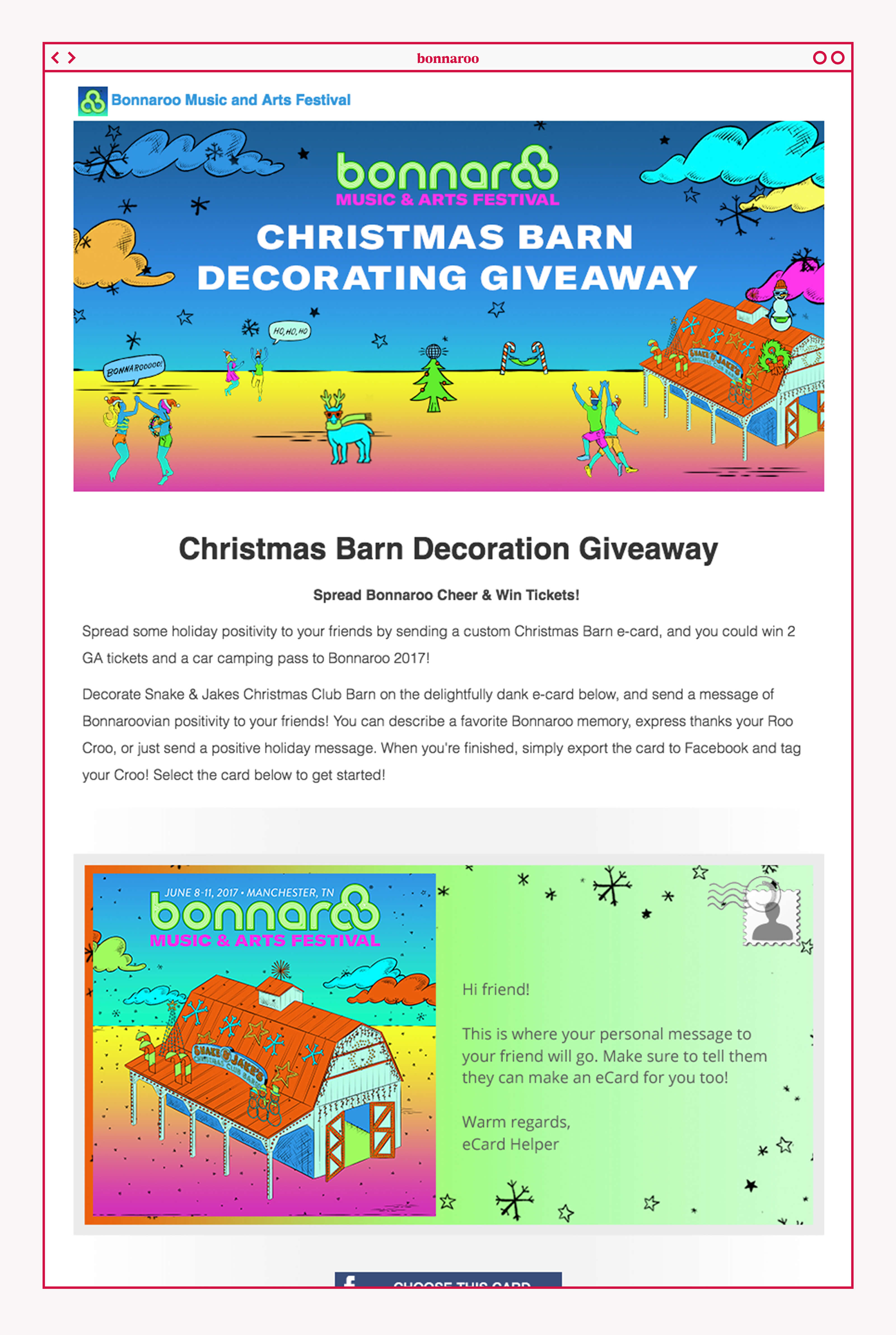
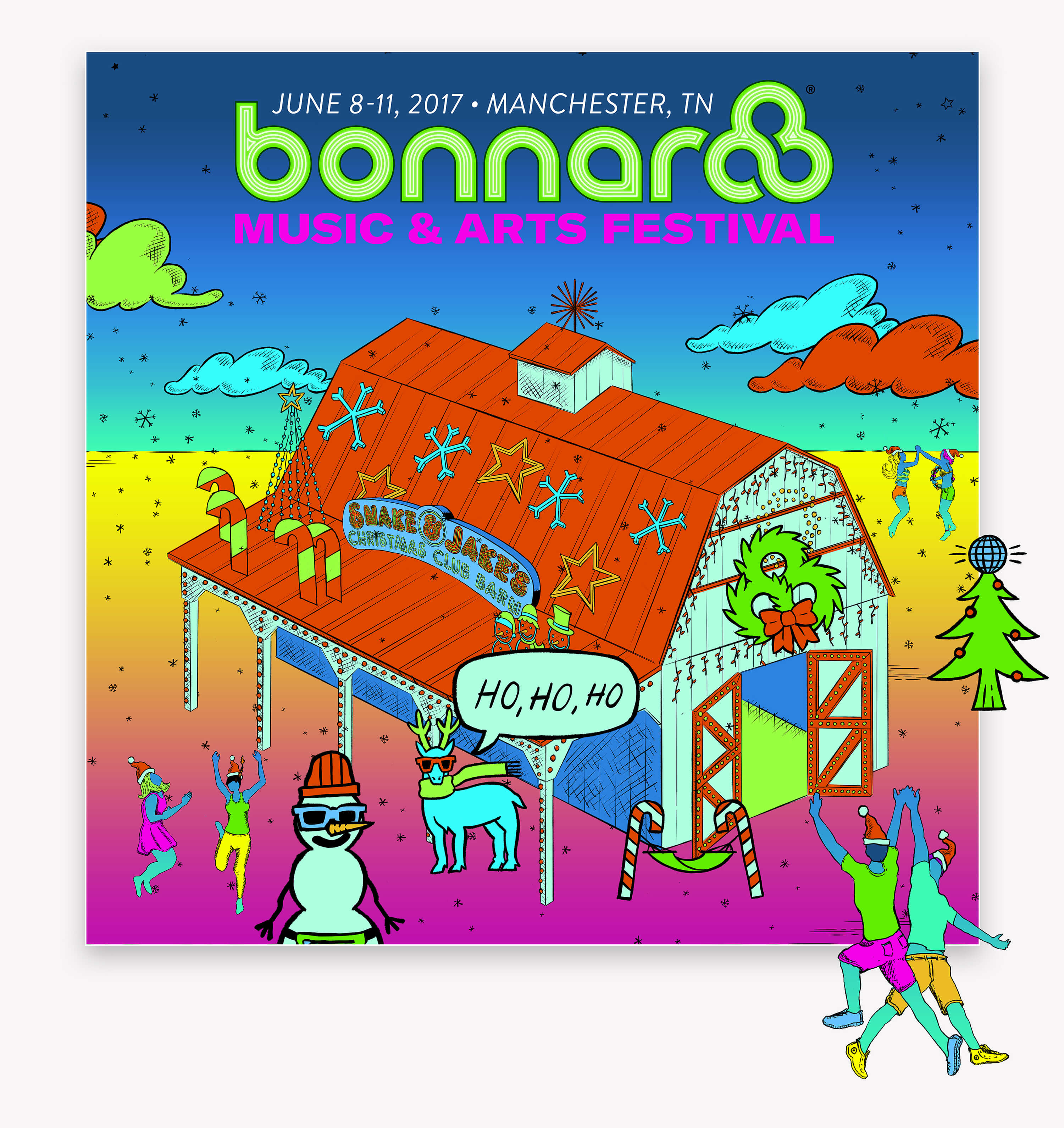
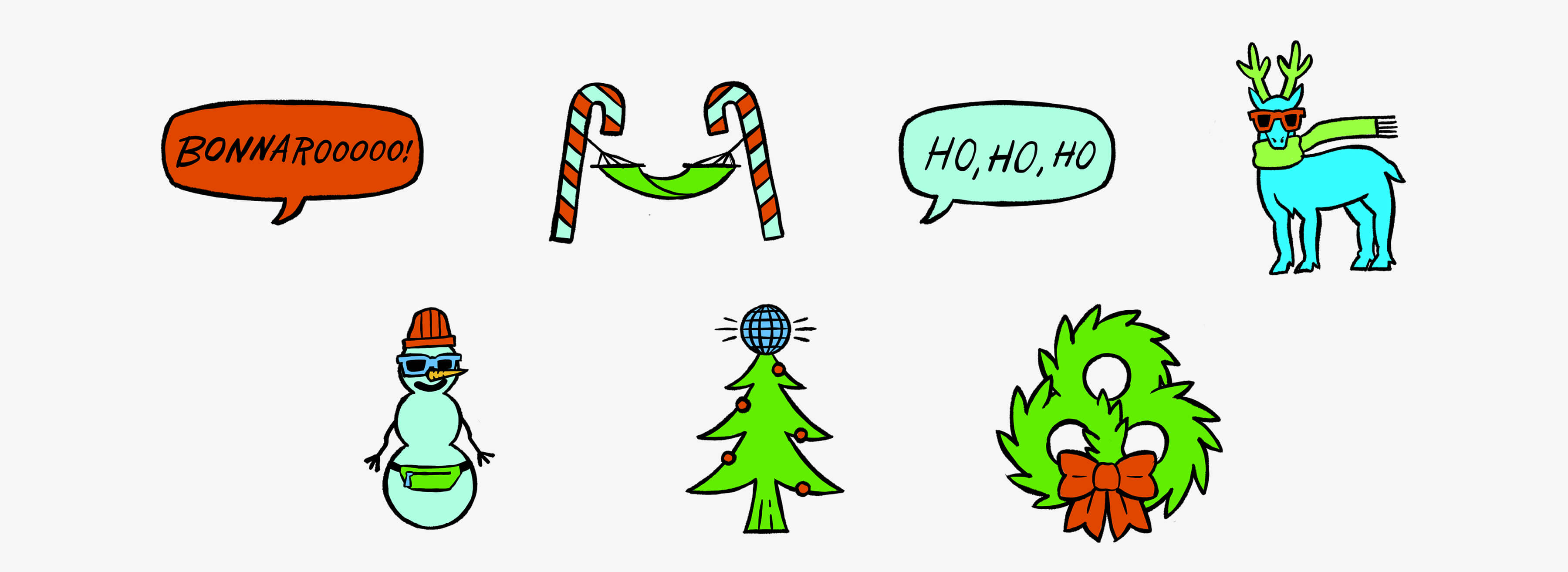
Putting digital stickers on everything is all the craze. It only made sense to create a interactive holiday E-Card where fans could build their own happy Bonnaroo Christmas Club Barn sticker medley.
ALL ARTWORK © BONNAROO MUSIC AND ARTS FESTIVAL
bonnaroo.com
Experience Bonnaroo Art installations and staging
