Reinventing a hometown hero
When a new owner stepped in, it was clear there was brand equity to resurrect and refine. ST8MNT has been proud to partner with the Bread & Company team on the rebrand.
A Nashville favorite, known for it’s fruit tea and yummy bread, was in desperate need of a revamp
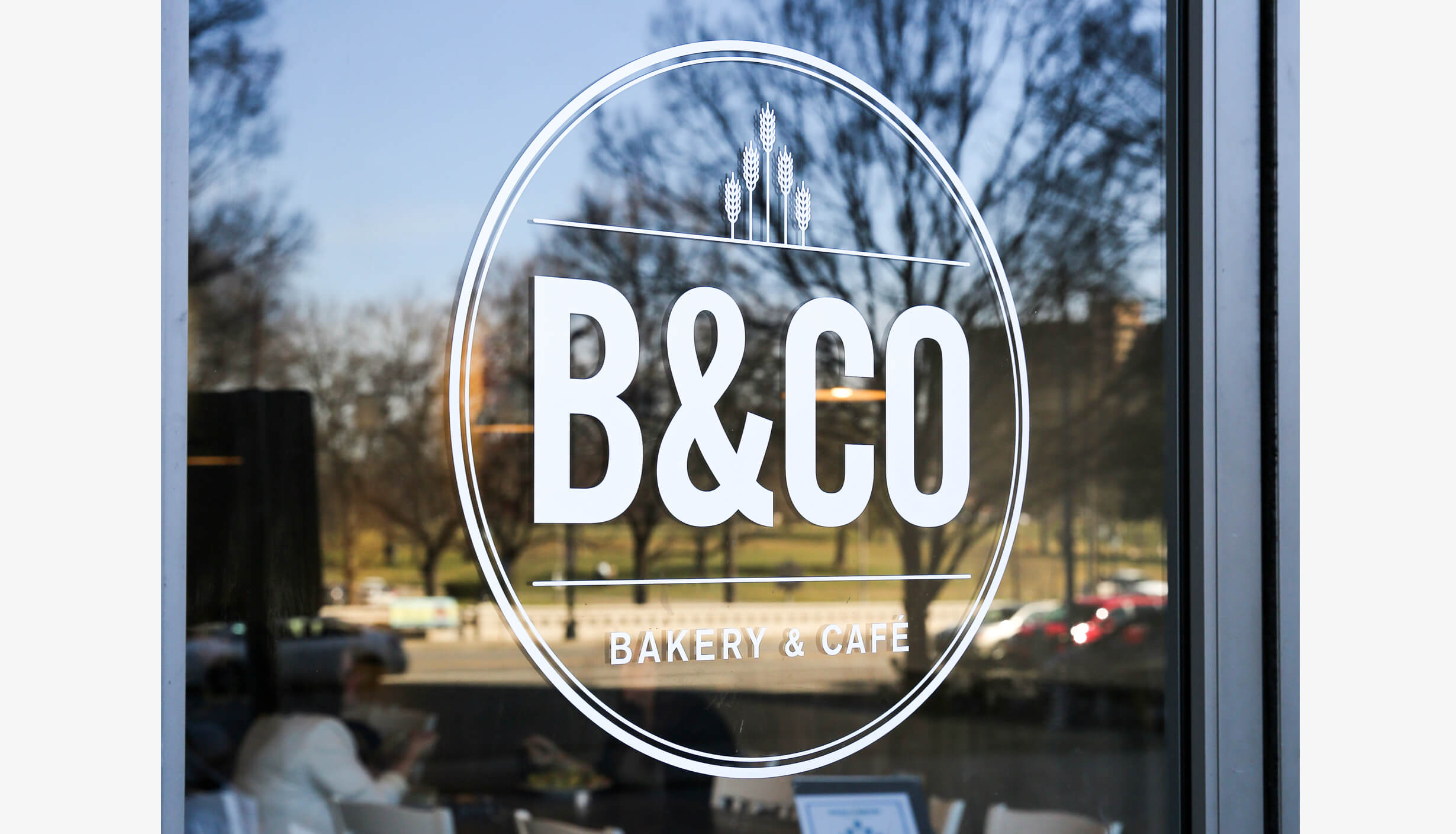
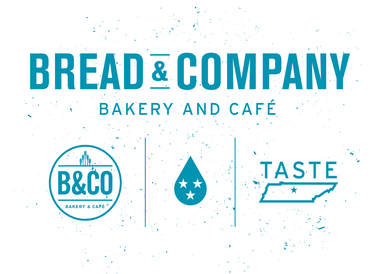
ST8MNT re-imagined the dated logo, and gave it a modern take. Warm, fresh, natural ingredients infused with an urban cleanliness and no fuss illustrations elevates B&CO, but keeps it true to its roots.
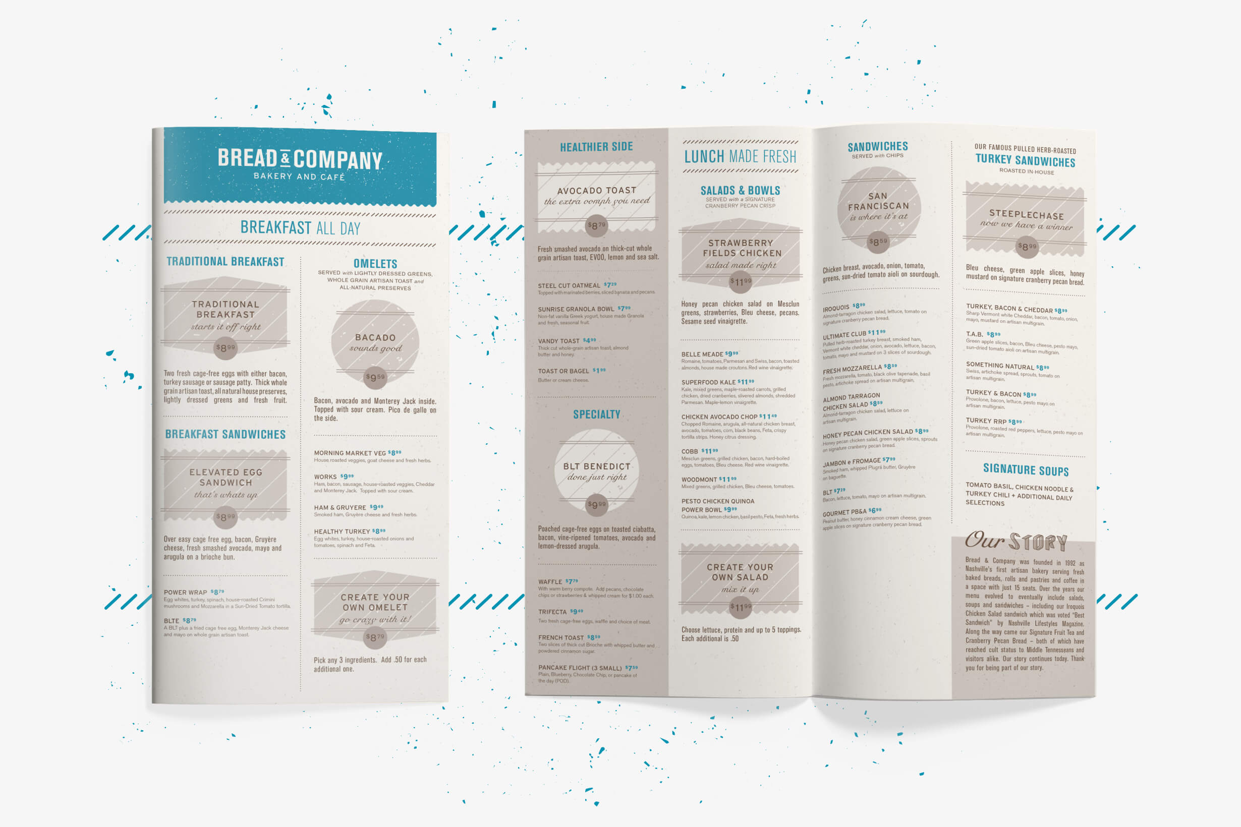
Sitting on the fence between city & country, like Nashville
The new Bread & Company menu offers old and new items, but needed all new organization and an updated design that ST8MNT had a blast creating. The details blur back and forth between modern and natural, making it a perfect fit for Nashville.
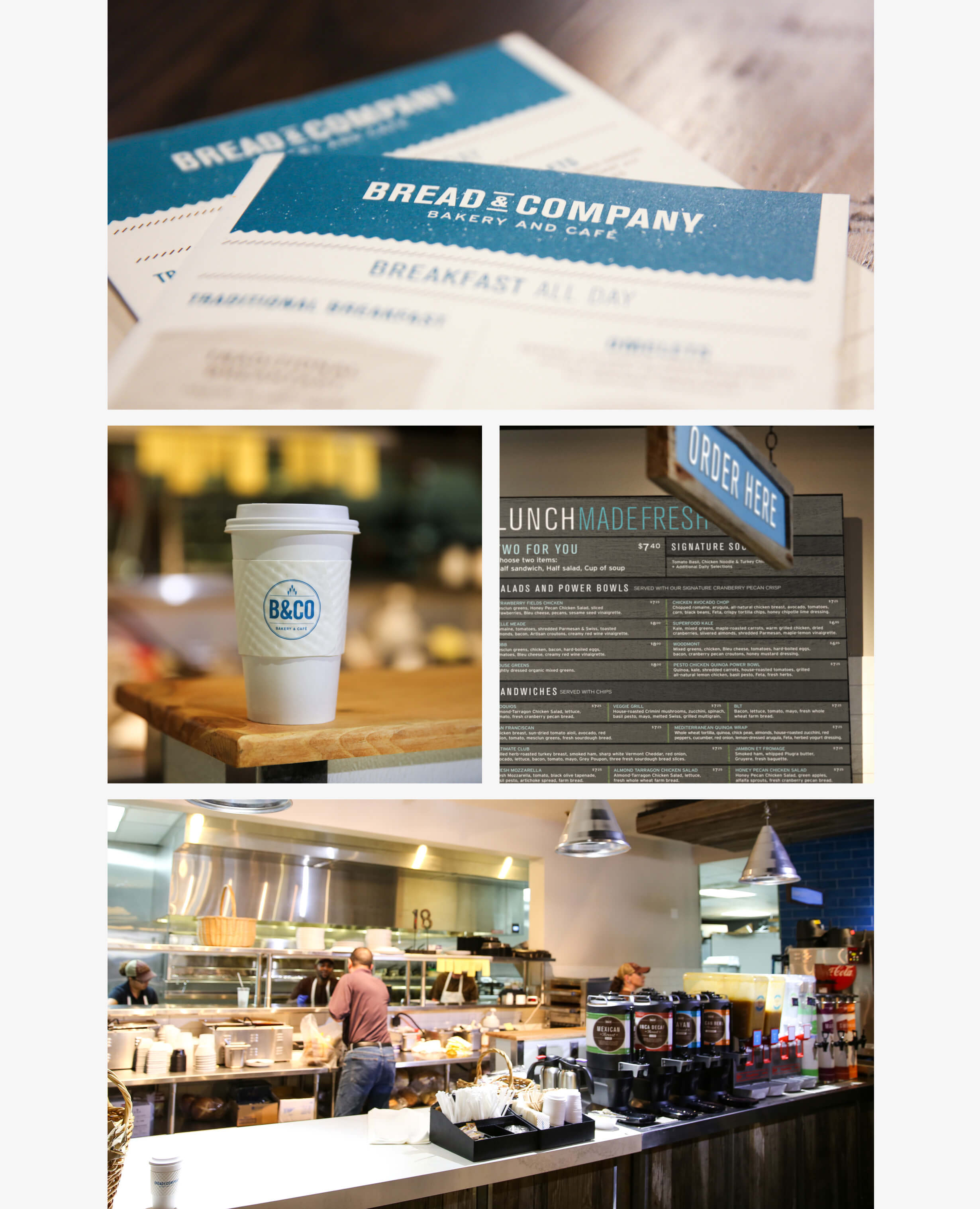
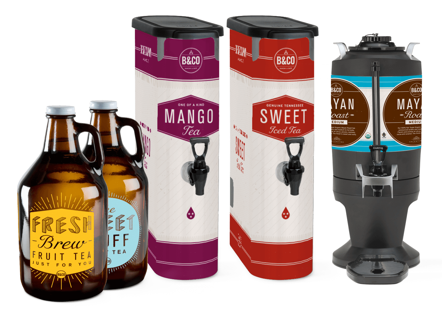
In Store details create a memorable experience
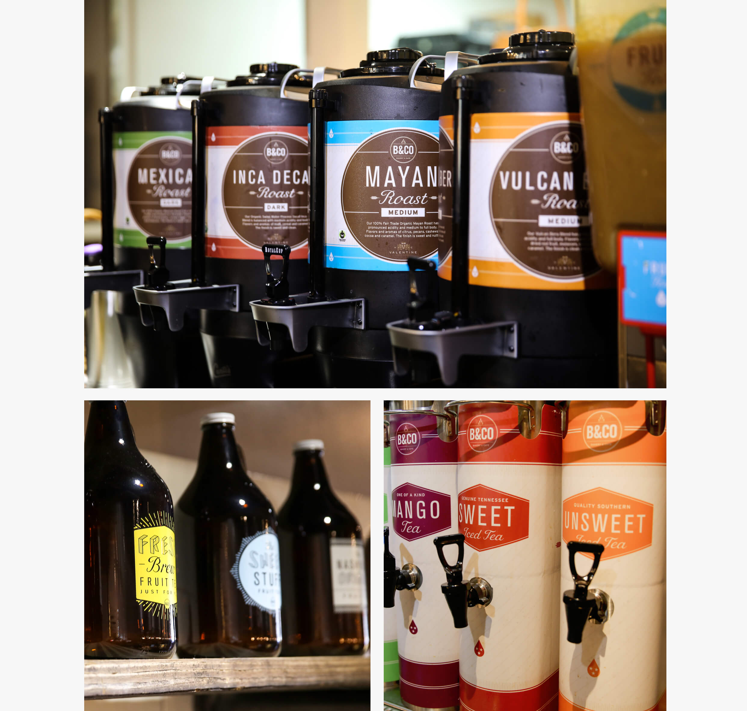
A user-friendly menu board, easy to follow wayfinding signs, beverage machine wraps, product labels, environmental art and more, were all designed to make for a pleasurable and easy experience, as well as leave a lasting impression of the brand with the customer.
and to please the masses, designer growlers to take home large quantities of fruit tea!!!
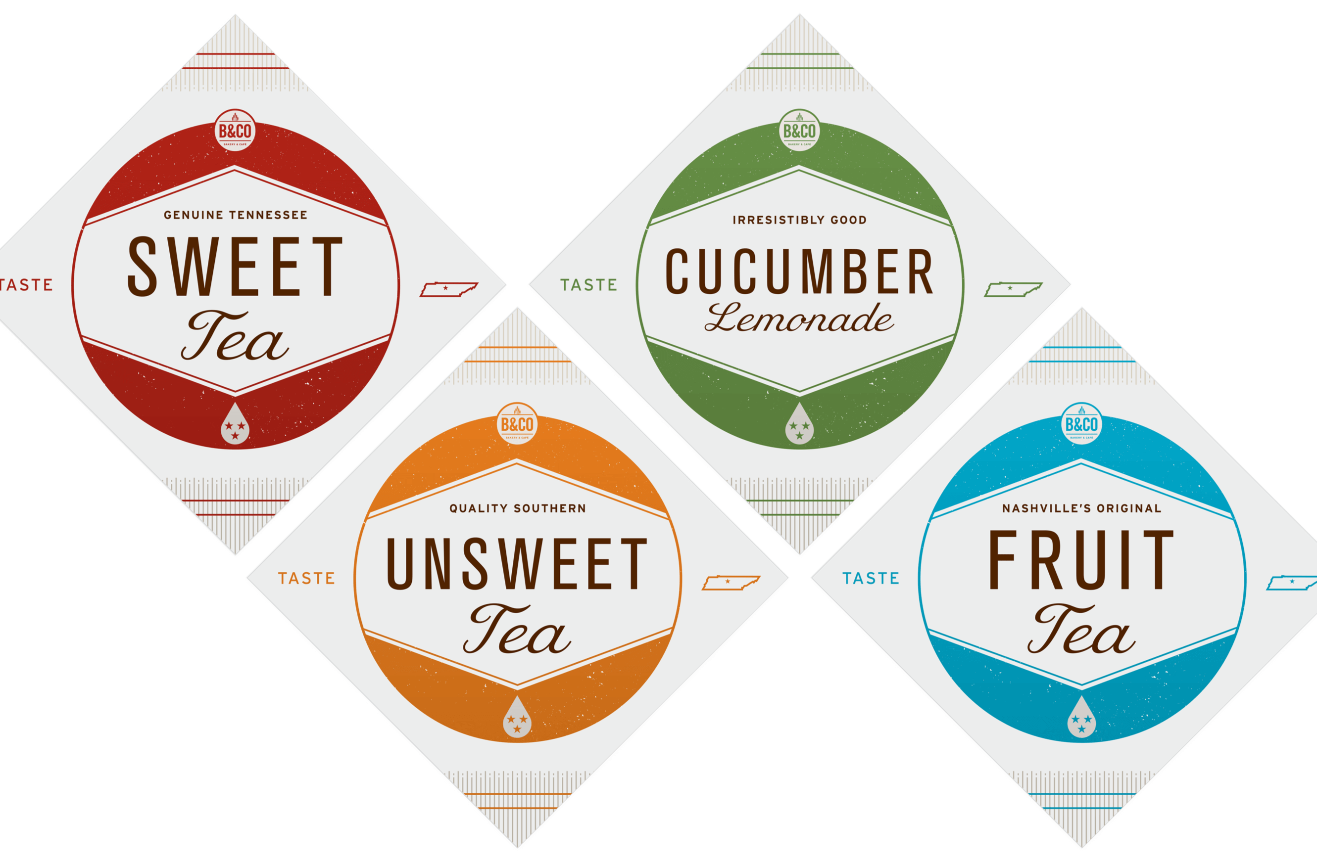
Seriously, go try the fruit tea. The focus groups couldn’t say enough about it, and our taste buds couldn’t agree more!
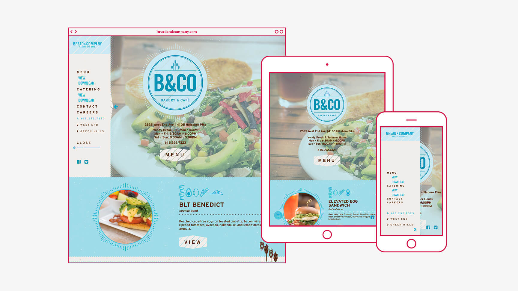
A website built for the hungry mobile user
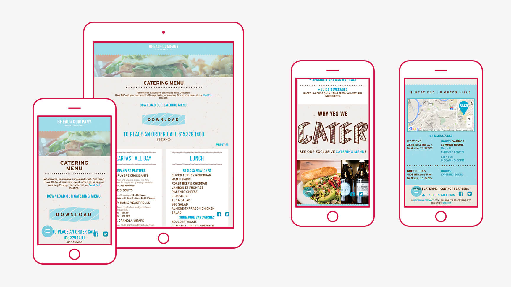
The importance of optimizing a site for a successful tablet and mobile experience is essential with the rising amount of mobile forward users – especially in the restaurant industry where many customers are on the road, searching for options. We dove head first into this subject with strategic thinking for Bread & Company. Check out our blog post, “Significance of Optimizing for the Modern Mobile User” for more on the subject.
ST8MNT created a site equipped with an ultra mobile friendly site navigation and food menu, as well as showcasing the updated brand. Our design is focused on users on the go, looking for a quick lunch spot, or ones wanting to dive into an interactive menu. The menu item spotlight area gives Bread and Company a space to promote seasonal and new offerings.
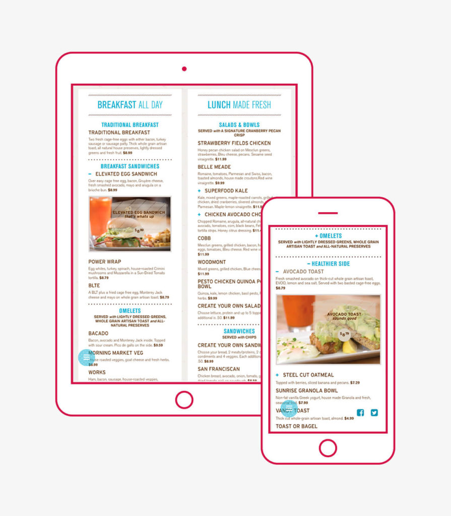
Interactive Menu
The food menu was top priority for Bread & Company. We took our print menu design and altered it into a web ready menu that is responsive and interactive. Sections of items are grouped together to help guide and focus users. These expandable areas condense the page length ultimately making the user experience more efficient. It was imperative to showcase the Bread & Company food menu in a clean and digestible fashion.
